National Parkitecture - Part 2.
Spending the time I did in Glacier National Park and at its lodges this past July got me thinking about how the NP brand identity and "Parkitecture" style has been repackaged as thematic design. Here is a look at three major Disney hotel resort projects that express and engage with that style.

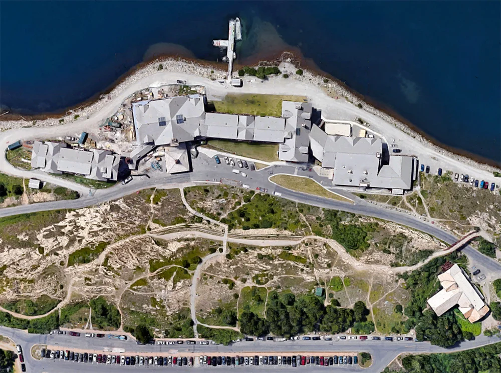
Wilderness Lodge, satellite view. Click for link. Map data: Ⓒ Google.
Disney's Wilderness Lodge, Walt Disney World Resort
What happens when all the individual stylistic and era-specific quirks of the some dozen classic National Parks Lodges are condensed into one singular, heightened, sweetened experience? It should be obvious that only Disney could do it (or would do it).
Approach to the main entrance and Porte Cochere.
Disney's Wilderness Lodge at the Walt Disney World Resort outside Orlando, Florida is just such a condensation. The hotel is very popular, so much so that it has its own unofficial fan website. I took the following pictures during a visit in October 2007.
Ⓒ Disney Enterprises, Inc.
This was not the first Disney project to adopt a "Parkitecture" theme (see below), but it is the largest and most comprehensive. The design phase took place from 1989 to 1991, ground was broken in August 1992, and the hotel opened in May 1994. You can see here from the property map that the hotel consists of two wings which branch off from the central lobby building. The addition structures that run along to the south are cabin bungalows in a similar style which opened in 2000, part of Disney's ever-expanding timeshare business. Additions continue to be made to the property. The latest of these, the Copper Creek Villas & Cabins, opened just this past summer, in July 2017.
Exterior trim above the main entrance.
Denver architect Peter Dominick drew upon primarily the cues of the Old Faithful Inn at Yellowstone, the Ahwahnee Hotel at Yosemite, Timberline Lodge (Mount Hood, Oregon), and lastly the Lake McDonald Lodge (which I visited while in Glacier). Disney seems to have felt that Dominick's lineage lent a certain credibility to the project—his father was a pioneering environmentalist and longtime Colorado senator. Dominick as architect of record was also augmented by two other Principals from his [then] firm Urban Design Group: Randal Johnson (Design) and Ronald D. Armstrong (Management).
Yet despite having a formal architect on the project, this was still thematic design—this was still show, in which architecture was just one component, a structural means to an end. At the lodge groundbreaking in the summer of 1992, Michael Eisner said “in our architecture, Disney continues to produce the kind of groundbreaking entertainment that keeps the Disney name magical to people around the world. Our architecture is part of the show” [emphasis added].
The design team on the project confirms that Mr. Eisner was very involved, and very hands on. “Michael reviewed the design completion and was involved in design presentations at each stage of the design process,” said Randal Johnson, as quoted in this excellent article by Chuck Mirarchi which details the entire development of the Wilderness Lodge at greater length.
Front entrance doors.
Upon closer inspection, a corporate gloss becomes apparent, perhaps due to Eisner's influence. All surfaces are spotless (moreso even than at the most meticulously restored NPL properties) and somewhat modernistic. The exposed beams have been vigorously sanded down and saturated in thick coats of paint. The flooring also has a very contemporary cast.
Old Faithful Inn, Yellowstone / Wilderness Lodge, Walt DIsney World.
The most direct influence on the main building is Yellowstone's Old Faithful Inn. Here is a vintage photograph of the Inn, compared with my shot of the Wilderness Lodge.

Vintage postcard of the Old Faithful Inn.
It's quite the direct lift, based on honest research. Mirarchi reports in the article I noted above that
An extensive amount of research went into the planning of the Wilderness Lodge. It began with the architects taking a tour of the National Parks including Yellowstone, Glacier and Yosemite. “These visits subsequently let to extensive research on the National Park System, the great western painters, indigenous peoples and western craftsman who helped shape the American west,” said Randy Johnson. “This influence shows up throughout the building—in the lobby floor, a Hopi storm pattern; in light fixtures and furniture, inspired by craftsman Thomas Molesworth; in the fireplace representing the strata of the Grand Canyon.”
Early concept sketch for the Wilderness Lodge. Ⓒ Urban Design Group, Inc.
Concept rendering for the Wilderness Lodge. Ⓒ Urban Design Group, Inc.
Wilderness Lodge lobby.
Once you enter the eight-story lobby, the lift from Old Faithful continues; pine railings imported from Oregon, carvings, fixtures, and lighting. Two massive 55-foot "authentic totem pole" columns contain Native American-inspired renderings of birds of prey, fashioned of standing dead Lodgepole Pine from Montana. I place "authentic" in scare quotes because that's what Disney calls the totems. Yet they were carved by Duane Pasco, a white guy raised in Alaska and Seattle, Washington. The birds' order from floor to ceiling is relative with their placement in the environment—at eye level with guests are field and meadow dwellers, rising up through alpine species and finally to the highest strata of eagles, falcons, and hawks.
The four 600-pound teepee chandeliers are actual rawhide, hand-painted with Native American iconography. Wilson & Associates served as the interiors and lighting design firm on the project.
Vintage postcard, Old Faithful Inn Lobby.
Early period photography demonstrates the very direct relationship the lobby of the Wilderness Lodge has the to the Old Faithful Inn.
Chimney looking upward.
The lodge's 82-foot chimney is in the very same same corner support position as at Yellowstone. It's the only element in the lobby that is fabricated, and was constructed and sculpted in place.
Central fireplace.
But then Disney starts mixing styles, references, and locales. After all, what does it matter? This hotel is in Central Florida; Yellowstone it ain't. The stonework of the fireplace depicts the strata of the Grand Canyon, with plenty of Native American accents. “Due to laws restricting the removal of material from National Parks, the fireplace was constructed...using similar materials,” said Christian Barlock, who worked on the project. “A paleontologist was hired to spend time in the Grand Canyon and document the strata and fossils. He then directed the construction of the fireplace at the lodge—including inserting actual fossils into the correct strata. This was done so we could ensure it was an accurate and successful representation."
Second floor sitting room.
There are cozy rooms off the main lobby that provide small moments of intimacy. Here the influence of Mount Hood's Timberline Lodge is more distinctly felt.
Top of central lobby.
Look up, however, and we have the classic lantern chandeliers and enormous vaulted ceilings.

Faux-vintage postcard. Ⓒ Disney Enterprises, Inc.
Like most Disney design projects, the Wilderness Lodge has an elaborate fictional backstory developed by the imagineers to help guide the creative process. In the earlier years of the lodge's operation, a fictional newspaper was distributed to guests upon check in, telling them of one (imagined) "Colonel Ezekiel Moreland" and his discovery of "Silver Creek Springs."
The faux-vintage newspaper once handed out to guests upon check in, The Silver Creek Star. Ⓒ Disney Enterprises, Inc.
Unfortunately the backstory has since been forgotten. From The Forgotten Story of the Wilderness Lodge by noted Disney historian Jim Korkis:
The Wilderness Lodge no longer has a copy of the Silver Creek Star that was given so freely to guests over a decade ago. There is no documentation of this story in their “Big Book of the Lodge” that is used by the rangers who give the outstanding “Wonders of the Lodge” walking tour four days a week as a reference to answer guests’ questions. The vivid adventures of Colonel Moreland... have completely disappeared from Disney history in less than two decades along with so many other interesting tales that should be recorded for future researchers.
Even more detail about this backstory can be read here and here at the Disney-focused 2719 Hyperion blog.
View facing the rear facade of the hotel, to the southwest, away from Bay Lake.
As with all Disney resort properties, there is an abundance of artificial water features. The Wilderness Lodge has its own waterfalls, streams, and the Fire Rock Geyser (a kind of Old Faithful in miniature, complete with a regular schedule of eruption).
Corner of the north wing.
Even not counting the timeshare facilities, the resort is sprawling. 728 rooms total were initially built before those later expansions.
Side entrance to the south.
There is a kind of hybrid modernity at work here as well. Notice the roof structures; they appear of the sort you'd find at a contemporary upscale ski resort.
Familiar Roofs.
Or the sprawling retail locations of the Cabela's sporting goods chain, designed by Pennsylvania architecture firm Crabtree, Rohrbaugh & Associates. I wonder if the team visited Wilderness Lodge; the similarity is uncanny.
These modern green roofs of the lodge look like they're designed to take the onslaught of snowy winters. Yet this is Central Florida. Dominick could have easily chosen to replicate the original rustic and charming shingle roof of the Old Faithful Inn—it certainly would not be damaged by weather as the original had. But he did not.
Poolside bar.
Native American iconography is all over the place. Sometimes it is used appropriately, sometimes not. This is the "Trout Pass Bar" serving poolside frozen margaritas and daiquiris. Despite such odd contexts, overall Disney seems satisfied with this dubious, appropriated integration of Native art. From Building a Dream: The Art of Disney Architecture by Beth Dunlop (1st edition, 1996):
Beyond using typical rustic architectural motifs and western materials, Dominick sought to use his commission to express spiritual ideas about the West. He was able to do so, in part, by incorporating as much Native American legend as possible—on columns and totem poles and in patterns in the rugs—and perhaps even more in what was both the philosophical and the structural approach to Wilderness Lodge, by trying to ensure "a roughness and a trueness of how things were put together."
The clincher, however, is Dunlop's closing comment on the resort project. "At Wilderness Lodge, authenticity is the fantasy." [emphasis mine]

Sequoia Lodge, satellite view. Click for link. Map data: Ⓒ Google.
Disney's Sequoia Lodge, Disneyland Paris Resort
As I mentioned above, Wilderness Lodge was not Disney's first foray into the realm of the National Parks. Disney's Sequoia Lodge opened at the Disneyland Paris Resort (then EuroDisney) two years prior.
The rear facade, from the water's edge.
Five original onsite hotels for the Paris project were the result of a competition initiated by Michael Eisner, and the resulting projects were designed by such luminaries as Frank Gehry, Michael Graves, and Robert A. M. Stern. A sixth, the Disneyland Paris Hotel (which connects to the the entrance of the park and overlooks it), was deemed "too cute" for these notables, and was designed in-house by the imagineers. These following photos are from my March 2008 visit.
Exterior trim with sharp lines.
The Sequoia feels very 'modern' (or at least contemporary to the late 80s when it was designed) and not much connected to the American West. Most jarring is the rigid mirror symmetry (see the satellite view above). This formalism smacks of royal palaces like Versailles, not the lodges of the National Parks. The Sequoia Lodge might best be termed interpretive, whereas the Wilderness Lodge is stylistically more derivative. In terms of my own taxonomy of thematic design, the former is referential, and the latter is representational.
The main entrance with NPL-esque cobblestone columns.
The Sequoia was the only hotel not be designed by one of Eisner's competition winners; it was the conception of French architect Antoine Grumbach. Again from Dunlop's Building a Dream:
Grumbach drew the most romantic assignment, a hotel in the spirit of the great national park lodges of the American West, the same inspiration for Orlando's Wilderness Lodge. ...Sequoia Lodge is a heavy, dark, handsome hotel that the architect terms "an ecology building." It is surrounded by trees and, unlike most Disney buildings, is executed largely in natural materials: wood, stone, and copper.
Now here is where things get odd. Dunlop goes on to say, "In form and execution, it pays homage to Frank Lloyd Wright and Greene & Greene, as well as to the Arts and Crafts Movement in general."
The Redwood Bar & Lounge.
Wright? Greene & Greene? Arts and Crafts Movement? What on earth does any of this have to do with the lodges of the National Parks? Dunlop merely concludes that "Sequoia Lodge, like Wilderness Lodge, is rooted in the early twentieth century architecture of the American West." To my thinking, that's an awfully wide net to cast—almost as nonspecific as saying a band draws its musical influences from "the major cities of the 1960s." One online review said, quite correctly, "Imagine if Frank Lloyd Wright designed Yosemite’s Ahwahnee." Which, I suppose, we can indeed imagine. It's just a strange dream to actually walk through. To use a musical metaphor again, this is not a remastering, or even a remix. This is a mashup; a design DJ taking Wright and spinning him together with Greene & Greene, with Arts and Crafts.
I only spent about an hour or so looking around the Sequoia Lodge, and I found plenty of Wright and Arts and Crafts, but very little "Parkitecture." There's no grand central lobby, no massiveness at all to speak of. The NPL style is all about grandeur, and I was hoping here, in the country that gave us the word, I'd find some.
Interior window treatments aping Wright.
Wright's iconic Prairie style leaded glass designs are featured throughout. This is the kind of "in the style of" stuff more commonly derived from name brand Renaissance masters like Leonardo Da Vinci (whose works are undoubtedly in the public domain at this point). Yet what happens when the artist being copied died in the middle of the last century—does the Wright estate need to approve such nods? Do they require authorization and compensation, like for the licensed products they sell at museums across the country? I don't know.
Mid-Century Modern lobby.
There are structural elements of Wright's DNA here as well. The hotel lobby's angled ceiling with exposed beams and large sun windows is rather reminiscent of Taliesin West, his winter home in Scottsdale, Arizona.
Drafting room at Taliesin West. Wikimedia Commons.
Typical Mission 66-style structure: Petrified forest National Park. Flickr Creative Commons.
I suspect this is also a subtle nod to Mission 66, the decade long expansion program 1956–1966 which brought many mid-century modern structures to the National Park System. But honestly, there was nothing NP "lodge" about Disney's Sequoia Lodge.
Moving on to Disney's more recent resorts in California; Wright, Greene & Greene, and the Craftsman / Arts and Crafts movement take center stage for an even greater departure.

Grand Californian, satellite view. Click for link. Map data: Ⓒ Google.
Disney's Grand Californian Hotel & Spa, Disneyland Resort
Disney's Grand Californian opened in 2001 as part of a colossal expansion to the Disneyland Resort which included a second theme park—Disney California Adventure—the Downtown Disney shopping district, the Mickey & Friends parking structure, and various other facilities and amenties.
Approach to the main entrance and Porte Cochere.
Interestingly, the Grand Californian is again the work of a team lead by architect Peter Dominick. Beth Dunlop describes the resort in Building a Dream: The Art of Disney Architecture (2nd edition, 2011):
The Grand Californian pays broad homage to the Arts and Crafts movement that flourished at the turn of the twentieth century and was a dominant influence on architecture throughout California. Though the hotel speaks directly to the work of such California architects as Bernard Maybeck and Charles and Henry Greene, it also evokes the memory of other designers including Frank Lloyd Wright and the Scotsman, Charles Rennie MacIntosh [sic].
Here is a "mashup" design which follows in the vein of the Sequoia Lodge project, but adds the grandeur of his Wilderness Lodge back in. And the grandeur, though welcome at (and appropriate to) a Disney resort, is a problem.
Not exactly a neighborhood Bungalow. Ⓒ Disney Enterprises, Inc.
Dominick spoke at the hotel's dedication on February 8, 2001 and noted how the vastness of the property and overall scale of the design was a departure from the domestic, small, intimate California Craftsman tradition:
Disney’s Grand Californian Hotel is perhaps the largest structure ever conceived in the Arts and Crafts style which has historically been residential in focus, size, and execution. And the garden was always the key influence in the design of Arts and Crafts structures. In this case we shifted the scale of the hotel to include the scale of the forest particularly those along California's coastlines with their Monterey pines and the spectacular groves of redwoods and sequoias providing an appropriate scale and inspiration for a project [this] immense. [emphasis mine]
Looking down into the lobby from the third floor.
The iconic, cavernous central lobby with dominant fireplace (ala Wilderness Lodge by way of Yellowstone) is back. Yet what stark contrast is this, to be in the Art and Crafts style which—as Dominick noted above—is small. It takes the quiet charm of the California Craftsman bungalow (even the larger 'ultimate bungalow') and amplifies it to crude shout across a parking lot. There are smaller moments, for sure, particularly at hotel check-in. Beth Dunlop notes in Building a Dream (2nd edition) that this first antechamber new guests encounter "is a tribute to San Francisco's exquisite Swedenborgian Church, which is considered to be the first Arts and Crafts structure in California."
Yet in sum, the Grand Californian feels as if someone had an enlarging ray gun and aimed it at the Gamble House, magically ballooning it to 948 rooms, with an additional 44 suites and 71 villas. While the scale is wrong, the details, however, are Wright.
Lighting fixtures in the main lobby.
In particular, Frank Llyod collides head on with California Craftsman style in the lighting and glasswork. These chandeliers would look rather well at home in any Prairie residence in the Chicago suburbs. Notice how the organic, floral forms (top upward facing sconces) are integrated with something akin to Wright's geometric, Japanese inspired forms and patterns (lower hanging lantern elements).
Main lobby railings.
This was a subtlety I did not catch until my third or fourth visit to the hotel's lobby—Wright leaded glass designs of the Prairie variety, integrated into the balcony railing structure in front of these massive windows. When the sun wasn't at the best angle, I never noticed them. But when light hits the rear windows at full strength, all the bright colors of the Avery Coonley Playhouse windows shine through rectilinear forms that recall Robie House.
Interior wayfinding.
Typography throughout the resort reflects the California take on the Craftsman style, yet to my eye they could have gone for even greater authenticity. Although the typeface here appears to be an alteration of ITC Willow (based on the lettering of Charles Rennie Mackintosh) it has a late 90s California contemporary feel. Perhaps Disney was concerned about readability.
Exposed beams on the walkway to the pool area.
The exterior details, observed in micro, give a better feel of the California Craftsman home. The massive scale of the overall site is troublesome, but in moments like this you can focus in on the detail and try and forget how sprawling the place is. Dunlop acknowledges in Building a Dream (2nd edition) that this variety aids the design, observing "...the spaces are carefully manipulated—small and tight and then huge and soaring—to perfect effect. The bracketed, vaulted wood ceilings seem to embrace the spaces."
I'm still not sure why the Disney literature, and online reviewers, place this resort in the NP lodge thematic category. Big lobby, wood, trees. That's about the only shared elements. It's sort of the same comment made about the Sequoia Lodge; "What if architect A of school B in the style C... designed a National Parks lodge." Why not just design something entirely new? Or, as with Wilderness Lodge, make the relationship to the NPL "Parkitecture" style explicit.
The facade facing the Downtown Disney shopping district.
Of these three Disney resort developments, in my view only the Wilderness Lodge captures a notion of authenticity and clearly expresses the NPL "Parkitecture" style as effective thematic design.
As reimagined interpretations ("mashup" works), the Sequoia Lodge and the Grand Californian convey interest and creativity, certainly. It might be that trying to tie their visions to the NP lodge concept was a mistake. It's not required. For the typical visitor who is unaware of the references at play, the design "mashups" work because they reference aesthetics that have become so popular as to exist in the public imagination as brands do. Frank Lloyd Wright, even if you can't name a single one of his projects, has a style that has been so broadly projected, interpreted—consumed—as to become a theme all its own. The same for the Arts and Crafts / California Craftsman style, or the Greene & Greene look. It's in the bloodstream. And for those visitors more aware and perhaps more architecturally astute, it's like any mashup recording you'd hear of artists you are familiar with; you're either going to be charmed or horrified.