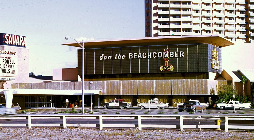
Polynesian Pop Vegas - Part 2: The Golden Tiki.
Frankie’s Tiki Room was the lone Vegas Polynesian Pop mecca for nearly a decade. Then The Golden Tiki arrived in the city’s Chinatown during the summer of 2015. Located in a small strip mall called The Center at Spring Mountain, the bar replaced an establishment called Little Macau.
Founded by former Hard Rock Hotel creative director Branden Powers, Golden Tiki was heavily inspired by Disneyland. It represents a step forward in themed immersion, more like the classic tiki temples of mid-century like the Aku Aku than Frankie’s. Yet with a contemporary twist and a wink and a nod to popular culture.
Case in point are the carved shields out front. The art is playful rather than attempting to channel legitimate South Seas vibes. In the center is the Golden Tiki mascot.
There is a mixture of signage outside, like this strange arrowhead form with Western wood typography. Like Frankie’s, Golden Tiki is open 24 hours and you can gamble.
Because it’s located within a strip mall, the bar still sports the standard fin that all the business tenants of The Center at Spring Mountain use.
The carvings on the door handle pulls look like the more traditional figures found at places like Trader Vic’s, even though they, too, are Americanized pop interpretations. This is one of the interesting aspects of tiki theming. Something can be called classic or traditional, and it’s referring to tiki’s own mid-century past rather than anything actual authentic to Pacific Islander culture.
Immediately upon entry, the Chinatown of Las Vegas disappears behind me. Themed environments are famous for transitions, liminal spaces, and thresholds. This is what Golden Tiki calls a “secret lava rock cave entrance with waterfall.” It noticeably cooler than the night desert air. I can feel the humidity of the water trickling down. The lighting effects shimmer. I almost feel and hear a slight breeze. I’m transported.
To the right as I walk in is a Tropical Trading Outpost, one of the many tropes of Polynesian Pop. Again begun by Trader Vic’s, there were many, many tiki bars using a Trader moniker, including Trader Dick’s, Traders Inn, Trader Ku's, and most recently the Disneyland Resort’s own Trader Sam’s (2011). A hand-painted sign reads BUY-SELL-HOCK-TRADE and there are various crates and cages filled with antique and vintage bric-a-brac, including the Central American idol from Raiders of the Lost Ark (1981).
As is customary, there is always a tiki or two at the foyer to greet us. A total of twenty-four carvings like this one were executed by Bosko, who had done the same for both Taboo Cove and Frankie’s.
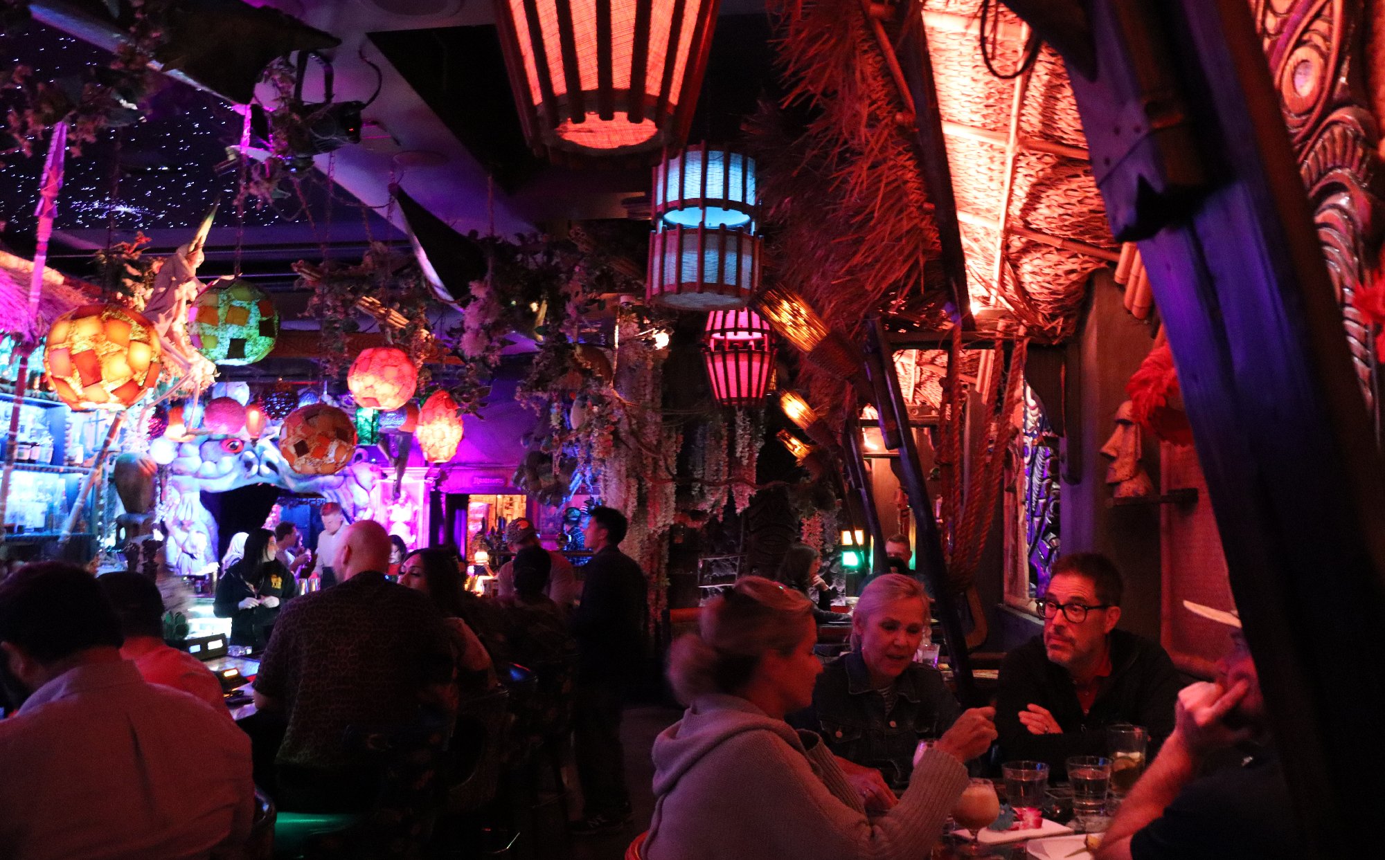
Immediately I can tell this is quite the cut above any tiki bar I’d yet seen in Las Vegas. The amount of detail is simply stunning. The central bar is roofed in thatch, common enough, bur everything is deliciously backlit. This is a space to drink in just as much as the cocktails.
Around to the left are some booths enclosed by fort-like bamboo structures. Again, this is common in Polynesian Pop environments. The design provides a measure of intimacy but also a sense of inhabitation, like we are living on a tropical island in a makeshift assemblage of our own creation. Perhaps we were shipwrecked here.
Just to the right of that along the wall is a series of cartoonish clamshells from which water cascades. The bar calls these, tongue firmly in cheek, Seamen Falls.
Walking around, I notice that Golden Tiki is a series of four interlocking lounge spaces that each carry an individual yet related theme.
For example, this is The Pirates Lair, which deeply channels Disney lore. There is an Audio-Animatronic figure above at the left (not sure if it’s a replica or an actual retired park attraction figure). The amount of propping, especially above my head, is impressive. I love that every space has multiple levels of detail, like this shelf above the booth areas carrying a painting and a skeleton locked up in a jail cell.
Everywhere you turn, the theme shifts slightly. But if you’re a fan of tiki in general, and the Disney parks more specifically, there are many not-so-hidden tributes to take in.
Along the wall to the right side as you enter The Golden Tiki is a series of typical A-frame thatch hut seating areas which are meticulously decorated. Though these date back to mid-century tiki establishments, the contemporary version of the trope is far more involved.
The lighting, in particular, is exquisite.
Each hut features a unique wall carving.
Again, these are more playful than authentic.
This one especially reminds me of Rolly Crump’s work on the original Walt Disney’s Enchanted Tiki Room.
Coming around to the rear corner of the central bar I notice another skeleton. There are several of them sprinkled throughout, often to humorous effect, which of course suggests to me Disney’s Pirates of the Caribbean.
And just above I notice something else. Even more Disney magic. There is an LED starfield embedded in the black ceiling, and periodically fiber optic fireworks erupt. The loop is long and the effect is subtle. You have to look up for a while to catch them.
A different Bosko tiki god guards each corner of the bar, along with a ship’s bell to announce things like a special drink order or last call. The torches, which appears to be LED, flicker realistically.
While I’m gazing starward, I notice a number of round lamps. They are based on another tiki trope dating back to the first Don the Beachcomber bar in Los Angeles which was later adopted by Victor Bergeron for his Trader Vic’s chain—the glass Japanese fishing float, called buoy balls (ukidama, 浮き玉) or glass balls (bindama, ビン玉). These were used as tropical decor, and during the tiki revival morphed into colorful light sources.
What’s clever here is how they’ve been installed. Many tiki establishments hang such lamps from a simple wood lattice structure. But here a small fishing boat has been hung upside down as their enclosure. It’s moments like these that remind me that the theming at Golden Tiki is meant to be immersive, but not necessarily realistic. There is a playful level of abstraction at work as well.
In such a fantasy setting, not unlike a film, cultural appropriation, misattribution, and/or stereotyping is not much of a concern. For example, the bar’s DJ booth is lined with skulls mounted on spikes in reference to the Jungle Headhunter trope.
The hallway leading to the restrooms at the rear of Golden Tiki is lined with bamboo-framed rattan and decorated with artworks and props.
Along with a mixture of weapons and other genuine artifacts are literary references like to the Monkey’s Paw.
Most stunning is the glass vitrine containing only some of the 250 custom shrunken heads created for Golden Tiki by Wyoming-based artist Terry Barr.
The ones in this case pay tribute to many famous figures of classic Polynesian Pop and its contemporary revival. I spot Bob Van Oosting and Leroy Schmaltz of Oceanic Arts which for 65 years was the leading California purveyor of tiki carvings and decor. Then there’s SHAG (aka Josh Agle), an illustrator and painter of mid-century style who has executed many works in the exotica genre, including many commissions for Disney. Speaking of, also sitting in the case is Disney Imagineer Bob Gurr, the last original one, as of 2026, still alive who personally worked with Walt Disney on Disneyland.
I see Vic Bergeron, founder of Trader Vic’s, representing the old guard. And Sven Kirsten and Otto Von Stroheim, tiki historians, as well Holden Westland, founder of Tiki Farm, the world’s largest current supplier of custom tiki mugs, symbolizing the current one.
A few shrunken heads I couldn’t place. But some were quite incongruous, like David Bowie as Gareth from the 1986 fantasy film Labyrinth.
Like any good themed space, the transition from the restrooms hallway back into the main bar area is a well-defined threshold moment of materials and lighting.
The last small Disney touch at Golden Tiki is the presence of Audio-Animatronic birds overhead which reference the Enchanted Tiki Room.
Like the pirate, I can’t tell if these are actual retired figures from the park or credible replicas. But when they came to life from time to time I was charmed.
The Golden Tiki is a perfect example of the twenty-first century tiki bar revival, with its references to classic establishments of Polynesian Pop. Yet also a melange of theme park elements, numerous props and elaborate decor, and an atmosphere augmented by evocative lighting and special effects.
In 2024 the bar celebrated pouring a half million Mai Tai cocktails, in 2025 its tenth anniversary, and shows no sign of slowing down. I’ve visited three times so far, and I am sure to return for an evening of tiki-themed immersion in the future.
Continued in Part 3.