Themerica

Musings on Thematic Design and the End of Architecture

  • Blog
  • Archive
  • About
WESTERN-TYPE-free-customer-parking.jpg

Typography As Theming in the Ol' West.

January 06, 2018 by Dave Gottwald

After leaving Great Falls, it was back on the road through Montana, into Wyoming, and on to South Dakota. How do we know we're in the Old West? In absence of covered wagons, dusty trails, and cowboys on horseback rounding up cattle...the typography.

I have a huge soft spot for nineteenth century American wood type. These garish display faces which originated in England during the 1820s and 30s have become possibly the most evocative visual expression of the Old West in the eyes of the public.

And why? Well, as with all aspects of thematic design, it's the strong connection to life in the cinematic mode.

Opening titles of two very popular and long-running television Westerns.

These "WANTED POSTER" slab serifs, fat faces, and circus type resonate so strongly because of their representation (signage, props and ephemera, even titles and credits) within the Western genre in film and television.

An authentic WANTED poster for John Wilkes Booth (1865), and one for the "Frito Bandito" (1968).

And also advertising, and many other forms of vernacular graphic design. If you want to say "Old West" as simply and boldly as possible, wood type as used on broadsides in the 1800s is the way to go.

For the first sixty years of the twentieth century, the Western was the most popular genre in American visual media. This (largely fantasy) Old West was so thematically important, both nostalgically and aspirationally, that Walt Disney included its expression—Frontierland—as one of the five core environments of his Disneyland concept.

To the trained designer, some of these forms as reproduced in a contemporary context feel visually apocryphal. Although hand lettering was set on curves during the 1800s, the execution of SALOON here smacks of the 'flag' warp effect in Adobe Illustrator. What gives it away is the distortion of the individual characters. But the average person is not likely to notice.

Something I found fascinating on some of the signage I encountered on this road trip was the collision of first generation (late 1800s) historical nods with second generation (1950s) retro-Western interpretations. Here "CACTUS CAFE LOUNGE" is rendered in a fairly authentic Tuscan, or what we might think of as circus type. Yet "Western Hospitality" is in the kind of cheesy lasso rope script you'd associate with Roy Rogers and Howdy Doody. Adobe's Giddyup typeface is one of the more recent takes on this look.

"What idiot dressed you in that outfit?"

This collision of the 'real' Old West with the mid-century retro pop version is one of the best jokes in Back to the Future Part III (1990), when Doc dresses Marty in what he thinks is the best 1955 version of what he should be wearing when he travels back in time to 1880. Marty is (of course) mocked, beaten, and nearly hanged for his outfit after he arrives.

Western type also collides with virtually any typographic style that was popular when the sign was made; in this case, it's most likely the 1940s through the 1960s. As Route 66 gave way to the interstate highway system throughout the western states, tourism (and the associated roadside attractions) soared. Here the "See" is classic mid-century, chamber of commerce boosterism. Funnily, the extraneous exclamation point on BEARS! is authentic to both nineteenth century broadside advertising and the 1950s equivalent.

Western wood typography is also employed out of context. I found this coffee roaster in Frankenmuth, Michigan, a town with a Bavarian theme. All the rest of the type I saw was heavily Germanic; the sort of blackletter, storybook fantasy-esque lettering which you would expect. But this is a Tuscan wood type style. I think the intention here—and I've seen this before with wood type—is to connote authentic, old-fashioned quality. If the sign is old and American looking, the coffee must taste more 'real' than what Starbucks offers across the street. This kind of marketing is what Andrew Potter calls the "authenticity hoax" in his book of the same name.

Although most of the lettering I found was rendered in the last fifty years, every now and then there were some great examples of authentic, antique hand lettering along the way. This sign in Deadwood, South Dakota appeared to date to the late nineteenth or early twentieth century.

Here the typeface is correct, but the method of manufacturing is too recent. This is direct print, like the kind of sign you'd see on a storefront in any stripmall in the country.

Here a fat French Clarendon mingles with some bold grotesque type. Mixing slabs with sans serifs is actually very true to nineteenth century printing, but I'm guessing here it's serendipity rather than a desire for period authenticity; grotesque/gothic faces were back in vogue at mid-century.

I'm glad I made it too! Wall Drug in South Dakota provided a wealth of lovely lettering. This sign is mid-century but hand painted in the traditional way.

Some of these signs were in the "so bad it's good" category. This ugliness borders on grace.

When the typeface looks right, and the hand painting appears authentic, I tend to think the sample predates the mid-century Western pop revival. This is probably from the 1920s or 30s.

Again to the trained eye, this type screams computer manipulation.

Circus type in neon! Unlike above, the technological incongruence here is charming. I'm used to seeing this sort of thing in Las Vegas; here it's inside a gas station above the beer coolers.

Many styles of typography are well recognized by the public. Elegant script faces, for example, connote luxury goods because they look and feel "French" and communicate "royalty." Helvetica says "no nonsense." Cooper Black says "kids sneakers" (or perhaps, if you're old enough, Pet Sounds). But I'd venture that nineteenth century wood type lettering and the Old West it is recognized for is probably the largest, widest, deepest piece of American mental real estate that typography could possibly claim.

Because of such extensive usage throughout the past century in popular visual media, it's in the water. It's part of our DNA as American consumers. As a component of thematic design, you don't just see it roadside. Wood type will be found at any venue that calls for an Old West flair; restaurants, bars, casinos, hotels, roller coasters and other such attractions, whole Frontierlands (as at the Disney Parks), even entire theme parks (Knott's Berry Farm, Silver Dollar City, Dollywood, et al).

As such, it's self-perpetuating at this point. Even if a young person has never seen a Western film or television show, they've undoubtedly been to one of those restaurants, walked around one of those theme parks, ridden one of those rides, stayed at one of those motels.

I'll end here with some more of my favorite examples from this past summer's trip. Can you guess the vintage of each? Which ones are painted and which ones are printed? Pre-computer or post? Or do they all blend together into a singular Old West...

Perhaps all wood type that is solid melts into air.


January 06, 2018 /Dave Gottwald
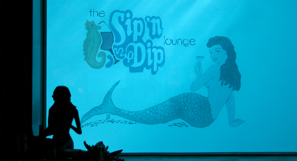
sip-n-dip-03.jpg

Swimming with Mermaids.

January 02, 2018 by Dave Gottwald

After tooling around the lodges of Glacier National Park, it was time press on to Great Falls, Montana to spend the night. There were plenty of vintage roadside motels to choose from, but I wanted to have a more thematic experience. Some fun. Some kitsch. Some tiki. Some mermaids.

The O'Haire Motor Inn sign from the parking lot, which appears very late 80s / early 90s.

I had visited the O'Haire Motor Inn the summer prior in 2016. In some respects, it's quite usual and expected—a family owned motel / restaurant / bar which opened in 1962, where elements have been added and subtracted over the many decades. As is the case with so many establishments built at midcentury which still exist in some form, evaluating the aesthetics is like peeling back the thin layers of an onion.

A panoramic of the lounge from the north wall, facing south towards the bar.

The Sip 'n Dip Lounge is a tiki bar on the second floor which opened along with the motel. I'm a big fan of 'Polynesian Pop,' which was a twentieth century cultural movement that included tiki bars, tiki supper clubs; tiki hotels, motels, apartments and even tiki bowling alleys and carwashes. Fueled by World War II servicemen returning from the South Seas with memories (and dreams) of exotic beaches, native women, and powerful drinks, tiki culture was further enhanced by Hawaii's statehood in 1959. The Sip 'n Dip's opening in 1962 was roughly at the apex of all those barrels of rum, all those inches of grass skirts, miles of bamboo, and acres of waterfalls.

Here the onion skinning reveals some of the original early 60s core at the base, a general coat of tackiness applied during the 1970s, and a Jimmy Buffet flair that smells very 80s. Although I have visited a wide variety of tiki bars all over the world to admire their thematic design, the Sip 'n Dip is definitely unique, this bizarre layer cake of style (and not all of it attractive).

Backlit, glass murals behind the bar.

The pieces that remain at the bottom are sometimes stunning, however. These large artworks flanking the main bar area are full of beautiful detail and just ooze the craftsmanship of the early 1960s.

Detail, glass mural on the right side of the bar.

Blown glass kelp forms with clamshells, seahorses, and starfish. I could easily imagine similar installations at any one of Morris Lapidus' Neo-baroque Miami Modern hotels such as The Fontainebleau.

A panoramic of the lounge from the west wall, near the slot machines and video poker games.

The real draw of the Sip 'n Dip is its connection to and integration with the motel pool. Massive glass windows reveal swimmers below the waterline to bar patrons. In a 2013 interview with KULR-TV (Billings, Montana) general manager Sandra Johnson-Thares revealed the inspiration for this. "The windows and the lounge are original to the building. The gentleman who built the hotel had been to the Playboy Club in Chicago and saw the same window concept and decided he wanted to put it here in the hotel."

Tile mural of the motel pool, on the south wall above the Sip 'n Dip.

The pool itself is very cool, and we took a dip in it the next morning before departing. It's completely indoors, on the top level of the motel parking garage. The grid is large enough that the tile mural of a dancing hula girl and surfer have a charming 8-bit quality. As a result, I'm not certain of the age of this piece; something tells me it's a much later addition.

The door to the motel pool.

As various bits of signage around note, guests (and motel guests only) may swim for most of the day. That is, until the mermaids swim.

Our swimming mermaid that evening.

These mermaids only date back to 1996, when the attraction was jokingly thought up by general manager Sandra Johnson-Thares to add an extra draw to both the motel and the bar. As she told the New York Times in a piece from this past November, Sandra was having a drink with her mother. “I joked that we should hire some mermaids,” Ms. Johnson-Thares said. “The more drinks we had, the funnier it got.”

The timing was right. It's notable that the mid-1990s were a period of mid-century revival, including Rat Pack-era Vegas, swing dancing, lounge and exotica music, the 'bachelor pad' aesthetic, and also tiki cocktails and tiki bars. And let's not forget, it was only six years after Disney's The Little Mermaid was a box office smash.

Thumbs up!

During the summer, the mermaids usually only swim on the weekend, but fortunately this was 4th of July week, and hours were extended for the holiday. Unlike some Las Vegas casinos I've seen where mermaids stay in underwater aquariums for extended periods by using scuba gear, this is strictly a sip (of air) and dip (hold your breath) affair. The mermaids' elaborate (and I have to imagine, durable) costumes are handmade by general manager Sandra Johnson-Thares. Photos are encouraged, as long as you provide a tip in the giant snifter on the bar counter.

Mermaid lamp at the entry to the lounge.

There are a number of art pieces and general mermaid iconography which reinforce the theme and central attraction. Were they all added after 1995? Or do some (or all) of them predate the show, and were perhaps the inspiration for the then-current owner's bright idea? I have no idea.

"The Fishbowl" drink, about the size of a bowling ball.

While slowly tackling a somewhat vile concoction called a "Fishbowl" (limited to one per customer, with good reason), my eyes panned around the Sip 'n Dip. Here I am in 2017, and, remarkably (in the middle of Montana!) it's still here.

Jimmy Buffetization.

The sad history of the Tiki bar in the United States is that the 1970s and 80s pretty much wiped them out. The era of disco and cocaine was followed by the wine cooler (and more cocaine). Rum cocktails were was out. And whatever thematic integrity there was to the Tiki bar design tradition was horribly eroded. As Sven A. Kirsten tells the tale in his seminal Book of Tiki, starting in the 70s the Polynesian style

was watered down further through a certain "Jimmy Buffetization"—the introduction of a generic tropical island theme with no definite identity Be it the Caribbean, Mexico, or Polynesia, everywhere was Margarita-ville. The popular TV show Fantasy Island [created] a world of white wicker colonial-style decor mixed with exotic plants. The fern bar replaced the Tiki bar.

The 1980s was the decade of destruction—the abolishment of Tiki and his culture. Either completely razed or renovated beyond recognition, Polynesian palaces disappeared without ever having been acknowledged as a unique facet of American pop culture. Purely an expression of a popular fad, they had always been denounced and ignored by the culture critics in their own time; now they represented merely an embarrassing lapse of taste. Unnoticed and without mourning, a whole tradition vanished. 

Still packed every night.

But the Sip 'n Dip survived. Why is that? Chiefly, I think, is the location. Great Falls, Montana is a city of less than 60,000 people in one of the country's most sparsely populated states. It's a long way from anywhere, and novelties thrive in out of the way places. Not just for tourists (like myself) but also for locals. During both of my visits (July 2016 and July 2017) the bar was packed with regulars. People who come drink at the Sip 'n Dip on a weekly (or even nightly!) basis, not just to see the mermaids swim but to also hear the musical stylings of "Piano Pat" Spoonheim who has played at the bar four nights a week for over 50 years.

So it's unique, and it doesn't have much in the way of competition. What of the thematic design elements make the Sip 'n Dip enduring? It could have been drastically remodeled, or gutted completely, in just the manner Kirsten decries above. I think the answer is that the bar was able to weather the changes in popular trends over the decades by retaining the core Tiki theme and aesthetics, yet subtly (sometimes not quite as subtly) introduce further 'onion layers.' Much of the lighting—as well as the seating and carpeting—looks like it was installed in the 1970s.

Disco ball coexists with thatch roofing.

These tacky 'disco lounge' elements allowed the Sip 'n Dip to ease into that era, and to coexist with the other clubs and bars of the times without seeming out of date. At this point, I could imagine some more "authentic" Tiki parts of the bar's original 1962 design being removed or downplayed. By the 1980s, the bar similarly absorbed the "Jimmy Buffetization" Kirsten notes; you can see the palm trees and neon flamingo beer neon signs and other signs of the era sprinkled throughout the Sip 'n Dip.

Finally to stay relevant in the 1990s when Tiki was making a comeback, the mermaids were added (and I imagine some of the excesses of the 70s and 80s were trimmed back). The bar had a new entertainment draw for the locals—who were always the core constituents—but now there is a new reason for younger Tiki revivalists to make the (admittedly, lengthy and arduous) journey to Great Falls. That's really key. As long as you can survive falling out of style in order to reemerge when a revival occurs, you've got a chance.

There is enough of the original design intact to please the tikiphiles, and also enough sitcom-level cheese to provide comfort and a sense of normalcy for boomers, seniors, and even frat boys. It's not a bar that squares would mock, it's a bar that hipsters can enjoy at an ironic distance, and it's a bar that tiki geeks can cross off their list. As one online reviewer put it:

This bar is not a polished artifice of certified Tiki aesthetics, like something designed by a Disney Imagineer. It has evolved organically over its history, accumulating encrustations from different eras. It still has tabletops of its pre-Tiki nautical theme. It has a big old organ in the middle of it. It has mermaids. It has VLTs off to the side. It's in a motel that leaves complimentary rubber duckies in the rooms. It has a regular clientele of hipster kids and weathered cowboys.

Hand-painted poster art by the restrooms.

Because it has navigated over five decades of trends and styles, the Sip 'n Dip is neither relevant nor irrelevant. Isn't that the kind of permanence which all art aspires to?


January 02, 2018 /Dave Gottwald
WDW-wilderness-lodge-00.jpg

National Parkitecture - Part 2.

December 20, 2017 by Dave Gottwald

Spending the time I did in Glacier National Park and at its lodges this past July got me thinking about how the NP brand identity and "Parkitecture" style has been repackaged as thematic design. Here is a look at three major Disney hotel resort projects that express and engage with that style.

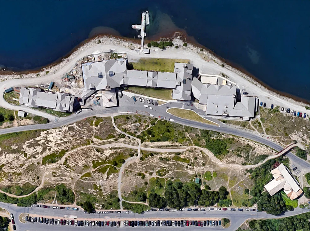
Wilderness Lodge, satellite view. Click for link. Map data: Ⓒ Google.

Wilderness Lodge, satellite view. Click for link. Map data: Ⓒ Google.

Disney's Wilderness Lodge, Walt Disney World Resort

What happens when all the individual stylistic and era-specific quirks of the some dozen classic National Parks Lodges are condensed into one singular, heightened, sweetened experience? It should be obvious that only Disney could do it (or would do it).

Approach to the main entrance and Porte Cochere.

Disney's Wilderness Lodge at the Walt Disney World Resort outside Orlando, Florida is just such a condensation. The hotel is very popular, so much so that it has its own unofficial fan website. I took the following pictures during a visit in October 2007.

Ⓒ Disney Enterprises, Inc.

This was not the first Disney project to adopt a "Parkitecture" theme (see below), but it is the largest and most comprehensive. The design phase took place from 1989 to 1991, ground was broken in August 1992, and the hotel opened in May 1994. You can see here from the property map that the hotel consists of two wings which branch off from the central lobby building. The addition structures that run along to the south are cabin bungalows in a similar style which opened in 2000, part of Disney's ever-expanding timeshare business. Additions continue to be made to the property. The latest of these, the Copper Creek Villas & Cabins, opened just this past summer, in July 2017.

Exterior trim above the main entrance.

Denver architect Peter Dominick drew upon primarily the cues of the Old Faithful Inn at Yellowstone, the Ahwahnee Hotel at Yosemite, Timberline Lodge (Mount Hood, Oregon), and lastly the Lake McDonald Lodge (which I visited while in Glacier). Disney seems to have felt that Dominick's lineage lent a certain credibility to the project—his father was a pioneering environmentalist and longtime Colorado senator. Dominick as architect of record was also augmented by two other Principals from his [then] firm Urban Design Group: Randal Johnson (Design) and Ronald D. Armstrong (Management).

Yet despite having a formal architect on the project, this was still thematic design—this was still show, in which architecture was just one component, a structural means to an end. At the lodge groundbreaking in the summer of 1992, Michael Eisner said “in our architecture, Disney continues to produce the kind of groundbreaking entertainment that keeps the Disney name magical to people around the world. Our architecture is part of the show” [emphasis added].

The design team on the project confirms that Mr. Eisner was very involved, and very hands on. “Michael reviewed the design completion and was involved in design presentations at each stage of the design process,” said Randal Johnson, as quoted in this excellent article by Chuck Mirarchi which details the entire development of the Wilderness Lodge at greater length.

Front entrance doors.

Upon closer inspection, a corporate gloss becomes apparent, perhaps due to Eisner's influence. All surfaces are spotless (moreso even than at the most meticulously restored NPL properties) and somewhat modernistic. The exposed beams have been vigorously sanded down and saturated in thick coats of paint. The flooring also has a very contemporary cast.

Old Faithful Inn, Yellowstone / Wilderness Lodge, Walt DIsney World.

The most direct influence on the main building is Yellowstone's Old Faithful Inn. Here is a vintage photograph of the Inn, compared with my shot of the Wilderness Lodge.

Vintage postcard of the Old Faithful Inn.

Vintage postcard of the Old Faithful Inn.

It's quite the direct lift, based on honest research. Mirarchi reports in the article I noted above that

An extensive amount of research went into the planning of the Wilderness Lodge. It began with the architects taking a tour of the National Parks including Yellowstone, Glacier and Yosemite. “These visits subsequently let to extensive research on the National Park System, the great western painters, indigenous peoples and western craftsman who helped shape the American west,” said Randy Johnson. “This influence shows up throughout the building—in the lobby floor, a Hopi storm pattern; in light fixtures and furniture, inspired by craftsman Thomas Molesworth; in the fireplace representing the strata of the Grand Canyon.”

Early concept sketch for the Wilderness Lodge. Ⓒ Urban Design Group, Inc.

Concept rendering for the Wilderness Lodge. Ⓒ Urban Design Group, Inc.

Wilderness Lodge lobby.

Once you enter the eight-story lobby, the lift from Old Faithful continues; pine railings imported from Oregon, carvings, fixtures, and lighting. Two massive 55-foot "authentic totem pole" columns contain Native American-inspired renderings of birds of prey, fashioned of standing dead Lodgepole Pine from Montana. I place "authentic" in scare quotes because that's what Disney calls the totems. Yet they were carved by Duane Pasco, a white guy raised in Alaska and Seattle, Washington. The birds' order from floor to ceiling is relative with their placement in the environment—at eye level with guests are field and meadow dwellers, rising up through alpine species and finally to the highest strata of eagles, falcons, and hawks.

The four 600-pound teepee chandeliers are actual rawhide, hand-painted with Native American iconography. Wilson & Associates served as the interiors and lighting design firm on the project.

Vintage postcard, Old Faithful Inn Lobby.

Early period photography demonstrates the very direct relationship the lobby of the Wilderness Lodge has the to the Old Faithful Inn.

Chimney looking upward.

The lodge's 82-foot chimney is in the very same same corner support position as at Yellowstone. It's the only element in the lobby that is fabricated, and was constructed and sculpted in place.

Central fireplace.

But then Disney starts mixing styles, references, and locales. After all, what does it matter? This hotel is in Central Florida; Yellowstone it ain't. The stonework of the fireplace depicts the strata of the Grand Canyon, with plenty of Native American accents. “Due to laws restricting the removal of material from National Parks, the fireplace was constructed...using similar materials,” said Christian Barlock, who worked on the project. “A paleontologist was hired to spend time in the Grand Canyon and document the strata and fossils. He then directed the construction of the fireplace at the lodge—including inserting actual fossils into the correct strata. This was done so we could ensure it was an accurate and successful representation."

Second floor sitting room.

There are cozy rooms off the main lobby that provide small moments of intimacy. Here the influence of Mount Hood's Timberline Lodge is more distinctly felt.

Top of central lobby.

Look up, however, and we have the classic lantern chandeliers and enormous vaulted ceilings.

Faux-vintage postcard. Ⓒ Disney Enterprises, Inc.

Faux-vintage postcard. Ⓒ Disney Enterprises, Inc.

Like most Disney design projects, the Wilderness Lodge has an elaborate fictional backstory developed by the imagineers to help guide the creative process. In the earlier years of the lodge's operation, a fictional newspaper was distributed to guests upon check in, telling them of one (imagined) "Colonel Ezekiel Moreland" and his discovery of "Silver Creek Springs."

The faux-vintage newspaper once handed out to guests upon check in, The Silver Creek Star. Ⓒ Disney Enterprises, Inc.

Unfortunately the backstory has since been forgotten. From The Forgotten Story of the Wilderness Lodge by noted Disney historian Jim Korkis:

The Wilderness Lodge no longer has a copy of the Silver Creek Star that was given so freely to guests over a decade ago. There is no documentation of this story in their “Big Book of the Lodge” that is used by the rangers who give the outstanding “Wonders of the Lodge” walking tour four days a week as a reference to answer guests’ questions. The vivid adventures of Colonel Moreland... have completely disappeared from Disney history in less than two decades along with so many other interesting tales that should be recorded for future researchers.

Even more detail about this backstory can be read here and here at the Disney-focused 2719 Hyperion blog. 

View facing the rear facade of the hotel, to the southwest, away from Bay Lake.

As with all Disney resort properties, there is an abundance of artificial water features. The Wilderness Lodge has its own waterfalls, streams, and the Fire Rock Geyser (a kind of Old Faithful in miniature, complete with a regular schedule of eruption).

Corner of the north wing.

Even not counting the timeshare facilities, the resort is sprawling. 728 rooms total were initially built before those later expansions.

Side entrance to the south.

There is a kind of hybrid modernity at work here as well. Notice the roof structures; they appear of the sort you'd find at a contemporary upscale ski resort.

Familiar Roofs.

Or the sprawling retail locations of the Cabela's sporting goods chain, designed by Pennsylvania architecture firm Crabtree, Rohrbaugh & Associates. I wonder if the team visited Wilderness Lodge; the similarity is uncanny.

These modern green roofs of the lodge look like they're designed to take the onslaught of snowy winters. Yet this is Central Florida. Dominick could have easily chosen to replicate the original rustic and charming shingle roof of the Old Faithful Inn—it certainly would not be damaged by weather as the original had. But he did not.

Poolside bar.

Native American iconography is all over the place. Sometimes it is used appropriately, sometimes not. This is the "Trout Pass Bar" serving poolside frozen margaritas and daiquiris. Despite such odd contexts, overall Disney seems satisfied with this dubious, appropriated integration of Native art. From Building a Dream: The Art of Disney Architecture by Beth Dunlop (1st edition, 1996):

Beyond using typical rustic architectural motifs and western materials, Dominick sought to use his commission to express spiritual ideas about the West. He was able to do so, in part, by incorporating as much Native American legend as possible—on columns and totem poles and in patterns in the rugs—and perhaps even more in what was both the philosophical and the structural approach to Wilderness Lodge, by trying to ensure "a roughness and a trueness of how things were put together." 

The clincher, however, is Dunlop's closing comment on the resort project. "At Wilderness Lodge, authenticity is the fantasy." [emphasis mine]

Sequoia Lodge, satellite view. Click for link. Map data: Ⓒ Google.

Sequoia Lodge, satellite view. Click for link. Map data: Ⓒ Google.

Disney's Sequoia Lodge, Disneyland Paris Resort

As I mentioned above, Wilderness Lodge was not Disney's first foray into the realm of the National Parks.  Disney's Sequoia Lodge opened at the Disneyland Paris Resort (then EuroDisney) two years prior.

The rear facade, from the water's edge.

Five original onsite hotels for the Paris project were the result of a competition initiated by Michael Eisner, and the resulting projects were designed by such luminaries as Frank Gehry, Michael Graves, and Robert A. M. Stern. A sixth, the Disneyland Paris Hotel (which connects to the the entrance of the park and overlooks it), was deemed "too cute" for these notables, and was designed in-house by the imagineers. These following photos are from my March 2008 visit.

Exterior trim with sharp lines.

The Sequoia feels very 'modern' (or at least contemporary to the late 80s when it was designed) and not much connected to the American West. Most jarring is the rigid mirror symmetry (see the satellite view above). This formalism smacks of royal palaces like Versailles, not the lodges of the National Parks. The Sequoia Lodge might best be termed interpretive, whereas the Wilderness Lodge is stylistically more derivative. In terms of my own taxonomy of thematic design, the former is referential, and the latter is representational.

The main entrance with NPL-esque cobblestone columns.

The Sequoia was the only hotel not be designed by one of Eisner's competition winners; it was the conception of French architect Antoine Grumbach. Again from Dunlop's Building a Dream:

Grumbach drew the most romantic assignment, a hotel in the spirit of the great national park lodges of the American West, the same inspiration for Orlando's Wilderness Lodge. ...Sequoia Lodge is a heavy, dark, handsome hotel that the architect terms "an ecology building." It is surrounded by trees and, unlike most Disney buildings, is executed largely in natural materials: wood, stone, and copper.

Now here is where things get odd. Dunlop goes on to say, "In form and execution, it pays homage to Frank Lloyd Wright and Greene & Greene, as well as to the Arts and Crafts Movement in general." 

The Redwood Bar & Lounge.

Wright? Greene & Greene? Arts and Crafts Movement? What on earth does any of this have to do with the lodges of the National Parks? Dunlop merely concludes that "Sequoia Lodge, like Wilderness Lodge, is rooted in the early twentieth century architecture of the American West." To my thinking, that's an awfully wide net to cast—almost as nonspecific as saying a band draws its musical influences from "the major cities of the 1960s." One online review said, quite correctly, "Imagine if Frank Lloyd Wright designed Yosemite’s Ahwahnee." Which, I suppose, we can indeed imagine. It's just a strange dream to actually walk through. To use a musical metaphor again, this is not a remastering, or even a remix. This is a mashup; a design DJ taking Wright and spinning him together with Greene & Greene, with Arts and Crafts.

I only spent about an hour or so looking around the Sequoia Lodge, and I found plenty of Wright and Arts and Crafts, but very little "Parkitecture." There's no grand central lobby, no massiveness at all to speak of. The NPL style is all about grandeur, and I was hoping here, in the country that gave us the word, I'd find some.

Interior window treatments aping Wright.

Wright's iconic Prairie style leaded glass designs are featured throughout. This is the kind of "in the style of" stuff more commonly derived from name brand Renaissance masters like Leonardo Da Vinci (whose works are undoubtedly in the public domain at this point). Yet what happens when the artist being copied died in the middle of the last century—does the Wright estate need to approve such nods? Do they require authorization and compensation, like for the licensed products they sell at museums across the country? I don't know.

Mid-Century Modern lobby.

There are structural elements of Wright's DNA here as well. The hotel lobby's angled ceiling with exposed beams and large sun windows is rather reminiscent of Taliesin West, his winter home in Scottsdale, Arizona.

Drafting room at Taliesin West. Wikimedia Commons.

Typical Mission 66-style structure: Petrified forest National Park. Flickr Creative Commons.

I suspect this is also a subtle nod to Mission 66, the decade long expansion program 1956–1966 which brought many mid-century modern structures to the National Park System. But honestly, there was nothing NP "lodge" about Disney's Sequoia Lodge.

Moving on to Disney's more recent resorts in California; Wright, Greene & Greene, and the Craftsman / Arts and Crafts movement take center stage for an even greater departure.

Grand Californian, satellite view. Click for link. Map data: Ⓒ Google.

Grand Californian, satellite view. Click for link. Map data: Ⓒ Google.

Disney's Grand Californian Hotel & Spa, Disneyland Resort

Disney's Grand Californian opened in 2001 as part of a colossal expansion to the Disneyland Resort which included a second theme park—Disney California Adventure—the Downtown Disney shopping district, the Mickey & Friends parking structure, and various other facilities and amenties.

Approach to the main entrance and Porte Cochere.

Interestingly, the Grand Californian is again the work of a team lead by architect Peter Dominick. Beth Dunlop describes the resort in Building a Dream: The Art of Disney Architecture (2nd edition, 2011):

The Grand Californian pays broad homage to the Arts and Crafts movement that flourished at the turn of the twentieth century and was a dominant influence on architecture throughout California. Though the hotel speaks directly to the work of such California architects as Bernard Maybeck and Charles and Henry Greene, it also evokes the memory of other designers including Frank Lloyd Wright and the Scotsman, Charles Rennie MacIntosh [sic].

Here is a "mashup" design which follows in the vein of the Sequoia Lodge project, but adds the grandeur of his Wilderness Lodge back in. And the grandeur, though welcome at (and appropriate to) a Disney resort, is a problem. 

Not exactly a neighborhood Bungalow. Ⓒ Disney Enterprises, Inc.

Dominick spoke at the hotel's dedication on February 8, 2001 and noted how the vastness of the property and overall scale of the design was a departure from the domestic, small, intimate California Craftsman tradition:

Disney’s Grand Californian Hotel is perhaps the largest structure ever conceived in the Arts and Crafts style which has historically been residential in focus, size, and execution. And the garden was always the key influence in the design of Arts and Crafts structures. In this case we shifted the scale of the hotel to include the scale of the forest particularly those along California's coastlines with their Monterey pines and the spectacular groves of redwoods and sequoias providing an appropriate scale and inspiration for a project [this] immense. [emphasis mine]

Looking down into the lobby from the third floor.

The iconic, cavernous central lobby with dominant fireplace (ala Wilderness Lodge by way of Yellowstone) is back. Yet what stark contrast is this, to be in the Art and Crafts style which—as Dominick noted above—is small. It takes the quiet charm of the California Craftsman bungalow (even the larger 'ultimate bungalow') and amplifies it to crude shout across a parking lot. There are smaller moments, for sure, particularly at hotel check-in. Beth Dunlop notes in Building a Dream (2nd edition) that this first antechamber new guests encounter "is a tribute to San Francisco's exquisite Swedenborgian Church, which is considered to be the first Arts and Crafts structure in California."

Yet in sum, the Grand Californian feels as if someone had an enlarging ray gun and aimed it at the Gamble House, magically ballooning it to 948 rooms, with an additional 44 suites and 71 villas. While the scale is wrong, the details, however, are Wright.

Lighting fixtures in the main lobby.

In particular, Frank Llyod collides head on with California Craftsman style in the lighting and glasswork. These chandeliers would look rather well at home in any Prairie residence in the Chicago suburbs. Notice how the organic, floral forms (top upward facing sconces) are integrated with something akin to Wright's geometric, Japanese inspired forms and patterns (lower hanging lantern elements).

Main lobby railings.

This was a subtlety I did not catch until my third or fourth visit to the hotel's lobby—Wright leaded glass designs of the Prairie variety, integrated into the balcony railing structure in front of these massive windows. When the sun wasn't at the best angle, I never noticed them. But when light hits the rear windows at full strength, all the bright colors of the Avery Coonley Playhouse windows shine through rectilinear forms that recall Robie House.

Interior wayfinding.

Typography throughout the resort reflects the California take on the Craftsman style, yet to my eye they could have gone for even greater authenticity. Although the typeface here appears to be an alteration of ITC Willow (based on the lettering of Charles Rennie Mackintosh) it has a late 90s California contemporary feel. Perhaps Disney was concerned about readability.

Exposed beams on the walkway to the pool area.

The exterior details, observed in micro, give a better feel of the California Craftsman home. The massive scale of the overall site is troublesome, but in moments like this you can focus in on the detail and try and forget how sprawling the place is. Dunlop acknowledges in Building a Dream (2nd edition) that this variety aids the design, observing "...the spaces are carefully manipulated—small and tight and then huge and soaring—to perfect effect. The bracketed, vaulted wood ceilings seem to embrace the spaces."

I'm still not sure why the Disney literature, and online reviewers, place this resort in the NP lodge thematic category. Big lobby, wood, trees. That's about the only shared elements. It's sort of the same comment made about the Sequoia Lodge; "What if architect A of school B in the style C... designed a National Parks lodge." Why not just design something entirely new? Or, as with Wilderness Lodge, make the relationship to the NPL "Parkitecture" style explicit.

The facade facing the Downtown Disney shopping district.

Of these three Disney resort developments, in my view only the Wilderness Lodge captures a notion of authenticity and clearly expresses the NPL "Parkitecture" style as effective thematic design.

As reimagined interpretations ("mashup" works), the Sequoia Lodge and the Grand Californian convey interest and creativity, certainly. It might be that trying to tie their visions to the NP lodge concept was a mistake. It's not required. For the typical visitor who is unaware of the references at play, the design "mashups" work because they reference aesthetics that have become so popular as to exist in the public imagination as brands do. Frank Lloyd Wright, even if you can't name a single one of his projects, has a style that has been so broadly projected, interpreted—consumed—as to become a theme all its own. The same for the Arts and Crafts / California Craftsman style, or the Greene & Greene look. It's in the bloodstream. And for those visitors more aware and perhaps more architecturally astute, it's like any mashup recording you'd hear of artists you are familiar with; you're either going to be charmed or horrified.


December 20, 2017 /Dave Gottwald
The iconic signage at the western entrance to Glacier.

National Parkitecture - Part 1.

December 17, 2017 by Dave Gottwald

Alright. Now begins a series of posts documenting (and inspired by) Themerica travels, summer 2017 edition. The first major stop on our journey east was Glacier National Park in Montana. I had been the summer prior, but this was the first visit for my fellow roadtripper David Janssen, Jr. It's a truly majestic place, and although it sits down at number ten for most visited National Parks, I'd easily place it up there with Yosemite, Yellowstone, and the Grand Canyon.

Left to right: Lake McDonald Lodge, Many Glacier Hotel, and Glacier Park Lodge.

The park lies along the Canadian border, adjacent to that country's Waterton Lakes National Park. In 1932 Waterton Lakes was combined with Glacier to form the world's first International Peace Park. There are several historic hotels and chalets within and around Glacier, including the three main lodges indicated here on the map.

The style of the lodges are well known enough to inspire documentaries.

The style of the lodges are well known enough to inspire documentaries.

If you are unfamiliar with the lodges of the National Parks, they are sort of a genre all to themselves. Built in the first few decades of the twentieth century (including notable entries within National Forest land such as Timberline that were part of FDR's public works projects during the Great Depression years), these lodges stand exclusively in the Western United States.

What's curious is that despite being designed and built by different teams, on different sites, in different years, the National Park Lodges (NPL) share a kind of meta-aesthetic. I've seen it referred to as "Parkitecture" at various places online—and I love a good portmanteau—so I'll use that term. A fantastic, in-depth piece was written in 2009 for the Society for Experiential Graphic Design (SEGD) by a designer who's worked for the park service for over four decades, so I'll quote right from it:

Although never intended as a primary expression of identity, architecture has long helped define the NPS style. Two relatively recent periods of intense construction account for the architectural forms associated with national (and state) parks. The first was the result of Franklin Roosevelt’s New Deal and the work of the Civilian Conservation Corps during the Depression’s later years. The genre (sometimes called “parkitecture”) was similar to the rustic Adirondack style used in the East, but is characterized by the stone and rough-hewn timbers most often used in Western parks, or the adobe used in the Southwest. The work is largely the legacy of architect Herbert Maier, who worked as a consultant to the NPS during the 1920s and 30s and later as an employee. Despite an appeal that endures today, the rustic style of architecture was rapidly abandoned after World War II [emphasis added].

The look and feel of these lodges loom large enough in the public's imagination to have formed the basis for an award winning series on PBS, and two volumes of companion text. If you've visited even one of these lodges, you know what I'm talking about.

Lake McDonald Lodge, satellite view. Click for link. Map data: Ⓒ Google. Note: this and all following satellite views of National Park Lodges are oriented in the same direction; main entrance at the bottom.

Lake McDonald Lodge, satellite view. Click for link. Map data: Ⓒ Google. Note: this and all following satellite views of National Park Lodges are oriented in the same direction; main entrance at the bottom.

Lake McDonald Lodge

Constructed in 1913 and opened the following year, Lake McDonald Lodge is the smallest of the three sites I visited in Glacier and sits near the western entrance to the park.

The view of the rear facade from the lake.

The lodge was designed by noted Pacific Northwest architect Kirtland Cutter. Although he fashioned the exterior in a Swiss Chalet style (very similar to his Idaho Building for the 1893 Chicago World's Fair), the interior spaces—particularly the central lobby—echo the other National Parks Lodges with an emphasis on grandness, natural materials, and Native American crafts and artworks.

At first this felt somewhat incongruous to me, but then I realized that the exterior Swiss style is in excellent balance with the surrounding landscapes. And it's very intentional, as we'll see below; Glacier National Park was marketed by the railroad companies to the domestic travelling elite as "America's Alps" and "The Switzerland of North America," particularly by Louis W. Hill, president of the Great Northern Railway. In the first half of the twentieth century, it was a way for the well-to-do to 'visit Europe' without getting on an ocean liner for an extensive voyage.

From the top floor looking down into the central lobby.

The interior spaces is where the NPL "Parkitecture" DNA is truly expressed, in contrast to the European facades outside. From the lighting to the furnishings, floor carpets to antiques, it would be easy to imagine this lobby at any other NP in the West. You can find similar raw wood railings and natural tree limb staircases, tones and colors, even fabrics and leathers at El Tovar or the Ahwahnee Hotel.

Many Glacier Hotel complex, satellite view. Click for link. Map data: Ⓒ Google.

Many Glacier Hotel complex, satellite view. Click for link. Map data: Ⓒ Google.

Many Glacier Hotel

On the far eastern side of the park sits the Many Glacier Hotel. This is Swiss style of Lake McDonald done writ large, and in a far grander setting.

A panorama of the hotel complex, facing west.

As I mentioned above, Glacier was intentionally marketed to wealthy tourists as an alternative to making the long journey to Europe; this grand hotel and its surrounding environs make good on that pitch.

Vintage promotional poster.

Vintage promotional poster.

The Great Northern Railway built all of Glacier Park's hotels through a newly organized subsidiary, the Glacier Park Hotel Company. Louis W. Hill chose the Many Glacier valley for the largest of the hotels.

Belton Chalet. Wikimedia Commons.

Belton Chalet. Wikimedia Commons.

Lake McDonald Lodge and Many Glacier Hotel are not the only lodgings in the park executed in the Swiss Style. There is also Belton Chalet just outside the west entrance as well as the more remote Granite Park and Sperry chalets. Many, however, is simply the most grand.

Rear facade from the lake, facing east.

The hotel was built a year after McDonald opened and for decades it was the single largest in Montana, having some 240 guest rooms in its wings. Many's overhanging roofs and balconies are painted a rich, deep brown, with white and gold trim. The traditional Swiss Cross of Helvetia—white on a red shield—is the hotel's coat of arms, and is used on signage throughout, as well as on the door of every guest room.

Germanic blackletter on interior signage.

As I've explored elsewhere, sometimes you get themes within themes, nested like Russian Matryoshka dolls, sometimes themes are blended together like a stew, and other times they sort of resemble Venn diagrams with only partial criteria overlapping. There is also this notion of volume knobs or mixer sliders; at certain times a theme is 'dialed up' and other times it is 'turned down' in relation to others in the medley. At Lake McDonald, the Swiss exterior and "Parkitecture" interiors are fairly in balance. Here at Many Glacier, the European elements are dominant, even on the inside.

Glacier Park Lodge, satellite view. Click for link. Map data: Ⓒ Google.

Glacier Park Lodge, satellite view. Click for link. Map data: Ⓒ Google.

Glacier Park Lodge

Despite its name, the third major site I visited is actually just outside the park's boundaries on the eastern side. Glacier Park Lodge is most closely tied to the NLP DNA, and does not retain any of the Swiss chalet elements present at the other sites.

Approach to the main entrance.

The lodge was ostensibly designed by noted Midwestern architect Samuel L. Bartlett, but in actuality Louis W. Hill of the Great Northern Railway dominated the entire process. The man was obsessed with the hotels the company was now building in Glacier National Park, and he even stepped down as company president to oversee them. Glacier Park Lodge is very much in step with the Western grandeur of Yosemite's Old Faithful Inn. Three story log balconies, covered by broad hooded gables, are finished in dark paint with bare window trim under dark green roofs.

The main lobby.

The playbook is consistent: a massive open lobby space adorned with raw timber columns and railings. Chandeliers done in a lantern style. Native American patterned carpets and upholstery. Framed landscape oils fill the hallways.

Lobby lighting in the rustic style.

It's almost as if somewhere at National Park headquarters, there is a large, dusty three-ring binder holding all the key brand standards to these properties. There isn't, but it sure feels that way.

Pendleton Wools NP collections.

Pendleton Wools NP collections.

Some have gone even further. There are companies such as Pendleton Wools who have transformed (the more cynical might say, exploited) the design elements they provided to various lodges under exclusive contract into complete branded product lines years on. Which brings up the issue, where is the line drawn between theme and brand? Or, as architects and artists would say, between school, style, program, and movement?

Native American-inspired apolstry on the lobby's second level.

Along with Native American designs, the buffalo remains a constant motif in the park lodges of the West.

Couch pattern from seating in the Glacier Park Lodge lobby's main level.

The public certainly recognizes the U.S National Parks as a brand. And the parks present themselves—in terms of communication design—along the same lines of consistency as you would see in corporate identity work.

National Park / National Monument / National Forest signage from this trip.

Typefaces, colors, shapes, and materials are for the most part quite consistent across National Parks, Monuments, and Forests. Wayfinding and site markers might vary dude to age, certainly. Yet this is a much stronger visual identity than is presented to the public by other government organs—and extremely unique, too. There is no Red White & Blue, no Stars & Stripes, no "Big D.C." nationalist branding. It's friendly and instantly recognizable. 

What happens when "Parkitecture" becomes thematic design?

Continued in Part 2.


December 17, 2017 /Dave Gottwald
motion-pano-01.jpg

Themerica Travel Resumed.

December 11, 2017 by Dave Gottwald

The Return

It's been a long road. Themerica is back. I'm Dave Gottwald. After seven years working in exhibit design and graphic design at the Oakland Museum of California, I took a full-time professorship at the University of Idaho in 2016. And in July of 2017, I began the first of what will be many travels continuing my documentation and analysis of thematic design. Themerica began in 2007 as my MFA design thesis project. Over the course of a year and a half, I traveled to many places; all eleven (at the time) Disney Parks around the world, Las Vegas, Macau, Dubai...

All those original musings and photograph are archived here, part of a larger section on my primary website about the project. Going forward, this new blog is where I'll be musing on thematic design and what myself and colleague Greg Turner-Rahman are calling the "End of Architecture." But first, on to this past summer's travels.

The route of our first leg through Wisconsin to Michigan. Map data: Ⓒ Google.

Summer 2017

It was simply by happenstance that myself and MFA candidate David Janssen, Jr. were both headed to the same place in July of 2017: Michigan. Rather than simply sharing the cost of gas and lodging, we thought this would be an awesome opportunity for collaboration between artist and designer, faculty and graduate student, mentor and protégé. David wanted to incorporate typography into his practice of painting and printmaking. Neither of us had any real experience setting type on press. The Hamilton Wood Type and Printing Museum in Two Rivers, Wisconsin was on our route, so we enrolled in one of their all-day letterpress workshops.

Spreads from our book, 88MPH.

Typo-photography

During the drive eastward, we decided to document all the typography we saw through seven states, aiming our lenses at the letters that form the backbone of roadside America. Upon returning home, I designed a book of our photography, 88MPH, and David designed the cover. We then curated a selection of photos for inclusion in the 2017 University of Idaho Faculty Exhibition, which is on view at Moscow's Prichard Art Gallery through December 23.

88MPH is a reference to the magical speed one must attain in the fabled Delorean to travel through time in the Back to the Future films. And in a sense, surveying the letters of roadside America is indeed its own form of time travel. Here were sun-bleached characters on sides of buildings; stoic ghosts that keep watch over the empty Main Streets of towns across the Heartland. Here was scrawl in permanent marker, worn paint on wood, cracked vinyl on glass.

The setting sun as we cruised through Wyoming.

Coming Attractions

So that was part of the journey eastward this past summer. The first leg. After leaving Mr. Janssen in Saginaw, MI, I was looking forward to the second and third legs of my travels, which would bring me back home through the highways, byways, and backroads of Themerica.

In general, all the photography posted will be my own. Occasionally I might use a third party source for something I was unable to capture, and attribute it as such. But for the most part I'll stick with my rough and tumble, point-and-shoot snaps. I won't try to fancy up any of my posts with professional photography lifted from online. I'm not a photographer by any stretch, so think of these as amateur Kodachrome slides, projected in the living room to accompanying narration.

Between teaching and other university duties, I'm not sure how frequently I will be posting here, but I'm going to begin with a series which documents the entire five weeks during July and August 2017 I spent on the road studying thematic design. From Deadwood, South Dakota to Cedar Point, Ohio. From Greenfield Village at the Henry Ford, to Kansas City's Worlds of Fun. From Walt Disney's boyhood town (Marceline, Missouri) to Harper Goff's (Fort Collins, Colorado)—both of which inspired designs at Disneyland. From two presidential libraries, to local history museums.

Onward.


December 11, 2017 /Dave Gottwald
  • Newer
  • Older

All original content on this site © 2007—2025 Dave Gottwald.
All photography which is my own is licensed under Creative Commons Attribution-NonCommercial 4.0.
This means you are free to share and adapt my images for non-commercial purposes only.