Themerica

Musings on Thematic Design and the End of Architecture

  • Blog
  • Archive
  • About
frankenmuth-01.jpg

Anytown, Europe.

October 27, 2018 by Dave Gottwald

The last stop on the first leg of my summer 2017 road trip was the themed “Alpine Village” town of Frankenmuth, Michigan. Again it was at the suggestion of my travel companion David Janssen Jr. who (rightly) declared it as something I had to see.

Frankenmuth, Michigan, satellite view. Click for link. Map data: Ⓒ Google.

Frankenmuth, Michigan, satellite view. Click for link. Map data: Ⓒ Google.

Frankenmuth—known as the “Little Bavaria” of the region—is a tourist destination of less than 10,000 people nestled along the Cass River about ninety miles northwest of Detroit.

Vintage postcard of Alpine Village, Torrance, California.

The Alpine Village Model

European themed “villages” like Frankenmuth are common throughout many parts of the United States, and much of their thematic design dates to after the opening of Disneyland. Southern California’s Alpine Village, for example, opened in 1968.

Vintage postcard of Solvang, California.

When I was growing up my family often visited Solvang in the wine country of the Santa Ynez Valley in Santa Barbara County. Solvang has a Danish theme and, like many such towns, was actually founded as a community of settlers from a particular part of Europe, but by mid-century had begun to embrace an enhanced, Disneyland-like form of design to further attract tourists. In 1958, Paul Kuelgen, a scenic artist at RKO Studios, was commissioned to construct stylized gables and dormers on buildings downtown, and when done commented—quite satisfied—that Solvang now “looked like a movie set.”

Vintage postcard of Leavenworth, Washington.

Another such famous town is Leavenworth, Washington which adapted a Bavarian theme in the early 1960s as part of a larger economic revitalization plan. Planners for this project actually travelled to Solvang, California for inspiration. In his history masters thesis The Origins of the Recreational Theme Town in the West (University of Idaho, 1996), Jake Sudderth notes that Solvang was the prototypical model for the “Alpine Village” themed town, utilizing what he calls “contrived architecture.”

In this way, many such towns developed “traditional” brand identities like any other product or company or service. Frankenmuth is very loud and proud about this—the banners above, complete with a (R) registered trademark—are hanging from every street lamp. It’s certainly not subtle and it’s not in any way clever; as a result it’s fairly off-putting.

Frankenmuth is the kind of place where the public trash cans thank you personally—in German.

Historian Richard V. Francaviglia suggests that this move towards regionalization was indeed a marketing tactic, and a way for communities to survive (and perhaps even thrive) as out of the way, off-the-beaten-path tourist stops. Again from his Main Street Revisited:

There are signs that Main Street design reflects a need to recognize diversity in the face of overwhelming assimilation. This has been become apparent in the late twentieth century, when regional or ethnic identity is marketed by communities. On Main Street, the search for regional identity has taken on a touch of the fanciful or bizarre as certain towns have deliberately attempted to create townscapes that recapture the original ethnic heritage of their residents.

The “Alpine Village” look of the Matterhorn Bobsleds at Disneyland, 2008.

The original concept art for Disneyland featured highly detailed and stylized European theming, a true ‘village’ look surrounding the courtyard of Sleeping Beauty’s Castle. However, the project ran out of funding in the long march to opening day, and Walt Disney had to settle for a “Medieval Royal Pageantry” look of tents, festive flags, and shields which barely disguised the steel sheds containing the land’s dark ride attractions.

A year after Disneyland opened, Walt got his wish for an “Alpine Village” theme with the addition of the park’s Skyway attraction; aerial tram buckets departed from a traditional chalet-style building. And in 1959, the Matterhorn Bobsleds debuted, featuring a queue building straight out of the Swiss Alps.

The 1983 redesign of Fantasyland at Disneyland, 2008.

In the early 1980s, Fantasyland was largely demolished, and the former festival sheds were replaced with a highly realized European village which was a much better fit for both the Matterhorn and Sleeping Beauty’s Castle. In this sense, the “Alpine Village” had come full circle, returning to the park which spawned the popular look of towns like Frankenmuth.

Vintage postcard of Sugarcreek, Ohio.

As Francaviglia points out, a great many towns in the Midwest embraced an Alpine theme in the wake of Disneyland’s enormous success. He notes that “merchants in Sugarcreek, Ohio, added Alpine motifs, including detailed porches, balconies, and gables to their Main Street to achieve a Swiss theme; some communities in Minnesota perpetuate their Finnish and German ethnic heritage through themed architecture on Main Street.”

It’s clearly the influence of Disney, as “this type of themed remodelling as been taking place since the 1950s and 60s.” Francaviglia could easily have been talking about Frankenmuth; note the resemblance here.

Very much like the Old West, the “Alpine Village” theme is often expressed liberally and abundantly through typography. The average American tourist is unlikely to be able to identify the various European regional forms of Blackletter script (Textura, Schwabacher, Fraktur, Cursiva, Hybrida/Bastarda etc.), so anything appearing to be “calligraphy” fits the bill. Again, Disney certainly popularized these uses throughout the twentieth century.

Sometimes this lettering is painted, but often it’s cut out of wood as well. Frankenmuth is also the kind of town where you’ll find a Haus instead of a House.

Generic Blackletter lettering is also rendered in 1950s–style neon, as here on the marquee for the very locally famous Zehnder's chicken dinner restaurant.

Vintage postcard of Zehnder’s.

The original property dates back to the decade before the Civil War, was remodeled in the 1920s, and took off in its current incarnation after World War II. During the late 1950s, the family-owned Zehnder’s company started buying other properties around town. Curiously, the current restaurant looks very much like this postcard from the 1940s—no attempt has been made to retheme it, and it retains this sort of New England colonial flavor.

The Bavarian Inn Restaurant

“Strong regional identities persist, if not as an authentic part of their character then as almost theatrical sets,” notes Francaviglia. This theatricality—this thematic design—is perhaps best executed at the Bavarian Inn Restaurant.

Vintage postcard of Fischer's Hotel.

Originally Fischer's Hotel, Zehnder’s bought the property as part of its post-war expansion in Frankenmuth. In 1959, it was renamed and rethemed in a very Disney-esque style.

Although the town is popularly known as “Little Bavaria,” the architectural details featuring X’s and diamonds on the buildings in Frankenmuth are actually Franconian.

The signage resembles the original Fantasyland voice of the Disney parks—circa 1950s, given the casual advertising style of brush script type. If this sign has been redone since Kennedy was in office, I can’t tell.

The complex is far larger than it appears from the exterior—three levels of shopping and dining.

From the side alley, the illusion is clear; the castle-like structure which faces the primary thoroughfare (South Main Street) hides the true depth of the building—again, a trick borrowed from Disney’s designers.

The castle tower out front is also designed with forced perspective, making it seem far taller than it actually is. Of course, in Frankenmuth medieval architecture like this isn’t authentic in any historical sense, but it adds a touch of Disney-esque fairytale fantasy—despite the American flags fluttering in the breeze above the ramparts.

Another trick borrowed from Disney is having a single structure appear to be different things from different angles. Looking south from Main Street, the castle is dominant. Looking north, it’s more of a haus presentation later in history.

The entire complex appears to slowly morph along Main Street, becoming more domestic and rustic, less regal and imperial.

To the south side of the Bavarian Inn is another massive facade featuring a decorative clock based on the The Rathaus-Glockenspiel of Munich which performs on a regular schedule.

After eating at one of the Inn’s German restaurants, we strolled the Holz Brücke (German for “Wooden Bridge,” as the sign indicates), a 239 foot, 230 ton covered span across the Cass River traditionally designed to look like it was built in the 1870s, but was of course actually erected in the 1970s.

Apparently folks walk the bridge, and then they walk back.

The Bavarian Inn Lodge

The Holz Brücke also is drivable over to the Bavarian Inn Lodge on the other side of the river, which is—you guessed it—owned by the family company behind Zehnder’s.

Bavarian Inn Lodge, satellite view. Click for link. Map data: Ⓒ Google.

Bavarian Inn Lodge, satellite view. Click for link. Map data: Ⓒ Google.

Again Frankenmuth demonstrates design cleverness at subverting scale (and thus expectations). From above you can see how extensive the complex actually is.

The Bavarian Inn Lodge was part of a 1985–86 resort expansion in Frankenmuth, and it shows. While the theming has more of a master plan approach, a bunch of Las Vegas (ala Vail) components hang off the lodge like these waterslides—giving the whole thing something of a silly Willy Wonka vibe.

The hotel entrance is clearly designed to harmonize with the original, late 1950s Bavarian Inn on the other side of the Cass River.

Part of the newer, Walt Disney World-style theming that is not evident in midcentury Frankenmuth is the concept of constructing a single large facility which appears, outwardly, to be a natural conglomeration of smaller local businesses.

In Europe, you’d likely be paying an actual small-time proprietor named “Oma,” but here the cash registers all ring for the owners of the Bavarian Inn Lodge—Zehnder’s.

The Bavarian Belle Riverboat

After walking across the Holz Brücke, we bought our tickets to take a cruise down the Cass River on the Bavarian Belle Riverboat, a fully restored 150-passenger paddlewheeler.

It was neat to go on a “ride” which added a theme park element to the town experience—very much like the Mark Twain Riverboat at Disneyland.

The River Place Shops

The newest thematic addition to Frankenmuth are the Frankenmuth River Place Shops which were built in 2001 and are dripping with late 90s theming. The website proudly proclaims “OVER 40 SHOPS AND ATTRACTIONS” and invites you to “SPEND THE DAY AT FRANKENMUTH’S VERY OWN GERMAN THEMED OUTDOOR SHOPPING MALL.” I thought it curious that the term ‘German Themed’ was emphasized.

Frankenmuth River Place Shops, satellite view. Click for link. Map data: Ⓒ Google.

Frankenmuth River Place Shops, satellite view. Click for link. Map data: Ⓒ Google.

The shops are a stand-alone, integrated complex along Main Street on the south edge of the Cass River. The Bavarian Belle Riverboat can be seen docked at the right.

Map of the River Place Shops.

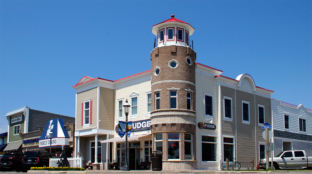
I was struck by the strong likeness to the Mackinaw Crossings retail district which I had recently visited on this same trip; they could have been designed by the same company by all appearances.

The architecture—as typical of these types of outdoor malls—is an eclectic mix, in this case, of “European-ness.” Not just German but also French, Dutch, and Scandinavian forms are evident.

Some of the shops are a very drastic departure from the Bavarian/Franconian theming which was introduced to Frankenmuth at midcentury.

Also typical of themed developments from this era are cost-cutting measures that impact the immersive qualities of the design—here most distinct in the windows, which could be from any late 90s McMansion track housing neighborhood. The painting schemes are also more garish and less carefully considered than you’d find at a Disney park; this is Disney on the cheap.

One of the hallmarks of late 1990s to early 2000s thematic design is the indoor painted sky. You can see this kind of treatment everywhere from Las Vegas casinos to Dubai shopping malls. I think Disney realizes how tacky this looks—they’ve only ever attempted “indoor for outdoor” in a nighttime setting, which can be quite stunning. Painted white clouds on powder blue just look cheap, like a children’s hospital daycare center.

I have a different appreciation for these kinds of spaces, a kind of ironic appreciation, like a guilty pleasure. Late 1990s to early 2000s theming—shopping malls, but also dining and casinos—is the b-movie equivalent of thematic design. I kind of love it because it’s so shabbily executed, because it’s so cheesy. The architecture is clearly planned and built to be appropriately referential, but the environmental immersion falls apart in poor materials choice, slapdash color, and an overall lack of detailing. All negatively impact verisimilitude.

Like many layered cakes I’ve seen on this journey, Frankenmuth is surprisingly complex, with multiple eras of theming, redesigns grafted onto authentic history, and fabricated history. From the late 1950s, Disneyland-inspired Bavarian Inn Restaurant (“Fake Real”) to the late 1990s Las Vegas casino-esque Frankenmuth River Place Shops (“Real Fake”), this classic Midwestern “Alpine Village” has it all. Even signs in German that bid you farewell.

October 27, 2018 /Dave Gottwald
mackinac-island-01.jpg

Big Mack Attack - Part 2: The Island.

September 16, 2018 by Dave Gottwald

It was at David Janssen Jr's insistence that we visited both Mackinaw City and nearby Mackinac Island. When we were in the early stages of planning our summer 2017 road trip, I recall his words were something along the lines of "You've got to see Mackinac Island, man! No cars allowed! All horses." And indeed, in my above photo there are no cars—just a horse-drawn trolly and a ton of rented bicycles. 

Mackinac Island, satellite view. Click for link. Map data: Ⓒ Google.

Mackinac Island, satellite view. Click for link. Map data: Ⓒ Google.

I was intrigued by Janssen's pitch. This fit snugly within the historical preservation / re-creation niche of thematic design, and the place sounded vaguely familiar. It was only in preparing notes for this post did I remember where I saw it.

As a kid growing up in the late 1970s and early 1980s, I was an avid reader. The Childcraft Encyclopedia Series was one of my many windows to the outside world via the written word. My very favorite book of the 1980 set which my sister and I shared was called Places to Know.

The rest of the books in this set are long gone, lost to moves and garage sales. But I still have this one.

Places to Know was all about exploring the planet through geographical oddities and curiosities, whether interesting natural settings or human-made places. The headline for the Mackinac City spread nearly paraphrases Mr. Janssen: NO CARS ALLOWED. The black and white photographs (probably dating to the fifties or sixties) on the spread from Places to Know above followed me around like ghosts as I explored the small downtown district on the island. But more on that a bit later.

Mackinac Island is a great example of a place with a real historical legacy that has been elevated through layers of kitsch and camp to the status of Tourist Trap.

There are resort towns like this all over the United States, and they tend to go well with bodies of water and a strong Summer Spending Season.

Conversely Mackinaw City, which we had just departed by ferry, doesn’t have the same kind of historical claim. It was built up and kitschified simply because it’s the access point to the island—which is the real enchilada, tourist-wise. The layers of historicity, remodelling, and redevelopment are similar, but there was no “original attraction” in Mackinaw City to latch onto. It’s just second banana; a gateway to another place.

As is typical with these types of towns, Mackinac Island dials up its “historicity” in service of branding. There is contemporary signage all over, replete with Victorian-looking typography that badges certain sites as “official” and “historic.”

There are numerous buildings which, at least to my untrained eye, appear to be restored historical structures from some past era. The materials use is the most telling; the mixtures of brick work and wood, and the lack of metal framing. Also window size (smaller, before mass-produced plate glass technology).

In other instances (again, I’m no architecture historian) the buildings appear new “as old” more in the Disney theme park loose interpretation of turn of the century Victorian forms.

I have mixed feelings about this, design-wise. In some ways, the lack of Total Control like you’d see in a Disneyland-type environment—or the Mackinaw Crossings retail district I had just left behind in Mackinaw City—means that the experience is more authentic.

Not everything is clean, shiny, upkept; there is less fiberglass and plasticity and gloss.

But that same lack of central ‘design authority’ means a visual hodgepodge; a mess.

Here a block-length Western clapboard saloon lives side by side with a small domestic bungalow—a contradiction you’d be hard-pressed to find at a Disney theme park environment.

With national chains, however, at least Mackinac Island tries. Many restored “historic districts” or renovated small town Main Streets across the country provide visual standards to companies that wish to plop down next to much older structures. Here Starbucks is presented with the same Old West-style false front architecture as many other shops on the island.

You get pockets of beauty, sure—a restored house, a renovated business block.

And then you get souvenir shops selling awful cheap t-shirt designs and retail spaces crammed to the gills with tchotchkes and too much fudge and way more ice cream than you can handle. The strongest vibe I got was of Lahaina on the West Side of Maui, where I spent a lot of time growing up.

The very historic storefront, circa 1960. But the signage and facade rather suggest 1860.

That’s the real rub; the authentic “contradictions” of the urban experience—which legendary Imagineer John Hench often noted with pride were rather intentionally eliminated through the Disney design process—are, from a certain perspective, compelling. Some are also ugly as hell.

The Disneyland-esque Mackinaw Crossings development is the kind of design that many (mostly architecture critics) label tastelessly contrived. But there is a holistic vision, a single story, being executed—even if you think it’s too shiny.

Mackinac Island has no such sweeping, cohesive narrative to its structures and spaces. There are bits and pieces—Fort Mackinac which was built during the American Revolutionary War, the tradition of fishing and fudge-making, the grand Victorian hotels and rooming houses, the banning of automobiles.

What’s interesting about the island is that there’s more than one level of tourism going on here. By that I mean that Mackinac Island was a tourist town historically. The well-to-do have been vacationing here and eating fudge here and buying souvenirs here since just after the Civil War.

And Mackinac Island is also a tourist town today. The crowds it draws during the summer months these days are really only two groups: overnight guests and day visitors.

Those who stay overnight at the island’s restored hotels and Victorian bed and breakfast houses basically pay through the nose for the privilege. They are the contemporary, upmarket equivalent of the island’s traditional, 19th century tourist base.

And then you have folks like me; we come out on the ferry for the day, take a bunch of pictures, buy some food and maybe a couple t-shirts of the “I Was Here” variety and some nautical-but-nice brass bric-à-brac from Ye Olde Candle Shoppe, and get right back on the boat to the mainland. This is the downmarket group, and I include myself in it.

The odd tension between downmarket and upmarket guests is expressed well in the spaces and structures seen on Mackinac Island.

Essentially, the nice, restored, well-kept stuff is mostly on the inland side of the streets of the downtown area. Or it’s far, far further down the water’s edge, like this restored hotel.

And the rest of downtown faces (and smells strongly of) the water. Here’s one such establishment—the obligatory “Western Trading Post” hocking cheap t-shirts.

In closing this brings me back to the book I read as a child, which gave me the mental pictures I carried along with me on my visit to Mackinac Island. I didn’t remember the text, not until I examined the book recently while preparing my notes for this post. But I had a vague sense of the photographs—they were pictures of the island as a tourist town historically. No tacky t-shirt shops and shabbily dressed (average) American visitors.

Although these photos hardly have people in them, I imagined them—in my mind’s eye—in historical costume. I imagined wealthy Victorian hotel guests. And although I’m speaking of pictures in a children’s encyclopedia, this is still the language of cinematic subsumption. I was let down ever so slightly that the Mackinac Island from the pages of my virtual childhood didn’t meet the reality. These heightened expectations are something I will return to time and again.

September 16, 2018 /Dave Gottwald
mackinaw-city-01.jpg

Big Mack Attack - Part 1: The City.

September 09, 2018 by Dave Gottwald

After spending some time in Wisconsin and taking an all-day letterpress workshop at the Hamilton Wood Type Museum in Two Rivers, it was time to make our way to Detroit. This would complete the first leg of the my summer 2017 travels. We drove up through Green Bay (stopping ever so briefly at Lambeau Field to pay tribute to the massive statue of Vince Lombardi) and into the wilds of the Upper Peninsula of Michigan and then down across the Mackinac Bridge (sometimes called locally "Mighty Mac") to Mackinaw City.

Mackinaw City, satellite view. Click for link. Map data: Ⓒ Google.

Mackinaw City, satellite view. Click for link. Map data: Ⓒ Google.

I realize there is a bit of linguistic confusion going on. The original Native American place name for the region is Michilimackinac, which means "Big Turtle" in Odawa, a dialect of the Ojibwe language which is spoken by the Ottawa people of this part of Northern Michigan. When the French occupied this land, they shortened the name to Mackinac but pronounced it as "Mackinaw" in a way which was natural to them. The British then came after the French, but changed the spelling to match the pronunciation. Today the city itself insists on AW while the bridge, the straits, and the island insist on AC. All are pronounced the same: "Mackinaw."

Mackinaw Crossings

As it happened, we parked (quite accidentally) right next to a thematic design bonanza.

Mackinaw Crossings is a classic example of a mid-1990s to mid-2000s themed retail redevelopment project. Billed on the city's website as "a Victorian inspired center where unique shopping, dining & entertainment come together," Mackinaw Crossings includes such amenities as "over 50 specialty shops, attractions and dining. Exciting new children’s playground, free nightly laser show, Rock climbing wall, Archery shooting lane and a 10,000 gallon fish aquarium." The outdoor shopping complex was built in 1997 by Bill Shepler and co-owned for many years with his partners Mike Ryan and Jimmy Wehr.

We entered from the parking lot via Sharky's Mackinaw Outfitters which looked nothing like the "Victorian" description of the rest of the development I later found online. But it works.

The aesthetic here is the archetypal North Woods Lodge, although to my eye the building smacked more of the Pacific Northwest and perhaps the National Parkitecture vibe of Yosemite, Yellowstone, or Glacier.

The sporting goods and outdoor recreation equipment national chain Cabela's has a very similar look and feel, although Sharkey's hews closer to a more historic presentation with authentic materials and construction—it's more "lodge" like.

My route through the Mackinaw Crossings shopping development.

Sharky's was only the largest retail node on the perimeter of a much more involved district; it is indicated here as number 13 at the far left. The areas I walked through are the purple zone from the parking lot to the green sector which spills out onto the street. As we were in a hurry to get to the ferry for our Mackinac Island day trip, I completely missed the rest of Mackinaw Crossings! But that which I did see and photograph told me all I needed to know.

Looking back towards Sharky's from further inside Mackinaw Crossings, it's evident that there is some 'blending' with regards to the rooflines and materials use that permits this 'lodge' to anchor comfortably to the more gingerbread trimmings of classic Victorian architecture (or at least the contemporary American reinterpretation of it).

Looking forward from Sharky's into Mackinaw Crossings, the Victorian theme starts to slowly takes over. I was actually impressed by (some) of the subtlety exhibited by the designers here. You don't typically see that much restraint at retail developments like this, but there is—dare I say—a bit of a Disney-esque approach to the transitions between building styles.

I've quoted Richard V. Francaviglia from his Main Street Revisited: Time, Space, and Image Building in Small-Town America elsewhere before, and I'll probably continue to do so as encounter these types of streetscapes and townscapes.

One of his key points in Main Street Revisited is that our twentieth-century conception of American small towns is sort of frozen in a Victorian overdrive which is historically inaccurate—and, more pointedly, a direct result of the Disneyland conception of Main Street USA. Francaviglia also notes the differences between the design of Main Street at the original park and the later version at Walt Disney World's Magic Kingdom:

A comparison of the two streetscapes reveals that the architecture in the Florida park has a much more lavish, overly ornate, perhaps almost burlesque, quality. In fact, whereas the Disneyland Main Street USA is fairly credible, Main Street USA in Walt Disney World is almost bizarre in its architectural treatment.

That newer generation of Disney design reflected in the Florida theme park seems to have been carried away with architectural hyperbole: Disney World's Main Street USA is a caricature of Disneyland's Main Street USA, which is in turn is a caricature of the Main Streets of places like Marceline and many other towns.

It is in this "more lavish, overly ornate, perhaps almost burlesque" style that Mackinaw Crossings is designed, and in that respect it's like many such places across the country which flourished from the early to mid-nineties until about the Great Recession of 2008.

Curiously, the development was apparently offered for auction (either as individual retail shops or as a whole) in the summer of 2006. I was unable to find the results of that auction, but in November 2017 the entire Mackinaw Crossings complex was purchased whole by Mackinac Bay Properties, a company run by Joe and Enzo Lieghio.

The article from the time of the auction announcement in the local Mackinac Island Town Crier quoted founding partner Bill Shepler as saying that the only thing like his shopping mall are the experiences that Disney provides:

The Mackinac Island Town Crier, July 15th to July 21st 2006 edition.

The Mackinac Island Town Crier, July 15th to July 21st 2006 edition.

Mackinaw Crossings shopping development, satellite view. Click for link. Map data: Ⓒ Google.

Mackinaw Crossings shopping development, satellite view. Click for link. Map data: Ⓒ Google.

Central Avenue

We made our way fairly quickly through Sharky's to the side street which spills out onto East Central Avenue to the north. This is the main artery, or "Main Street" of Mackinaw City, despite the fact that the actual boulevard named Main Street is just south of the Mackinaw Crossings development (and does not appear to have been redeveloped). This quirk jives with Richard V. Francaviglia's observation that Disney's "Main Street USA" has transformed "Main Street" into its own brand identity which is employed by towns which don't even feature a Main Street, or, in this case, is played up through design on another avenue other than the actual Main Street.

This is the north side of Mackinaw Crossings which spills onto East Central Avenue. That main thoroughfare is lined with an eclectic mix of buildings old, new, restored, and re-created—just like towns such as Deadwood, South Dakota which I had visited earlier this trip.

In retrospect, I regret that I didn't spend just a bit more time milling around the Mackinaw Crossings development. But we had a ferry to catch out to Mackinac Island.

In keeping with Francaviglia's field observations in Main Street Revisited, the streetscape here on East Central Avenue is quite amalgamated in its historicity; it's a decoupage, and good luck determining a timeline of development here, even with a trained eye. Some storefronts are possibly older than the turn of the twentieth century, such as this general store.

Typical for American tourist traps like this, Native American iconography is exploited in the name of "authenticity." I ducked into the shop and the owners were white as white can be.

A few buildings appeared to date to mid-century, such as this post office. Very modernist; glass curtain walls, no fascia on the roof edge, etc.

Francaviglia points out that many smaller towns across the United States began retrofitting their Main Streets and environs with thematic touches in the wake of Disneyland's overwhelming  popular success. These 'improvements' were often designed to heighten the ethnic heritage of a particular township or region. Here the blackletter typography suggests Germanic roots, although the name "Cunningham" is early medieval Scottish in origin.

Part of the archetypal design approach to these kinds of spaces means that 'Germanic' becomes a condensed and distilled shorthand for 'Old Worlde European.' 

I don't know if I'd say "clever" thematic design—perhaps "effective" thematic design—leverages existing iconography, whether geographic, cultural, historic, or sometimes merely structural. For all kinds of seafaring peoples, a lighthouse can inspire perhaps not full genuflection but at least a kind of totemistic reverence.

This "Fudge Lighthouse" is definitely a more recent structure (I'd guess mid-to-late nineties) and it feels oddly grafted onto the Victorian gingerbread around it, but it anchors the corner where East Central Avenue terminates at the waterfront, so its location is at least somewhat conceptually appropriate.

Turning the corner there are even more fudge shops (I guess Mackinaw City is famous for its fudge) and great examples of "new as old" construction common to revitalized Main Streets. The saturated wall and roof tile colors are consistent with Francaviglia's field research, in which representations far exceed historical accuracy:

Regarding the subject of historic colors on Main Street, however, many architects in the 1970s and 1980s consulted contemporary guidebooks and style books from the period 1890–1910 to determine which colors were popular. They followed directions, accenting the elaborate trim with varied colors. Nevertheless, a careful look at historic photographs reveals that the buildings on real Main Streets were often painted in fairly simple color schemes; white, buff, and green being common. Thus, the renovation architects may have introduced colors more typical of the elaborate bay-windowed Victorian "painted lady" townhouse of San Francisco, or Walt Disney's version of the small town as seen in the Disney parks, than what Main Street actually looked like ca. 1900.

Oddly (or, perhaps, completely predictably) at the water's edge adjacent to the ferry docks—and across the street from the "Fudge Lighthouse"—we've come full circle from where we parked back at Sharky's Mackinaw Outfitters; the North Woods Lodge look.

There's plenty of confusing things going on here. "Dixie" of course is the traditional nickname for the American South. "Saloon" suggests a bar in the Old West, perhaps a 19th century mining town. But the architecture is sort of a Colorado version of National Parkitecture crossed with the Great Midwestern Hunting Lodge I saw back at Sharky's.

The interior had massive vaulted ceilings with exposed (pine?) beams. There were also smaller design touches that suggested proximity to the water, such as rope and hurricane lamps.

So the South, by way of the Old West, waterside in the Midwest. It was a confusing design statement to make; I was expected something that would perhaps transition more naturally to getting on the ferry and experiencing the (hopefully more authentic?) history of Mackinac Island. But that's also sort of the fun of theming—like a screenplay with carefully placed jump scares I occasionally get quite thrown.

Continued in Part 2.

September 09, 2018 /Dave Gottwald
wall-drug-01.jpg

Where the Heck is Wall Drug?

September 05, 2018 by Dave Gottwald

The roadside attraction—it's as American as apple pie. Architecture critics have chronicled these way-stations of 20th century popular culture for years, and every time I'm on a road trip I try to do the same. Wall Drug had been on my bucket list for quite some time; I'd driven near it, by it, and around it—but was never actually able to stop in before.

We didn't have as much time as I'd hoped, but I was still able to mill around the place and get a paper cup of their World Famous Free Ice Water. Wall Drug's founder Ted Hustead struggled with his wife Dorothy to make ends meet on the Great Plains during an even greater Depression. What saved their business, quite frankly, was nearby Mount Rushmore which had recently opened to the public.

Dorothy had the foresight to realize that highway traffic was due to increase, and Wall Drug needed a clever gimmick to attract passerbys: free ice water. Of course, many places offered free water, even back then, in the form of drinking fountains or bathroom facilities. But it was Dorothy's genius to present the water as a unique experience and market it as a luxury by employing large signage along the highways. This billboard campaign eventually grew legs in the form of "so many miles to Wall Drug." These signs can now be found all over the world, on every continent—even Antarctica.

Some nice large 19th century wood type—which appears to be hand-painted—adorns nearly every storefront of the massive complex.

Wall Drug complex, satellite view. Click for link. Map data: Ⓒ Google.

Wall Drug complex, satellite view. Click for link. Map data: Ⓒ Google.

Over the years Wall Drug has expanded from a simple pharmacy property to something of an eclectic collection of adjoining buildings not unlike a Main Street of a small American town. The large, repeated signage recalls the famous billboard campaign which one can see coast to coast. 

In terms of thematic design, Wall Drug is a wonderful decoupage—part Wild West Outpost, part Small Town Pharmacy / General Store / Ice Cream Parlor / Soda Fountain, part Mid-Century Diner,  part Grandma's Antique Store, Part Hunting Lodge, part Church, part Art Gallery, part Rock Garden, part Giant Dinosaur (!?). Ok... part Everything.

Souvenir map handed out inside.

The evolution of Wall Drug as a themed attraction reminds me very much of Knott's Berry Farm in Buena Park, California: a small family-run business weathers the Great Depression years, gains a strong local reputation, and prospers as a national tourist destination in the years after World War II. Granted, Wall Drug is much smaller in scale, and lacks roller coasters and other thrill rides. But it still has an extensive "backyard" environment featuring a pan for gold activity (cribbed right from Knott's) and bizarre photo opportunities.


Development of Interstate Highway I-90 in the late 1960s meant that Wall Drug was effectively bypassed as a roadside attraction—cars had to get off the interstate and make their way through a few downtown streets to get there. As a result, Ted and company hired a local sculptor named Emmet Sullivan to erect a fifty-ton, 80-foot-long dinosaur to attract traffic from the interstate. The dino's eyes lit up at night. Emmet knew what he was doing—in 1936 a Dinosaur park he had designed and built opened just outside nearby Rapid City. He even worked on the Mount Rushmore project.

Wall Drug is quite proud of all the publicity it gets across the nation, mostly in the form of free bumper stickers handed out reading WHERE THE HECK IS WALL DRUG?

I took several series of photos which I then later stitched together into seamless panoramics, to sort of get a sense of the scale of the place. Click any of them to enlarge.

Wall Drug is replete with signage—both historic and reimagined—that creates a kind of amplified brand effect inside its retail spaces. In a very odd way, this is analogous to how well-designed brand chains like the Apple Store or Niketown work; every fit and fixture reinforces the identity of the company and its products. Except in the case of Wall Drug, there is no brand, and the wares for sale are varied. Still, you can't turn around a single corner without another cute reminder that indeed, you're at Wall Drug.

Although Wall Drug shares the aesthetic of the American Old West with Knott's Berry Farm, it also occupies a sort of nebulous kitsch space. This is the theming of the eclectic—think a typical antique mall. All the mismatched junk; that's the show. That's the point. Beyond the retail spaces inside, this collage extends to the exterior facades: Saloon, General Store, Cabin, Brownstone, Wooden Shack, Medieval Castle (?!?).

In case you feel lost, here are the precise coordinates of your location to set you at ease.

And of course, you don't want to miss the backyard.

There are many such roadside attractions scattered throughout the United States. They comprise a very distinct flavor of what we think of as Americana, and such places appear to be more prevalent west of the Mississippi. It might be the endless expanses to cross via highway out west—the weary traveller on the one hand looking for somewhere interesting to stop, and the proprietor on the other trying to eke out a living in the middle of nowhere. In this case, a ridiculous massive green dinosaur works well for both parties.

Where the Heck is Wall Drug? It's lots of places, if you look for it.

September 05, 2018 /Dave Gottwald
mt-rushmore-01.jpg

Borglum's Magic Mountain.

June 19, 2018 by Dave Gottwald

I'd only been to Mount Rushmore once before, more than a dozen years ago. This time (July 2017) I had a few questions on my mind. Very much like my stop by Devils Tower a couple days prior, there is a cinematic connection—Alfred Hitchcock's North by Northwest (1959). In the final sequence of the film this iconic location becomes an integral part of the story. It's the setting for the climax of the plot, and is as fixed in the public's mind as that of the tower rendezvous with alien visitors in Spielberg's Close Encounters of the Third Kind.

Sign on the drive into Mount Rushmore.
A rear projection of the monument in North by Northwest. All screen caps are from my DVD.

The folks who maintain the signage on the highway approach to Mount Rushmore proudly announce the Hitchcock connection. I can't admit to actually having seen National Treasure: Book of Secrets, although I slept through it on a flight once. The appearance of the monument in North by Northwest is a combination of location shooting, rear projection, matte paintings, full size sets, and scale model work.

Actual location shot of the visitors center in the film.
A matte painting of the monument from the film's finale.

Due to the objection of the government, we weren't allowed to have any of the figures on the faces, even in the interior studio shots... We were told very definitely that we could only have the figures slide down between the heads of the presidents. They said that after all, this is the shrine to democracy. — Alfred Hitchcock

The production initially planned to do most of the live action photography on location, and some shots outside the real visitors center remain in the final film. They were on location for just one day—September 16, 1958. But after word got out that there would be a fight scene and a couple of character deaths at the location, government officials barred them from completing planned filming on the faces of the monument.

Proof the cast was on location for shooting, if only for one day.

The crew flew back to Hollywood, where Mt. Rushmore had to be recreated at MGM. The South Dakota State Historical Society published a fascinating article about this in 1993 if you'd like to read about it in more detail.

The final sequence on the monument's presidential faces was achieved using a combination of sets, models, matte paintings, and rear projection.

Nothing could be built on top of the monument, even temporarily. The MGM researchers had to get special permits and US National Park Service escorts just to visit the area in order to photograph and measure it in detail. There's actually a documentary called The Man on Lincoln's Nose (2000) about the entire process which received an Oscar nomination for short subject that year. The film features interviews with Hitchcock's famous art director and production designer, Robert Boyle.

Aerial view of the monument site, Wikimedia Commons.

What's fascinating to me is—like Devils Tower—cinematic subsumption ensures that anyone who has seen even a just few seconds of the finale of North by Northwest after midnight on TCM can't get the cinematic Mount Rushmore out of their brain when they visit the location. As Daniel J. Boorstin (The Image), Jerry Mander (Four Arguments for the Elimination of Television), Neil Postman (Amusing Ourselves to Death), and most recently Neal Gabler (Life: the Movie) have argued; we recognize the difference between film and reality when we're asked to consider it. But we can't manage that distinction. And the version on screen—whether in a movie theater, on a television set, on a computer, or a tablet, or a phone—is the one that comes to dominate.

The monument looms as we drive towards it.

So all I'm thinking about as I wander the grounds is North by Northwest. I think about how long it's been since I last saw the movie. I'm mapping my own point of view in accordance with the vistas featured in the film. And I'm far from the only one—I overheard several different visitors (albeit, older ones; retirees) make a comment or two about the Hitchcock classic. "Remember in that movie when..." etc.

Funnily, upon the film's release, most of the public thought everything actually was shot at the monument on location. The U.S. Department of the Interior was not amused, and demanded that MGM remove the line at the end of the film's credits thanking them.

The approach from the parking lot.

In the context of theming, just like at Devils Tower, the presentation on screen becomes the essential character of the location. The only aspect which thrust me into the present were the additions to the monument since it appeared in North by Northwest.

The Avenue of Flags

After leaving the parking lot, the walk towards the monument is framed with a symmetrical alley of stone columns. From the US National Park Service website: The Avenue of Flags was initially established as part of the celebration of the United States' Bicentennial in 1976 at the request of a visitor. The 56 flags represent the 50 states, one district, three territories, and two commonwealths of the United States of America.

The avenue was constructed in 1976 for the United States Bicentennial and augmented in 1998 with additional structures. The aesthetic is strikingly modernist next to the monument, creating a somewhat distracting contrast—it's almost too solemn, too cold. 

Borglum with his concept model for the monument, 1936, Public Domain.

Mount Rushmore was the brain child of South Dakota state historian Doane Robinson, and was executed by sculptor Gutzon Borglum and his son Lincoln. Gutzon died in March, 1941 during construction; it was actually Lincoln who saw to the completion of the monument in October later than year. It's curious to note that originally the design called for the presidents to be carved from head to waist—as seen in this concept model—but the project ran out of funds.

The scale of the trees almost feels like forced perspective.

It's interesting that cinematic subsumption runs both ways. Because of its iconic status and visual record of U.S. Presidents, Mount Rushmore is sometimes featured in film and on television to indicate changes to American society, either in the present or in the future.

The defaced Mount Rushmore in Superman II (1980).
Screen cap from my Superman Ultimate Collector's Edition DVD box set (2007).

In the sequel to the original Christopher Reeve Superman film (1978), three Kryptonian supervillains (General Zod, Ursa, and Non) fly over the monument and alter it with their heat vision to depict themselves. Abraham Lincoln is destroyed and shown to crumble to pieces while the current U.S. President and members of his staff watch on television in the Oval Office.

The defacing of Mount Rushmore is both literal (the Kryptonians establishing themselves as the absolute rulers of the United States) and metaphorical—they are remaking the history and culture of the country in their own image.

A future Mount Rushmore in an unused production matte from Star Trek V.
Screen cap from my Star Trek V Special Collector's Edition DVD (2003).

In the original screenplay for Star Trek V: The Final Frontier (1989), officers Chekov and Sulu of the starship Enterprise were to hike in the park at the monument and get lost in the woods. This scene was not shot, but a proposed matte painting exists, with a woman to the left of George Washington. The novelization of the film by J.M. Dillard (based on the screenplay, not the finished film) identifies her as Sarah Susan Eckert, the first African-American president of "Northam" which appears to be some kind of future successor to the United States as a nation state (seems to be a contraction of "North America"). In Star Trek canon, the year is 2287:

Sulu glanced absently over his shoulder at the wilderness they were leaving behind. in the distance, a great mountain thrust into the sky, five faces carved into the stone. All of those honored here were political figures who had died centuries before Sulu was born, including the most recent addition to the monument, Sarah Susan Eckert, the first black Northam president. — Star Trek V novelization by J.M. Dillard, p. 59

Mount Rushmore from the highway, the moment the road turns to face it directly.

Here, the author Dillard is adding texture and detail to the screenplay (and perhaps matte art) she was referencing—these author(s) and/or scene artist(s) foresaw not only an African-American president, but a female one as well. One of these has indeed come to pass, and it happened less than twenty years after the film's release, rather than two hundred.

While researching this little-known aspect of Star Trek lore, I couldn't help but imagine a contemporary film (perhaps set in the near future) in which President Obama is depicted on Mount Rushmore. Again, the subsumption works both ways. Our cinematic experiences of Rushmore are telegraphed over it in real life, and conversely the monument becomes a canvas with which to paint our imaginings of an alternate America's present (Superman II) and even longings for the future (Star Trek V).

"The Vandamm House" in North by Northwest.

For me, and for many film buffs, North by Northwest will always be inexorably bound up with Alfred Hitchcock. As a child, I vividly remember the Frank Lloyd Wright-esque Mid-Century modern retreat which belongs to James Mason’s character, Phillip Vandamm. Wright was actually asked to design the house, but his fee was too high, so the Hollywood people led by Robert Boyle took care of it. The house was accomplished via a combination of full interior sets, partial exterior sets, and matte work.

I was so sure "The Vandamm House" was a real structure that I asked where it was when I first visited Mount Rushmore in 2005. But it only exists in the realm of cinematic subsumption.

June 19, 2018 /Dave Gottwald
  • Newer
  • Older

All original content on this site © 2007—2025 Dave Gottwald.
All photography which is my own is licensed under Creative Commons Attribution-NonCommercial 4.0.
This means you are free to share and adapt my images for non-commercial purposes only.