Greenfield Village - Part 1: Brave Old World.
The following observations and photos are culled from two separate visits to The Henry Ford museum complex in Dearborn, Michigan. My first visit was on July 15, 2017 and the majority of the photos featured in this post are from that day. Most recently I visited again on May 26, 2018 with my colleague Greg Turner-Rahman.
"History is more or less bunk." — Henry Ford, 1916
Industrialist Henry Ford—founder of the Ford Motor Company and perfector and popularizer of the mass production assembly line—was also an obsessive collector, and by the late 1920s he had amassed perhaps the largest collection of Americana in the country. Ford was fascinated by two notions; first, the preservation of ordinary, useful objects such as machinery and household goods, and second, an appreciation for pre-industrial times (quite ironic, given his most profitable efforts to hasten that very industrialization). Most of Ford’s vast accumulation of objects were deposited in a former tractor assembly warehouse while he planned for a larger display project.
Vintage postcard, the Edison Institute.
The resultant museum was designed by Robert O. Derrick and resembled Independence Hall in Philadelphia; dedicated in 1929, it opened to the public in 1933, and was mostly built out by the 1940s. The museum was initially called the Edison Institute in tribute to Ford’s friend and mentor Thomas A. Edison (the 1929 dedication marked the 50th anniversary of Edison's electric light).
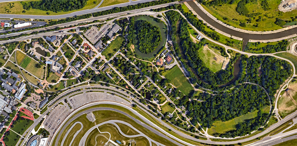
Greenfield Village, satellite view. Click for link. Map data: Ⓒ Google.
Although interesting on its own, the purpose of my two visits was the adjacent Greenfield Village property, an outdoor living history museum noted by the National Register of Historic Places for being a model for subsequent types of museums (along with Colonial Williamsburg which was restored and re-created with funding from John D. Rockefeller at roughly the same time). At its time of opening, a re-creation of Edison’s Menlo Park Laboratory Complex was a key highlight of the Village experience.
Souvenir map of the Greenfield Village property, 1951. The David Rumsey Map Collection.
In History Is Bunk: Assembling the Past at Henry Ford's Greenfield Village, Jessie Swigger offers perhaps the best description of the park and its intentions. Calling it "an imagined place" she notes that it was named after the township where Henry Ford's wife was born, and that the
village was constructed in Dearborn, just a few miles from the farmhouse where [Ford] grew up and a short drive from downtown Detroit. Only a few of the buildings represented local history, however; several were moved to the village from across the country or, like the Menlo Park buildings, built on the premises. The homes, artisan and industrial shops, and businesses were not linked by geography or time period but, as the replica of Menlo Park suggests, by Ford's personal interests. [emphasis mine]
If this sounds like Walt Disney’s intentions in building his park, it’s no coincidence.
Walt Disney with his daughter Diane at The Henry Ford museum on April 12, 1940.
Ⓒ Disney Enterprises, Inc.
The Henry Ford records two visits by Walt Disney to the Edison Institute and to Greenfield Village, the first being in 1940, and both times he took a tintype souvenir photograph. Given the broader timeline of his ruminations for the concept which became Disneyland, this is somewhat premature for a ‘scouting’ trip. Officials remarked that Walt was much impressed by all he saw, particularly showing “a great interest in everything mechanical.”
Walt Disney with animator Ward Kimball at The Henry Ford on August 3, 1948.
Ⓒ Disney Enterprises, Inc.
Disneyland Origins: The 1948 Chicago Railroad Fair
By his second visit in 1948, however, Walt’s ideas for Disneyland were beginning to solidify, and he was surely paying closer attention this time. Walt had travelled to Chicago that summer with Disney animator Ward Kimball to visit the Chicago Railroad Fair. Kimball had grown close to Walt over their mutual love of trains, and when the Disney Studios nurse, Hazel George, suggested that her boss was in dire need of a vacation to relieve stress (despite having just returned from Hawaii a few weeks prior), Kimball was pressed into service as his companion.
Vintage postcard, Chicago Railroad Fair.
The Chicago Railroad Fair is a curious chapter in the development of Disneyland all on its own. Several themed environments that would later become part of the Disneyland concept, such as an Indian Village and a Gold Rush-era ghost town, were highlights of the Fair.
Vintage postcard, Chicago Railroad Fair.
The historical re-creations and thematic design which Disney and Kimball ate up during their visit served as the perfect appetizer for their visit to Henry Ford’s own take on Americana.
The Martha-Mary Chapel.
Disneyland Origins: Main Street Muse
After visiting the Railroad Fair and gawking over the massive spectacle of locomotives and rolling stock on display, Walt and Ward spent two days at Ford’s Edison Institute and Greenfield Village on their return trip to California. The one-two punch of the Fair and the Village managed to reignite Walt’s imagination and pushed the visioning for his park into overdrive. Kimball later said that it was all Walt talked about during their entire trip.
Left: Village Green, Greenfield Village. Right: Main Street U.S.A., Disneyland. Map data: Ⓒ Google.
During both my visits, it became quite clear that Walt Disney took some very direct planning cues from the Village. Greenfield's Main Street aligns with a long symmetrical lawn, or Village Green, flanked on either end by two structures Henry Ford had in mind for his Village since the very beginning—a town hall and a chapel. The exact same vantage and dual “weenies” would later employed at Disneyland—the train station at the park’s entrance and then down Main Street U.S.A. to Sleeping Beauty’s Castle.
The Town Hall at the opposite end of the Village Green from the Chapel.
Upon his return to the studio, Walt passed on detailed notes to studio production designer Dick Kelsey that clearly show the influence of his time spent in both Chicago and Dearborn. According to Neal Gabler in his comprehensive and well-regarded biography, the memo to Kelsey dated August 31, 1948 described “a Main Village with a railroad station and a village green…a small town would be built around the green, with the railroad station at one end and a town hall at the other…there would be other sections too: an old farm, a western village, [and] an Indian compound” [emphasis added].
Vintage postcard, Suwanee Riverboat at Greenfield Village.
Disneyland Origins: Steamboat Sympaticos
There’s another key feature of the Village which Walt tucked in his back pocket and later deployed as a main attraction at Disneyland—a steamboat river ride. As with so many things at Greenfield, all things point back to Thomas Edison. While in Florida, Edison was fond of travelling on a 19th century steamer, the Suwanee. In time it was sunk and Henry Ford had the engine salvaged. In 1929 (the year the museum and village were dedicated) Ford hired Conrad Menge, who had once captained the Suwanee, to help rebuild it. In 1937 a loop of the adjacent Rouge River was dredged to create Suwanee Lagoon, and boat tours began around it.
Interestingly, ten years later the Suwanee was one of the last things Henry Ford saw on his final visit to Greenfield Village on April 7, 1947—the day he died. The Rouge River had recently been flooded by heavy rains, and the riverboat was submerged at its dock, disabled. Ford’s driver reported that with a laugh, he quipped “We’ll soon put it back on an even keel again.” The craft was indeed repaired and continued to offer tours to guests for decades until the Suwanee was taken out of service at the Village in 2004; she was finally dismantled, board by board, in 2011.
The Mark Twain Riverboat at Disneyland, 2008.
Although the vessel Walt had built for his park was far larger than the Suwanee, it was still smaller than an actual Mississippi riverboat—roughly 5/8 scale. Comparing the two from roughly the same vantage point, it’s evident that the Greenfield craft informed the Mark Twain’s central role in Frontierland, even down to the looped route of travel.
Left: Suwanee Lagoon, Greenfield Village. Right: Rivers of America, Disneyland. Map data: Ⓒ Google.
The Rivers of America at Disneyland is longer, narrower, and more elaborate, snaking back and forth around Tom Sawyer’s Island—but the DNA of the experience is right here at Henry Ford’s Greenfield Village.
Redesigned entry plaza.
Disneyfying Greenfield
For most of the Village’s history, the park had grown organically. There was no cohesive master plan, and this unplanned nature of the attraction became even more pronounced after Ford’s death. Ironically, Henry Ford’s obsession with historical re-creation and that influence on Walt’s Disneyland concept would come full circle by the late 1990s; Greenfield Village would be, quite deliberately, turned into something of a Disney-style theme park.
A history attraction uses the techniques of theater, drama, storytelling, pacing and crowd control of the themed attraction to address the important stories that matter in people’s lives [emphasis added]. — The Henry Ford’s “History Principles,” 2002
Visitors center at the park entrance.
The Village entrance plaza and visitors center which were built during a massive 2002–2003 renovation reflect the Colonial look of the Independence Hall facade of the Henry Ford museum complex right next door, but these structures are even more elaborated planned and themed than that older “re-creation.”
Liberty Square, The Magic Kingdom, Walt Disney World, 2007.
The renovation designers appear to have taken a very direct lead from the Liberty Square area of Walt Disney World’s Magic Kingdom, which is themed to the time of the American Revolution. This land was wisely included on the opening day menu of that park in 1971 as a substitution for New Orleans Square (the real Big Easy was thought to be too close to Florida to be exotic), and five years later both the area and its signature attraction, The Hall of Presidents, were inundated with guests as the entire country was caught up in Bicentennial fever. Perhaps I digress; bottom line, Greenfield’s new entrance is more Disney than Ford.
Greenfield Village's full-size steam train.
Or perhaps I digress not. Even though the Disneyfication of the Village wasn’t complete until the early 2000s, I’d argue that it actually began much sooner, in direct response to that very opening of the Magic Kingdom at Walt Disney World in October 1971. It was not until the summer of 1972 that Greenfield received an antique steam train attraction, and just like in the fashion of Disney parks, it circled (and thus enclosed and provided a perimeter for) the Village on a three-mile course. The subsequent Main Street and Suwanee Stations was completed and operational for the 1974 season. Unlike the Disney Version, however, Greenfield’s Weiser Railroad is standard gauge and employs no reduced scaling.
Looking back at the park's entry gates.
Company leadership was very direct about these alterations to the Village (which included not only the new railroad but also Suwanee Park, a themed re-creation of a turn-of-the-century amusement area by 1974) and that the emphasis now needed to be experiential:
We must realize that the area in which we operate—the attraction of visitors—has become extremely competitive in recent years [meaning, among other things, Walt Disney World]… A major purpose of our development program is to add the means by which we can offer visitors a greater sense of personal participation—all within a historical context [emphasis added]. — William Clay Ford, July 1972.
Themed districts with their own title signage.
The ultimate extension of this desire to compete with attractions like the Disney parks and also to offer visitors a more immersive experience meant not just redesign in the late 1990s and early 2000s; it also meant reorganization.
Rather than an organic assemblage of buildings Ford had bought and moved, or had ordered constructed new “as old” on site, Greenfield Village took on the narrative approach of seven newly organized themed districts (much like Disney’s “lands”) during its 2002–2003 renovation. As indicated in colors and numbers on the above map, those areas in 2017 and 2018 when I visited were:
1.) Working Farms: This is a demonstration of traditional American farming. Produce grown and livestock raised here are served at some of the Village’s finer restaurants.
2.) Liberty Craftworks: Pottery, Glassblowing, Metalworking, Milling, and Printing are demonstrated in period-appropriate settings, with wares available for sale.
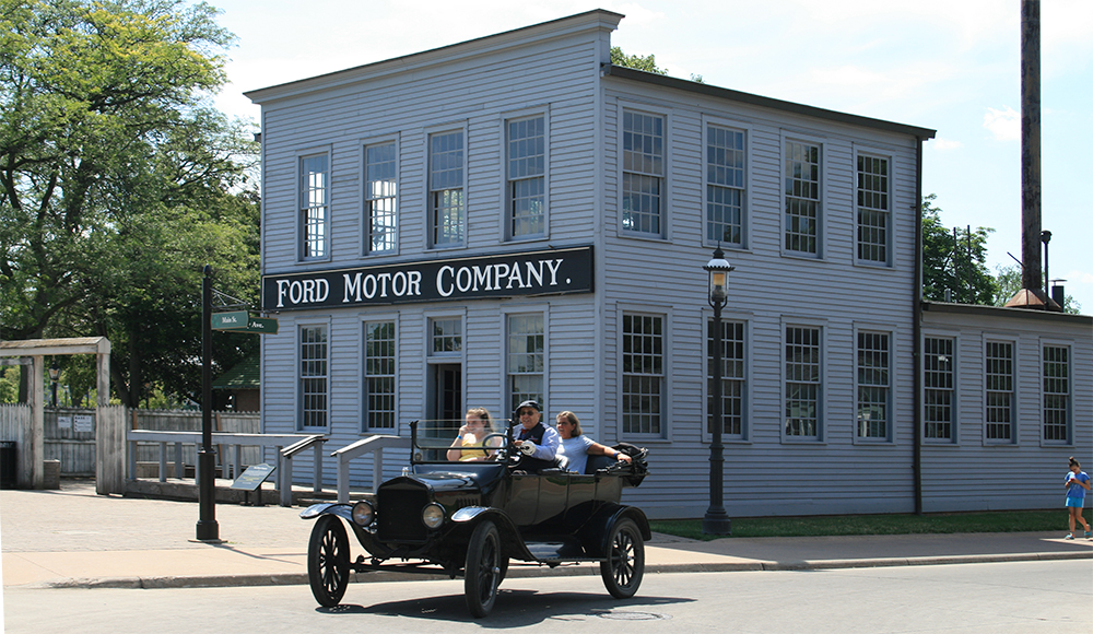
3.) Henry Ford’s Model T: A scaled down replica of a Ford manufacturing plant frames perhaps the park’s most popular contemporary attraction—the opportunity to ride in restored antique Ford automobiles around the Village.
4.) Railroad Junction: A reconstructed roundhouse from Marshall, Michigan was added to the Village in 2000 and became the heart of this area dedicated to Greenfield’s trains.
5.) Main Street: The area which probably required the least amount of reorganization as its theme was evident at the Village’s opening. Also includes the Suwanee Park amusement area which was added in 1974, and the Suwanee Lagoon (now lacking a riverboat).
6.) Edison at Work: This re-creation of Edison’s Menlo Park Laboratory Complex has been Greenfield’s signature attraction since the day the park was dedicated.
7.) Porches and Parlors: Essentially a residential district composed of historic structures which Ford had moved to the site, or re-creations constructed in situ at his direction.
Greenfield Village is one of those rare examples of a park which not only predated Disneyland but directly informed Walt’s design choices for his project—and then in turn was itself Disneyfied to remain a compelling and competitive experience in the wake of the success of the Disney Park Model.