Themerica

Musings on Thematic Design and the End of Architecture

  • Blog
  • Archive
  • About
kings-island-65.jpg

Kings Island - Part 4: Odds 'n' Ends.

March 03, 2019 by Dave Gottwald

One of the more interesting side effects of a theme park having shifted between different owners over the years is the swath of odds ‘n’ ends left behind—the orphaned areas and attractions, conflicting design motifs, abandoned IPs, and renamed lands. And Kings Island certainly has its share.

Oktoberfest on Kings Island 1972 souvenir park map poster.

The Ghosts of Oktober Past

Kings Island opened in 1972 with a Bavarian-themed land called Oktoberfest. Although it still exists today on park maps, you’d be hard pressed to identify it.

Oktoberfest during the park’s first season.

The theme seems appropriate given that this was once the site of the western station for the park’s Von Roll Sky Ride, which was called the Swiss Sky Ride when it first resided at Cincinnati’s Coney Island. Just like at Disneyland, the thematic logic was as follows: gondola / cable car = ski resort = Switzerland. And Bavaria is certainly close enough, geographically as well as aesthetically. Not to mention that Ohio, and nearby Cincinnati specifically, is home to a large Germanic population.

The original Kings Island biergarten.

Here is the park’s “Der Alte Deutsche Bier Garten” at the heart of the Oktoberfest area, sometime after the Sky Ride was removed for the 1980 season; there is no sign of the support tower to the left as seen in the earlier photograph. For years this delightfully designed biergarten served up German gastronomic standards such as bratwurst and sauerkraut, traditional music performers in the requisite lederhosen, and, of course, plenty of beer.

Oktoberfest area on Kings Island 1989 souvenir park map poster.

Oktoberfest area on Kings Island 1989 souvenir park map poster.

Although by the mid-1980s the stand-up coaster King Cobra had been added to the area (the first of its kind in the world to be designed as such), Oktoberfest managed to maintain its original charm. But it wouldn’t last.

Oktoberfest, 1990.

For the first season of the nineties, the Der Spinning Keggers ride was removed. From design through to the name, this Kings Island version of Disney’s Mad Tea Party (commonly just called “The Teacups”) was very Oktoberfest—guests spun about in massive beer kegs. This could be seen as the beginning of the end for the land’s overall theme, which continued to be chipped away at throughout the decade when Paramount owned the park.

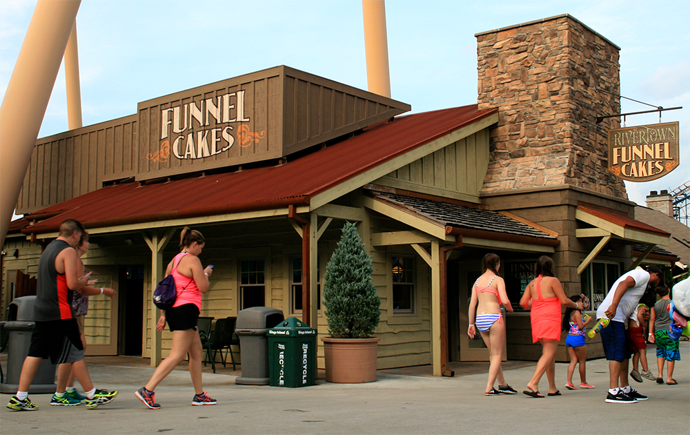
Here is the biergarten as it looks today; a completely generic “country cottage” structure surrounded by picket fencing. During the Paramount years, this building was briefly a location in the Bubba Gump Shrimp Company themed restaurant chain. Currently, the closest to German it gets is the sponsor—Budweiser.

As seen from the park’s Eiffel Tower, this is the Festhaus building, which was added between Oktoberfest and International Street in 1982 for the parks’ inaugural “Winterfest” Christmas event as the largest indoor entertainment and dining venue at Kings Island. Offerings were strictly German for many years, but these days it’s all pizza, burgers, and similarly generic amusement park fare.

Frankenmuth’s glockenspiel.

The Festhaus also used to have ornate decorations and signage, in addition to a working glockenspiel clock. Just like I saw in Frankenmuth, Michigan, this kind of clock has music bells and dancing figures that move around in a circular performance (“glockenspiel” literally translates into English as “bells play”). After years of disrepair, the Festhaus glockenspiel was removed for the 2014 season.

Around on the other side of the biergarten is a Mexican restaurant (this area also contains, inexplicably, a Panda Express Chinese fast food outlet; completely out of place, just like I saw in a Frontier setting at Cedar Point). The thematic design is pretty well executed, it just has no place in a supposedly “German” neighborhood.

Nice use of gooseneck-style barn lighting, corrugated metal roofing, and appropriate, vintage typography on the signage. There’s a decent pan-Latin American vibe here, very plantation house. But again, this land is still identified as Oktoberfest on park maps.

And why the Latin American motif? In 1991 an Aztec-adventure-themed Arrow mine train coaster called Adventure Express opened—yes, in the Oktoberfest area, adjacent to Coney Mall. The park’s own official history blog notes the audacious incongruity in all this, saying that the addition of Adventure Express “signaled the first time the park would install an alternatively-themed attraction to a previously established themed area.” My thinking is that the Mexican eatery next door was added to reinforce the ride’s theme, but to the detriment of the original Bavarian theme of Oktoberfest .

Kings Island park map, circa 2000.

Getting in the Zone

During the nineties, the Paramount Action Zone was added right next door to Oktoberfest. This was a move Paramount pulled at all the parks it took ownership of during this period—adding fairly standard amusement park thrill rides under the banner of some of the studio’s action movies.

Top Gun postcard, 1993.

This included the aforementioned Arrow suspended roller coaster originally themed to Top Gun (1993 to 2007), then known as Flight Deck (2008 to 2013) after Cedar Fair acquired Paramount Parks, and finally rechristened The Bat in honor of the park’s original (failed) Arrow suspended prototype for the 2014 season.

Local newspaper article announcing Top Gun.

The theming for Top Gun was originally quite considered. In the April, 1993 issue of Cincinnati Magazine, an article on Paramount’s purchase of Kings Island noted:

The addition of the new “Top Gun” roller coaster—an inverted version of traditional coasters, with the wheels and tracks above the seats, leaving nothing underneath riders except the treetops—was handled the same way. The physical structure—all 660 tons of it—was in the planning long before Paramount. Not so long in advance, though, that Paramount couldn’t jump in and inject its Hollywood twist, hiring John DeCuir Jr. to make the coaster’s boarding station resemble an aircraft carrier. DeCuir was in charge of the design for the original Top Gun movie…

This local television news broadcast from 1993 shows the original aircraft carrier theming of the queue area, along with music and steam effects.

Days of Thunder postcard, 1994.

That same Cincinnati Magazine article quoted a consultant involved in the Paramount acquisition: “You’re going to see a lot of movie theming going into existing rides, and new rides that are orientated and built around future or successful movies that Paramount has released.” And indeed, Paramount’s cinematic additions to Kings Island during the nineties also included a virtual reality ride themed to the (completely forgettable) 1990 Tom Cruise NASCAR vehicle Days of Thunder, in a venue called the Action Theater.

The most recent addition to the Action Zone area is Banshee. This Bolliger & Mabillard (B&M) triumph is the longest suspended roller coaster in the world, and it actually contains a fair amount of theming for a Cedar Fair park. A banshee is a female spirit in Irish mythology who apparently shows up wailing and shrieking whenever a family member dies. The press release at the time called Banshee “the first female-inspired thrill ride” at Kings Island, although I’m unsure what kind of honor that is.

True to theme, the queue area winds through a graveyard with various markers. One of these is an eternal flame in tribute to the prior coaster which occupied this park of the park—Son of Beast. No name, just the defunct ride’s mysterious logo and the date ranch of its operation. I thought this kind of obscure reference was a very nice touch for park history aficionados.

Son of Beast. Wikimedia Commons.

This first wooden hypercoaster—with a steel vertical loop—broke all kinds of records when it opened in 2000. But it was not to last. The ride was plagued with problems, and the loop in particular caused numerous issues; it was eventually removed for the 2007 season. Two years later the ride closed permanently, and the coaster was finally demolished in 2012.

I think the Action Zone needs to go away completely, replaced by some kind of cohesive theme that can include The Bat as well as Banshee (and maybe even the nearby Adventure Express). Perhaps something horror-related? And while they’re at it, the park could restore Oktoberfest to its German roots.

The Inner Limits

There is one last thematic remnant of the Paramount era which I’d like to mention. The Outer Limits: Flight of Fear opened in 1996 as one of two linear induction motor (LIM) launch coasters, the world’s first (the other opened at sister park Kings Dominion).

The ride’s original theme was tied to the classic 1960s science fiction show The Outer Limits, and features an alien spacecraft in an Area 51-like miliary warehouse setting. When Paramount’s licencing agreement expired, references to the show were removed and the ride became simply Flight of Fear beginning with the 2001 season. The UFO theme, however, has remained.

Flight of Fear is completely indoors, and a such serves as sort of the Kings Island equivalent of Disney’s Space Mountain. Unlike the detailed exterior design found at Disney parks, however, the building for the ride is relatively unadorned. The outside of the hangar housing the queue references a bit of UFO mythology—it’s marked with a large 18 (Hangar 18 at Wright-Patterson Air Force Base is supposedly where flying saucer remains and alien corpses were stored after the legendary Roswell crash).

Once through the queue of this Hangar 18, guests “board” the alien ship (a flying saucer design) by walking up a ramp into the interior. The ride loading area is designed to resemble some type of generic sci-fi alien environment.

There are even what appear to be cryogenically frozen alien bodies stored here. I would imagine during the Outer Limits era, there was a more explicit backstory throughout these spaces, possibly tying into a specific episode from the series (which certainly featured its share of creepy aliens). But now it’s just generic “weird.”

The linear induction launch was quite thrilling, and the coaster experience felt very much like Space Mountain. Kings Island has done a decent job of maintaining the alien theme despite losing the originating IP.

The thematic missteps at Kings Island are all due to turnover in owner and management. During the Taft years, there was at least sense of shared vision—something more immersive than the average amusement park, but less so than Disney. Sort of how Six Flags Over Texas began. When Paramount bought Kings Island, they (haphazardly) tried the Universal approach of injecting IP from their film library throughout, with mixed results. And then when Cedar Fair acquired the Paramount Parks in 2006, they brought with them a very uneven tradition of retheming and adding even more thrill rides.

The lesson is clear—for thematic design, consistency means constancy. Kings Island is a beautiful park with a rich history. I can only hope that, in the tradition of recent attractions like Banshee and Mystic Timbers, Cedar Fair remains committed to quality, thoughtful alterations.

Over at KI Central, a forums site that’s been around since 2003 and calls itself “a community that loves Kings Island” I saw a comment that seemed to me to be quite astute. In a thread about the degradation of thematic integrity, a user pointed out that “Cedar Fair doesn’t manage theme parks, they manage amusement parks.” Which is true, and I shouldn’t expect Disney-level design from them.

Yet the near future looks promising: International Street is being completely overhauled and resurfaced for the 2019 season, along with the opening of the new Kings Mills Antique Autos, comparable to the original Les Taxis antique car ride (1972–2004).

Keep it up, Kings Island!

March 03, 2019 /Dave Gottwald
kings-island-27.jpg

Kings Island - Part 3: What Remains of Rivertown.

February 24, 2019 by Dave Gottwald

Although Kings Island today is made up of a variety of themed areas, the last core aspect of the park’s original design which I am going to examine is Rivertown. Sadly, this Wild West equivalent of Disney’s Frontierland (called Frontiertown and Frontier Land during the park’s design phase) has been degraded almost beyond recognition through the park’s multiple owners over the years.

Like International Street, garish paint schemes and contemporary retail tenants have ruined the charm, but at least that area of the park retains its structural (architectural) thematic integrity. With steel coasters towering overhead and Charlie Brown’s Peanuts gang encroaching, Rivertown doesn’t even have that.

Rivertown area, satellite view. Map data: Ⓒ Google.

Go West (Again)

Just as I’ve seen at parks like Cedar Point, adding a venerable Wild West area has been seen time and again as a way to expedite drawing a Disneyland-like audience. It’s almost as if having a “Western Land” of some kind or another is American shorthand for “theme park.”

As is frequently the case, placemaking in this kind of Old West setting is established through the use of fictional proprietorships (more of which I’ll point out below). Based on the photo research I’ve done, I cannot tell if this small rooftop water tower is part of the original 1972 structures in the area. But the typeface treatment—despite evoking a period-appropriate slab serif—feels quite recent in fact.

Rivertown area on Kings Island 1989 souvenir park map poster.

As recently as the late 1980s, Rivertown still retained most of its original Old West thematic charm. On this 1989 souvenir park map poster you can see the extent of the various buildings and winding streets. All the elements you’d expect are here, from the “Saloon” to the “Shooting Gallery.”

Vintage postcard, Rivertown.

That same article in the July 1972 issue of Cincinnati Magazine which I quoted in my first Kings Island post describes a place which

…lives in the mid-1800’s, when the steam locomotive was an important part of local life. At the center of the town are a general store and the frontier train station where the Tecumseh and the Simon Kenton, narrow-gauge steam locomotives arrive pulling coaches.

I’ll return to said railroad in a moment, but I want to first point out what the buildings in RIvertown used to look like, and how they appear now. As you can see in the 1970s postcard above, much of the wood is bare and treated to look aged. The trims of the Court of Games here—which are painted—are rendered in desaturated, dull, and subtle hues.

This is the same block of buildings in 2017. Any bare wood is gone (which, fairly, might have been a victim of weather) and all surfaces take on a more artificial, fiberglassy vibe. Kings Island is clearly trying to go for the kind of cute variety found on Disneyland’s Main Street U.S.A. but it’s just not working. As with at Cedar Point’s Frontier Town, there’s a Baudrillardian simulacra vibe going on here—a copy of a copy; an impression of a remembrance of what the Disney Version is like.

This kind of design treatment is so widespread in the United States that, again, it telegraphs “theme park” quite succinctly, or at least a theme park of the Cedar Fair / Six Flags variety.

I wish I could have experienced the original, bare, desaturated Rivertown from the 1970s, but this is what I found. Here at the games area at least, the structures themselves are intact.

Beverages and The Beast

However, the entrance to The Beast, which opened in 1979 as the tallest, fastest, and longest wooden roller coaster in the world (it still holds the title of longest after all these years) struck me as odd. It’s a vending machine area called “Beast Canyon Cold Drinks.” You sort of navigate around the candy and soda and the route evolves into a queue for the ride. The walkway abruptly ends, with everything to the right fenced off. And that “ENTRANCE” sign looks super tacked on. Something was amiss.

“Beast Canyon Cold Drinks” on Kings Island 1989 souvenir park map poster.

At first I thought this was likely a more recent development. But nope, looking closer at this 1989 park map poster, there’s the same building, nestled up against The Beast coaster station. Tooling around online I discovered that “Beast Canyon Cold Drinks” has always been there, and there’s even a video showing people waiting in front of the building during the ride’s opening season.

The Beast and surrounding area on Kings Island 1979 souvenir park map poster, the ride’s opening season.

Originally there was an actual concession stand here (which also sold beer), not just vending machines, but the queue for the The Beast did not run through it. As shown above on the opening season’s park map poster, there used to be a path alongside to the right of “Beast Canyon Cold Drinks” and what appears to be a block of assorted mining town structures. That was the ride’s original entrance.

The logo for The Beast is wicked cool, and remains pretty much the way it looked when it was first unveiled back in 1979. It was designed by a Cincinatti ad firm, Lawler Ballard Little, and actually won an award from the New York Advertising Club. This sign is off to the left side of “Beast Canyon Cold Drinks” and functions as sort of a photo op.

The original, much larger, logo sign for The Beast.

But I also discovered that this is not the original sign—it’s a smaller and less detailed version of what used to be displayed more prominently out in front of the ride’s queue entrance. The original featured real chains and dimensional lettering that appeared to burst off the wood planking.

Vintage postcard, The Beast.

Another sign near the original queue entrance once carried a warning from the president of the “The Little Miami Amalgamated Mining & Minerals Co” providing some backstory for the ride, pictured on the above postcard from 1981. Here is this text:

PUBLIC NOTICE: Help is urgently solicited!

Due to the increasing occurrence of mysterious noises, inexplicable tremors, and vicious acts of vandalism within these premises, it has become necessary to suspend the normal operations of this company.

Although the cause of this evil phenomena defies identification, authorities agree it is surely the work of some demonic creature of prodigious size, which for now can only be designated as: THE BEAST

LET THE FOOLHARDY BEWARE! This so-named Beast appears to be very much alive and intent upon conquering all who would oppose him. Nothing of the imagination would be able to inflict such terror upon the human soul.

IT IS WITH UTMOST URGENCY that the Management entreats all civic-spirited persons to assist it's loyal employees in the ongoing effort to subdue this disruptive scourge and restore order to the community.

ALL VOLUNTEERS will kindly apply by entering through the employment office. (At times it may be necessary to await recruitment at the observation area to the left of the office building.) Thank you, and may the Lord have mercy!

CHARLES J. DINN President
The Little Miami Amalgamated Mining & Minerals Co.

Kings Island 1978 press kit announcing The Beast.

So the coaster actually had a fairly cohesive theme when it opened—that of a haunted mine!

Playing on the Kings Mills region for which the park is partially named (although Kings Island is actually just to the south, near the town of Mason), the queue and station building for The Beast was designed as an ol’ timey mill, complete with an operating water wheel and all the appropriate accessories, “adjacent to a small lake.” There were also mining implements and a small mine entrance.

The queue for The Beast during its first season.

This still from a local news broadcast shot during the ride’s first summer shows that small lake which was originally part of the theme of the The Beast as a mill operation. The 1979 souvenir park map above also clearly shows this body of water, which was once host to Kenton’s Cove Canoes and Shawnee Landing. Later part of this land was used briefly by The Bat, and since 1987, Vortex.

Here is a good view of the original water elements which were a part of the ride station. Today this entire part of the queue is fenced off—there’s just a wall of wood planks along the left side of the line.

The queue at Big Thunder Mountain Railroad, Disneyland, 2007.

The sluice structure in particular reminds of the elements in the queue at Disneyland’s Big Thunder Mountain Railroad, a mining operation-themed roller coaster type ride which opened some six months after The Beast in September, 1979.

In this early photograph the mine entrance diorama is clearly visible, complete with a small track and ore car.

The lake was drained in 1987 as the pump and wheel elements in the station building picture above had not worked in years, leaving the body of water stagnate. This also facilitated the introduction of an accessibility ramp, which re-routed the exit.

GhostRider at Knott’s Berry Farm, 2007.

Knott’s Berry Farm borrowed a number of these design elements for their own classic wooden roller coaster GhostRider which opened in 1998. The queue and station are themed to a mining operation, with the same sort of propping, mine diorama with ore car, etc. Everything is more elaborate than at Kings Island, but the basic idea is the same—if you’re going to have trains of small cars (a roller coaster) depart from a large industrial shed and travel on a wooden superstructure over hills and through tunnels in an Old West setting, what does that sound like? Some kind of mining operation. Or perhaps a lumber mill (more on this in a moment).

And as Kings Island and Disneyland had established some two decades before, the idea of a haunting—of a spirit causing the trains to run out of control—adds the appropriate amount of drama. Unfortunately, this original theme for The Beast has long since been patched over and forgotten.

The Diamondback Bites

What changed everything about the entrance and queue for The Beast, disrupting its original theme as a haunted mill and mining operation? A massive steel hypercoaster designed and built by Bolliger & Mabillard (B&M) called Diamondback, which opened for the 2009 season.

Diamondback under construction in 2008. Eddie~S/Flickr.

You can see here while Diamondback was under construction that there used to be a sort of midway lined with trees leading up to the queue for the beast. That’s where the original logo sign was. From the accounts I’ve read online, fans are nostalgia for this original entrance, feeling that it added a forbidding vibe, and heightened anticipation for the coaster. None of the tracks and trains of The Beast could be seen from this wooded area. It must have looked even cooler in the dark of night.

Compare with this picture of nearly the same vantage which I took from the observation deck at the top of the park’s Eiffel Tower.

One of Diamondback’s helix elements cuts back into that part of Rivertown, so all the trees had to be torn out. Here are the stumps during the coaster’s construction.

The Beast entrance, satellite view. Map data: Google.

The entrance to The Beast was rerouted through the somewhat incongruous “Beast Canyon Cold Drinks” building, and the original entrance was fenced off and became a backstage area.

I understand the addition of Diamondback, as Cedar Fair prides itself on the biggest and best coasters. The logo and signage are pretty typical for the Six Flags / Cedar Fair interpretation of “Old West Thrill Ride.” The steel track as a snake’s forked tongue is a nice touch, although the orange gradient lettering is very SNAP INTO A SLIM JIM. Yet, truth be told, the queue area and station have all the requisite trappings—corrugated metal roofing, barn lighting, signs on distressed wood planks, etc.

Where Diamondback throws a wrench in the thematic design of the Rivertown area is with both materials and scale. You can’t unsee those massive support beams sprouting up at every odd angle in and around the quaint country cottage shacks. As such, any attempt at immersion is shattered beyond repair.

Silver Bullet looms over Ghost Town at Knott’s Berry Farm, 2007.

This very same visual disruption can also be seen at another park in Cedar Fair’s portfolio—Knott’s Berry Farm. The first major thrill ride added after the company acquired the park, Silver Bullet opened in 2004 and has dominated the skyline of three themed areas—Ghost Town, Fiesta Village, and Indian Trails—ever since. The construction of this steel inverted coaster (like Diamondback, provided by Bolliger & Mabillard) required that many historic structures at Knott’s—including a church—be removed or relocated.

Wood coasters, by contrast, are made of the appropriate materials for the Old West setting, and don’t interfere with the overall scale. They also present well as mining, milling, or lumber (getting to it) operations.

Mystic Timbers

So appropriately, the latest addition to Rivertown is another wooden coaster, Mystic Timbers, which opened for the 2017 season. What’s nice to see is—perhaps to make up for the losses over the years to The Beast—this attraction packs a ton of thematic design into its queue, station, and even on the ride itself.

Much like its older cousin, The Beast, Mystic Timbers makes wonderful use of the heavily wooded terrain around the park’s edges. One thing Kings Island did right was to purchase far more land than they actually developed for the 1972 opening. As such, over the years they’ve been able to subtly expand into the forest periphery. The coaster whips through the trees and changes elevation multiple times, crossing over train tracks as well as water features.

Once again, a fictional industrial concern (as I’ve seen at Cedar Point and elsewhere here at Kings Island) forms the backbone of the theme for Mystic Timbers. Since The Beast had already laid claim (pun intended) to a mining operation theme (even though today you wouldn’t know it), this time it’s a lumber company (I told you I’d get to this), or “Co.” in Old West Speak.

I was confused to see “Miami River” here in Ohio (as I think of Florida) but as it turns out the Great Miami River runs through southwestern Ohio and Indiana and is named for the Miami tribe who are one of the local Native American groups who speak Algonquian. I subsequently discovered that Miami, Florida is of no relation, and that state’s Miami River is named after the Mayaimi people.

See, roller coasters can be educational.

The layout of Mystic Timbers is terrific and makes great use of the terrain. What sets this coaster apart from others at Kings Island, however, is the finale. Although I was unable to photograph it on the ride, when the train completes its course and returns to the station, it stops first inside a warehouse space.

Don’t Go in the Shed

I can’t really describe what goes on, so here’s a video clip. There are audio-animatronics, digital projections, surround sound, and light and smoke effects. It’s pretty nifty, and takes the “haunting” aspect of the original theme for The Beast and brings it into the twenty-first century. However I don’t think they properly built suspense for it throughout the queue area or in the station loading, so coming as it does right at the end of a traditional wooden roller coaster experience, it does feel tacked on; an afterthought.

Rivertown during the 2017 season. Underlay map data: Ⓒ Google.

All Aboard the Kings Island & Miami Valley Railroad

As I’ve looked at elsewhere, if you were making additions to your park—or developing an entirely new project—in order to compete with Disneyland in the 1960s and 70s, one of the required attractions on your wishlist was a narrow-gauge railroad.

So naturally, Kings Island opened with one. Named after the aforementioned Great Miami River, the Kings Island & Miami Valley Railroad is a charming line which meanders through the backwoods at the southern edge of the park. There is a station stop at the adjacent Soak City waterpark, so there were plenty of folks with swimwear on looking to get wet for a bit and them come back to Kings Island’s coasters.

I want to point out the obnoxious Coca-Cola advertising on the Rivertown station, however. The entire interior has been stripped of whatever 19th century theming and props it was originally adorned with, and now it’s a red and white Coke retail space. At least they’re using the old-timey script logo, and not the modern one. Still, yuck.

The park’s railroad maintains two working locomotives. There is the #12 engine, nicknamed the "Kenny Van Meter" and the #19 engine, pictured here, which carries the nickname the "Lew Brown." Both are powered by propane and are 2/3 scale replicas of the Western & Atlantic Railroad #3 General, which apparently became quite famous during the Civil War.

Why is the Rivertown depot noting a township called “Losantiville?” That’s actually the original name of nearby Cincinnati, going back to 1788.

Most of the ride was charming (and unlike at Cedar Point, in the shade), but just like in Rivertown proper, the massive steel presence of Diamondback intrudes from time to time.

The forest made the difference—such a lovely, cool, relaxing trip. It’s no wonder the park’s railroad, per total rides, is the second most popular at Kings Island (over 50 million and counting).

Vintage postcard, Kings Mills Log Flume.

Flumes from Island to Island

My last stop in Rivertown was the park’s Log Flume. Just like The Beast, I was excited to see it given its history. And just like The Beast, I was disappointed at what had become of its theming over the years (yet there is actually some redemption at the end of the tale).

The original log flume Race for Your Life at Cincinnati’s Coney Island.

Race for Your Life was one of the original attractions which made the move from Cincinnati’s Coney Island. They sort of had to move it, because this standard Arrow log flume model cost half a million dollars to install in 1968 (a fortune at the time).

To fit with Rivertown’s 19th century pioneer setting, the ride was christened the Kings Mills Log Flume. As you can see by comparing this vantage with the Coney Island photo above, the basic structures are different, but the features like the waterwheel and the flume’s route are retained. The western trappings also appeared dialed back in the new installation; the roof planks of the original are uneven, for example.

For the second season at Kings Island (1973), a second Arrow water ride—a variant called a hydroflume—opened in the back corner of Rivertown. Kenton's Cove Keelboat Canal lasted through the 2000 season. This photo shows the ride sometime in the 1970s, before The Beast had opened next door to the left.

For the 2001 season the following year, Rivertown took a sizeable thematic punch to the stomach. The Hanna-Barbera Land (which Kings Island opened with) was re-themed as Nickelodeon Central at the behest of the park’s Paramount owners. Parts of Rivertown were annexed, including the log flume, now called The Wild Thornberry’s River Adventure, based on a television series which ran on Nickelodeon for several years.

But the retheming didn’t end there. After Cedar Fair acquired the park, they slowly eased the Nickelodeon properties out and introduced Charlie Brown and the Peanuts gang. The Peanuts?

In 1983 Camp Snoopy opened at Knott's Berry Farm, and upon buying that park in 1997, Cedar Fair found that the Peanuts license came with the deal. Cedar Fair eventually extended this arrangement and brought the popular Snoopy and Friends to its other parks across the country. So it was only a matter of time until they set up shop at Kings Island.

The once proud Kings Mill Log Flume became Race for Your Life Charlie Brown in 2010. The theming is now cheeky and cartoonish, but also colorful and fun. I’m just disappointed that, for one, the ride is no longer part of Rivertown, and second, that it’s not themed to an actual pioneer log flume anymore.

What’s wild about the name, though, is at first I assumed it was a tribute to the original Race for Your Life at Cincinnati’s Coney Island. But nope. There’s actually a 1977 feature-length animated film called Race for Your Life, Charlie Brown in which the gang goes to summer camp in the wilderness, and they run in a river-raft race. Which means what I thought was just an IP lazily slapped onto an aging log ride turned out to be spot-on. So although I’m personally disappointed, kudos to the designers at Kings Island for nailing this.

Rivertown at Kings Island is—from a thematic design perspective—a land of abandoned visions and contradictory elements. Some things to love, some to like, but mostly “meh.” I’ll conclude my disappointment with this House of Coca-Cola, which sort of sums things up.

Continued in Part 4.

February 24, 2019 /Dave Gottwald
kings-island-01.jpg

Kings Island - Part 2: Coney Island Resurrected.

February 02, 2019 by Dave Gottwald

Just beyond the Disney-esque International Street area lies a major component of Kings Island (and the reason for half its name—I told you I would get to this), and a special one at that. One might argue that the Coney Island area is the sentimental heart of the park, and it represents a great example of meta-theming—here the classic amusement park of old becomes a theme in and of itself within another park.

Vintage postcard, Cincinnati’s Coney Island, 1926.

The Coney Island of the West

Cincinnati’s "Ohio Grove, The Coney Island of the West" opened in 1886 on the banks of the Ohio river, and was named to capitalize upon New York’s already famous seaside resort and amusement boardwalk; for the second season the park made this even more explicit and shortened its moniker to simply “Coney Island.” The park was popular and seasonal attendance was high. Citizens of Cincinnati and the surrounding area came to view their Coney Island as a much-beloved local institution.

Vintage postcard, Cincinnati’s Coney Island.

The above postcard perfectly illustrates the park’s strong aesthetic and kinetic link to the New York original, as well as all such early twentieth century amusement parks and boardwalk areas from California and Colorado to the mid-Atlantic Seaboard and Massachusetts. Popcorn and peanuts, wooden roller coasters and balloons, carousels and carnival midway games and cotton candy. You can almost smell it.

Cincinnati’s Coney Island underwater, 1968.

The problem with Cincinnati’s Coney Island, despite its overwhelming popularity, was its location. The Ohio River was prone to seasonal flooding, and the park was frequently damaged as a result. By the storms of 1968 pictured above, talks were underway to reestablish the park at a new location, still close to the Cincinnati metro area, but far from the unpredictable riverbanks.

Vintage postcard, Cincinnati’s Coney Island, mid-to-late sixties.

The park was wildly popular with the public, attracting over one million guests in 1970. Obviously Taft Broadcasting, Coney Island’s new owner and the developer of the soon to open Kings Island, couldn’t just shutter the old park and expect people to embrace a new one, sight unseen.

So the idea was to honor the park’s 85-year-old legacy and disassemble and move many of Coney Island’s attractions to the new Kings Island—classic flat rides dating back to the 1920s and 30s such as Dodgem, Monster, Scrambler, The Whip, and The Wild Mouse—as well as more recent additions like a Von Roll Sky Ride (1965) and even an Arrow log flume called Race for Your Life (1968) which was the most expensive in the park, constructed for some $500,000, a fortune at the time.

The park closed in its original form forever on September 6, 1971. However just two years later, Cincinnati’s Coney Island reopened in a somewhat reduced incarnation, and today it remains a popular water park destination featuring the famous Sunlite Pool, the largest recirculating swimming pool in the world.

Coney Island area on Kings Island 1989 souvenir park map poster.

When Kings Island finally opened in 1972 after years of development, this area was simply called Coney Island in tribute to the original park. For the 1980 season—and I couldn’t discover why; perhaps a desire for more pointed literalism—the area was renamed Old Coney. In 1986 the name changed again to Coney Mall and has remained that way ever since.

The Racer Which Started a Renaissance

The great wooden roller coasters of Cincinnati’s Coney Island did not make the move to the new park and were demolished. However, it was decided to build one from scratch. The flagship attraction of Coney Mall today—and indeed all of Kings Island when it opened—is The Racer, and its place in the history of American roller coasters is legendary. For The Racer is credited by historians as single-handedly sparking the American “Coaster Renaissance” of the 1970s and 80s.

In the years between the Depression and the end of the 1960s, countless old amusement parks across the United States and their beloved classic wooden roller coasters, or “woodies,” had been burned, were quietly closed, and/or demolished for redevelopment. Many of these rides were designed by the legendary John C. Allen of Philadelphia Toboggan Coasters (PTC), and in 1964 his Blue Streak opened at Cedar Point and was the first coaster to be built there since before World War II.

Seeking to capitalize on the popularity of the Shooting Star (1947) woodie at Cincinnati’s Coney Island, Kings Island literally brought Allen out of retirement to design The Racer, a dual track coaster with a first drop of 88 feet and a top speed of 53 miles per hour (in 1972, this was record-setting). Racing coasters, in which two separate trains run alongside each other, were extremely popular during the 1920s, but none had been built since. The traditional “out and back” layout of The Racer is ridiculously long (some 3,415 feet), so here’s a panorama taken from the observation deck of the park’s Eiffel Tower replica (264 feet in the air). 

Peering down from that same vantage you can admire the amount of landscaping that the park dedicated to the Coney Island / Old Coney / Coney Mall area. In fact, that was one of the most impressive aspects of the park as a whole—all the trees and bushes were well-kept, and there was shade in abundance almost everywhere. The effect was rather charming (though certainly not on par with Disney).

Coney Mall recreates the original midway feeling of Cincinnati’s Coney Island park with a single, wide thoroughfare chocked full of arcades, game booths, and traditional food and beverage concessions. If it wasn’t for people staring intently (and distractedly) at their smartphone screens while paying for softball throws with a credit card swipe, this could be the early twentieth century at any state fair or travelling carnival in the United States.

And why did The Racer generate such national interest, leading parks old and new all over the United States to begin building their own coasters at a fantastic rate? Many claim it was actually The Brady Bunch.

In August of 1973 the popular television sitcom shot an episode at Kings Island, “The Cincinnati Kids,” which aired the following November and featured a family ride on The Racer in a prominent sequence. It would seem nearly everyone in the country saw it, because the park experienced record attendance for the 1974 season as a result.

In the above clip you can watch The Bradys ride The Racer in “The Cincinnati Kids.”

Rollercoaster! quarterly, 1985.

Rollercoaster! quarterly, 1985.

American Coaster Enthusiasts (ACE) was founded in 1978 in the wake of the American amusement park’s second golden age which was begun with the success of The Racer. Even over a decade later, the ride was popular enough to be featured on the cover of the organization’s quarterly publication Rollercoaster! (likely in tribute to the ride’s enormous influence, as there wasn’t even an article about it in that issue).

This meta-theming—a nostalgic amusement park within another theme park—was first pioneered at Kings Island, but the trick has since been pulled elsewhere.

Lost Kennywood. M. McIntyre/Flickr.

Lost Kennywood. M. McIntyre/Flickr.

Lost Kennywood

In 1995, Kennywood near Pittsburgh, Pennsylvania added a Lost Kennywood section to their park. Kennywood has a rich heritage dating back to the 1890s, and was even granted landmark status in 1987 (one of only two amusement parks listed in the National Register of Historic Places). Lost Kennywood, which the park calls “a themed area you’d only find in Kennywood, presenting rides and architecture of days gone by,” faithfully recreates (as much as possible) the look and feel of the original park in the early decades of the twentieth century, complete with majestic fountains and a Shoot-the-Chutes ride called, nostalgically, the Pittsburg Plunge (from 1890–1911 Pittsburgh was spelled without the 'h').

Paradise Pier, Disney California Adventure, 2008.

Paradise Pier

Disney even got into the act when their California Adventure park opened on Disneyland’s former parking lot in February of 2001. An entire land dedicated to the early twentieth century seaside amusement park—some of which like the Santa Cruz Beach Boardwalk and Belmont Park in San Diego, still operate in California today—the Paradise Pier area featured an oversize Ferris wheel-type ride and a coaster called California Screamin’ which was constructed to appear like a classic woodie but was actually made of steel.

The supreme (some say disgraceful) irony here is that in developing Disneyland, Walt Disney was reacting against exactly these kinds of parks, which he considered seedy places run by “tough-looking people.” His park would be the anti-Coney Island. Paradise Pier has since been rethemed into Pixar Pier, and California Screamin’ is now home to the characters from The Incredibles (2004), having been redubbed the Incredicoaster in 2018 to coincide with the opening of the film’s sequel.

Parks Within Parks

As I observed while visiting Cedar Point, both classic amusement parks and their roller coasters are a distinct form of American visual culture. Wood coasters in particular have an unmistakable form to them (so much so that Disney was inspired to design a modern steel coaster aping a wood structure, down to the smallest details on each and every support).

This is the power of the meta-theme, and what makes possible (read: credible) that one type of familiar amusement park—frozen in setting as a particular time and place—can exist as a land within a larger park.

Just as with the Old West, no one needs to have any first-hand memories of Cincinnati’s original Coney Island, or any other such amusement park from the early twentieth century, to understand Coney Mall at Kings Island. Basically, Disneyland’s Frontierland and Cedar Point’s Frontier Town work even if you’ve never even seen a Western movie or visited a Western state; it’s just in the American cultural bloodstream. It’s the same reason I can know what Breaking Bad is (and even understand a bit of its premise) without having ever seen a single episode.

kings-island-24.jpg

Remnants of The Bat

There is one last bit of design I’d like comment on within Kings Island’s Coney Mall area, and it’s what I call a thematic remnant. The station for Vortex (1987), an Arrow steel looper featuring six inversions, has a Victorian station that’s decidedly gothic in appearance. The building could almost be a haunted house attraction; all that’s missing is a belfry, some fog, and some creepy organ music.

For a Reagan-era vintage coaster, Vortex is ridiculously photogenic. The park is well aware of this; there is even a path alongside much of the ride’s footprint clearly intended for picture taking.

But the beauty of the ride’s structure, layout, and landscaping isn’t connected to the theme of its station at all. The name Vortex certainly doesn’t help us either.

The Bat on Kings Island 1982 souvenir park map poster.

But you see, Vortex wasn’t always there. Sitting on this same exact footprint for a very short time (1981–1983 and running intermittently, at that) was a suspended coaster prototype, also developed by Arrow, called The Bat.

Original Bat marquee, circa 1982.

The ride’s logo was simply delicious, almost belonging on an early eighties Ozzy Osbourne album cover. And considering the appropriately Medieval blackletter typography, suddenly the gothic castle vibe of Vortex’s station makes total sense.

The coaster station is a thematic remanent, left over from the previous tenant, The Bat. The disastrous, spectacular failure of this suspended prototype, which Arrow would fix a year later with the debut of The Big Bad Wolf at Busch Gardens Williamsburg, has been well-documented (I recommend this extensive post at the Kings Island official blog if you’re curious about the details). So why was the station left? Quite frankly, the failure of The Bat had cost Arrow and their relationship with Kings Island dearly. They needed to make good on replacing the ride with Vortex, and they had to do so without breaking the bank. The station was neither replaced, nor redesigned, nor rethemed; it was a cost-saving measure.

Some of concrete footers which held the steel support columns for The Bat still remain in and around the layout of Vortex to this day like grave markers.

Arrow eventually returned to Kings Island with its tenth (and final) perfected suspended coaster model during the years when Paramount owned the park. The ride thus opened as Top Gun (1993) but retained its naval aircraft theme sans-Tom Cruise as Flight Deck (2006) after Cedar Fair bought the property.

Given the incredible nostalgia that Cincinnati locals have for their long-vanquished winged mammal, Kings Island made good and rechristened the coaster The Bat for the 2014 season. The ride also received a new paint job reminiscent of its predecessor. Although riders swear it pales in comparison to the original, I really appreciate it when parks honor their history like this. I loved riding The Bat v2.0, but one thing’s for sure—the new logo can’t even hold a candle to the old one. It looks like a sports franchise!

The above camcorder footage, a full-circuit POV on The Bat during its April, 1981 grand opening, also includes a vintage television advertisement for the ride, demonstrating its gothic horror theme. Knowing, as I did, a bit of the coaster’s tragic history when I visited Kings Island made discovering the station for Vortex—this thematic remanent, virtually untouched—a delightful surprise.

It’s details like this at thematic environments the world over that enhance (for me, at least) the delicate, layered history of these places. I think this rather unremarkable coaster station was perhaps my favorite discovery of all at Kings Island.

Continued in Part 3.

February 02, 2019 /Dave Gottwald
kings-island-00.jpg

Kings Island - Part 1: It's Good to Be the King.

January 26, 2019 by Dave Gottwald

The 1970s were a boom time for theme park development. Everywhere, in every corner of the United States, everyone wanted their own Disneyland. Some parks, as I’ve noted with Cedar Point, would leverage their long history, pivot their marketing strategy, and retrofit Disney-esque elements to their offerings to become “The Disneyland of” whatever region they were in.

Still more parks were designed from scratch, and for some reason they came as siblings in pairs. There were two by the Marriott Corporation, both named Great America—one in Northern California and one between Chicago and Milwaukee. The California park is owned today by Cedar Fair and the Midwestern one has been owned by Six Flags since 1984.

The Anheuser-Busch Company had begun a rather humble effort during the early twentieth century to entertain patrons near their brewery sites with flora and fauna, the first of which was in Pasadena, California (1905–1937). A second followed in nearby Van Nuys after World War II (1964–1979 with a South Pacific theme) and then one in Texas (1971–1973 with an Asian theme). Only two remain today: sister parks in Tampa, Florida (opened in 1959 with an African theme) and Williamsburg, Virginia (opened in 1975 with a European theme). Both are now owned by SeaWorld.

Kings Island satellite view. Click for link. Map data: Ⓒ Google.

Kings Island satellite view. Click for link. Map data: Ⓒ Google.

We Two Kings

And then there are the “Two Kings” which were opened by the Cincinnati-based Taft Broadcasting Company (now defunct). In much the same way that Marriott’s Great America parks were conceived, Kings Island (Ohio) and Kings Dominion (Virginia) were designed as twin sisters with the same basic layout. Kings Island opened on April 29, 1972 and Kings Dominion followed three years later on May 3. Construction began on the second park barely after the first summer season at Kings Island had finished.

Kings Island (left) as compared with Kings Dominion (right). Map data: Ⓒ Google.

Just like the Great America parks, the Kings have evolved on their own independent paths since the 1970s, adding (and subtracting) their own unique themed lands and attractions. Today the only remaining similar characteristics appear to be in and around the central entry corridor called International Street.

How did these parks get their names? Kings Island is a combination of Kings Mill, the name of the region in Ohio where the park was built, and Cincinnati’s Coney Island (more on this later). This was the winning name in a public contest which received over 100,000 entries in 1970. As for its sister park, the Taft Company kept Kings (always hold onto a solid brand once it’s established) and combined it with the traditional nickname for its new home state of Virginia, "Old Dominion.”

A third park with many similar design elements, Canada’s Wonderland, was opened by Taft in 1981 just north of Toronto.

Kings Island 2017 park map.

Both of these Kings (along with Canada’s Wonderland) are now owned by Cedar Fair after having spent some years owned by Paramount Parks, which Cedar Fair absorbed in 2006 as a result of parent company Viacom being split apart. Which means, among other things, more hyperbolic park guide maps.

Kings Island 1972 souvenir park map poster.

The opening season’s park map poster is quite artful by comparison, and was lovingly rendered in the sort of painterly, slightly cartoonish illustration style which was very popular for theme parks during this era. Unfortunately in these contemporary, corporate times, this kind of creative flourish is increasingly rare. Disney and Universal still manage it. But many theme parks now communicate like so many other large businesses; there is less fantasy, less magic.

Kings Island’s original wordmark.

Kings Island’s original wordmark.

And back in the early seventies—what magic! I particularly like the thick, medieval, blackletter typography of the park’s original logo, which is still trotted out from time to time on commemorative merchandise.

Disneyland’s current wordmark, refined over the years.

Disneyland’s current wordmark, refined over the years.

Although Kings Island would contain no fantasy elements, it’s quite obviously derivative of Disneyland’s wordmark, as well it should be.

It’s important to note that (unlike Cedar Point) Kings Island was designed and developed as a theme park from the very beginning. An article in the July 1972 issue of Cincinnati Magazine on King Island’s opening season quotes General Manager Gary Wachs: “We take elements of fantasy, excitement, warmth, nostalgia, and legend and put them all together.” Mr. Wachs might have also added “with Disney’s playbook” but he doesn’t have to.

Cincinnati architect Darrell W. Daniel was the park’s primary designer, along with Dick Harsley of Cincinnati’s Coney Island (again, more on this later). Former Disney artist Bruce Bushman (who had moved on to Hanna-Barbera) and Charles Thompson also worked on the park’s design (Thompson had worked on Six Flags Over Texas after leaving Disney) and sources at Kings Island also claim even Roy Disney lent some advice to the project’s managers on feasibility.

In the same article, Gary Wachs notes that they were very thorough. “We knew the elements we wanted to incorporate into the new park, but we went through 150 different concepts for the park’s physical layout before we found one we all agreed on.” And what they did agree on was something which felt a lot like Disneyland.

Vintage postcard, International Street.

International (Europe) Street

Both Kings Island and Kings Dominion feature a central entry corridor called International Street, which is clearly a variation of Disney’s Main Street U.S.A. concept. This is no accident—the area’s primary designer was Bruce Bushman who had worked on Disneyland (particularly the Fantasyland dark rides). There’s a terrific nine-part documentary produced in 2009 by CET (Cincinnati's PBS station) called Riding History to the Limits which chronicles the design, development, construction, opening, and early years of Kings Island. I’ve gotten my information on Bushman’s role (along with many other smaller details) from those videos, and I highly recommend them if you’re interested in the history of Kings Island. Sadly Bushman passed away the February before Kings Island opened.

From this entry corridor, guests had a choice of four additional lands on opening day: Oktoberfest (Bavarian), Coney Island (wait for it…more on this later!), Rivertown (frontier backwoods) and lastly some exclusive IP with The Happy Land of Hanna-Barbera (the cartoons of… you guessed it).

THe original four-leaf clover layout of Kings Island. Underlay map data: Ⓒ Google.

Those four lands, plus International Street and the Eiffel Tower replica at the heart of it all, formed a kind of four-leaf clover in the original design. One could argue that this was an improvement on Disneyland’s hub-and-spoke model, in which each of the lands branching off from the central plaza lead to dead ends. In the park’s early years, you always had to return to the hub to choose a new land. At Kings Island, all the lands were interconnected from the start on opening day.

In essence, Kings Island had most of the ingredients of a Disney Magic Kingdom-style park: nostalgia (here channeled into both the “Old Country” European variety of International Street and amusement parks of days past in Coney Island), fantasy and animation (in the Oktoberfest and Hanna-Barbera areas), and the American frontier past of Rivertown. When the park partnered with Lion Country Safari in their third season, they gained a monorail (exciting technology of the future, like Tomorrowland) and wild animals in a jungle setting (just like Adventureland, but not animatronic). All the pieces.

Vintage postcard, International Street.

International Street featured three dozen shops and eateries representing the European countries of France, Germany, Italy, Spain, and Switzerland on opening day.

International Street area on Kings Island 1972 souvenir park map poster.

This was, of course, a classic format borrowed from the World’s Fair model—packaged cultural tourism as consumption of food, beverages, and goods. Although called International, here we are only dealing with Europe, and a (quite friendly, quite white) Western Europe at that. This Eurocentric “villages” model would be repeated in the design of Busch Gardens “The Old Country” which would open only three years later in the woods of Virginia not far from Colonial Williamsburg.

The “permanent World’s Fair” approach to thematic design would reach an even fuller expression (adding all sorts of countries) at the World Showcase half of Disney’s EPCOT Center which would open in 1982 at Walt Disney World outside Orlando, Florida.

Vintage postcard, International Street.

During the parks early years, Kings Island featured a Von Roll Sky Ride which can be seen in the above postcard, just like other such rides at Disneyland and Cedar Point. The gondola was originally built in 1965 for Cincinnati's Coney Island (yes… I will get to this) and was relocated to Kings Island for the park’s opening. The route spanned perpendicular across International Street and the width of the park, as opposed to at Coney Island, where the gondolas travelled the length of the midway. After a shutdown due to extreme winds on April 24, 1977 stranded some 45 park guests 96 feet in the air, as well as low ridership and increasingly rare spare parts, the Sky Ride was removed for the 1980 season.

Vintage postcard, International Street.

Key to International Street’s Disneyesque appeal is its employment of the Weenie design concept. Using Disneyland as a reference, Kings Island’s entrance resembles Main Street U.S.A. in that the Royal Fountain with pedestrian walks on either side leads directly to a scale replica of the famed Eiffel Tower—in the same position as Sleeping Beauty’s Castle.

Walt Disney called these attractive visual magnets “weenies” in that they drew guests forward. As the story goes (and although many Disney sources over the years have recounted this origin tale, one does wonder if it’s simply apocryphal), Walt used to beckon the family dog with a small hot dog morsel, perhaps asking for a trick in exchange for a treat. In the same way, all throughout Disneyland’s design “weenies” were placed—the originals were (north, going forward) the castle at the end of Main Street, (west, to the left) the smokestacks of the Mark Twain Riverboat, and (east, to the right) the TWA Moonliner of the Rocket to the Moon attraction. Here the Eiffel Tower at Kings Island serves the same purpose.

Vintage postcard, International Street.

In these postcards I’ve collected, you can really see the level of detail that went into the structures on International Street, especially the color schemes.

Vintage postcard, International Street.

We can certainly tell that it’s the early seventies; lots of mustard yellows, oranges, drab olive greens, browns and tans. Also taking a cue from Disneyland, popcorn lights adorn the rooflines and provide for a delightful display at nighttime.

La (Faux) Tour Eiffel

The central icon—the castle, the “weenie”—of Kings Island (and later, Kings Dominion) is a one-third scale replica of the Eiffel Tower. The tower is 315 feet tall (some sources say 330 feet) with an observation deck at the top, some 264 feet up in the air. There is also a lower observation platform only 50 feet up for those who are weary of heights. Although the park describes the tower as an accurate replica, I’m not so sure.

The Kings Island version compared with the Paris original. Wikimedia Commons.

Their tower appears squatter than the Paris original, and the observation deck definitely looks out of proportion; a great deal larger than it should be. At first I thought the designers (noted Swiss amusement manufacturers Intamin, who built the tower in Graz, Austria) used the reduced scale of one particular dimension to claim a “one-third” reduction overall. But then something occurred to me once I really got under the thing and looked up. The tower isn’t meant to be considered head-on from a distance. That’s why it looks wrong in a 1:1 comparison.

The designers at Intamin cleverly used another one of Disney’s classic techniques—forced perspective—to ensure that the tower looks taller than it actually is when you’re right below it. Just like Sleeping Beauty’s Castle, or the Matterhorn at Disneyland.

Royal Fountain

Just like at Cedar Point, I’m grateful to have had a high vantage from which to photograph various aspects of the park for study. For most parks, I' have to rely on satellite views to really take a close look at how the design of structures are connected and interrelated. But if there’s a tower or gondola ride—eureka!

The Royal Fountain’s relationship to the Eiffel Tower is quite considered. This pool—which recalls the grand tradition of European palaces and pleasure gardens—is 300 feet long, so it mirrors the height of the tower closely. In this way the visual magnet is a one-two punch; the Royal Fountain is a lateral “weenie” and the Eiffel Tower is a vertical one. The park’s designers clearly thought the pool was important, as installation cost half a million (1971!) dollars, double what the water feature was budgeted for. Yet this inclusion is rather precinct, as it predates the awesome draw of the magnificent fountains of Las Vegas Strip at The Mirage and Bellagio resorts over a decade later. Even the Paris resort with its own replica Eiffel Tower (which, to be fair, is far more accurate than the one at Kings Island).

“Italy”

As I was able to observe both on the ground and from up on high at the top of the Eiffel Tower replica, there was originally some care that went into the architectural design details of the various “nations.”

The connections to the Disney construction model are most evident from the air. Individual façades retain unique properties, personality and ‘voice’—especially with regards to the rooflines— but in fact each block is a single structure. This was one of the many innovations pioneered in the thematic design of Disneyland; although Main Street U.S.A. feels very much like a series of independent proprietorships, in actuality it’s simply a very cleverly disguised suburban mall.

Disney has done very well in keeping up the original design intentions at their theme parks, even through decades of remodelling, refurbishment, and repainting. However, Kings Island has not fared as well.

“Spain”

The best example of this erosion of design integrity is in how the buildings are presently painted. Compared to the vintage postcards above, does this look and feel like Spain? These green shades seem to come straight out of a late nineties Southern California gated community surrounding a golf course. Say what you want about the overwhelming Brown and Beige Seventies—there was at least a Mediterranean Old World authenticity to those dusty hues.

Take these bright baby blue trim lines and how they clash with the traditional Mission/ barrel tile roofs. Or the salmon and teal wall treatments. Everything feels almost like a child’s dollhouse.

“France” (Southwest Side)

The design intent is clearly Parisian here, but again, the paint schemes completely ruin the effect. This is an upscale retail district ‘bold and bright’ version of a French urbanscape. All charm is lost.

Again from the air, thematic design tricks are exposed. The upper floors and mansard roofs are false fronts.

One bit of attention to detail that Bushman and the other designers did carefully consider is that there are French-styled structures at both the east and west ‘endcaps’ of International Street so that the Eiffel Tower replica is appropriately flanked with regional relevance. It’s just a shame that these late nineties paint schemes make everything more ‘mall-ish.’

“Switzerland”

In my later research into Kings Island’s design history, I learned that this portion of International Street is supposed to be a Swiss chalet. But when I was visiting the park, I had assumed this was an English cottage. Perhaps the original paint scheme was stronger, but I think this misses the chalet mark.

Again, here is a good aerial view of how each block is a single building with multiple façades.

Ye Olde Starbucks is the most recent tenant in “Switzerland,” just like the company has hung a shingle at Disney parks worldwide as well as other Cedar Fair parks across the United States.

Ironically, in this instance dialing up the color identity would strengthen the motif to suggest more Swiss than English. In other areas on International Street, the schemes are too garish; here they are too mute.

“Germany”

German regional architecture is, I think, more difficult to telegraph to a broad American audience. Because of our inundation with the ‘Disney Version’ of classic European fairy tales throughout the twentieth century, these kinds of castle-like stones and related iconography translates as a sort of Pan-Euro village setting.

“Germany” and “France” (Southeast Side)

I really appreciated the level of variety in the individual façades on this block—different forms, heights, and color schemes. This was (to my eye) the most convincing and immersive thematic design on all of International Street.

kings-island-08.jpg

From the air, of course, it’s just a disguised strip mall.

Despite renovations which have damaged the original design’s thematic integrity over the years—garish nineties color schemes, the national food and beverage chains, and heaps of generic merchandise being sold in shops which have lost all their unique cultural charm—I liked International Street. It’s certainly the most original thematic design remaining at Kings Island; an adaptation of Main Street U.S.A. whose art director worked on Disneyland himself.

Now it’s time to leave Europe and visit Coney Island…Ohio.

Continued in Part 2.

January 26, 2019 /Dave Gottwald
cedar-point-26.jpg

Cedar Point - Part 4: A Few Additional Point(s).

December 30, 2018 by Dave Gottwald

Apart from the Main Midway (which features restored historic examples of Coney Island-esque entertainment architecture as well as “pocket theming”) and the Frontier Town & Frontier Trail sections (which are comprised of Disney-style Western and some not-so-Western structures and environments, along with historic / relocated / restored structures) the rest of Cedar Point is sort of a grab bag jumble of thematic design. So this final post is for everything at the park that doesn’t really fit anywhere else.

The Kiddy Kingdom playground area pictured above is the only instance I found at the park of the popular “Medieval Fantasy” thematic trope, and this makes sense; there just isn’t a proper setting for a Disneyland-style castle along the shores of Lake Erie. The interpretation here is like a fast food version of Ye Olde Medieval Faire… maybe they were thinking White Castle? The chain’s headquarters, after all, is in Columbus, Ohio.

Miscellaneous Midway

Is this a Boston Market outlet? It sure looks like it. But no, it’s the Midway Market. Ironically the design resembles the “Festival Marketplace” concept which was the brainchild of developer James Rouse, who was an avid disciple of Walt Disney. Rouse built such marketplaces all over the Eastern Seaboard, including the Faneuil Hall Marketplace in Boston, Massachusetts.

Not quite “Theme Park Gingerbread” but this Lost Persons & Message Center sort of functions like Main Street U.S.A.’s Town Hall at Disneyland. The belfry and roofing also resembles that same park’s primary train station.

Just like serving guests as livestock in the farm-like snack bars of Frontier Town, here ice cream is served in a Midwestern dairy barn, complete with white fencing. Given the bright blue highlights, you could almost call the design “Seaside Wisconsin.”

Cedar Point also has some thematic recreations of popular landmarks from elsewhere. Pink’s Hot Dogs has been a Hollywood institution since 1939, and in the late 2000s began licensing its brand further afield as a themed restaurant experience. There are currently Pink’s at places like Universal CItywalk, and there was once one on the Las Vegas Strip. Here the design has been tweaked to appear as more of a beachside eatery, given the location along the shores of Lake Erie. In other words, the seagulls fit just as they would in Venice Beach, California.

Chickie's & Pete's is a sports bar / restaurant chain based in Philadelphia which is famous for their seasoned crab fries. The place is serious about it, too—they trademarked “crab fries” in 2007 and are zealously litigious towards any other restaurant who tries to sell the dish. Yet I’m confused by the design here. The restaurant is famous for crab, but (perhaps due to the name Chickie’s?) this house looks more like a Southern fried chicken establishment, albeit a bit on the “Theme Park Gingerbread” side of things.

Jurassic Lark

At some point, popular media depictions completely colonize the public mind’s perception of a subject—just another example of what Greg Turner-Rahman and I call cinematic subsumption. JAWS (along with its signature John Williams dum-DUM dum-DUM score) owns sharks; if you see a shark in the media, JAWS is invariably referenced. The same goes for dinosaurs—and Steven Spielberg is once again the culprit. Since his 1993 adaptation of Michael Crichton’s best-selling novel Jurassic Park, to see a dinosaur (any dino) is to see it encased—trapped like a mosquito in amber—in that creative context.

So Cedar Point’s Dinosaurs Alive! on Adventure Island is the exact clone (pun intended) you’d expect. The colors and dinos-with-tropical-treescape silhouettes are torn right off the movie’s logo (which itself was based on Chip Kidd’s original book cover design), even down to the expected clumsy substitution of Lithos for the movie’s use of Neuland. I don’t know why second-rate designers always, always swap Neuland for Lithos, but they do. And let’s not get started on the problematic racist implications of using either to depict the jungles of the African continent.

Adventure Island, satellite view. Map data: Ⓒ Google.

The location for this low-rent animatronic experience is appropriate, however. This “Adventure Island” and the waterways around it was in years past home to such Disney-esque attractions as the Western Cruise (1962–64) then Paddlewheel Excursions (1964–2011). Many of the sights found along the Rivers of America at Disneyland were featured, such as animatronic Native American figures, an old army fort, and a burning settlers cabin.

Cedar Point park map showing waterways and islands, late sixties.

Originally there were three primary islands in this part of the park, surrounded by canals. For the 1965 season, Jungle Larry's Safari Island opened on the topmost (eastmost) one, and this live animal attraction was so popular it was expanded two years later. In 1976 the canals around this island were filled in as the midway was expanded to accommodate new roller coasters such as Corkscrew.

The safari attraction lasted until 1994. The dinos moved to the central island in 2012 and (a year after my visit) went, um, extinct at the end of the 2018 summer season. An immersive, interactive, gamified experience is coming to the island in 2019.

The design of the structures in the Dinosaurs Alive! area do not relate to what people have seen in the Jurassic Park miniland areas of the Universal Studios theme parks. Instead, the Cedar Point designers opted for a more generic “safari” look, one that you can find all over Disney’s Animal Kingdom park, or at the San Diego Zoo, for example. This shorthand for “tropical” is apparently corrugated metal roofing, preferably painted red or orange.

Another way to say “tropical” in thematic design is to utilize barn lighting. As the Barn Light Electric Company defines it,

The term “Barn Light” is a broad classification with a few basic guidelines. As indicated by their name, barn lights originated in agricultural settings, like silos, barns, and farmhouses. These lights performed utilitarian tasks in rugged settings, and their designs reflected this functional mentality.

The four lights across this DINOSTORE sign are of the “Frontier Angle Shade” variety of the Gooseneck fixture model, and are indeed common to industrial settings in tropical climes. And let’s not forget—in Disney fashion—that groan-worthy puns abound. A Dinostore that’s just T-Rific! No Bones About It!

And Lastly, Some Coasters…

Roller coasters, aesthetically, are a kind of theme all to themselves. Especially wooden ones, which connote the turn-of-the-century pleasure beach amusement pier (which Cedar Point actually once was). But sometimes a coaster’s name, the design of a ride’s logo, or its station (the building inside which guests board) and surrounding landscape has its own bits of thematic design.

Although roller coasters with true themed elements have become more popular in recent years beyond the Disney parks (such as Wicker Man at Alton Towers or Mystic Timbers at Kings Island), there aren’t any at Cedar Point anymore—not after the closing of Disaster Transport in 2012. Originally a bobsled roller coaster called Avalanche Run which opened in 1985, the ride was enclosed and given an outer space theme in 1990, making it much like DIsney’s Space Mountain. When it was leveled to make room for GateKeeper, Cedar Point lost its one true themed coaster.

Being a typography aficionado, I really enjoy what a ride’s logo can tell us about the history of an attraction. Gemini is an Arrow dual track steel coaster built on a wooden structure, technically making it a hybrid. First of all, the name is clever for a racing coaster (Gemini, remember, is the dual sign of the twins) and the moniker also recalls NASA’s space program of the 1960s (the Gemini program was the two-person craft which followed the single-seat Project Mercury).

The Gemini logo is quite dated now, being set in Data 70 (designed by Bob Newman), which is derivative of the near-ubiquitous Westminster (designed by Leo Maggs) and also has the same MICR vibes as Amelia (designed by  Stanley Davis—think the Beatles and their Yellow Submarine). Set here in an orange and red color scheme, I think of a video arcade in the late 70s and early 80s (MICR and OCR typefaces were widely used in science fiction media to indicate the “future-ness” of computer technology); exactly the trend the park’s designers were hoping to ride. Gemini opened in 1978 and feels precisely of its era.

As I approached Arrow’s Magnum XL-200 I kind of chuckled at the look of the coaster’s station. The ride opened in 1989, but unlike Gemini doesn’t feel of its era at all. What sort of corporate sci-fi brutalist futurism was this? It felt like the 1967 redesign of Disneyland’s Tomorrowland, which Walt Disney World’s Magic Kingdom opened with in 1971 but which only exists today at Tokyo Disneyland—white concrete, sterile features. Even the bland landscaping in front smacks of a Southern California business park from the Carter years.

Magnum XL-200’s logo could have come right off the poster for Blade Runner, although this silver version installed for the coaster’s 20th anniversary in 2009 is pretty NASCAR looking too.

When I first saw a train depart the station, I got it; it all came together. NASA! The coaster trains are modeled like spaceship rockets of some generic type (again taking a nod from Disney’s Space Mountain), somewhere between Kubrick’s 2001 and the Space Shuttle. Also the reddish-orange steel track reminds of the Apollo gantry tower.

This Space Race theme makes total sense, as Magnum XL-200 opened as the world's tallest, fastest and steepest complete-circuit roller coaster—and the first with a height over 200 feet, ushering in the era of the hypercoaster. The ride’s opening also began something of a coaster arms race, of which Cedar Point was always at the forefront.

Finally, we have Arrow’s Corkscrew. After their prototype at Knott’s Berry Farm (which now resides at Silverwood Theme Park in Athol, Idaho) opened in 1975 and was the first modern roller coaster to feature inversions, Arrow built ten exact copies at parks across the United States during the next four years. For Cedar Point’s more custom layout, Arrow added a vertical loop—yet the ride barely missed grabbing the title of the first modern coaster to invert riders vertically, as Anton Schwarzkopf’s Revolution had opened at Magic Mountain just the prior week.

As for the station, I don’t know what this kind of architecture is called. But I’m going with “1970s Japanese Steakhouse Modern.” From the contours of the roof, to the stair railings, to the globe light poles; there’s just a styling here I can taste. And the flavor is definitely teppanyaki, post-Watergate.

The neatest touch I thought was this abstract logomark. Again it’s very of the era—the middle of the 1970s were probably the apex of the corporate identity movement which began in advertising in the mid-sixties. The concept for the Corkscrew and its inversions is given a simple line form; uncomplicated, terrific.

I didn’t find any ride logos or station designs of interest besides these three. The trend in more recent years has been to simply come up with a cool name for a coaster which will look nifty on a sweatshirt (and a logo that usually involves an animal and looks like a major sports team mascot), and the look of the station, trains, and even the terrain and landscape around a ride is not given much thought. This is not true across the board, of course, but I think bland coaster design is certainly the norm.

My final stop on the last night of my visit was the Melt restaurant off the Main Midway. Although Melt is an Ohio chain, the interior design of this location is a museum-quality tribute to Cedar Point’s long history. There are vintage maps, advertising, photographs, and other ephemera all over the place. But I was most taken with this very cool reception area, which is sort of a little chapel for the park’s ride logos, both current and retired.

Well that’s it for my design notes on Cedar Point. Next stop, the park’s relatively close neighbor—Kings Island.

December 30, 2018 /Dave Gottwald
  • Newer
  • Older

All original content on this site © 2007—2025 Dave Gottwald.
All photography which is my own is licensed under Creative Commons Attribution-NonCommercial 4.0.
This means you are free to share and adapt my images for non-commercial purposes only.