Themerica

Musings on Thematic Design and the End of Architecture

  • Blog
  • Archive
  • About
six-flags-great-america-48.jpg

Six Flags Great America - Part 2: The Original Lands.

April 22, 2019 by Dave Gottwald

Since I spent nearly two full days at Great America, I’ve got a lot of photography to parse of the three other original lands besides Carousel Plaza and Hometown Square—Orleans Place, Yukon Territory, and County Fair. I visited each area more than once during different times, so lighting shifts from all manner of daylight to dusk and then to twilight in these photographs.

Vintage postcard, Orleans Place.

(New) Orleans (Square) Place

It’s kind of charming when I come across thematic design that it so obviously derivative of other projects. In this case, I think it’s pretty obvious that Randall Duell and his design team took a cue from New Orleans Square at Disneyland.

Concept painting of the Orleans Place area.

Even the concept art by R. Duell & Associates for the land strongly resembles the many painted renderings which imagineer Herb Ryman and Dorothea Redmond executed for the New Orleans Square project. Note the park’s railroad in the lower right corner.

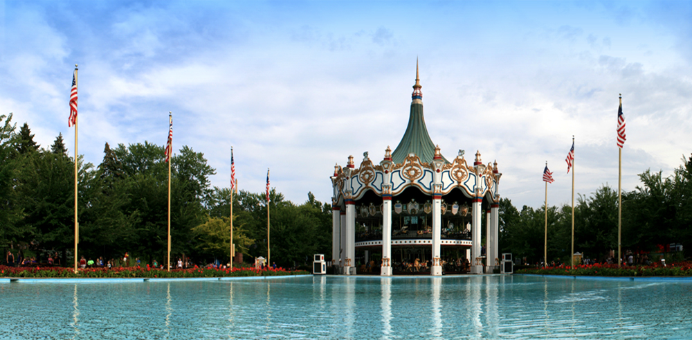
Leaving Hometown Square and passing back underneath the tracks of the Great America Scenic Railway and then weaving around the Columbia Carousel is the most direct way to access Orleans Place. Both Carousel Plaza and this area have matching brick and wrought iron entries.

Orleans Place lies entirely outside the railroad berm which circles the rest of Great America. Again, with the Duell Loop model, the only other way to get there would be to walk through all the other lands first in the opposite direction (counter-clockwise from the entrance). It seems most likely to me that because the way in which Hometown Square is staged, first-time visitors would proceed forward counter-clockwise, thus encountering Orleans Place only towards the end of their day.

For those familiar with the French Quarter, this is the architectural stereotype which comes to mind—the elaborate, rounded-corner ironwork balconies as at the intersection of Royal and St. Peter streets.

As I made my way through, I began to notice that Duell’s designers took a ‘piecemeal’ rather than a ‘holistic’ approach to Great America. This allows for a greater variety of structures with their own subtle motifs, but also creates sort of a collaged effect. The pieces are all from the same kit of parts, so to speak, but there’s no master picture on the Lego box which is being followed.

This first retail block on the left as you enter Orleans Place is a perfect example. The corner begins with the classic Quarter ironwork of a Creole townhouse; again, the most stereotyped visual identifier. This adjoins an American townhouse with stucco finish (painted in garish lavender), then a low shingle roof building which then terminates with more wrought iron and a traditional copper roof.

The individual elements are interesting, and inspired by the New Orleans theme, but just like the architectural amalgamations I found at Cedar Point, they feel off when taken as a single composition.

New Orleans Square at Disneyland, 2008.

Now compare with this photo of New Orleans Square at Disneyland. Everything here is tightly integrated and composed. If we’re talking about spaces which tell stories (and I am) then I’d say this is well-plotted. There are actual “story beats” to each and every facade, and they are all interrelated.

New Orleans Square at Disneyland, 2008.

New Orleans Square was the first new land to open at Disneyland. Walt himself dedicated the land on July 24, 1966 in what was to be his last public appearance at Disneyland before passing away in December of that year. As such he never saw its signature attraction, Pirates of the Caribbean, completed (it finally opened in March of 1967). The New Orleans Square expansion cost as much in mid-1960s dollars as the entire construction of Disneyland cost in 1955—some $17 million.

New Orleans Square at Disneyland, 2008.

Obviously Duell and Marriott didn’t have that kind of money to spend on a single land. But, and perhaps this is unfair, I couldn’t help but compare Orleans Place with New Orleans Square at every turn.

One thing that I thought the Great America designers did effectively, given their budget constraints, was to consider the city of New Orleans beyond simply the French Quarter. Although Disney’s version is dripping with detail and verisimilitude, architecturally the experience is pretty much limited to the Quarter.

The world's largest bumper car floor, Rue Le Dodge, is fashioned as a country manor.

Other attraction queue areas have more of a Spanish flavor, which is authentic to Louisiana but not necessarily what the public would expect.

There are also more generic “cottage” type structures.

I’m not sure if this is a direct nod, an inside joke, or just a coincidence. This ride sign is rendered in a typeface called Rubens, a wood type cut by John F. Cumming released in the 1880s or 1890s. Notable in this context is that Rubens is used extensively at The Haunted Mansion attraction at Disneyland, which resides in New Orleans Square.

Rubens had undergone a revival in the mid-sixties, and the Mansion opened in the summer of 1969. Of the various digital font versions of the typeface, the two most popular—Ravenscroft and Mansion—are based on its Disney park usage.

Count on Six Flags, however, to muck up the original design intentions for any one of their parks. Usually by dropping a massive coaster named after a DC comics superhero right in the middle of things.

What used to be a French Quarter double-gallery house now serves as the entrance, storage lockers, and part of the ride queue for Superman: Ultimate Flight. I had to sneak around a corner to even get this view of it—the obnoxious signage for the ride blocks the entire front of the building.

Then right next door, you have The Dark Knight Coaster, which is in an indoor WIld Mouse style ride in the dark with various effects. Six Flags must have just bulldozed what was here prior, because this “Gotham City Transit” station is nestled right in with the original New Orleans buildings. No connection at all, other than Superman was already living next door.

And then next is a standalone themed cottage selling pizza.

I will say this about Great America. They might not always take the time to design their own themed graphics, signage, and other ephemera, but they do employ lovely historical examples, such as this wheat pasted large format advertisement for Tabasco Sauce.

Mardi Gras

In 2004, Six Flags tweaked the section of Orleans Place which connects with Yankee Harbor and christened it Mardi Gras. I’m not even sure that I’d call it a mini-land, as there are only two rides here among a variety of carnival games. More festive, I supposed? It doesn’t really work.

The architectural interactions are stronger than the original Duell designs from 1976, however. This block is unified almost on the level of Disney’s New Orleans Square, even along the rooflines.

One last Great America element which doesn’t factor in to the Disney Version of New Orleans are the vintage-style marquees in the Mardi Gras area which offer lovely ambience after nightfall. I would suspect the reason is twofold. First, Disneyland’s Crescent City is specifically set in the pre-industrial Antebellum South. The second is that Main Street U.S.A.—set at the dawn of twentieth century and the spread of electrical lighting—has this sort of flourish covered quite well already.

Vintage postcard, Yankee Harbor.

From Yankee to Yukon

Continuing along the Duell loop in a clockwise fashion, you come to the Yankee Harbor area which appears to be themed to a late 18th or early 19th century New England port reminiscent of the Maine coast or Cape Cod in Massachusetts.

Concept painting of the Yankee Harbor area.

Although I enjoy looking at concept paintings for theme park projects, most are inevitably something of a dissapointment. Only perhaps half of the intention of the above rendering ended up being built.

Walking into Yankee Harbor from Mardi Gras, I encountered my first “theme bridge.” I remembered these from the Great America park in California. Apparently the design team felt that a reasonable shortcut to crafting transitions between the various themed lands was to just build a covered bridge and stick a sign with the name of the land on either side.

Yankee Harbor has many more smaller, stand-alone structures than Orleans Place. Many are deliberately domestic in orientation—as if these buildings house the ‘residents’ of this waterfront area.

six-flags-great-america-47.jpg

The quality of signage at Six Flags parks certainly varies. Here the graphic and typographic style is somewhat correct, but tacky and anachronistic in presentation. Obviously no one warped text using Adobe Illustrator in pre-industrial New England.

Cape Cod at Tokyo Disneysea, 2008.

Just as I drew comparisons between New Orleans Square and Orleans Place, Yankee Harbor reminded me strongly of the Cape Cod section of the American Waterfront area at Tokyo Disneysea. Naturally, Disney had more money to spend on their designs—in this case, actually quite more than usual. The Tokyo Disney Resort is wholly owned by The Oriental Land Company, and as such the Japanese invest their own funds, hiring out to Disney for design and operations consultation.

Vintage postcard, Yankee Harbor.

Tokyo Disneysea opened in 2001 at a cost of nearly three billion dollars. So naturally I couldn’t expect the same of Six Flags (née Marriott). But looking at vintage postcards from the park’s opening decade, it’s such a shame that much (if not most) of Randall Duell’s original designs have been altered, degraded, or simply neglected. I couldn’t even find the iconic lighthouse featured on both cards, so maybe it’s been removed?

This is the only connected block that I found in Yankee Harbor, and it demonstrates the same spatial ‘piecemeal’ approach which I saw in Orleans Place. However here the roofs appear to overlap and interlock in more organic ways.

I was surprised by the amount of blacktop and concrete in and around this “seaport.” There are pier pilings at the right edge of this shot, so why not wood plank decking? Based on the images on the vintage postcards I found, it’s possible this kind of detail was originally present, but removed due to wear and tear and never replaced.

Snacks are often found in “shacks,” whether at a Disney, Universal, Cedar Fair, or Six Flags park.

Here a Yankee “house” is joined with an industrial-looking shed, once again showing a ‘piecemeal’ design language (and here not very successfully).

More houses…

…and more shacks.

Vintage postcard, Yukon Territory.

Continuing clockwise along the Duell Loop, Yankee Harbor gives way to Yukon Territory. Although named for the Canadian region, also here is all the romance of the Klondike / Alaskan Gold Rush, interspersed with native Alaskan Iñupiat and Canadian Inuit iconography. Although in 1976 the designers likely called it “Eskimo” (a term which has since been deprecated by these peoples).

Concept painting of the Yukon Territory area.

The concept art features a snowy mountain in the background to the right, and what look like Russian onion domes in the striped style of Saint Basil's Cathedral to the left foreground.

“Theme bridge” number two, this time with carved totems and tacky timber sticks-as-lettering.

I don’t think it’s a stretch to suggest that these totems were probably carved by Midwestern white guys. I’ve been thinking about this kind of stuff quite a bit, but I’m not ready to address it just yet with my posts on Great America. So more on this later.

Epcot’s Canada pavilion, 2007.

These Northern Native vibes really reminded me of some of the carvings and other designs at the Canada Pavilion at Epcot’s World Showcase, Walt Disney World, Florida. Disney at least had the good cultural sense (or budget) to commission the real thing—the wooden totem pictured here was carved by David A. Boxley, an American artist of the Tsimshian, an indigenous people of the Pacific Northwest Coast.

But this time, the scale is grander and more extensive here at Great America. And cheesier, as evidenced by this “Watering Hole” sign.

Compared to Yankee Harbor, where wood seemed lacking overall, here in the Yukon Territory there is lumber galore. And much of it is painted a reddish dark brown for some reason.

Some carved wood type lettering adds the proper Western Frontier trappings.

The same goes for hand painted signage, which is abundant at the DIsney parks, but rarer in the Six Flags or Cedar Fair realm.

Vintage postcard, Yukon Territory.

Were the 1970s actually browner, or was it the cast of the photography? Even today, the Yukon Territory area is awfully brown. Sadly most of the props and much of the signage seen in the above postcard has been removed over the years.

And the propping which does remain—what are sometimes called “tertiary elements” in video game design—is rather thoughtlessly placed. Consider the pairs of skis tacked up on this Old West false front. Would skis ever appear like this in the actual Yukon? Just nailed to a storefront, out of reach?

Such haphazard design ‘decisions’ are decidedly very Six Flags. But this roof structure is a level of building detail which can only belong to Duell’s original designs for Marriott.

The Six Flags additions sometimes feel slapped onto the original structures like bumper stickers, like this “Cartoon Caravan” sign.

Yet by taking a closer look, original details can still be appreciated.

Lastly there are parts of the Yukon Territory area which feel lonely and abandoned. Was this once a retail establishment, or perhaps a crafts demonstration space? I saw more than one of these—a part of the park which was simply shuttered (apparently long ago). This is a lovely false front though, nearly identical to one I saw in Deadwood, South Dakota.

It’s Just Not Fair

At the far back of Great America from the entrance, halfway through the Duell Loop, is the County Fair area. I found this to be the most sparsely designed and generic land in the park. Part of this is probably because here we are in Illinois, in the Midwest, and the theme is, well, the Midwest. In fact, the original name for the area when Great America opened was The Great Midwest Livestock Exposition at County Fair.

Quite a mouthful; no wonder they shortened it.

Concept painting of the County Fair area.

Once again, the vision of the concept art exceeded the grasp of the designer’s actual budget. But here with County Fair I feel it’s actually the smaller details—things which would not have cost much to add, like the patriotic bunting and flags—which are lacking. Disney does more just during their seasonal Fourth of July overlays on Main Street U.S.A.

Here we go again…another “theme bridge.” Unlike the entry to the Yukon Territory, the sign here is well-designed and feels authentic for the setting.

Interestingly, the “theme bridges” are only employed as transitions between lands on the east side of the Duell Loop (clockwise from the entrance to the back of the park). On the west side, there are these arches / gateways.

The typography here is off, and reads more Renaissance Fair than County Fair.

Unlike the “theme bridges” on the east side, these gateways are generic and feature the same style of signage on either side, no matter which land you are facing.

When I say County Fair feels less considered, I mean that it’s as if the designers ran out of time (or money, or both) and started dropping in generic versions of structures which had already been drafted for other themed areas throughout the park. This shack seems to be from Yankee Harbor.

This house looks just like its cousins over in Orleans Place.

And this small eatery has the nondescript “amusement park-ness” of Carousel Plaza, complete with the expected Circus Wood Type look.

Other than a few thrill rides, County Fair is dominated by a food court and countless midway-style carnival games. I’m not sure why, but the area became more interesting as dusk gave way to twilight. I felt the same way at Kings Island—once the Coney Island area emptied out towards the end of the day, there was this beautiful, almost melancholic sense.

Here is the American Eagle, a dual track woodie which opened in 1981 and could be considered the anchor attraction of the entire County Fair area. With rows of popcorn lights moving in sequence, just like the rest of the land, it becomes more kinetic at night. It’s just a shame that the designers of Great America appear to have hastily completed this back part of the park and were never able to fully address its shortcomings in the years following.

Pirates of the Midwest?

If you follow the Duell Loop back from County Fair towards the entrance to the Southwest Territory area, you come across this, well, anachronism. But it’s not just out of time, it’s out of place. It’s out of everything. What do you call some thematic design that just feels like it appeared out of nowhere? I guess I’ll just go with incongruous.

Buccaneer Battle is a generic pirate boat ride featuring small scale effects and interactivity developed by a German company called Mack Rides. which was added to the park in 2009. The elaborate thematic design of the exteriors was executed by a firm called Bleck & Bleck Architects in Libertyville, Illinois. Visually, the attraction does not appear to belong to any one land, but the park guide map lists it as officially part of County Fair.

Unless that county happens to be within the Spanish Main during the 16th or 17th century, it doesn’t wash. I do have to commend Mack Rides here, though. The structural design and finishing touches are very high level, much more so than the typical Six Flags offering. Mack is owned by the same family which owns and operates Europa-Park (the second most popular theme park in Europe after Disneyland Paris), so I’m not surprised by the quality of the ride, along with the design elements that Bleck & Bleck added. Still, let’s be honest. It’s Pirates of the Caribbean on the cheap.

Now that I’ve explored the original lands of Great America, this Spanish Main setting is actually an appropriate segway to the most recent addition, Southwest Territory.

Continued in Part 3.

April 22, 2019 /Dave Gottwald
six-flags-great-america-01.jpg

Six Flags Great America - Part 1: Marriott in the Midwest.

April 06, 2019 by Dave Gottwald

After a rather unengaging six hours spent at Michigan’s Adventure, I had only planned on assigning a single day to Six Flags Great America, just a ferry ride away across the waters of Lake Michigan located in the VIllage of Gurnee, Illinois. But the park surprised me with much more to take in than I anticipated, and I ended up spending two days instead.

Six Flags Great America, satellite view. Click for link. Map data: Ⓒ Google.

Six Flags Great America, satellite view. Click for link. Map data: Ⓒ Google.

A Tale of Two Americas

Seeing the success of Disneyland clones like Six Flags Over Texas and its sequel Six Flags Over Georgia, in the early 1970s the Marriott Corporation sought to expand their core hospitality business and get in on the action. The company wisely took advantage of the coming American Bicentennial and planned two sister theme parks called “Great America” as a tribute to the history of the United States.

Both Great America parks—this one in Illinois between Chicago and Milwaukee, and the other in Northern California near the Bay Area—were liberally sprinkled with the Disney design approach to nostalgia: a narrow-gauge railroad circling the property, vernacular architecture rendered in forced perspective, individually themed lands—it’s all there.

Even a weenie! Rather than a castle at the end of a main street, drawing the public forward, at the Great America parks a double-decker carousel sits at the end of a long pool. In Illinois it’s known as the Columbia Carousel, and out in California it’s known—conversely—as the Carousel Columbia (where it still remains the world’s tallest carousel).

Six Flags Great America 2017 park map.

The California park opened on March 20, 1976 and its counterpart in Illinois followed on May 29. Yet just like Kings Island and Kings Dominion, the layout and design of the sister parks has diverged over the years. I guess it’s like two twins who are born identical, but then develop their own unique characteristics and personality—personhood—as they mature. And even more distinctly so if the twins grow up in different environments.

Six Flags Great America 1987 souvenir park map poster.

After Marriot divested of them to focus on its hotels, the Great America parks went through a series of various owners. Six Flags has owned the Illinois park—in one corporate guise or another—since 1984. The California park went much the way of Kings Island, being owned first by Paramount and then passing to Cedar Fair in 2006. Thus since the 1980s, the changes to each park have been unique, but the focus has been the same—an emphasis on roller coasters and more traditional amusement park rides.

California’s Great America (left) as compared with Six Flags Great America (right). Map data: Ⓒ Google.

In California, Great America has been hemmed in on all sides in the City of Santa Clara by housing developments, business parks, and even a sports stadium. Conversely, in Illinois the park was built well outside Chicago in the Village of Gurnee, which was pretty much in the middle of nowhere back in the 1970s, and still remains somewhat so today. Thus Six Flags America has had ample berth to widen beyond the original park boundaries; California’s Great America, much less so.

Both Great America parks feature an Intamin Gyro tower ride just to the right of Carousel Plaza. The Gurnee park’s version is called the Sky Trek Tower.

Up in the tower there are magnificent views from some 300 feet in the air. What struck me the most was how much more verdant this Great America park is compared with the one in California. There are dense trees surrounding each and every land, and it really adds significantly to the charm of the place.

Original organization of Great America, with “Duell Loop” and central service corridor. Underlay map data: Ⓒ Google.

Thrown for a Loop

Both Great America parks were designed by Southern California firm R. Duell & Associates.

Randall Duell.

Like nearly every creative professional who came to practice thematic design, Randall Duell began his career as an architect but struggled to find work in that field during the Great Depression, so he took jobs for Hollywood movie studios as an art director. He had over 30 MGM titles to his credits, including The Wizard of Oz (1939) Singin’ in the Rain (1952), when he left the business in 1959.

Blue-line site plan dated October 30, 1974.

Duell first collaborated with C.V. Wood and Wade Rubottom on the failed Freedomland U.S.A. theme park in The Bronx, New York before founding R. Duell & Associates in the early 1960s. That park had featured many Disneyland-esque elements which would return in Duell’s subsequent park designs, the first of which was Six Flags Over Texas, which his company developed for Angus G. Wynne. It opened in 1961 and serves as the basis for the Six Flags chain we know today.

Service corridor as seen on a concept painting of the Gurnee park.

Characteristic of his Texas project was Wynne’s desire to ‘one-up’ Disneyland, and one way in which Duell and his design team did that was in proposing a loop instead of a hub-and-spoke model. Duell repeated this device so many times at the parks he designed that industry folks still refer to it as the Duell Loop. In the Great America model, there is a service corridor placed through the middle section which allows the various lands to be serviced without disrupting the flow of guests.

Great America under construction, winter of 1975–76.

Great America under construction, winter of 1975–76.

The original themed areas or ‘lands’ within the design of both Great America parks on their respective opening days (clockwise from entry) were Carousel Plaza, Orleans Place, Yukon Territory, The Great Midwest Livestock Exposition at County Fair (now just County Fair), and Hometown Square. In 1996, Southwest Territory was finally added to the park, outside the railroad berm to the right of the square.

Another tradition borrowed from Disneyland are framed promotional posters on display throughout the park. Unlike Disney, however, here at Great America there is a poster for each land as opposed to individual attractions.

When Disneyland operated under the original A–E ticket system, such posters served to advertise the park’s offerings to guests—especially ones they might overlook. In the era of single-ticket admission, they only serve a commemorative, perhaps nostalgic purpose.

The illustration style for this poster series reminds me very much of those drawn for Knott’s Berry Farm in the early 1980s—it’s painterly but somewhat cartoonish at the same time.

The Orleans Place poster features the Arrow steel coaster ShockWave (1988–2002) and Yankee Harbor one sports Bolliger & Mabillard’s inverted prototype Batman: The Ride which was added in 1992. Country Fair shows the Sky Whirl prominently at front and center, which was removed in 2000. So I suspect these posters were commissioned for Great America’s 20th anniversary in 1996.

As you enter the park at Carousel Plaza, there isn’t much of a theme, other than “amusement park-ness.” The structures resemble traditional boardwalks and midways, like those found at Cedar Point or Coney Island. It’s not unlike the “Victorian Gingerbread” found at many theme parks. And to American eyes, at least, this is all that’s needed.

All signage is rendered in the expected Circus Wood Type look. It’s nice to see graphics like this actually routed in wood and hand-painted, as opposed to the plastic variety found at most other Six Flags and Cedar Fair parks.

Vintage postcard, Hometown Square.

There’s No Place Like Hometown

I’ve visited California’s Great America several times, and it only took the first twenty minutes or so inside the Six Flags version to judge it superior. More of the original thematic design from the Marriott era remains, the landscaping is thoughtful, and the changes and expansions over the years have been well considered and executed throughout.

Concept painting of the Hometown Square area.

All the areas of Great America were thoroughly rendered as concept paintings and illustrations by Duell’s design team, just as the Disney imagineers were accustomed to doing. And also like at Disney, what ended up being actually constructed was a scaled back version of the original vision.

Once you walk around the Columbia Carousel, there are two brick entry points, one for Hometown Square (to the right) and one for Orleans Place (to the left). They appear identical to their California counterparts, and their placement bothered me in the same way—the entrances are not laid out symmetrically, and they’re both outside the railroad berm. In fact, the entire Orleans Place area is outside the berm.

To the right as you enter the Hometown Square area is a page right out of the Disneyland Main Street U.S.A. playbook, although it seemed to my eyes at least that the forced perspective has been executed less skillfully. Paint schemes are both lively and authentic, however, and don’t suffer from a 1990s mall-like, garish genericization as seen on International Street at Kings Island.

I do wonder why Duell’s design team chose only a Town Square, as opposed to the more thematically traditional Main Street model.

One book I refer back to over and over again is historian Richard V. Francaviglia’s Main Street Revisited: Time, Space, and Image Building in Small-Town America (1996). The text explores the genealogy of the American Small Town throughout different regions of the country, and explores the illusions we have in our imagination of these places as filtered through film, television, and theme parks.

Hometown Square, satellite view. Map data: Google.

Francaviglia notes that the Town Square was imported from Europe and took root predominantly in New England. It was also established in the Southwest as a result of Spanish influence. But somewhere in the middle of the country (Ohio, Indiana, and Illinois) the Main Street model became more popular, and this extended through the Plains to the Rockies and eventually to the American West.

Town Square, Disneyland, 2007.

Disney’s Magic Kingdom-style parks do feature a Town Square at the entrance which then connects to the rest of Main Street U.S.A. and leads down to the castle.

Yet there’s an irony here at Great America: Walt Disney brought the Midwestern Main Street from his hometown memories of Marceline, Missouri to Southern California. And Randall Duell brought the Town Square from his design firm in Southern California (where the Spanish had built Zocalos, or Town Squares). to Gurnee, Illinois—the region where the Main Street model originated.

It could just be that doing a small town Main Street in cute Victorian trimmings would have been too direct of a lift from Disneyland, and Duell’s designers—whether creatively or legally—were reluctant to go there.

Which is why I found this particular structure, first on the right as you enter the square, supremely odd. There appears to be a small residence of some kind on the second floor. And even during the day, there is a single lamp illuminated inside.

Walt’s Disneyland apartment, 2007.

To me this smacked directly of Walt Disney’s famous apartment above the Firehouse on Main Street U.S.A. As the story goes, Walt asked for this small residence to be incorporated into the park’s design so that he could stay overnight at Disneyland as the long hours of construction neared completion.

Walt stayed in the apartment frequently, often with family members, in the years after the park opened. Walt Disney passed away in December, 1966, and ever since, a single lamp remains lit during park hours day and night as a sort of ‘eternal flame’ tribute.

I don’t know if this similar presentation in Hometown Square at Great America is a coincidence or not, but there’s the lamp up in the window. I asked a couple park employees what was up on the second story and what the single light was all about, but neither had any idea. Mystery marked: unsolved.

Opposite the park entrance at the far end of Hometown Square is the Grand Music Hall, and it was closed during my visit. This did not surprise me, as live entertainment does not hold the same draw at theme parks that it had in decades past—comedy shows and musical revues used to play to packed houses like this one several times a day. I’m not sure if it’s because we’re in the age of the smartphones and streaming, but these shows simply don’t pull in the crowds anymore. Yet when Great America first opened, this venue was the hottest ticket in the park.

Despite the various restaurant rebranding and vendor turnover which has undoubtedly occurred over the years, most of the structures I saw at Great America were decently maintained and retained their original charm (and paint schemes).

There’s a single-room schoolhouse in the area of the square which appears to function as restroom facilities. At first I thought it might have been a historial relocation or re-creation, like at Knott’s Berry Farm, but I think it was simply designed thematically along with the rest of the park.

Everything in Hometown Square is a sly and subtle mixture of Victorian Gingerbread with Midwestern Small Town elements, and Old Country Ranch with some Generic Americana thrown in. Again, I was pleasantly surprised to find so much actual routed wood type. Although the lettering treatment here screams “Seventies Strip Mall Laundromat,” it’s at least real painted wood, not plastic.

This is the view of Hometown Square from the railroad station near the park entrance towards the Grand Music Hall. Forward and to the right lies the way to Midwest County Fair. Because of the central service corridor to the left, Orleans Place is accessed by going back towards Carousel Plaza and outside the railroad berm.

All Aboard the Great America Scenic Railway

The Hometown Square Railroad Station perhaps best illustrates the differences in design vision and attention to detail which set Disney apart from its many imitators and competitors. From the walls to the roofing to the interlocking cinder blocks and green railings, this feel more like a mobile home park in rural Illinois than a turn of the century train depot.

Disneyland’s Main Street Station, 2007.

Even setting scale aside, the grandeur of Disneyland’s primary railroad depot is obvious. And it’s not just a matter of money—construction costs for both Great America parks was 72.75 million in 1976 dollars (by comparison, Disneyland cost some $17 million in mid-century money). Just like at other Six Flags and Cedar Fair parks, it’s a matter of priorities. And the priority is thrill rides.

And among all the thrilling roller coasters, it is nice that the attraction is here at all. The railroad and two train stations at California’s Great America were dismantled in 1999.

Rather than the custom themed graphics found at Disneyland, the train station features actual antique sign reproductions.

The Great America Scenic Railway is the same narrow gauge as the railroads at Disneyland, Cedar Point, Kings Island, and many other parks throughout the United States. In fact, one of Great America’s former locomotives (c. 1980) was traded to Disneyland, then later relocated to the Magic Kingdom at Walt Disney World, then sold to Cedar Fair, run at Knott’s Berry Farm, and finally returned to Cedar Point in 2010 and operates there today as the G.A. Boeckling.

The railroad ride around the park was relaxing and cool, a result of the lush landscaping throughout. It felt different than either Disneyland (which has varying amounts of foliage and views of backstage areas throughout) or Cedar Point (with the views of Lake Michigan). The ride felt close to Kings Island in terms of being lost in the woods, but the route was far longer.

six-flags-great-america-24.jpg

The Midwest County Fair Railroad Station is of the same basic modest design as the one I left at Hometown Square, though I think it has a better paint scheme.

Unlike the antique reproductions I saw earlier, around this train station are stylized, themed graphics. “For good and reliable service to all Six Flags Theme Parks.”

Walt Disney’s design instincts have been proved right time and time again, and for certain, there’s just something about having a train circling a park. That’s probably why it’s the most oft-copied Disneyland feature found at parks across the country.

Continued in Part 2.

April 06, 2019 /Dave Gottwald
michigans-adventure-01.jpg

Michigan's Mis-Adventure.

March 09, 2019 by Dave Gottwald

After spending several days at Cedar Point and Kings Island in Ohio, I continued my travels through the Midwest and made a quick, nearly half-day stop at what I discovered is the smallest park in the Cedar Fair portfolio—Michigan’s Adventure.

Michigan’s Adventure, satellite view. Click for link. Map data: Ⓒ Google.

Michigan’s Adventure, satellite view. Click for link. Map data: Ⓒ Google.

Peering down from a satellite view, the park looks quite larger than its actual 250 acres. This is because a substantial (5,383 feet, fourth longest in the world) out and back wooden coaster runs the entire length of the parking lot and then some (pictured here along the bottom right edge).

Michigan’s Adventure 2017 park map.

It wouldn’t be a Cedar Fair park without another hyperbolic park map, and scale and proportions are all out of whack as usual. I make it a point to limit my reconnaissance and online research before I visit a new thematic site, as I prefer my initial impressions to be fresh. As such, I wasn’t aware of how ridiculously small Michigan’s Adventure is. So glancing down at the park map as I entered for the day, I thought, ok, plenty enough to do here. How wrong I would be.

Vintage postcard, Deer Park.

A Deer Destination

Like many parks which Cedar Fair has come to acquire, this property began as something quite different.

Vintage advertisement, Deer Park.

Deer Park opened on this site in 1956, and featured a petting zoo (with, you guessed it, deer being on display prominently).

Vintage postcard, Deer Park.

There was also a storybook themed land (similar to Children’s Fairyland in Oakland, California and other such parks across the United States), some small rides for children, and a picnic area.

In 1968, during a decade-long, nationwide scramble to compete with Disneyland which brought forward the first Six Flags parks, the admission gating of Knott’s Berry Farm, and expansion at Cedar Point, a man named Roger Jourden bought the park with the intention of developing it into a larger local attraction.

Jourden dispensed with the deer and started adding more rides, renaming the place Deer Park Funland in 1972 to suggest an amusement atmosphere. He continued to add more rides each and every season. By 1979 the park had a standard Arrow model Corkscrew (the seventh) which is still in operation.

Shiver Me Timbers

Throughout the 1980s and early 1990s, the park continued on in this manner, quietly adding a few new attractions from year to year. For the 1988 season Deer Park Funland was renamed Michigan’s Adventure and gained its first wooden roller coaster, Wolverine Wildcat.

Yet ten years later, for the first time the park landed on national roller coaster radar with the addition of Shivering Timbers. The ride broke records and brought in fans from all over the world. Michigan’s Adventure was finally, somewhat, famous.

The landscaping around the coaster is lush, with foliage suggesting a logging theme (though this is not made explicit by any theming or propping in the station ). Timbers = logging = trees seems to be the extent of the vision here.

michigans-adventure-06.jpg

Even after Cedar Fair purchased the park in 2001, no great efforts were taken to ‘theme-up’ Michigan’s Adventure. It doesn’t have ‘lands’ and never has, so design motifs are sporadic and not cohesive. In and around Shivering Timbers the retail and dining structures carry a generic “woodsman” frontier look, which scans decently as the Northwoods region of Wisconsin as well as Michigan’s Upper Peninsula.

It’s woodsy, there are shingles on the roof…time to cut down a tree, start a fire, and cook some game! But again, I should go easy on the place. Michigan’s Adventure is not a theme park, has never been a theme park, and is not pretending to be one, either.

Here we have the kind of cheesy plastic-molded 19th century wood typography that is stock in trade for Six Flags parks and remains hopelessly stuck in the Jimmy Carter’s only term.

The park’s Timbertown Railway is a cute, scale train ride (smaller than narrow gauge). This is the depot near Shivering Timbers, and it feels much like the station I found at Cedar Point’s Frontier Town.

The typography on the signage here is a more authentic treatment than the “General Store” above, but certainly a contemporary interpretation—it’s from the Letterhead Fonts Foundry (LHF) which was founded in the late 1990s.

At first I assumed this was the same railroad as pictured in the vintage advertisement above, but actually it was only added to Michigan’s Adventure in 2002, just a year after Cedar Fair acquired the park. The track appears to be the same gauge, however.

Rapids All Around

After a relaxing journey out into the the surrounding woods—including a small lake and a tunnel—the train stops at its second depot, the Grand Rapids Junction. Once again, solid 19th century type, though the fonts themselves are of more recent vintage.

As I glanced back, I noticed that this station is even more rustic—less Victorian—than the one I departed from over in the wooded area surrounding Shivering Timbers (the first lift hill of which can be seen here in the distance).

During the 2006 season, Michigan’s Adventure celebrated its 50th anniversary, and for the occasion Cedar Fair added the Grand Rapids water ride. This was a previously undeveloped corner of the park, and probably contains its best-executed thematic design. The structures, rock work, and foliage all work to tell the same story with considered visual literacy.

Since acquiring Knott’s Berry Farm in 1997, Cedar Fair’s designers (or, more likely, their contractors) have been cribbing liberally from that Southern California park’s classic Old West theming as the company has augmented its other properties with renovations of existing attractions, new rides, and even new lands.

Whether it’s a new coaster, shop, quick service food stop, or even a sign, Cedar Fair seems to return to Knott’s for inspiration. This makes sense—it’s the only park, besides Cedar Point itself, which has a rich history to draw upon. I hadn’t noticed this until I visited Michigan’s Adventure, but looking back now, there are bits of Knott’s all over Cedar Point and Kings Island as well.

Case in point, this “RIP ROARIN’ FUN” sawblade is right from the Knott’s Berry Farm playbook. And the type, as before, is from the Letterhead Font Foundry. Again, a late-1800s industrial proprietorship becomes the most natural backstory for a ride conveyance, just like at Cedar Point and Kings Island.

The Grand Rapids ride itself also nods quite directly to BigFoot Rapids at Knott’s, which is actually currently undergoing renovation and retheming and will open in the summer of 2019 as Calico River Rapids (tying it more closely to other attractions in the Ghost Town portion of the park).

Although I didn’t ride it, I observed the “Old Faithful”-style water effects which were quite neat. The queue, load station, and surrounding props were all well designed. I will say though that the sweltering humidity of midsummer in Michigan worked against the visuals here, which smacked more of the Rockies region.

The Grand Rapids area aside, Michigan’s Adventure just didn’t deliver. I was glad to have ridden one of the more noted wooden roller coasters in the United States, but the park is lacking in scope. There just wasn’t enough to do. I planned on staying all day but barely lasted six hours (and this was with a lot of walking around and re-riding attractions multiple times).

I ended my stay with a pleasant lakeside view of the Wolverine Wildcat. Though the lake is artificial, the cool breezes blowing off its surface were certainly real (and welcome, given both the sun beating down and the heavy humidity).

I will say that Michigan’s Adventure did have this going for it—it was quiet, uncrowded, and relatively inexpensive. It just wasn’t the thematic destination I was hoping for.

Next stop: Six Flags Great America.

March 09, 2019 /Dave Gottwald
kings-island-65.jpg

Kings Island - Part 4: Odds 'n' Ends.

March 03, 2019 by Dave Gottwald

One of the more interesting side effects of a theme park having shifted between different owners over the years is the swath of odds ‘n’ ends left behind—the orphaned areas and attractions, conflicting design motifs, abandoned IPs, and renamed lands. And Kings Island certainly has its share.

Oktoberfest on Kings Island 1972 souvenir park map poster.

The Ghosts of Oktober Past

Kings Island opened in 1972 with a Bavarian-themed land called Oktoberfest. Although it still exists today on park maps, you’d be hard pressed to identify it.

Oktoberfest during the park’s first season.

The theme seems appropriate given that this was once the site of the western station for the park’s Von Roll Sky Ride, which was called the Swiss Sky Ride when it first resided at Cincinnati’s Coney Island. Just like at Disneyland, the thematic logic was as follows: gondola / cable car = ski resort = Switzerland. And Bavaria is certainly close enough, geographically as well as aesthetically. Not to mention that Ohio, and nearby Cincinnati specifically, is home to a large Germanic population.

The original Kings Island biergarten.

Here is the park’s “Der Alte Deutsche Bier Garten” at the heart of the Oktoberfest area, sometime after the Sky Ride was removed for the 1980 season; there is no sign of the support tower to the left as seen in the earlier photograph. For years this delightfully designed biergarten served up German gastronomic standards such as bratwurst and sauerkraut, traditional music performers in the requisite lederhosen, and, of course, plenty of beer.

Oktoberfest area on Kings Island 1989 souvenir park map poster.

Oktoberfest area on Kings Island 1989 souvenir park map poster.

Although by the mid-1980s the stand-up coaster King Cobra had been added to the area (the first of its kind in the world to be designed as such), Oktoberfest managed to maintain its original charm. But it wouldn’t last.

Oktoberfest, 1990.

For the first season of the nineties, the Der Spinning Keggers ride was removed. From design through to the name, this Kings Island version of Disney’s Mad Tea Party (commonly just called “The Teacups”) was very Oktoberfest—guests spun about in massive beer kegs. This could be seen as the beginning of the end for the land’s overall theme, which continued to be chipped away at throughout the decade when Paramount owned the park.

Here is the biergarten as it looks today; a completely generic “country cottage” structure surrounded by picket fencing. During the Paramount years, this building was briefly a location in the Bubba Gump Shrimp Company themed restaurant chain. Currently, the closest to German it gets is the sponsor—Budweiser.

As seen from the park’s Eiffel Tower, this is the Festhaus building, which was added between Oktoberfest and International Street in 1982 for the parks’ inaugural “Winterfest” Christmas event as the largest indoor entertainment and dining venue at Kings Island. Offerings were strictly German for many years, but these days it’s all pizza, burgers, and similarly generic amusement park fare.

Frankenmuth’s glockenspiel.

The Festhaus also used to have ornate decorations and signage, in addition to a working glockenspiel clock. Just like I saw in Frankenmuth, Michigan, this kind of clock has music bells and dancing figures that move around in a circular performance (“glockenspiel” literally translates into English as “bells play”). After years of disrepair, the Festhaus glockenspiel was removed for the 2014 season.

Around on the other side of the biergarten is a Mexican restaurant (this area also contains, inexplicably, a Panda Express Chinese fast food outlet; completely out of place, just like I saw in a Frontier setting at Cedar Point). The thematic design is pretty well executed, it just has no place in a supposedly “German” neighborhood.

Nice use of gooseneck-style barn lighting, corrugated metal roofing, and appropriate, vintage typography on the signage. There’s a decent pan-Latin American vibe here, very plantation house. But again, this land is still identified as Oktoberfest on park maps.

And why the Latin American motif? In 1991 an Aztec-adventure-themed Arrow mine train coaster called Adventure Express opened—yes, in the Oktoberfest area, adjacent to Coney Mall. The park’s own official history blog notes the audacious incongruity in all this, saying that the addition of Adventure Express “signaled the first time the park would install an alternatively-themed attraction to a previously established themed area.” My thinking is that the Mexican eatery next door was added to reinforce the ride’s theme, but to the detriment of the original Bavarian theme of Oktoberfest .

Kings Island park map, circa 2000.

Getting in the Zone

During the nineties, the Paramount Action Zone was added right next door to Oktoberfest. This was a move Paramount pulled at all the parks it took ownership of during this period—adding fairly standard amusement park thrill rides under the banner of some of the studio’s action movies.

Top Gun postcard, 1993.

This included the aforementioned Arrow suspended roller coaster originally themed to Top Gun (1993 to 2007), then known as Flight Deck (2008 to 2013) after Cedar Fair acquired Paramount Parks, and finally rechristened The Bat in honor of the park’s original (failed) Arrow suspended prototype for the 2014 season.

Local newspaper article announcing Top Gun.

The theming for Top Gun was originally quite considered. In the April, 1993 issue of Cincinnati Magazine, an article on Paramount’s purchase of Kings Island noted:

The addition of the new “Top Gun” roller coaster—an inverted version of traditional coasters, with the wheels and tracks above the seats, leaving nothing underneath riders except the treetops—was handled the same way. The physical structure—all 660 tons of it—was in the planning long before Paramount. Not so long in advance, though, that Paramount couldn’t jump in and inject its Hollywood twist, hiring John DeCuir Jr. to make the coaster’s boarding station resemble an aircraft carrier. DeCuir was in charge of the design for the original Top Gun movie…

This local television news broadcast from 1993 shows the original aircraft carrier theming of the queue area, along with music and steam effects.

Days of Thunder postcard, 1994.

That same Cincinnati Magazine article quoted a consultant involved in the Paramount acquisition: “You’re going to see a lot of movie theming going into existing rides, and new rides that are orientated and built around future or successful movies that Paramount has released.” And indeed, Paramount’s cinematic additions to Kings Island during the nineties also included a virtual reality ride themed to the (completely forgettable) 1990 Tom Cruise NASCAR vehicle Days of Thunder, in a venue called the Action Theater.

The most recent addition to the Action Zone area is Banshee. This Bolliger & Mabillard (B&M) triumph is the longest suspended roller coaster in the world, and it actually contains a fair amount of theming for a Cedar Fair park. A banshee is a female spirit in Irish mythology who apparently shows up wailing and shrieking whenever a family member dies. The press release at the time called Banshee “the first female-inspired thrill ride” at Kings Island, although I’m unsure what kind of honor that is.

True to theme, the queue area winds through a graveyard with various markers. One of these is an eternal flame in tribute to the prior coaster which occupied this park of the park—Son of Beast. No name, just the defunct ride’s mysterious logo and the date ranch of its operation. I thought this kind of obscure reference was a very nice touch for park history aficionados.

Son of Beast. Wikimedia Commons.

This first wooden hypercoaster—with a steel vertical loop—broke all kinds of records when it opened in 2000. But it was not to last. The ride was plagued with problems, and the loop in particular caused numerous issues; it was eventually removed for the 2007 season. Two years later the ride closed permanently, and the coaster was finally demolished in 2012.

I think the Action Zone needs to go away completely, replaced by some kind of cohesive theme that can include The Bat as well as Banshee (and maybe even the nearby Adventure Express). Perhaps something horror-related? And while they’re at it, the park could restore Oktoberfest to its German roots.

The Inner Limits

There is one last thematic remnant of the Paramount era which I’d like to mention. The Outer Limits: Flight of Fear opened in 1996 as one of two linear induction motor (LIM) launch coasters, the world’s first (the other opened at sister park Kings Dominion).

The ride’s original theme was tied to the classic 1960s science fiction show The Outer Limits, and features an alien spacecraft in an Area 51-like miliary warehouse setting. When Paramount’s licencing agreement expired, references to the show were removed and the ride became simply Flight of Fear beginning with the 2001 season. The UFO theme, however, has remained.

Flight of Fear is completely indoors, and a such serves as sort of the Kings Island equivalent of Disney’s Space Mountain. Unlike the detailed exterior design found at Disney parks, however, the building for the ride is relatively unadorned. The outside of the hangar housing the queue references a bit of UFO mythology—it’s marked with a large 18 (Hangar 18 at Wright-Patterson Air Force Base is supposedly where flying saucer remains and alien corpses were stored after the legendary Roswell crash).

Once through the queue of this Hangar 18, guests “board” the alien ship (a flying saucer design) by walking up a ramp into the interior. The ride loading area is designed to resemble some type of generic sci-fi alien environment.

There are even what appear to be cryogenically frozen alien bodies stored here. I would imagine during the Outer Limits era, there was a more explicit backstory throughout these spaces, possibly tying into a specific episode from the series (which certainly featured its share of creepy aliens). But now it’s just generic “weird.”

The linear induction launch was quite thrilling, and the coaster experience felt very much like Space Mountain. Kings Island has done a decent job of maintaining the alien theme despite losing the originating IP.

The thematic missteps at Kings Island are all due to turnover in owner and management. During the Taft years, there was at least sense of shared vision—something more immersive than the average amusement park, but less so than Disney. Sort of how Six Flags Over Texas began. When Paramount bought Kings Island, they (haphazardly) tried the Universal approach of injecting IP from their film library throughout, with mixed results. And then when Cedar Fair acquired the Paramount Parks in 2006, they brought with them a very uneven tradition of retheming and adding even more thrill rides.

The lesson is clear—for thematic design, consistency means constancy. Kings Island is a beautiful park with a rich history. I can only hope that, in the tradition of recent attractions like Banshee and Mystic Timbers, Cedar Fair remains committed to quality, thoughtful alterations.

Over at KI Central, a forums site that’s been around since 2003 and calls itself “a community that loves Kings Island” I saw a comment that seemed to me to be quite astute. In a thread about the degradation of thematic integrity, a user pointed out that “Cedar Fair doesn’t manage theme parks, they manage amusement parks.” Which is true, and I shouldn’t expect Disney-level design from them.

Yet the near future looks promising: International Street is being completely overhauled and resurfaced for the 2019 season, along with the opening of the new Kings Mills Antique Autos, comparable to the original Les Taxis antique car ride (1972–2004).

Keep it up, Kings Island!

March 03, 2019 /Dave Gottwald
kings-island-27.jpg

Kings Island - Part 3: What Remains of Rivertown.

February 24, 2019 by Dave Gottwald

Although Kings Island today is made up of a variety of themed areas, the last core aspect of the park’s original design which I am going to examine is Rivertown. Sadly, this Wild West equivalent of Disney’s Frontierland (called Frontiertown and Frontier Land during the park’s design phase) has been degraded almost beyond recognition through the park’s multiple owners over the years.

Like International Street, garish paint schemes and contemporary retail tenants have ruined the charm, but at least that area of the park retains its structural (architectural) thematic integrity. With steel coasters towering overhead and Charlie Brown’s Peanuts gang encroaching, Rivertown doesn’t even have that.

Rivertown area, satellite view. Map data: Ⓒ Google.

Go West (Again)

Just as I’ve seen at parks like Cedar Point, adding a venerable Wild West area has been seen time and again as a way to expedite drawing a Disneyland-like audience. It’s almost as if having a “Western Land” of some kind or another is American shorthand for “theme park.”

As is frequently the case, placemaking in this kind of Old West setting is established through the use of fictional proprietorships (more of which I’ll point out below). Based on the photo research I’ve done, I cannot tell if this small rooftop water tower is part of the original 1972 structures in the area. But the typeface treatment—despite evoking a period-appropriate slab serif—feels quite recent in fact.

Rivertown area on Kings Island 1989 souvenir park map poster.

As recently as the late 1980s, Rivertown still retained most of its original Old West thematic charm. On this 1989 souvenir park map poster you can see the extent of the various buildings and winding streets. All the elements you’d expect are here, from the “Saloon” to the “Shooting Gallery.”

Vintage postcard, Rivertown.

That same article in the July 1972 issue of Cincinnati Magazine which I quoted in my first Kings Island post describes a place which

…lives in the mid-1800’s, when the steam locomotive was an important part of local life. At the center of the town are a general store and the frontier train station where the Tecumseh and the Simon Kenton, narrow-gauge steam locomotives arrive pulling coaches.

I’ll return to said railroad in a moment, but I want to first point out what the buildings in RIvertown used to look like, and how they appear now. As you can see in the 1970s postcard above, much of the wood is bare and treated to look aged. The trims of the Court of Games here—which are painted—are rendered in desaturated, dull, and subtle hues.

This is the same block of buildings in 2017. Any bare wood is gone (which, fairly, might have been a victim of weather) and all surfaces take on a more artificial, fiberglassy vibe. Kings Island is clearly trying to go for the kind of cute variety found on Disneyland’s Main Street U.S.A. but it’s just not working. As with at Cedar Point’s Frontier Town, there’s a Baudrillardian simulacra vibe going on here—a copy of a copy; an impression of a remembrance of what the Disney Version is like.

This kind of design treatment is so widespread in the United States that, again, it telegraphs “theme park” quite succinctly, or at least a theme park of the Cedar Fair / Six Flags variety.

I wish I could have experienced the original, bare, desaturated Rivertown from the 1970s, but this is what I found. Here at the games area at least, the structures themselves are intact.

Beverages and The Beast

However, the entrance to The Beast, which opened in 1979 as the tallest, fastest, and longest wooden roller coaster in the world (it still holds the title of longest after all these years) struck me as odd. It’s a vending machine area called “Beast Canyon Cold Drinks.” You sort of navigate around the candy and soda and the route evolves into a queue for the ride. The walkway abruptly ends, with everything to the right fenced off. And that “ENTRANCE” sign looks super tacked on. Something was amiss.

“Beast Canyon Cold Drinks” on Kings Island 1989 souvenir park map poster.

At first I thought this was likely a more recent development. But nope, looking closer at this 1989 park map poster, there’s the same building, nestled up against The Beast coaster station. Tooling around online I discovered that “Beast Canyon Cold Drinks” has always been there, and there’s even a video showing people waiting in front of the building during the ride’s opening season.

The Beast and surrounding area on Kings Island 1979 souvenir park map poster, the ride’s opening season.

Originally there was an actual concession stand here (which also sold beer), not just vending machines, but the queue for the The Beast did not run through it. As shown above on the opening season’s park map poster, there used to be a path alongside to the right of “Beast Canyon Cold Drinks” and what appears to be a block of assorted mining town structures. That was the ride’s original entrance.

The logo for The Beast is wicked cool, and remains pretty much the way it looked when it was first unveiled back in 1979. It was designed by a Cincinatti ad firm, Lawler Ballard Little, and actually won an award from the New York Advertising Club. This sign is off to the left side of “Beast Canyon Cold Drinks” and functions as sort of a photo op.

The original, much larger, logo sign for The Beast.

But I also discovered that this is not the original sign—it’s a smaller and less detailed version of what used to be displayed more prominently out in front of the ride’s queue entrance. The original featured real chains and dimensional lettering that appeared to burst off the wood planking.

Vintage postcard, The Beast.

Another sign near the original queue entrance once carried a warning from the president of the “The Little Miami Amalgamated Mining & Minerals Co” providing some backstory for the ride, pictured on the above postcard from 1981. Here is this text:

PUBLIC NOTICE: Help is urgently solicited!

Due to the increasing occurrence of mysterious noises, inexplicable tremors, and vicious acts of vandalism within these premises, it has become necessary to suspend the normal operations of this company.

Although the cause of this evil phenomena defies identification, authorities agree it is surely the work of some demonic creature of prodigious size, which for now can only be designated as: THE BEAST

LET THE FOOLHARDY BEWARE! This so-named Beast appears to be very much alive and intent upon conquering all who would oppose him. Nothing of the imagination would be able to inflict such terror upon the human soul.

IT IS WITH UTMOST URGENCY that the Management entreats all civic-spirited persons to assist it's loyal employees in the ongoing effort to subdue this disruptive scourge and restore order to the community.

ALL VOLUNTEERS will kindly apply by entering through the employment office. (At times it may be necessary to await recruitment at the observation area to the left of the office building.) Thank you, and may the Lord have mercy!

CHARLES J. DINN President
The Little Miami Amalgamated Mining & Minerals Co.

Kings Island 1978 press kit announcing The Beast.

So the coaster actually had a fairly cohesive theme when it opened—that of a haunted mine!

Playing on the Kings Mills region for which the park is partially named (although Kings Island is actually just to the south, near the town of Mason), the queue and station building for The Beast was designed as an ol’ timey mill, complete with an operating water wheel and all the appropriate accessories, “adjacent to a small lake.” There were also mining implements and a small mine entrance.

The queue for The Beast during its first season.

This still from a local news broadcast shot during the ride’s first summer shows that small lake which was originally part of the theme of the The Beast as a mill operation. The 1979 souvenir park map above also clearly shows this body of water, which was once host to Kenton’s Cove Canoes and Shawnee Landing. Later part of this land was used briefly by The Bat, and since 1987, Vortex.

Here is a good view of the original water elements which were a part of the ride station. Today this entire part of the queue is fenced off—there’s just a wall of wood planks along the left side of the line.

The queue at Big Thunder Mountain Railroad, Disneyland, 2007.

The sluice structure in particular reminds of the elements in the queue at Disneyland’s Big Thunder Mountain Railroad, a mining operation-themed roller coaster type ride which opened some six months after The Beast in September, 1979.

In this early photograph the mine entrance diorama is clearly visible, complete with a small track and ore car.

The lake was drained in 1987 as the pump and wheel elements in the station building picture above had not worked in years, leaving the body of water stagnate. This also facilitated the introduction of an accessibility ramp, which re-routed the exit.

GhostRider at Knott’s Berry Farm, 2007.

Knott’s Berry Farm borrowed a number of these design elements for their own classic wooden roller coaster GhostRider which opened in 1998. The queue and station are themed to a mining operation, with the same sort of propping, mine diorama with ore car, etc. Everything is more elaborate than at Kings Island, but the basic idea is the same—if you’re going to have trains of small cars (a roller coaster) depart from a large industrial shed and travel on a wooden superstructure over hills and through tunnels in an Old West setting, what does that sound like? Some kind of mining operation. Or perhaps a lumber mill (more on this in a moment).

And as Kings Island and Disneyland had established some two decades before, the idea of a haunting—of a spirit causing the trains to run out of control—adds the appropriate amount of drama. Unfortunately, this original theme for The Beast has long since been patched over and forgotten.

The Diamondback Bites

What changed everything about the entrance and queue for The Beast, disrupting its original theme as a haunted mill and mining operation? A massive steel hypercoaster designed and built by Bolliger & Mabillard (B&M) called Diamondback, which opened for the 2009 season.

Diamondback under construction in 2008. Eddie~S/Flickr.

You can see here while Diamondback was under construction that there used to be a sort of midway lined with trees leading up to the queue for the beast. That’s where the original logo sign was. From the accounts I’ve read online, fans are nostalgia for this original entrance, feeling that it added a forbidding vibe, and heightened anticipation for the coaster. None of the tracks and trains of The Beast could be seen from this wooded area. It must have looked even cooler in the dark of night.

Compare with this picture of nearly the same vantage which I took from the observation deck at the top of the park’s Eiffel Tower.

One of Diamondback’s helix elements cuts back into that part of Rivertown, so all the trees had to be torn out. Here are the stumps during the coaster’s construction.

The Beast entrance, satellite view. Map data: Google.

The entrance to The Beast was rerouted through the somewhat incongruous “Beast Canyon Cold Drinks” building, and the original entrance was fenced off and became a backstage area.

I understand the addition of Diamondback, as Cedar Fair prides itself on the biggest and best coasters. The logo and signage are pretty typical for the Six Flags / Cedar Fair interpretation of “Old West Thrill Ride.” The steel track as a snake’s forked tongue is a nice touch, although the orange gradient lettering is very SNAP INTO A SLIM JIM. Yet, truth be told, the queue area and station have all the requisite trappings—corrugated metal roofing, barn lighting, signs on distressed wood planks, etc.

Where Diamondback throws a wrench in the thematic design of the Rivertown area is with both materials and scale. You can’t unsee those massive support beams sprouting up at every odd angle in and around the quaint country cottage shacks. As such, any attempt at immersion is shattered beyond repair.

Silver Bullet looms over Ghost Town at Knott’s Berry Farm, 2007.

This very same visual disruption can also be seen at another park in Cedar Fair’s portfolio—Knott’s Berry Farm. The first major thrill ride added after the company acquired the park, Silver Bullet opened in 2004 and has dominated the skyline of three themed areas—Ghost Town, Fiesta Village, and Indian Trails—ever since. The construction of this steel inverted coaster (like Diamondback, provided by Bolliger & Mabillard) required that many historic structures at Knott’s—including a church—be removed or relocated.

Wood coasters, by contrast, are made of the appropriate materials for the Old West setting, and don’t interfere with the overall scale. They also present well as mining, milling, or lumber (getting to it) operations.

Mystic Timbers

So appropriately, the latest addition to Rivertown is another wooden coaster, Mystic Timbers, which opened for the 2017 season. What’s nice to see is—perhaps to make up for the losses over the years to The Beast—this attraction packs a ton of thematic design into its queue, station, and even on the ride itself.

Much like its older cousin, The Beast, Mystic Timbers makes wonderful use of the heavily wooded terrain around the park’s edges. One thing Kings Island did right was to purchase far more land than they actually developed for the 1972 opening. As such, over the years they’ve been able to subtly expand into the forest periphery. The coaster whips through the trees and changes elevation multiple times, crossing over train tracks as well as water features.

Once again, a fictional industrial concern (as I’ve seen at Cedar Point and elsewhere here at Kings Island) forms the backbone of the theme for Mystic Timbers. Since The Beast had already laid claim (pun intended) to a mining operation theme (even though today you wouldn’t know it), this time it’s a lumber company (I told you I’d get to this), or “Co.” in Old West Speak.

I was confused to see “Miami River” here in Ohio (as I think of Florida) but as it turns out the Great Miami River runs through southwestern Ohio and Indiana and is named for the Miami tribe who are one of the local Native American groups who speak Algonquian. I subsequently discovered that Miami, Florida is of no relation, and that state’s Miami River is named after the Mayaimi people.

See, roller coasters can be educational.

The layout of Mystic Timbers is terrific and makes great use of the terrain. What sets this coaster apart from others at Kings Island, however, is the finale. Although I was unable to photograph it on the ride, when the train completes its course and returns to the station, it stops first inside a warehouse space.

Don’t Go in the Shed

I can’t really describe what goes on, so here’s a video clip. There are audio-animatronics, digital projections, surround sound, and light and smoke effects. It’s pretty nifty, and takes the “haunting” aspect of the original theme for The Beast and brings it into the twenty-first century. However I don’t think they properly built suspense for it throughout the queue area or in the station loading, so coming as it does right at the end of a traditional wooden roller coaster experience, it does feel tacked on; an afterthought.

Rivertown during the 2017 season. Underlay map data: Ⓒ Google.

All Aboard the Kings Island & Miami Valley Railroad

As I’ve looked at elsewhere, if you were making additions to your park—or developing an entirely new project—in order to compete with Disneyland in the 1960s and 70s, one of the required attractions on your wishlist was a narrow-gauge railroad.

So naturally, Kings Island opened with one. Named after the aforementioned Great Miami River, the Kings Island & Miami Valley Railroad is a charming line which meanders through the backwoods at the southern edge of the park. There is a station stop at the adjacent Soak City waterpark, so there were plenty of folks with swimwear on looking to get wet for a bit and them come back to Kings Island’s coasters.

I want to point out the obnoxious Coca-Cola advertising on the Rivertown station, however. The entire interior has been stripped of whatever 19th century theming and props it was originally adorned with, and now it’s a red and white Coke retail space. At least they’re using the old-timey script logo, and not the modern one. Still, yuck.

The park’s railroad maintains two working locomotives. There is the #12 engine, nicknamed the "Kenny Van Meter" and the #19 engine, pictured here, which carries the nickname the "Lew Brown." Both are powered by propane and are 2/3 scale replicas of the Western & Atlantic Railroad #3 General, which apparently became quite famous during the Civil War.

Why is the Rivertown depot noting a township called “Losantiville?” That’s actually the original name of nearby Cincinnati, going back to 1788.

Most of the ride was charming (and unlike at Cedar Point, in the shade), but just like in Rivertown proper, the massive steel presence of Diamondback intrudes from time to time.

The forest made the difference—such a lovely, cool, relaxing trip. It’s no wonder the park’s railroad, per total rides, is the second most popular at Kings Island (over 50 million and counting).

Vintage postcard, Kings Mills Log Flume.

Flumes from Island to Island

My last stop in Rivertown was the park’s Log Flume. Just like The Beast, I was excited to see it given its history. And just like The Beast, I was disappointed at what had become of its theming over the years (yet there is actually some redemption at the end of the tale).

The original log flume Race for Your Life at Cincinnati’s Coney Island.

Race for Your Life was one of the original attractions which made the move from Cincinnati’s Coney Island. They sort of had to move it, because this standard Arrow log flume model cost half a million dollars to install in 1968 (a fortune at the time).

To fit with Rivertown’s 19th century pioneer setting, the ride was christened the Kings Mills Log Flume. As you can see by comparing this vantage with the Coney Island photo above, the basic structures are different, but the features like the waterwheel and the flume’s route are retained. The western trappings also appeared dialed back in the new installation; the roof planks of the original are uneven, for example.

For the second season at Kings Island (1973), a second Arrow water ride—a variant called a hydroflume—opened in the back corner of Rivertown. Kenton's Cove Keelboat Canal lasted through the 2000 season. This photo shows the ride sometime in the 1970s, before The Beast had opened next door to the left.

For the 2001 season the following year, Rivertown took a sizeable thematic punch to the stomach. The Hanna-Barbera Land (which Kings Island opened with) was re-themed as Nickelodeon Central at the behest of the park’s Paramount owners. Parts of Rivertown were annexed, including the log flume, now called The Wild Thornberry’s River Adventure, based on a television series which ran on Nickelodeon for several years.

But the retheming didn’t end there. After Cedar Fair acquired the park, they slowly eased the Nickelodeon properties out and introduced Charlie Brown and the Peanuts gang. The Peanuts?

In 1983 Camp Snoopy opened at Knott's Berry Farm, and upon buying that park in 1997, Cedar Fair found that the Peanuts license came with the deal. Cedar Fair eventually extended this arrangement and brought the popular Snoopy and Friends to its other parks across the country. So it was only a matter of time until they set up shop at Kings Island.

The once proud Kings Mill Log Flume became Race for Your Life Charlie Brown in 2010. The theming is now cheeky and cartoonish, but also colorful and fun. I’m just disappointed that, for one, the ride is no longer part of Rivertown, and second, that it’s not themed to an actual pioneer log flume anymore.

What’s wild about the name, though, is at first I assumed it was a tribute to the original Race for Your Life at Cincinnati’s Coney Island. But nope. There’s actually a 1977 feature-length animated film called Race for Your Life, Charlie Brown in which the gang goes to summer camp in the wilderness, and they run in a river-raft race. Which means what I thought was just an IP lazily slapped onto an aging log ride turned out to be spot-on. So although I’m personally disappointed, kudos to the designers at Kings Island for nailing this.

Rivertown at Kings Island is—from a thematic design perspective—a land of abandoned visions and contradictory elements. Some things to love, some to like, but mostly “meh.” I’ll conclude my disappointment with this House of Coca-Cola, which sort of sums things up.

Continued in Part 4.

February 24, 2019 /Dave Gottwald
  • Newer
  • Older

All original content on this site © 2007—2025 Dave Gottwald.
All photography which is my own is licensed under Creative Commons Attribution-NonCommercial 4.0.
This means you are free to share and adapt my images for non-commercial purposes only.