Worlds of Fun - Part 1: A Tale of Two Gates
Worlds of Fun, located in Kansas City, Missouri, was something of a destination of convenience. I had purchased an annual pass for all the Cedar Fair parks for my planned multi-day trips to Cedar Point and Kings Island, and I was looking for other parks owned by the chain which I could factor into my return drive.
To that list I added Michigan’s Adventure and Valleyfair just outside Minneapolis. Worlds of Fun also happened to be close enough along my way, and allowed me stop by Walt Disney’s childhood home of Marceline, Missouri as I came into town.
Again, my approach is to visit these places “fresh” and to not do much in the way of research ahead of time. All I knew was that the park opened in the early seventies, had geographic themes, and was scooped up by Cedar Fair in the mid-nineties.

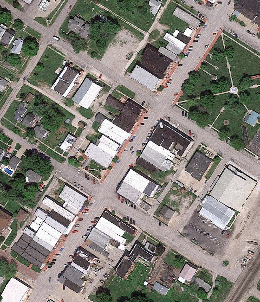
Worlds of Fun, satellite view. Click for link. Map data: Ⓒ Google.
As evident in this satellite image, Worlds of Fun is lushly landscaped, and I found this to be one of the park’s strengths, both as visual charm and as relieve from the summer humidity of Kansas City. The park was designed by Southern California firm R. Duell & Associates, who also developed Six Flags Over Texas, the Great America parks for Marriott, and many other such developments.
Worlds of Fun 2017 park map.
What would another Cedar Fair park be without a hyperbolic map design? As usual, proportion (particularly the heights of various attractions) is played fast and loose. The park also appears to be far less lush than it actually is.
Worlds of Fun 1973 souvenir park map poster.
Contrast that with the delectable illustration style of the park’s maps from the early years. So rich you can almost taste it. And so green! The orientation of this representation is also very, very different from today’s park maps (something I’ll get into).
Worlds of Fun original hot air balloon marketing.
Know What I Mean, Verne?
Worlds of Fun was the brainchild of Lamar Hunt (noted professional sports icon, founder and owner of the Kansas City Chiefs and his business partner Jack Stedman. The meta-theme for the park upon opening was the epic motion picture Around the World in 80 Days (1956) which was adapted from the 1873 Jules Verne novel of the same name. The plot that drives the film is a wager between a rich Victorian Englishman, Phileas Fogg, and four fellow members of his private club that he can circumnavigate the globe in eighty days. Despite my love of Verne (especially Twenty Thousand Leagues Under the Sea and its 1954 Disney film adaptation) this struck me as odd. I’d never seen this film—in fact, I’d barely even heard of it. But apparently it was nominated for eight Academy Awards and won five, including Best Picture. Since the park opened in 1973, some fifteen years after the win, this must have felt like a safe bet by the park’s investors and designers; most opening day guests would surely remember the film.
The original logo for Worlds of Fun features a hot air balloon, as Fogg begins his journey by departing from Paris in one. Since no such balloon appears in Verne’s source novel, this iconic usage links the park explicitly to the Oscar-winning film adaptation.
We chose the large, multicolored ascension balloon for our symbol because it represents fun, adventure and travel reminiscent of the movie, Around the World in 80 Days. These are the things we want Worlds of Fun to represent. — Jack Steadman, 1971.
Worlds of Fun original logomark.
If the typeface here feels super early seventies, well it is. And if it further reminds you of The Partridge Family (1970–74), then good eye. The custom lettering for the original Worlds of Fun wordmark is based on the same Art Nouveau script used for the titles of that show: Kalligraphia. Although first cut in 1902 by German type founder Otto Weisert, Kalligraphia experienced a huge revival when it was converted to phototypesetting in the mid-sixties.
The Partridge Family opening title card, 1970.
That’s why even today we associate this script with hippies, Woodstock, and, well that Partridge Family titles sequence. Many of those German Art Nouveau faces came back in a big way in the phototype era, and have communicated the seventies ever since. The wordmark for a nineties television take on the decade, That 70s Show, was set in another such face designed by Otto Weisert: Arnold Boecklin.
Making an Entrance
As I approached Worlds of Fun from the parking lot, I was struck by the overall grandeur and compelling design of the entry plaza. It felt brand new, and in fact, it was. When I visited the park in July of 2017, this new gate structure had just been unveiled for the season. The entire plaza and its buildings were executed by Bleck & Bleck Architects of Libertyville, Illinois. The firm had already designed several projects for Six Flags Great America in their home state prior to being hired by Worlds of Fun.
Old Billingsgate Market. Bill Rand/flickr.
What’s surprising to me is that the design actually reinforces the park’s original theme; the opening setting for Around the World in 80 Days is London. As the firm notes on their website:
The entrance gate’s design was inspired by European architecture that followed the industrial revolution. We took cues from London’s Billingsgate Market, designed in the Italianate style in 1875 by City architect Sir Horace Jones.
I also loved the large iconic hot air balloon statue placed prominently in the center of the entry plaza. This was a smart marketing move, as Bleck & Bleck explain that “a colorful new hot air balloon structure provides the perfect backdrop for your first social media image of the day.”
Original parking lot balloon.
In the early years, a similar (much less detailed) balloon once stood as guests approached the Worlds of Fun parking lot in their cars. So despite the park’s name being rendered in the more generic Cedar Fair chain style, this is still a wonderful touch and an appropriate nod to the park’s history.
Right after walking through the new plaza and gate, however, there are immediate thematic collisions. Something doesn’t quite feel right. In fact, “Plaza Gifts” used to be a more nondescript arcade before being repurposed as a convenient souvenir stop on your way out of the park after a long day.
Worlds of Fun 1997 souvenir park map poster.
This is because since opening day in 1973 until the late nineties, Worlds of Fun had two park entrances, shown here in the bottom left and right corners of this map. The original main park entrance plaza, lower right, was served by trams from the parking lot. The secondary “back” entrance, lower left, was accessed on foot. It was secondary in consideration, and thus secondary in design and presentation. Just a back door, a quick way to get to the parking lot (and avoid potentially long lines for the tram).
Worlds of Fun, original primary park entrance.
Americana Plaza
Worlds of Fun opened with the following lands suggesting locations visited in Around the World in 80 Days: Americana, Europa, Orient, Africa, and Scandinavia. As the park was designed by Randall Duell and his team, these lands are organized around his Duell Loop model, with backstage areas located in the middle.
A sub-area was added to Americana in 1976 called “Bicentennial Square.” Two seasons later “Aerodrome” followed, also an addition to Americana. This became "Pandamonium!" in 1987, then a decade later was transformed into Berenstain Bear Country. The bears only lasted three seasons, until this part of Americana became Camp Snoopy for the 2001 season after Cedar Fair purchased the park. It was subsequently fleshed out and expanded as Planet Snoopy a decade later.
The primary park entrance in 1973 was at Americana, being that you “began” your global tour here in the United States, and then “navigated” to other more exotic locales. The geography of the rest of the original park layout roughly makes sense, as Africa is the furthest from this main entrance.
Vintage postcard, S.S. Henrietta (1973–1998).
The ticket booths for Worlds of Fun at this main entrance sat just outside one of the park’s three ships (all of which have since been removed). Two of these ships were actually constructed by MGM and used in film productions—Cotton Blossom, a sternwheel paddle boat built for Show Boat (1951), and Victrix, a full scale four-masted schooner best remembered from All the Brothers Were Valiant (1953). Both were purchased at a backlot auction in 1971 along with other props used in the theming of Worlds of Fun.
I thought this was strange, as Around the World in 80 Days was produced by United Artists, not MGM. But I guess they weren’t selling off anything interesting that year. Thus this third ship, the S.S. Henrietta, is only a copy of the ship which UA built for the film. And it’s a very loose interpretation at that.
Promotional still for Around the World in 80 Days.
Here is the Henrietta as it appeared in the film.
Vintage postcard, original Americana main park entrance (1973–1998).
And here’s what was built for Worlds of Fun.
Vintage postcard, original Americana plaza.
Upon having their tickets taken and either cruising around or directly across the deck of the S.S. Henrietta via two planked walkways, guests originally encountered Americana Plaza. From the promotional and souvenir literature I’ve tracked down online, the idea was for guests to experience an early twentieth century Kansas City. From a 1973 Worlds of Fun brochure:
Your journey begins as you cross the gangplank of the S.S. Henrietta, Jules Vern’s [sic] famous steamship from “Around the World in 80 Days.” From there you’ll travel back in time to the rambunctious frontier and the gaslight gaiety of old Kansas City.
Because of the removal of the S.S. Henrietta and the Americana entry in 1998, guest orientation to the plaza today is essentially backwards. It’s sort of like only being able to walk down Main Street USA in reverse. As such, I really had no idea what I was actually looking at, emerging from behind the Cinnabon location pictured at the far left from the Orient area.
The architectural details appear to have been futzed with too, and sport garish paint schemes that scream “late nineties outlet mall.” I couldn’t find any historical documentation for the plaza being called “Front Street” so this is likely a newer designation.
At the park’s primary information booth I was able to chat it up with some young cast members about the changes to Worlds of Fun over the years, and the attractions which have been retired.
Worlds of Fun park guide maps, 1998 season (top) and 1999 season (bottom).
Among the things I learned was that the original entrance plaza area was converted for the 1999 season into the queue and grounds for a gasoline go-kart ride, Grand Prix Raceway. This lasted until 2013, and the following year a Mondial Windseeker swing ride called Steelhawk opened in its place (having been relocated from Knott’s Berry Farm after two incidents forced its closure).
This standalone Coca-Cola location was built in 2014 approximately where the S.S. Henrietta used to be. It was formerly the ticketing location for the Grand Prix Raceway which utilized some of the Henrietta’s original framing. These last remains of the ship were bulldozed completely to make room for Coke.
All of this is to say that the park’s layout is confounding for today’s guests. The S.S. Henrietta and Americana Plaza were designed to set the stage for a tour around the world (in about 8 hours), but now we come in through the back door and start in Scandinavia (which wasn’t even visited in Around the World in 80 Days) with options to head into Africa or Orient. Americana gets encountered last, and is now the “back” of the park. It’s quite a jumble. I’ll detailed these other themed areas next.