Worlds of Fun - Part 2: Around the Worlds in (About) Eight Hours.
As I mentioned in my last post, Kansas City’s Worlds of Fun was inspired by the Oscar-winning film Around the World in 80 Days (1956). As such, the themed areas or “worlds” are Americana, Europa, Africa, Scandinavia, and Orient. From here I’ll detail each land in the order I found them during my visit.
Scandinavia
Because of the removal of the park’s Americana gate in 1998, the first “world” guests have encountered since is actually the Scandinavia area, at what was once the rear of the property. This is what I first walked into after coming through the newly designed main gate. As described in the original 1973 Worlds of Fun souvenir guidebook, this is Scandinavia:
Enjoy the Ski Heis Sky Ride. The sailing ship “Victrix,” a three-masted man-of-war schooner which sailed the high seas in many Hollywood movies, has been reconstructed as a cannon firing range. The Viking Voyager is a flume ride through the Fjords of the North Sea. Visit the Alpine Animal Village—a petting zoo for all ages. Clap your hands and stomp your feet. You won’t be able to stay in your seat as you enjoy the musical review in the giant Tivoli Playhouse. Take a dipping, diving ski slope ride down the Schussboomer.
Vintage postcard, original Scandinavia area.
Sounds exciting, right? Unfortunately, very little of this original, fairly detailed theming remains today. In fact, the only thing the above photograph has in common with today’s Scandinavia is the dense trees in the background.
Vintage postcard, Victrix (1973–1993).
For many years, guests could fire small cannons from the deck of Victrix at targets floating in the lake. By the late eighties the ship had thoroughly deteriorated and much of its wooden structure was rotted. Victrix was thus scuttled and removed in 1993.
There are still themed pockets of woodwork in and around where the ship was docked for so many years. This small structure now serves as a smoking section and is home to a Coke machine.
Other elements are tied to a Nordic aesthetic of the area but in a cheesier, more carnival fair way. Sea Dragon (added in 1994) is your classic “large swinging boat” ride.
Vintage postcard, Sky Hi (Ski Heis) headed towards Scandinavia (1973–1987).
The signature attraction for Scandinavia remains however—a classic Arrow log flume ride called Viking Voyager. I was actually impressed with how well the queue building has been upkept; the paint looked relatively shiny and new. And the lettering works, despite being pretty seventies.
What’s so cool and unique about this log ride is that, well, there aren’t any “logs.” As the Worlds of Fun website notes, the boats are themed appropriately and “armored and adorned in the style of Vikings ships that sailed the Scandinavian seas.”
Viking Voyager in 1973.
The original boats were adorned with dragon heads affixed to their bows, but in 1993 (the same year Victrix was destroyed) they were replaced by brightly colored, headless boats still in use today. Fans speculate it was due to weight or perhaps they obscured guest faces for on-ride photos. Either way they appear to be missed.
The rest of the Scandinavia area is a mishmash of some decently designed, freshly painted buildings. And a bunch of stuff which just doesn’t fit at all.
No attempt whatsoever was made to integrate Cedar Fair regular Chickie & Pete’s. At both Cedar Point and Valleyfair I found the location of the chain restaurant to be more or less appropriate (in either an Americana or Old West setting). Here it’s been dropped from the sky into a Nordic area.
At least the trimmings and colors here are pretty good. But pizza in Norway?
Other retail locations and eateries throughout have been somewhat genericized, though you can still spot a bit of Nordic-style trim at the apex of this roof gable.
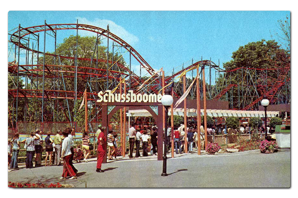
Vintage postcard, Schussboomer (1973–1984).
Long since removed is this Schwarzkopf “Wildcat” model coaster, Schussboomer. That routed blackletter sign is fantastic; I would have loved to have seen it in person.
Africa
From Scandinavia I continued on, underneath a railroad trestle. And things began to get cheesier. However, from the 1973 Worlds of Fun promotional literature, you’d have assumed they were going for authenticity:
Enjoy an African Safari where you will explore the deepest corners of the African Continent. Unknown excitement lurks behind each bush and boulder as you steer your jeep along the African Safari. Zigzag with blinding speed through jungle trees on the Zambezi Zinger, one of the world’s tallest and fastest rides. Test your marksmanship in the Big Game Hunt.
As with Scandinavia, most of this is long gone. The “zebra-striped jeeps” of The Safari only lasted five years. Zambezi Zinger, a much beloved roller coaster, made it all the way to the late nineties (more about this ride in a future post).
Many of the structures are simply country shacks painted in bright colors. There is an aura of generic “tribal culture” throughout—obviously nothing like the attention to detail you’d find at Disney’s Animal Kingdom. It’s probably more similar to San Diego Zoo Safari Park or Busch Gardens Tampa Bay.
Just around to the left after entering the Africa area from Scandinavia is now Prowler, a fantastic wooden coaster from Great Coasters International which opened in 2009.
Typographically, wherever and whenever “Africa” is expressed, you tend to find the inline variant of the wood type Neuland, hand-carved in 1923 by German Rudolf Koch.
Although I’d like to blame Jurassic Park (1993), well before that franchise’s logo came along the face had a long history of evoking the “Dark Continent” and other jungle-like settings, and these designs are culturally problematic (to say the least).
I was disappointed in the theming for Prowler. Although wooden roller coasters typically don’t need much (at least when they’re in a Western setting), the load station has some tropical tin roofing and that’s about it. They could have done more, possibly suggesting a mining operation or a jungle tour company.
Elsewhere in Africa, Worlds of Fun isn’t shy about making connections with Jurassic Park. In this case, however, they got the typography wrong. This isn’t Neuland, but some handpainted Lithos which was designed by Carol Twombly in 1989 and is based on Ancient Greek letterforms. To the layperson it resembles Neuland a bit, and thus shares its problematic stereotyped past.
The jungle theme continues towards the far back of Worlds of Fun. Mamba (1998) is a steel hypercoaster which faces Oceans of Fun, a companion water park that opened in 1982. Mamba is the younger sister of Wild Thing (1996) at Valleyfair and Steel Force (1997) at Dorney Park; all three have a very similar layout and general specifications.
The load station for Mamba was inexpensive (not surprising for a Cedar Fair park), but also subtle and kind of clever (which is surprising). The Victorian metalwork and glass skylights really reminded me of the famed Crystal Palace at the Great Exhibition of 1851 in Hyde Park, London. Given the colonialist flavor of both the exhibition and that era in general, this makes sense for a coaster named after a species of extremely venomous snake supposedly set in the jungles of Africa.
The rest of the Africa area includes some Moroccan and Egyptian stylings—really terrible stuff—but I’ll be looking more closely at that in my next post.
Europa
Moving along, the area in about the center of the Worlds of Fun property has a European theme. As the 1973 marketing copy describes:
Ride the Le Taxitour where guests will drive antique French Taxis along beautifully landscaped hillside roads. Arrive at Moulin Rouge, a 300 seat indoor theatre, and be treated to a musical travelog show. Whirl like a windmill on the Flying Dutchman. Ride der Fender Bender—the bumper-crunching autobahn. Stroll the tree-lined promenade with its brightly colored shops.
As with many themed lands representing “Europe” at parks around the world, bits of national iconography are carved out. This appears to be the “Italian” district. No rides, just a (closed) pizza place.
As I’ve seen at other Cedar Fair parks, Coca-Cola tends to set up shop no matter what the theme of a particular area happens to be and where its setting is. Although there is an appropriate irony here at Worlds of Fun—nothing is more American than Coke, yet you find it all over the world in just about every culture. Disney handles this kind of sponsorship with greater authenticity; for example, at Animal Kingdom the Coca-Cola logos are rendered in the actual languages in which you’d find them. Not so at Cedar Fair.
Just like at Cedar Point (and now again at Kings Island), Worlds of Fun has an autopia-style, drive-your-own car ride. Originally there were two such rides at the park, the other being the aforementioned The Safari (1973–1978). But Le TaxiTour is still here. The queue building features an Eiffel Tower-style roof element, which reinforces the cheesy pun of the ride’s name (the landmark is called “tour Eiffel” in French).
The vehicles are styled as antique Fords very similar to those found at other Cedar Fair parks.
I found the ride pleasant and the grounds well kept.
Despite the French name and setting, there are bits of vintage Americana car culture sprinkled throughout in the form of authentic antique signage.
I particularly appreciated the lettering on this Firestone specimen.
But not so fast. The rest of the signage in and around the Europa area drips with seventies cheese. The warping on this Autobahn Fraktur text is particularly egregious. Autobahn is the park’s classic bumper car attraction.
The dimensional title sign for Falcon’s Flight fairs a bit better. This carnival-style spinner ride was added for the 2017 season, so the cheese here is more of a 2010s energy drink / sports team variety.
Americana
After walking under another railroad trestle, Europa connects with what once was the opening act for Worlds of Fun—Americana.
The two trestles between themed areas at Worlds of Fun.
This is the second time a trestle has been used as a transition zone between themed areas; I crossed under the railroad tracks from Scandinavia into Africa as well. I suspect the design intention is the same as the covered bridges at Six Flags Great America—it’s a nice quick and dirty shortcut for moving spatially between themes.
And although I might bring bias from being so familiar with the Disneyland entrance into Main Street USA under their railroad via two tunnels, I do think there is an organic aspect to this approach which famed architect Frank Lloyd Wright referred to as “compression and release.”
Passing under the railway tracks (either via a tunnel or a trestle) provides a micro of this experience. Your vision narrows in the passage, allowing for a visual “wipe” of the theme you’re leaving, and then you emerge and the vista opens up in a brand new setting, waiting to be explored.
In 1973, Americana was described in park literature as being a land of:
Turn-of-the-century atmosphere with lush gardens, stately structures, and the famous riverboat “Cotton Blossom.” Also enjoy a step back in time when entering Americana’s “Westward Ho” era. Wander the bustling streets and browse the old time shops of historic Kansas City. Walk the 9th Street Incline…water really does flow uphill! “Grab some grub” at the Vittle Griddle and board the huffing, puffing, fire belching WORLDS OF FUN Train at the Union Depot.
Vintage postcard, Cotton Blossom (1973–1995).
Americana was once home to the third full-size boat at Worlds of Fun, Cotton Blossom. Just like Victrix it was purchased at an MGM backlot auction. Cotton Blossom was most fondly remembered for being the primary set piece in Show Boat (1951). The vessel served as the platform for the opening ceremony for Worlds of Fun on May 26, 1973, but that wasn’t enough to save it from wood rot. It was scrapped at the end of the 1995 season. There is now a namesake BBQ restaurant in the same location which opened in 2019.
Americana - “Westward Ho”
The Worlds of Fun Railroad is a 36" narrow gauge line with a single stop in Americana, Union Depot. The route is loop of just over a mile, pulled by a single locomotive named ELI which was manufactured by Crown Metal Products of Pennsylvania. Crown Metal also provided the two engines for Kings Island’s narrow gauge railroad as well as several other parks before going bankrupt in 1989.
Union Depot was small and charming, and reminded me of the original Frontierland station at Disneyland (which is now part of the New Orleans Square area of the park). The trope of listing a town’s elevation—something actually done at many early railroad depots, and followed through at Disneyland—is proudly displayed, with “Kansas City” as the location rather than “Americana” or “Worlds of Fun.”
Vintage postcard, Sky-Hi station in Americana (1973–1987).
Riding the train is a wonderful way to take in the lush landscaping of the Worlds of Fun property. But for nearly a decade and a half, you could admire the park from the air too.
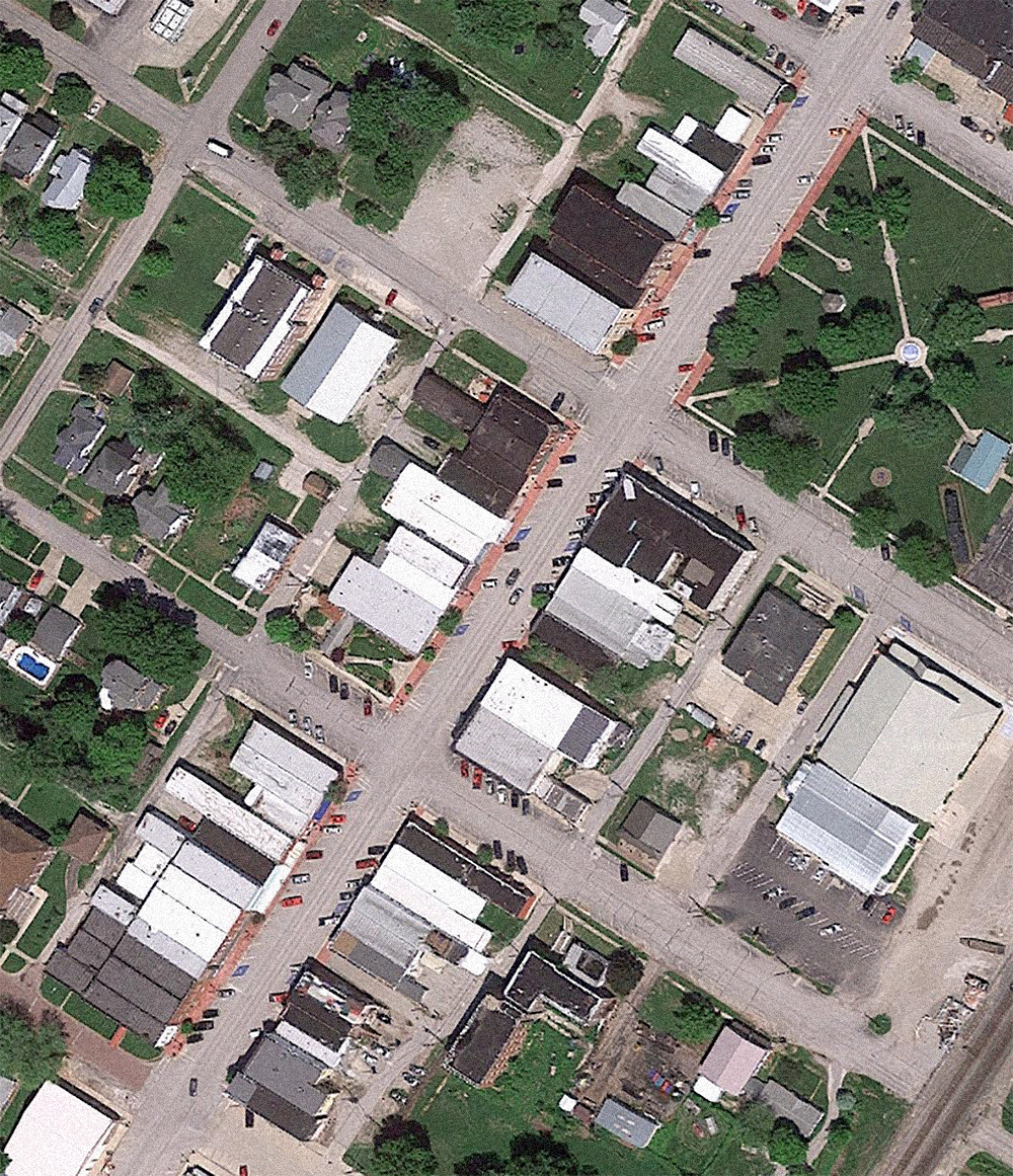
The two Von Roll gondola stations still exist. Underlay map data: Ⓒ Google.
The Von Roll type 101 sky ride route roughly ran northeast to southwest and back (here I’ve rotated the satellite view vertically). The station in Americana labeled the ride “Sky Hi” while the station in Scandinavia called the gondola “Ski Heis.”
Vintage postcard, Sky-Hi (Ski Heis) headed towards Americana (1973–1987).
Like so many Von Roll sky rides, Sky Hi/Ski Heis was victim to both high maintenance costs and insurance liabilities. Once a staple of amusement parks, theme parks, and zoos across the country, there are only eight permanent installations left in the United States.
I didn’t spot the former Ski Heis station when I was walking through Scandinavia (today it’s a picnic facility), but I did find the Sky Hi Americana station, which is now a red barn featuring carnival games.
Directly across the way from Union Depot is some kind of Wild West structure in garish colors. This was originally added to the park in 1981 as an ice cream parlor, and fourteen years later it was converted into a full service Tex-Mex joint called Blue Bronco. On the day visited it was Battle Creek BBQ, but for the 2019 season it reverted to Tex-Mex and is called Prospector's Cantina.
Plenty of generic “country cottage” style structures serving pizza and other fast food options seemed to be around every turn in Americana.
If I see another Subway Sandwich outlet dressed as a country cabin…
Just like at many other Cedar Fair and Six Flags parks, there are generic “Old West” style buildings scattered throughout, many of them with garishly bright paint jobs and signage.
Some of the structures were decked out in more muted colors and actually quite well-maintained.
This one cropping had real Ghost Town at Knott’s Berry Farm vibes. Everything from the varied storefronts to mismatched materials to faux aging. What to call this? It’s sort of authentically theme park.
Cyclone Sam's is an interesting twist on a classic seated spinner ride. The Wobble Wheel (1977–1993) sat here prior, and was a similar contraption. What makes this experience unique is that it’s indoors in the dark with various cyclone and tornado effects. The exterior barn reminded me of Disney’s Splash Mountain.
Americana - “Bicentennial Square”
Around the corner from the “Westward Ho” section of Americana, I came to something quite eerie. Here was a back corner of the park which appeared to be completely abandoned.
Copious Victorian Gingerbread everywhere, but no people.
Most of the carnival games were boarded up, closed.
Further back, there looked to be a kind of Christmas village.
Indeed Worlds of Fun does run a Winterfest event on select nights in November and December.
So does this back corner of the park simply sit dormant until then?
The whole thing was very odd. And I know I’ve used this analogy before, but it felt like an old episode of the Twilight Zone. Particularly the pilot, “Where is Everybody?”.
The only draw seemed to be a traditional wooden coaster called Timber Wolf.
The coaster was added to Worlds of Fun in 1989, and doesn’t have any theming or other design elements except for the woodsy landscaping.
Looking around at the queue area out in front of Timber Wolf, I saw a stream and several ponds. There were also concrete pavers. What could have sat here before?
Vintage brochure featuring the debut of Screamroller (1976–1988).
As it turns out, the signature attraction for “Bicentennial Square” (basically its single biggest draw) was an Arrow Corkscrew model called Screamroller. This was the fifth of the total first ten Corkscrew clones built between 1975 and 1979.
Worlds of Fun 1976 souvenir park map poster featuring Bicentennial Square.
For the 1983 season, Screamroller was converted to a stand up coaster (the first such ride in the United States) and renamed Extremeroller. The standing configuration was too stressful on the coaster’s superstructure, and it was reverted to a seated model in 1984. The new name stuck, however, until Extremeroller was removed four years later.
The opening of “Bicentennial Square” at Worlds of Fun in 1976 was part of a patriotic wave that swept over amusement parks and theme parks all across the United States. Today there doesn’t even appear to be any Bicentennial signage and it’s not designated on park maps. The entire area—the former entry plaza, “Westward Ho” and “Bicentennial Square” are collectively simply called Americana.
Thirty years later, though, patriotism was back.
Patriot is a Bolliger & Mabillard inverted steel roller coaster in the Batman fashion. Pretty standard fare for a Cedar Fair or Six Flags park. There are some small Colonial thematic trappings throughout the queue area such as these eagle statuary.
The ride’s souvenir store is presented as a classic ol’ timey American country home.
Just like at Disney parks these days, the go-to for period-appropriate American typography is the venerable Letterhead Fonts.
Orient
The last “land” I encountered at Worlds of Fun was the Orient area. The theming going on here is a melange of middle class white American notions of “Asia-ness” as frozen in the early seventies. It’s all so intense, garish and bizarre that I’ll be saving most of my photos and thoughts for my next post.
True to cultural indifference, in early park promotional literature, this area is referred to as both “Oriental” and “Orient.” From the 1973 guidebook:
Enjoy the alluring Oriental gardens along the ancient and mysterious waterways of the Far East. Challenge the tangling tentacles of the Octopus and delight to the amazing antics of the Dolphins at the Fins and Flippers Show.
Original Torii Gate (1973–1999).
For many years, as guests entered the Orient area from Americana they walked through a traditional Japanese torii gate which is typically found at the entrance to a Shinto shrine (signifying a physical transition between the profane and sacred). I’m not sure why it was removed—doubtful it was cultural sensitivity. I’m going with the same culprit which doomed the ships of Worlds of Fun; wood rot.
Some structures appears to be influenced by Thai design.
Traditional Japanese gardens blend with Chinese and Korean iconography. And red. Lots and lots of red.
It was certainly surprising to find a Panda Express outlet in an aesthetically and somewhat culturally appropriate context (even though the food is still terrible). I’m used to seeing these at Cedar Fair and Six Flags parks in everything from Southern to Colonial to Old West structures.
Next I’ll be delving into such problematic design issues in more detail, not just in the Orient area but all throughout Worlds of Fun.