Themerica

Musings on Thematic Design and the End of Architecture

  • Blog
  • Archive
  • About
fort-collins-01.jpg

Harper / Collins.

October 14, 2019 by Dave Gottwald

After leaving Denver, I headed north for my final thematic destination on this 2017 summer road trip. Earlier I had stopped by Marceline, Missouri to investigate the roots of Disneyland’s Main Street USA. But as it turns out, right along my route was yet another town with perhaps even more legitimate design connections—Fort Collins.

Old Town District, Fort Collins, satellite view. Click for link. Map data: Ⓒ Google.

Old Town District, Fort Collins, satellite view. Click for link. Map data: Ⓒ Google.

Fort Collins is the fourth largest city in Colorado, about fifty miles north of Denver. Although it’s grown into a sprawling college town, home of Colorado State University, Fort Collins was founded as a U.S. Army outpost during the Civil War, and later became a bustling freight hub for the Union Pacific and Burlington Northern Santa Fe railroads by the 1870s. My interest, however, is that Fort Collins is where Disney artist Harper Goff was born in 1911. Thus this post’s title is a pun on Harper Goff and Fort Collins as a tribute to one of my favorite publishers.

Goff went to school at the Chouinard Art Institute in Los Angeles and went on to be a commercial illustrator in New York for a time but returned to Southern California to work as a set designer and art director at Warner Bros. After a chance encounter in a London shop in 1951, Walt Disney and Harper Goff bonded over their mutual love of model railroading, and not long after Walt hired him after he had left Warners for a time. Today Goff is still best remembered for designing Captain Nemo’s Nautilus submarine and its interiors for Disney’s 20,000 Leagues Under the Sea (1954)—the famed look and feel of which is a foundational element of today’s steampunk aesthetic.

Harper Goff’s honorary window in Adventureland, Disneyland, 2008.

The Second Imagineer

Goff was one of the very first studio personnel whom Walt Disney handpicked to work on the Disneyland project. In 1951 Goff, along with others, developed concept art for Walt’s initial idea, a sixteen-acre park adjacent to the company property in Burbank. Before the final site in Anaheim had even been selected for what became Disneyland, Walt had him travelling around the country doing field research at amusement parks and fairs. Jeff Kurti in Walt Disney's Imagineering Legends and the Genesis of the Disney Theme Park (2008) called him “The Second Imagineer” after Walt Disney himself.

At Disneyland, Goff designed the interiors for the Golden Horseshoe saloon in Frontierland (which he cribbed directly from his work on 1953’s Calamity Jane for Warner Bros) and was the art director for the entire Adventureland area, including the detailed planning required for the Jungle Cruise attraction.

Unlike other Disney Legends who have tributes painted on the windows of Main Street USA, Goff’s window is above the Adventureland Bazaar. It advertises him offering banjo lessons as he played the instrument in the Firehouse Five Plus Two, a Dixieland jazz group which also featured fellow animator (and train enthusiast) Ward Kimball.

Vintage photograph, Larimer County Courthouse.

Vintage photograph, Larimer County Courthouse.

Collins Connection: Disneyland’s City Hall

Harper Goff’s other notable contribution to Disneyland’s design was his work on Main Street USA, in which he drew upon his childhood memories of Fort Collins. As Goff elaborated in an interview for the Winter 1992–1993 issue of The "E" Ticket magazine:

I was born in that little town…Fort Collins, Colorado. My dad owned a newspaper there, the Fort Collins Express Courier, and I grew up there. It was a very prosperous town. We had banks that looked like banks, you know, and there was a Victorian city hall. I was born in 1911 and these buildings were around when I was a kid. When I started working on Main Street, I had photographs of Fort Collins taken. I showed them to Walt and he liked them very much. Disneyland's City Hall was copied from Fort Collins…so was the Bank building and some of the others.

The structure in question which was the basis for Disneyland City Hall is, by all accounts, the Larimer County Courthouse. The large brick building was actually the third courthouse built (Fort Collins is currently on their fifth, dedicated in 2000). It opened in 1888 and was demolished in 1957 upon the inauguration of its replacement. There are several great photographs of the courthouse which you can view at the Fort Collins History Connection, an online collaboration between the Fort Collins Museum of Discovery and the Poudre River Public Library District.

Disneyland City Hall, 2007.

I took the above photograph from a very low vantage to emphasize what Disneyland City Hall looks like to a small child; this is likely how Harper Goff remembered the Larimer County Courthouse in Fort Collins from his youth, towering over him.

Vintage postcard, Larimer County Courthouse.

Goff’s choice of words in the interview, “copied from Fort Collins,” is somewhat misleading, although I’m sure he probably meant it. Clearly there is some inspiration, but it’s pretty loose. For one thing, the courthouse is several order of magnitudes larger. And the materials are vastly different—the courthouse is nearly all red brick with a gray roof.

Belvedere and cupola, Larimer County Courthouse.

Belvedere and cupola, Larimer County Courthouse.

If Harper remembered anything from his childhood that he wished to bring to Disneyland, it was clearly the towering belvedere and cupola combination above the front entrance.

Disneyland City Hall, 2007.

Disneyland City Hall, 2007.

Though all of the design details on the Disneyland City Hall version are wildly different, that thing sure made an impression on young Harper. The width of the tower seems about right in proportion to the rest of the building, though the height and stature of the cupola has been reduced. The plot thickens, however. Disney historian Jim Korkis asserts that the designers actually referenced a photograph of the Bay County Courthouse in Bay City Michigan, but I have the book he mentions and I couldn’t find the relevant image inside. Have a look at that courthouse (built 1868) yourself and compare.

Collins Connection: Disneyland’s Firehouse

The Larimer County Courthouse is long since gone, but I used my afternoon in Fort Collins to explore what other design connections there might be.

The aforementioned Fort Collins History Connection maintains a page on “Old Town and Disneyland's Main Street USA” and they note how historian Richard V. Francaviglia visited the Fort Collins archives when he was conducting research for his book Main Street Revisited: Time, Space, and Image Building in Small-Town America (1996) which I have referenced before and consider a cherished source.

Goff was vague in his recollection of what other designs he borrowed from his Colorado upbringing—”the Bank building and some of the others”—so I decided to poke around the Old Town District and see for myself. As it turns out, there is another bell tower structure similar to the one Harper remembered from the Larimer County Courthouse still in Fort Collins today, at the town’s former firehouse.

Overlay of vintage photograph of Fort Collins firehouse on current structure.

Curiously, the footprint of the building is sort of a mirror image of what it used to be. This early 1900s photograph shows that there once a building to the left, and nothing to the right, of the original firehouse. Today this is reverse; the building has been added on at the right, and the lot to the left is vacant.

I went inside the building, which now is fittingly home to a wonderful independent bookstore, and inquired about any design connections to Disneyland. One of the older staff members mentioned that “this firehouse was inspiration for the one at Disneyland.” A customer in the store suggested that even the look of Sleeping Beauty’s Castle at that park was linked the firehouse. Finally one other staff member said, no, but the firehouse’s tower design contributed to the City Hall at Disneyland (as noted above, inspired by the Larimer County Courthouse instead).

This is a common thing with local folklore, and gets repeated in the press from time to time. Even the Fort Collins Historical Society offered conflicting accounts when I stopped by and asked about Harper Goff and any Fort Collins connections to Disneyland. Because besides interviews with Goff himself, we don’t have much.

Disneyland Fire Department, 2007.

Here’s the Disneyland version, which doesn’t look anything like the firehouse in Fort Collins. Perhaps Harper Goff was simply interested in the rectangular orientation of the facades.

Disneyland Fire Department, 2007.

Looking closer, there is indeed a small tower on the left side of the building. Over the decades it’s been almost completely obscured by trees.

Vintage postcard, Town Square of Main Street USA, Disneyland. Ⓒ Disney Enterprises, Inc.

During the park’s early years, none of those trees existed. In this postcard view, you can clearly see the tower of the firehouse building.

Hong Kong Disneyland Fire Department, 2008.

All the features are much more accessible at Hong Kong Disneyland. Most of the Main Street USA area there is a near 1:1 copy of the original Disneyland park. In Hong Kong the trees have not fully grown in yet and the Jungle Cruise at that park does not sit directly behind the firehouse, so there is no dense foliage around the back of the building either.

Magic Kingdom Fire Station, 2007.

The second Main Street USA firehouse at Walt Disney World’s Magic Kingdom seems to have even greater Fort Collins lineage—both from the Larimer County Courthouse and the town’s former firehouse. The company is named Engine Co. 71 after the opening year of the Florida resort, 1971.

Just look at that tower! I was browsing through the Fort Collins History Connection database, and lo and behold, the roof feature at the top is practically identical to that of one Hottel House on 215 South College, which was built in the 1890s and demolished in 1962.

But by the time the Magic Kingdom was in full creative development, Harper Goff had moved on. During that time he returned to live action Hollywood, providing production design work for such films as Fantastic Voyage (1966), in which he managed to fuse the concept of a submarine with a Detroit automobile, and Willy Wonka and the Chocolate Factory (1971), where his steampunk visions of cast iron pipes and brass were turned fanciful. It was to be his final film credit. Goff later returned to work for Disney in the late 1970s as a conceptual consultant on the EPCOT project’s World Showcase and continued to do work for the company off and on until his death in 1993.

Magic Kingdom City Hall, Walt Disney World. Roller Coaster Philosophy/Flickr.

Disney artists such as Collin Campbell, Paul Hartley, and Dorothea Redmond are credited with the concept art for the Magic Kingdom’s Main Street USA. The approach to that park is larger, more elaborately Victorian, and more urban. It’s more Kansas City than Marceline or Fort Collins. The Magic Kingdom’s City Hall is easily twice the size or more of the Disneyland original, and adds a clock to its belvedere tower and cupola. It’s unclear how much these designers consulted with the original Disneyland concept renderings by Harper Goff and others, but I suspect with at least the Engine Co. 71 they did.

Collins Connection: Disneyland’s Bank Building

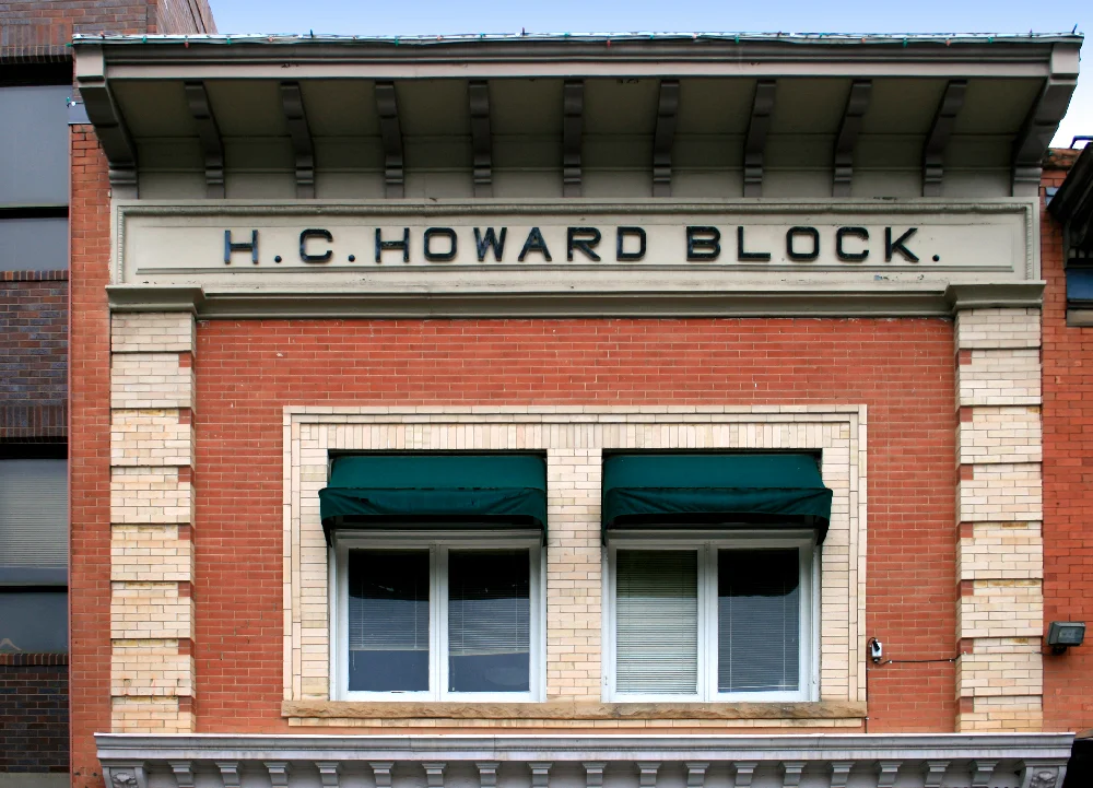
Goff specifically mentions “the bank” in his 1992 interview. And indeed, there appear to be many building blocks in the Old Town District of Fort Collins which look similar to the bank building on the east side of Main Street USA as you enter Town Square at Disneyland.

Vintage Bank of America brochure for Disneyland. Ⓒ Disney Enterprises, Inc.

According to Bank of America, who hosted the location from 1955 until mid-1993, “located on Main Street stood a fully functioning Bank of America branch. Bank associates dressed in turn-of-the-century clothing and even offered money orders printed only for the Disneyland branch.” The bank was one of the very few in the United States during those years to be open on Sundays and holidays because the branch basically kept Disneyland’s hours. With the tellers departing in 1993 and the spread of ATMs, by 2001 the location was used for Annual Passport processing. Since 2009, it’s been the location of The Disney Gallery and its attached retail space.

Bank of America at Disneyland, 1956.

Bank of America at Disneyland, 1956.

In the park’s early years the building appears to have been more monochromatic and realistic; basically, more like the structures I found in Fort Collins.

Bank of Main Street at Disneyland, 2008.

All of the building facades along Disneyland’s Main Street USA have been extensively altered and retrofitted over the decades. Typically, paint color schemes have gotten more saturated, and decor more lavish. Main Street USA looks far more “theme park” than it did in the early years. But looking at older photos, I could definitely see the Fort Collins connection.

Yet that’s the thing. America’s actual historic districts and main streets and old towns look far more “theme park” today too. This was an essential point that Francaviglia was making in his investigation Main Street Revisited: Time, Space, and Image Building in Small-Town America—that the historic preservation and downtown revitalization movements that began in the 1970s and continue to today take their design cues from the public’s expectations for nostalgia. Which comes from theme parks, beginning with Disneyland.

fort-collins-17.jpg

Fort Collins even has a new Downtown Plan for their Old Town Historic District which the city adopted in the spring of 2017, amending and updating their original revitalization efforts which began in 1989. The District itself dates back to the late seventies.

Collins in Context

Harper Goff was certainly not the only one who was channeling childhood nostalgia while working on the Disneyland project. As Disney Imagineer David Mumford wrote in a 1992 letter to Jack and Leon Janzen, publishers of The “E” Ticket magazine, many designers worked on Main Street USA:

It seems little has been documented on the design development of Main Street at Disneyland…it is difficult to attribute Main Street’s design to just one person…Main Street is actually a typical representation of a Walt Disney Imagineering project, since it represents a collaborative effort by many creative people.

Mumford mentions Dick Irvine, Marvin Davis, Wade Rubottom, Harry McAfee, Harvey Gillette, and Sam McKim as having worked on designs with the participation Walt Disney. Also of note:

These men were assisted by Harry Webster, who seemed to have a natural ability for drawing American Gothic and Victorian details. Harry went on to work with Randall Duell on Six Flag Theme Parks, but was “borrowed back” by WED to design the France pavilion for World Showcase at EPCOT Center.

Mumford also confirms Goff’s story about Fort Collins, and repeats the matter of City Hall:

An effort has been made to find some of the reference material used to inspire each of the Main Street buildings. For example, Main Street’s City Hall is based on a building in Harper Goff’s home town of Fort Collins, Colorado.

But he also notes that many other disparate childhood memories of Americana were likely at play:

Imagineering legend Sam McKim recalls how the designs relied on a vintage book of photographs of turn-of-the-century Sonoma, California. But in tracking down this book from the studio library, I have found no direct references to Disneyland’s Main Street buildings. Perhaps like Walt, all the gentlemen working on the project had some Main Street roots from their home town that they brought to the design.

So although I did find elements here and there around Fort Collins that influenced Harper Goff’s concept renderings for Main Street USA besides the City Hall, FIre Department, and Bank of Main Street building, I have to consider all the other memories of the other designers (and any photo reference they may have used) as part of the mix. Main Street is a melange; saying it’s based only on Walt’s childhood in Marceline and Goff’s days in Fort Collins makes for nice promotional copy, but it’s a shortcut to the truth.

Yet given that, I found several general turn-of-the-century Victorian architectural threads here in Fort Collins which connect to Main Street USA. And that’s probably because while Walt was channeling the “small town-ness” of his boyhood in Missouri, the more interesting designs to ape off are in larger, more prosperous, much more locally influential towns like Fort Collins.

The kind folks at the Fort Collins Historical Society really urged me to check out the former Linden Hotel which began as the Poudre Valley Bank in 1882. This is one of the few buildings in Old Town which commanded the ‘corner presence’ often found at the Main Streets of the Disney parks. The upper floors were private offices when I visited but are to be converted into four luxury apartments as part of the city’s new Downtown Plan.

The stonework and brownstoning in the Old Town District were quite impressive, and also far more Western in orientation than the Mid Western structures of Marceline. Fort Collins felt like Denver, like Flagstaff, like Salt Lake City, like Billings.

As part of the efforts begun in 1989, a single block of Linden Street between Walnut Street and East Mountain Avenue was at some point closed to automobile traffic and converted into a pedestrian promenade.

The trim here in the upper right feels like what Disney’s people were going for when designing Main Street USA. And again, these features are not so much specific to Fort Collins and Harper Goff’s memories of it, but rather typical of towns more prosperous and populous than Marceline at the turn of the century.

The Miller Block dates back to 1888 (as proudly proclaimed by the sign, which may or may not be original), and I got some pretty strong Disneyland vibes off of it, especially the details along the roofline.

Like so many other buildings in the Old Town District, the Miller Block carries colorful trims which are less period accurate and more Disney-esque authentic.

fort-collins-10.jpg

The labeling and dating of the various blocks can be problematic. Some are actually over 100 years old, while others have been added as part of “restoration” efforts.

Perhaps the lettering here is authentic and has simply been repainted over the years; it’s just impossible to tell from the street. On Disney’s Main Street USA there is no such labeling, but one thing that thematic design leverages often to establish feelings of place and community are faux proprietorships. I’ve seen this at plenty other theme parks as well.

Main Street USA, Disneyland, 2008.

Neither Marceline Nor Fort Collins

After visiting both towns, I’ve come to realize that neither can really be dusted for fingerprints with regards to the design of Disneyland’s Main Street USA. There are echoes and ghosts and approximations, for sure. But no true one-to-one comparisons to be made (unless we count the roof feature from the Hottel House which somehow ended up on Engine Co. 71 at the Magic Kingdom). The Larimer County Courthouse / Disneyland City Hall is the most frequently cited, but even that is something of a stretch.

Main Street USA, Disneyland, 2008.

For one, the Disney model includes many more architectural aspects of domesticity. At both Marceline and Fort Collins, all the blocks are part of a twentieth century “urban core” consisting of banks, hotels, various businesses, and perhaps a couple restaurants or a saloon or two. At the Disney parks, bits of “houses” crop up in between and around the other facades, reinforcing a communal sense of “town-ness.”

Main Street USA, Disneyland, 2007.

All of Main Street’s architectural residents are much leaner as well. In Marceline the blocks were subdivided into maybe four or five side by side structures; in Fort Collins many of the blocks were a single building long. On Disney’s Main Street USA, so many are like the building above—wide enough only for a single proprietor and storefront entrance.

Main Street USA, Disneyland, 2007.

And the roof treatments! These appear to be flights of fancy; none to be found in either Walt or Harper’s Missouri and Colorado memories. As I mentioned earlier when looking at the Miller Block, a notable exception is the wrought iron railings on that building and others currently standing in Fort Collins which clearly served as inspiration for all the similar iron work on Main Street USA. There are no such features in Marceline, Missouri.

Main Street USA, Disneyland, 2008.

As for the use of awnings on nearly every window, it’s possible this was more common in both towns at the turn of the century, given the lack of electric fans or air conditioning. But awnings on the upper floors in Marceline and Fort Collins today are largely a thing of the past.

Main Street USA, Disneyland, 2007.

Much is made of the corner-facing structures at the end of each block on Main Street USA. The primary walk between the train station and the castle hub, which runs south to north, is bisected at the midpoint by the narrower Center Street. Thus there is an East and West Center street, and all the corners of each are given a commanding presence. Conversely, there are only a couple moments of “corner-ness” in Marceline and Fort Collins (notably the former Linden Hotel at the latter).

Disneyland Opera House, 2008.

I have no idea where the design of the Disneyland Opera House came from; some sources say Sam McKim, others Marvin Davis, still others Dale Hennesy. But there’s certainly nothing like it in Marceline or Fort Collins. It should be noted that Harper Goff’s earliest concept drawings for the Town Square end of Main Street USA were more frontier and Old West rustic, as opposed to Victorian Gingerbread.

Main Street USA, Disneyland, 2008.

Documenting both the Marceline of Walt Disney’s youth and the Fort Collins of Harper Goff’s gave me more insight into how Disneyland’s Main Street USA model wasn’t designed rather than how it was. It’s part of company lore at this point, and both towns like to play up the connection to drive tourism (although I’d argue that Fort Collins could do even more on the ground, so to speak). But it’s mostly mythology.

Main Street USA, Disneyland, 2007.

At Fort Collins, the most direct link is of course that oft-mentioned Larimer County Courthouse, which has long since been demolished. And there are hints at the firehouse for sure that wound up in the DNA of both the Main Street USA areas at Disneyland and the Magic Kingdom at Walt Disney World. But as someone cataloging visual evidence would say, it’s all anecdotal in the details, and largely apocryphal in the bigger picture.

Finally Finished

This concludes the documentation of my five weeks of travel during the summer months of 2017. Between processing my photographs, designing custom graphics and maps, and (of course) the writing, it certainly took way longer than I expected. But I’m glad I got it all down in proper order.

Going forward I have a few notes from 2018 and then I’ll begin posts on this blog detailing site documentation from my three weeks of travel during the summer of 2019.

Onward.

October 14, 2019 /Dave Gottwald
elitch-gardens-01.jpg

In the Gardens of Elitch.

October 06, 2019 by Dave Gottwald

After an afternoon photographing Lakeside Amusement Park, I made a short drive across Denver to Elitch Gardens. “Elitch's,” as the locals call it, has a long and varied history going back to its opening in 1890 as the first metropolitan zoo west of Chicago. From there the floral gardens and animal displays evolved with the addition of a Kiddieland area in the 1950s and exciting roller coasters and other attractions in the 1960s and 70s.

Vintage postcard, original entrance to Elitch’s Gardens.

The Original Gardens

As the name suggests, the property was not conceived of as an amusement park. Mary Elizabeth Hauck Elitch Long (whew!) had a great love for both flora and fauna. So when her first husband John took some of the money earned at his successful Elitch Palace restaurant (which had the longest bar in Denver at the time) and purchased sixteen acres of farmland, the focus was all plants and animals.

Vintage postcard, Miniature Railroad.

“Elitch’s Zoological Gardens” opened for its inaugural season on May 1, 1890, and was quite profitable from the start. By the following spring, however, Mary’s husband was dead of pneumonia. She considered the Gardens their greatest joint project, and was determined to press forward without him. Record attendance was set three seasons later, and by the turn of the twentieth century Mary Elitch had expanded the property by a dozen acres and added several attractions.

Vintage postcard, Battle of the Monitor and Merrimac.

These included a penny arcade, narrow gauge railroad, and even a Civil War naval battle reenactment—in addition to upgrading the landscaping of the grounds and providing the electric lighting which was becoming more commonplace at this time.

Map of the Elitch’s Gardens property, 1904.

In 1904 the park gained its first wooden roller coaster, and two years later a Philadelphia Toboggan Company carousel (their sixth) was built for the park. The carousel remained in service at the park until 1928, and during the depression it was sold. Today it resides in the town of Burlington, Colorado—and if only I had known! I had just driven through there the day prior, and I could have seen it.

Vintage postcard, second entrance to Elitch’s Gardens.

It was actually competition from Denver’s nearby “White City” of Lakeside during the following decade that spurred Mary’s park on to even more lavish theming and attractions. The original wooden arched entrance (seen in the first postcard above) was replaced with a Greek styled one, likely conceived to evoke the same grandeur of the Beaux-Arts structures at Lakeside.

Vintage postcard, Elitch exotic flower beds.

In 1916, Mary Elitch sold out—but with the stipulation that her park’s name never be changed, and that she be permitted to reside on the property for the rest of her life, rent-free. The new owner, John Mulvihill, rather quickly transformed the once bucolic property into something more flashy.

Vintage postcard, Trocadero Ballroom.

He added a Trocadero Ballroom and soon Elitch’s was the site of much drinking and dancing during the Roaring Twenties—something Mary didn’t care for at all (she was a teetotaler and had allowed no alcohol at her Gardens).

Vintage postcard, the Wildcat.

By the mid-thirties, both Mary Elitch and John Mulvihill were gone; so was the zoo and part of the original botanical gardens. Mulvihill’s son-in law, Arthur Gurtler, had taken ownership and was intent on adding more and more rides and attractions. The Sky Rocket wooden coaster, built in 1926, was revamped in 1935 as the Wildcat.

Map of the Elitch’s Gardens property, 1950.

Gurtler’s two sons took over in 1945 and by mid-century Elitch Gardens—like so many other small parks across the United States—had become swept up in the phenomenal success of Disneyland. But “Elitch’s” was actually a bit ahead of the national curve.

Vintage postcard, Kiddieland.

While Disneyland was just breaking ground in 1954, a Kiddieland section of the Gardens opened featuring rides just for smaller visitors and it was a huge hit, proving that amusement parks weren’t just for couples on dates or beer swilling workmen. The open ceremonies were presided over by TV celebrity Hopalong Cassidy and his horse, Topper—again presaging Disney and the media synergy his park would be known for.

Aerial view of the original Elitch’s Gardens location, circa mid-eighties.

A much-beloved wooden coaster, Mr. Twister, was designed by the famed John C. Allen and made its debut in 1964. For years, riders on Mr. Twister were directly within the sightline of nearby Lakeside’s Cyclone and could gaze across at riders on that coaster from the top of the first lift hill.

More attractions were added throughout the 1970s and 80s. But it was not to last.

Riverside Resurrection

By the late eighties, the neighborhood around Elitch’s Gardens was changing. The Gurtler family also wanted to expand the park. In this case, expansion meant moving. The result was a sweetheart deal with the City of Denver—the family bought sixty-five acres along the Platte River downtown (a former Superfund site) for about $6 million, and voters in 1989 approved a $14 million bond measure to pay for the preparation of the land and various infrastructure improvements.

The campaign slogan was "Vote for Elitch's — it's Denver!" which recalled the decades old park slogan “Not to see Elitch’s is not to see Denver.”

The current Elitch Gardens location, satellite view. Click for link. Map data: Ⓒ Google.

The current Elitch Gardens location, satellite view. Click for link. Map data: Ⓒ Google.

Elitch Gardens reopened at its current home on May 27, 1995. Fifteen of the twenty major attractions at the former Gardens were transplanted, although the long history and charm of the original grounds was gone. The entire ride relocation and new construction projects cost some $90 million.

Today, the park features six roller coasters, a water park and dozens of other rides and attractions, and holds the title of the only the only amusement park in the United States in the downtown core of a major city. The fourth-generation Gurtlers sold their interests after two (financially disappointing) seasons at the new location, and Elitch Gardens was passed back and forth between a number of corporate owners. The park was formerly part of the Six Flags chain until it sold the property in 2006. Today “Elitch’s” is actually owned by a sports and entertainment holding company, but managed by Premier Parks, a company started by a former Six Flags executive which manages a dozen amusement and water parks across the United States.

Elitch Gardens 2017 park guide map.

Elitch Gardens 2017 park guide map.

Although Six Flags split in 2006, the design of the Elitch park map is still very much in their graphic vein. Which is to say, less hyperbolic than the maps of Cedar Fair parks, but still somewhat stylized.

Entering the parking lot, I got very much a sports stadium vibe, mixed with traditional amusement park trappings. The flags, however, are metal. Lots of red, blue, and yellow.

Victorian gingerbread and wrought iron filigree adorns the ticket booths; this is something which has become a defacto design language standard at parks all over the world due to the influence of Disneyland.

This main entrance really struck me as odd; no familiar spatial organization for theme parks or amusement parks is visible from the parking lot. Without the Observation Tower in the background, there wouldn’t even be a visual cue that something exists beyond. In fact, with its arcing walls and striped awnings, the Elitch’s entrance looks much like a ballpark.

Once moving through the turnstiles, guests walk into a mid-sized indoor area with a few retail outlets and souvenir stands (presumably for last-minute purchases on the way out at park closing). There are a few design nods to the Victorian era and specifically London’s Crystal Palace from the Great Exhibition of 1851; similar cast-iron and plate-glass is employed here.

World Bazaar at Tokyo Disneyland, 2008.

It reminded me a bit of the World Bazaar area at the entrance at Tokyo Disneyland, which references the same language. The entrance to Elitch Gardens was just as loud, too, with concrete floors and sound bouncing off all the glass and metal. But here it’s small, and again, organized in a shape that feels like a sports stadium. I’m wondering—given the unique urban downtown location of the park—if this was a deliberate attempt at familiarity.

Immediately across the way after remmerging in the sunlight is the park’s Carousel which is a restored antique model that is over 80 years old, and is one of the many classic attractions which was relocated from the old Elitch Gardens. This is the very carousel (#51) which replaced the park’s first Philadelphia Toboggan model (#6) in 1928.

The park’s Observation Tower was closed for maintenance on the day I visited, so I was not able to get any cool photography to tinker with like I did at Cedar Point, Kings Island, and Six Flags Great America. The views of downtown Denver must be spectacular too; the observation deck is 250 feet up.

Main Street, Denver

Beyond the Carousel and Observation Tower to the right is the waterpark area at Elitch’s. The rest of the grounds lie to the left. And the entry corridor to all the other attractions is a very, very, decidedly Disney-esque Main Street USA model. Seriously, I’ve never seen one this directly cribbed from the mouse.

Elitch “Main Street” area, satellite view. Click for link. Map data: Ⓒ Google.

Elitch “Main Street” area, satellite view. Click for link. Map data: Ⓒ Google.

The corridor is rather narrow, with a row of trees directly down the middle. This gives the walk something of a Midway feeling, but with added compression. The architecture is a Victorian hyperbolic mixture of the original Disneyland Main Street and its newer, larger cousins around the world.

All the trees really add something to the ambience. It wasn’t overly warm on the August day that I visited, but I can imagine it being an asphalt jungle at times without the lush landscaping.

There doesn’t appear to be forced perspective employed on the upper floors of the buildings here, which makes everything feel unnaturally large and imposing. Here’s another (unintentional) connection to World Bazaar at Tokyo Disneyland—the secondary floors there are all full scale as well, and many of the retail spaces and restaurants continue upstairs.

I walked this “Main Street” back a forth a few times, and with the trees, a narrow street, and the lack of forced perspective, it was indeed cramped. I don’t know if they were going for “cozy” but I definitely had compression on my mind.

Plenty of vintage-style graphic design, often in routed wood. The typefaces appear to be from the Letterhead Fonts Foundry, which I’ve seen at Disney as well as Cedar Fair parks.

The majority of the signage I saw was well done and on the more subtle side (read: not garish). Everything fits every well with late 1990s to mid-2010s Disney park design.

This makes sense, as the first season at the new Elitch’s was summer 1995. So whoever did the design work for this “Main Street” area was drawing on Disneyland (1955), the Magic Kingdom (1971), Tokyo Disneyland (1983), and even Disneyland Paris (1992).

Elitch’s is fascinating not just because of its long local history, but because in relocating in the mid-nineties, the park represents what designers in the industry thought represented “theme park-ness” at the time. It’s a snapshot of what tropes were well established enough by that time to work for the public.

For someone well-versed with Disney park design, this “Main Street” came off at once as a cute homage but also a knock off. Yet the execution was so on point that it didn’t feel cheap, as knock offs often do.

A curious feature of this area of Elitch Gardens are LED string lights which span the entire street, and then ended up looking pretty cool at night.

What would Mary Elitch think! The Trocadero has been resurrected right along with new Elitch Gardens—an addition by John Mulvihill which Mary always loathed for the drinking and dancing it brought.

elitch-gardens-19.jpg

At the end of this “Main Street” is the Big Wheel, a Ferris-type model some 100 feet tall. The compression of the walk leads to a classic sense of release as the view opens up; in this way the wheel functions as a classic Disney weenie, just like Sleeping Beauty’s Castle at the end of Main Street USA at Disneyland.

Looking back, the Observation Tower provides a weenie at the other end as well.

After passing through the courtyard area which holds the Big Wheel, things start to get more disparate. Elitch Gardens doesn’t really have “lands” per say, on its park map or otherwise. There are pockets, areas that seem to have the trappings of themes, and then stuff just kind of scattered in between. J.M. Mulvihills Bar & Grill doesn’t seem to be attached to anything (although the nearby swings ride is called Turn of the Century).

I loved this. A taco truck with a false front hacienda behind it to set the mood! This is the kind of thing I’m used to seeing at a Universal Studios park in the backlot area, or what I caught in the Southwest Territory area of Six Flags Great America. It’s the kind of FAKE / FAKE that’s almost charming.

Food Comes a Courtin’

Everywhere I’ve travelled, The Old West seems to be an inescapable theme. And not just in the United States, but in Europe and Asia too. Here at Elitch Gardens, its inclusion creates weird contradictions. So far, from the entrance through the park’s “Main Street” area, the emphasis has been on both traditional American amusement park iconography, and Victorian stylings suggesting the turn of the twentieth century. Although the park’s designers clearly leaned on Disney tropes (meeting mid-nineties expectations for “theme park-ness”), there’s at least a tangential connection to the legacy of the original Gardens.

But this “Frontiertown” approach has no connection to Elich’s or to the Denver area. As such, the theme is primarily relegated to a massive food court building.

Just as with “urban renewal” and “shopping mall,” the term “food court” is attributed to developer James Rouse. Wanting shoppers to extend their day at his indoor malls, he first added such a space to his Plymouth Meeting Mall (1966) outside Philadelphia in 1971, but it was too small and didn’t have much variety on the menu. Success finally struck three years later at the food court at his Paramus Park Mall (1974) in New Jersey.

Rouse was an unabashed fan of Disney. In 1963 he delivered the keynote address at Harvard’s Seventh Urban Design Conference, in which he asserted that given “its performance in relationship to its purpose” he felt that “the greatest piece of urban design in the United States today is Disneyland.” Rouse went on to correctly predict the massive impact the park’s spatial design principles would have in the coming decades on retail, dining, hospitality, and housing developments—and further this with his own projects; The Rouse Company ended up building Disney-inspired “Festival Marketplaces” all over the country in the 1970s and 1980s.

Mad Props

My overall impression of the Rustler’s Food Court at Elitch Gardens is that they went overboard on the propping. As I observed at Six Flags Great America, excessive propping is the lazy way to do what Disney does more purposefully with their decor.

This is what I call the “Flotsam / Jetsam” approached to a vaulted ceiling. Basically, if you’ve got a high open interior area in a structure, a solid shortcut to theming is to fill the rafters with a bunch of appropriate “stuff.”

And it’s not just excessive here at Rustler’s, it’s also quite random.

You have the expected displays, like livestock skulls and coils of lassos. But the rows of cowboy boots that are simply affixed to the wall? That I don’t get.

There’s no sense of historicity, even an invented one. If we’re supposed to be in the “Old West” then what are these Colorado license plates from 1970 doing here?

All the overdone propping spills out to the exteriors, especially on the roofs.

Just a pile of junk, with hand-painted signs that look like they came from the bric-a-brac aisle at Target.

There’s literally a stack like this on either side of every entrance and exit to the food court.

There are what appear to be a few genuine antiques scattered throughout. If this isn’t an authentic sign from the period, it’s well-reproduced for sure.

The Rustler’s Food Court building connects with a couple other exterior spaces. This “Tack and Saddlery” is home to carnival games (which did not seem to open on the day I visited).

In case you missed it, there are a half-dozen signs that say FOOD COURT on the roofs. The hand painted wood typography is a nice touch however.

There are also a couple retail spaces which are staged as faux proprietorships.

One trick which the Elitch Gardens designers successfully borrowed from Disney is the use of multiple, connected facades which actually lead all into the same building. Even though this appears to be a saloon, it’s just another entrance into Rustler’s Food Court.

At least this is clever—carnival fun as a “Gaming Parlour.”

Waters of the West

The Old West theming extends slightly beyond this one food court, but only in small ways. Disaster Canyon is the parks’ standard river rapids ride, and like so many models around the world, some kind of “Frontier” setting is the default. It was a bit chilly and the sun was due to set soon, so I skipped this one.

Nearby Shipwreck Falls is Elitch’s version of a shoot the chute attraction, and it has what looks like literal flotsam and jetsam strewn all over the place—the stuff you might find floating in the ocean after a ship has gone down.

The queue entrance is a lighthouse, which reminds me of the New England themed Yankee Harbor area I found at Six Flags Great America. But because Elitch Gardens is so small, and there are no clearly marked “lands,” there isn’t really an opportunity for immersion. This “seaport lighthouse” area is nestled in next to some standard, off-the-shelf amusement park rides, roller coasters, etc.

Nicely routed type on the signage, even though the design feels like an uncomfortable mix of US Navy surplus grit and Hyannis Port yacht club class.

Let’s Get Twisted

Again, there’s no lands or themed areas per say at Elitch Gardens. So right around the corner from these water rides, and just down the road from the Old West food court, right at the back edge of the park, is a classic wooden roller coaster which doesn’t seem to have a relationship to its environs at all.

Vintage brochure, The Twister.

The original Elitch Gardens had installed a number of coaster rides over the decades, including Toboggan Slide (1904–1925) and Sky Rocket (1926–1935). But none was more famous or beloved than Mister Twister which was designed by industry legend John C. Allen. Unfortunately, the some 3,000 feet of thrilling track did not make the move to the new Elitch Gardens in the mid-nineties; it’s likely the park balked at the sheer expense of dismantling and reconstructing it. Given its age, the Twister probably would have required some serious retrofitting and restoration as well.

Vintage poster for Mister Twister on the current Twister II queue building.

A few years after the new Elitch Gardens opened, family-owned Knoebels in Elysburg, Pennsylvania seemed to think it was worth the expense, and expressed interest in purchasing and moving Mister Twister, which had been left standing at the former property. This proved impractical, so instead the park bought the blueprints, modified the layout to fit the footprint on the Knoebels property, and mirrored it. The park’s Twister opened in 1999 and has been thrilling guests ever since. So this classic coaster—or at least the experience it provided—isn’t quite gone forever.

Elitch built an entirely fresh ten-story coaster from scratch at their new location instead, and unimaginatively called it Twister II. The park claims it recaptures the famed twists, turns, and thrills of the original (“Built Wilder The Second Time Around”), but most fans who remember the first Mister Twister don’t agree. I myself couldn’t make the comparison, but I rode it twice (once in the front row and once in the back) and I found Twister II lacking. The ride was pretty rough and uneven, actually.

Odds ‘n’ Ends

Apart from the theming I’ve already covered, all that’s left are some disparate bits of amusement park charm scattered here and there, and some of the same sorts of vintage typography that I found at Lakeside earlier that same day. I’m sure this looks great when it’s lit up at night.

This typical Theme Park Gingerbread looks like a food stand, but it’s actually one of two entrances to a rather unremarkable interactive dark ride called Ghost Blasters which is part of a larger franchise. This attractions closed in the fall of 2018. For the 2019 season the location reopened as a “thrill ride for the mind” called the Kaleidoscape which was developed by Meow Wolf, an arts and entertainment group which began in New Mexico as an artist collective in 2008.

Right next door in front of Mind Eraser, a Vekoma suspended coaster, is this cute little shack housing the Colorado Corn Dog Company. I point it out because there are nice little thematic design moments through Elitch Gardens, but because they were not comprehensively planned with an overall narrative, or even more specifically themed lands or areas, the charm falls flat. If this shack was supported by, say, a turn of the twentieth century boardwalk or perhaps a county fair setting, it would really shine.

Goodnight for the Gardens?

It’s rather fitting that it was dark by the time I strolled back through the “Main Street” area to exit Elitch Garden, because a permanent night might end up falling over the park—its future might be in jeopardy.

Rumors began swirling when the city of Denver approved a new zoning plan for the land that the park sits on in December of 2018. The River Mile is a mixed-use urban redevelopment project which includes high density housing in the form of some 8,000 units of various configurations. Office space would be available in some towers, with the street level reserved for retail and dining.

The architects working on the project say it will take several decades for The River Mile to be completed, so for now at least, Elitch Gardens seems to be secure in its current location. But who knows what might happen down the road. Could Elitch Gardens move on to yet a third iteration?

Walking towards the exit of the park, I took my time. The small LED lights strung across the rooftops of the “Main Street” area of Elitch Gardens were synchronized in an elaborate display with colored lighting on each and every building. I watch this go through several cycles; everything was bright and colorful, but the transitions were slow and subtle enough that the lighting wasn’t obnoxious. It was a very pleasant way to end my day in Denver.

Elitch Gardens is interesting to me mostly because of the snapshot of mid-nineties, Disney-esque thematic design on display. From the park’s “Main Street” to Rustler’s Food Court, Elitch Gardens v 2.0 looks like a shopping list of visual tropes that audiences have come to expect from the theme park experience. It would have been nice if the park was designed with a cohesive vision rather than the more fragmentary approach they took with the property, but if you’re in the Denver area during the summer months I think it is well worth a visit.

October 06, 2019 /Dave Gottwald
lakeside-01.jpg

Things Fall Apart.

September 28, 2019 by Dave Gottwald

I had two destinations in mind when I added Denver, Colorado to my route. Both are historically important examples of early amusement parks. One has been completely relocated, and the other, sadly, appears to be in a state of some decline.

Lakeside Amusement Park, satellite view. Click for link. Map data: Ⓒ Google.

Lakeside Amusement Park, satellite view. Click for link. Map data: Ⓒ Google.

Lakeside Amusement Park has been a Denver attraction since 1908. It’s what was known in the United States as a trolley park, or an outdoor amusement area that was the 19th century precursor to the more 20th century amusement park. Located in close proximity to streetcar lines in major cities, such parks were often financed and constructed by the companies which operated the lines themselves, to bolster weekend ridership when residents were not commuting for work; here this line was the Denver Tramway.

Vintage photograph, White City.

A “White City” for Denver

Lakeside is notable for being the only remaining park in the United States which employs proto-theming based on the designs of the 1893 Chicago World’s Fair and its “White City.” There were dozens of White Cities built during the first couple decades of the twentieth century, and the term became synonymous in the public mind with trolley parks and amusement parks, just as Coney Islands sprouted up far from New York as that name served as shorthand for “seaside amusement boardwalk.”

Vintage panorama, White City.

Local brewing magnate Adolph Zang—whose additional success in insurance, investments, and mining made him one of Denver’s richest men (think Mr. Burns on The Simpsons)—opened his “White City” on May 20, 1908. The park was the brainchild of Zang and Denver mayor Robert Speer. Some fifty thousand people attended that first day, and the park glistened at night under the pale glow of one hundred thousand electric light bulbs (the “white” for which it and parks like it were named).

Vintage postcard, The Chutes.

Denver’s “White City” not only included several expected amusement park rides popular at the time such as a Shoot the Chute, but also an indoor swimming pool (quite a luxury in the early twentieth century) called the Natatorium, a skating rink, the El Patio Ballroom, a narrow-gauge railroad, even a casino—all bordering along the edge of thirty-seven-acre Lake Sylvan, used for fishing and boat rides. The park advertised 41 attractions at opening.

Zang even managed to get the property and its environs incorporated as the town of Lakeside, making the serving of alcohol legal in his German basement beer hall (presumably serving his own label).

Vintage postcard, White City.

As this postcard and the one below show, the names “Lakeside” and “White City” appear to have been used interchangeably in the park’s early years (though some sources today claim that “White City” was never more than a nickname). Since at least the late 1930s the property has been known exclusively as Lakeside, after the Lakeside Realty and Amusement Company (which was basically just a syndicate of Zang and his brewer friends) as well as the city he lobbied to create in its name.

Vintage postcard, Lakeside Park.

All of the original buildings at White City / Lakeside were designed in the Beaux Arts style, just like much of the Chicago World’s Fair. This meant lots of white plaster forming neoclassical buildings, Greco-Roman columns and decorations, and every manner of excessive ersatz Rococo flourish. All aglow with thousands and thousands of the aforementioned electric light bulbs.

Vintage postcard, Lakeside Park.

Another element ported over from the Chicago fair was plenty of pools with fountains. As pictured above, all was illuminated at night. I can only imagine what their monthly electric bill was in those early days.

Towering Jewels

Today only a dozen or so Beaux-Arts structures remain. The grandest of these by far is the Tower of Jewels which serves as the park’s main entrance at the intersection of Sheridan Boulevard and West 46th Avenue. I parked in the dirt lot further down the road and then walked back to admire it.

The building at the tower’s base originally housed Lakeside’s casino and theatre; today the park’s administrative offices are inside, including a manual telephone switchboard which reportedly still works.

At 150 feet, the Tower of Jewels was the tallest structure in all of Denver in 1908. Although it’s not in the best shape today, the details on the tower, especially its intricate light bulb patterns, are impressive. There are an estimated 10,000 of them on the tower.

This lovely hand-painted sign looks more 1950s or 60s than early twentieth century.

Lakeside’s major wooden roller coaster, the Cyclone, was added in 1940. This marquee advertisement, complete with dimensional letters, probably dates to a couple decades later.

Back where I parked my truck, I spied this nifty hand-painted sign a few feet away. Based on this rendering of the PEPSI logo—which was in use from 1973 to 1987—this sign hadn’t been used in at least three decades when I came across it.

Former Lakeside Speedway, satellite view. Click for link. Map data: Ⓒ Google.

Former Lakeside Speedway, satellite view. Click for link. Map data: Ⓒ Google.

What exactly was the Lakeside Speedway? I didn’t find out during my visit, but I later discovered that a one-fifth-mile oval stock car race track at Lakeside opened in the late 1930s. Unfortunately, a tragedy in the summer of 1988 in which a driver lost control and killed a spectator (also injuring several others) closed it for good. The speedway has sat pretty much undisturbed in the some thirty years since.

The Phantom Ticket Booths

As I walked from the parking lot towards the secondary gate of Lakeside, I realized that the speedway PEPSI sign was just the beginning. This was going to be a typographic bonanza. Best of all, I pretty much had the park to myself!

Lakeside’s hours vary widely, even during the summer. On the Wednesday in July that I visited, gates were not scheduled to open until 6pm, with rides coming on an hour later. This was only late afternoon. However the staff member at the gate kindly let me in anyway (without paying a dime!) when I explained that I was a design professor and just wanted to take some photos.

This sign caught my eye shortly after I entered Lakeside. The script looked familiar, but I couldn’t place it.

Matterhorn at Cedar Point.

Going back through my other trip photos, I found it. Matterhorn appears to be an off-the-shelf amusement ride, and I saw this one first at Cedar Point a few weeks prior. The logo is exactly the same.

The sky was cloudy and it was drizzling on and off. Combined with the park being virtually empty except for some maintenance workers, there was an eerie, abandoned, post-apocalyptic vibe in the air.

The neon sign for the Skoota Boats is clearly not Beaux-Arts; this is some lovely Bauhaus-style type in the fashion of Herbert Bayer. Why?

Well in 1935 Lakeside got a new owner—Ben Krasner, who had started as a concessionaire at the park in 1917, and by the thirties had worked his way up to head of all concessions. Krasner wanted to update the look and feel of Lakeside, so he brought in architect Richard Crowther who introduced many Art Deco and Streamline Moderne structures popular at the time, including some very memorable ticket booths.

I’ve never observed original ticket booths in these styles at an amusement park anywhere. Though paint schemes in recent years seem to have gotten more extreme, these were so cool to see.

Crowther also added neon lighting all over the park. The once “white” twinkling of the original thousands of light bulbs was pretty much relegated to the Tower of Jewels in favor of a garish, multicolor extravaganza. The ticket booth here appears to be of a later vintage, perhaps the 1940s or 50s.

Beaux-Arts touches remain around the grounds, albeit repainted with brighter hues.

There is also a mixture of Spanish Colonial style ceramic tile roofs on some of the carnival games buildings.

The park’s Lakeshore Railway is a narrow-gauge railroad which circles Lake Rhoda (Krasner renamed it after his daughter). The train cars were originally pulled by two steam engines built for the 1904 St. Louis World's Fair, Puffing Billy and Whistling Tom. The ride still runs today, pulled by diesel engines.

Hand-lettered typography around every corner! This probably dates to the 1960s.

What appears newest (and brightest) at Lakeside is the paint jobs, but some of the signage could use some work; witness the missing “a” above. Many of these marquees feature bizarre typeface pairings—”Labyrnithe” is a mid-century script, but “Crystal Palace” is a distinctly early twentieth century display face.

What a find! This script neon is delicious, and you so rarely find actual vintage samples at amusement parks in the wild—they’re usually more recent retro-style additions.

Lovely modern type, probably from the 1940s. I do have to commend the staff of Lakeside; despite many structures in various states of disrepair, maintenance were on the grounds that day specifically fixing up neon signage.

This appears to be a condensed cut of Futura, very popular at mid-century.

Sixties pop in full effect! I can almost hear The Monkees playing in the background.

And seventies Mexicana! This is the omnipresent Davida designed in 1965 by Louis Minott, and it’s been gracing Mexican food packaging ever since (as well as, oddly, products from Café du Monde in New Orleans). The typeface is a classic example of the 1960s Victorian revival in phototype and all its exuberance.

More sixties wackiness. I really like the bouncy-on-the-baseline treatment and playful sans serif faces which were very popular at the time.

So much dimensional script. This might be earlier, 1950s perhaps. I will admit it does bother me that neither the “t” at the end of Tilt nor the “l” at the end of Whirl terminate through the stem.

Thirties or forties moderne type, but with sixties-style baseline bounce!

I don’t even know what to make of this one. The lettering reminds me of the more wild fifties and sixties display scripts by French designer Roger Excoffon, but run through an early 80s New Wave pop blender.

The only shame is that I wasn’t able to stay until Lakeside opened for the evening, so I couldn’t see any of this fantastic stuff lit up in full glory after sundown.

Riding Up a Storm

In 1940, Ben Krasner stepped up to the big leagues and added a wooden roller coaster—the calling card for any twentieth century American amusement park. The coaster station and marquee was constructed in the Streamline Moderne style so popular at the time.

The Cyclone was built by the famed T.M. Harton Company of Pittsburg and designed by Edward A. Vettel Sr. (1885–1952), and is only one of two Vettel coasters left in the United States (he designed dozens during his prime). The other is Blue Streak at Conneaut Lake Park in Pennsylvania.

The lift hill tops out at 85 feet (which was quite high for that era) and then drops guests onto a more than four thousand feet of track in a simple out and back layout. There are only a handful of coasters built before World War II like the Cyclone left; in 2003 American Coaster Enthusiasts (ACE) added it to their list of Landmark Coasters. This is one I really wish I had been able to stay until 7pm to ride. But it was not to be.

Lakeside Today

Lakeside is still owned and operated by one Rhoda Krasner, the daughter for whom Ben renamed the lake. Krasner the elder passed away in 1965, and Rhoda—then just out of college—took over management. She and her own daughter, Brenda Fishman, are reluctant to sell the park to this day, and offers of investing or otherwise modernizing the property to increase revenue fall on deaf ears.

None of the park’s structures (not even the Tower of Jewels) are on the National Register of Historic Places, and Rhoda (who’s quite shy about press and publicity) doesn’t seem interested at all. For one thing, Adolph Zang’s political maneuvering so many years ago which incorporated Lakeside so he could sell beer means that today the park is actually its own municipality, and Denver’s smallest, with only eight residents. Just like a miniature Walt Disney World, Lakeside maintains its own police force and firefighters. So any preservation efforts (especially at the federal level) might thus disrupt the autonomy which the Krasner family no doubt enjoys.

Lakeside still has a special place in the hearts of long-time Denver residents, although for me it was strictly a typographic odyssey through a mostly vacant property. Local author David Forsyth published Denver's Lakeside Amusement Park: From the White City Beautiful to a Century of Fun in 2016, and amassed a wealth of knowledge from old timers, some of which was not substantiated enough to include.

When I visited in August 2017, Lakeside was already having a rough year; in March, a car slammed into a parking structure and it collapsed, in May a hailstorm pummelled the Tower of Jewels and caused some damage. Although it could use more than just a couple coats of new paint, I’m glad Lakeside is still with us, and that it’s still family-owned and fiercely independent in this era of the Disneys, the Universals, and the Cedar Fairs.

Next stop: Elitch Gardens.

September 28, 2019 /Dave Gottwald
old-town-museum-01.jpg

Our (Old) Town.

September 22, 2019 by Dave Gottwald

When I embark on these kinds of road trips to themed venues, it’s mostly planned out. But sometimes serendipity comes calling, like the Welcome to Iowa stateline casino complex I stumbled upon while on my way down to Missouri. Here’s another such treasure: the Old Town Museum in Burlington, Colorado.

Burlington’s Old Town Museum, satellite view. Click for link. Map data: Ⓒ Google.

Burlington’s Old Town Museum, satellite view. Click for link. Map data: Ⓒ Google.

I was zipping along on I-70 on my way to Denver after having spent the day prior driving through Kansas when I found Burlington, which is the first town after crossing the state line. It’s a pretty small place, about 4,000 people. The city’s official website is boosterism at its finest, proclaiming in a cheerful voice you can almost taste:

With 256 days of sunshine, the City of Burlington is one of Colorado’s best-kept secrets. You can find us just off Interstate 70 near the Colorado/Kansas border. Burlington is a full service city located approximately 170 miles from the Denver-Metro area. Make plans to come for the day but don’t worry, we’re prepared for you to spend the night!

I decided to pull off at the town’s official Colorado Welcome Center just to rest and stretch a minute. Unlike Iowa’s barns-within-barns, this center didn’t feature any noteworthy design. But—rather wisely—the Old Town Museum is practically next door, and their parking lots connect. I could spy some Old West looking buildings from my truck. What was this?

The main building of the museum is pretty standard fare; these types of small town attractions are all over the country. After paying a small fee ($8), there are some interpretive panels about the history of the area (mostly agricultural) to take in before grabbing a map and wandering around the complex.

The town of Burlington proclaims that the museum is “more than just a barn” and they’re not wrong. Unfortunately, the buildings here lack any interpretation, so you can’t really make sense of what you’re looking at.

Like many of these “Old Town” presentations, there appears to be a mix of relocated, restored, rebuilt, and ‘new for old’ structures. And just like other historic downtowns throughout the West which I’ve documented, it’s all scrambled.

It’s a quiet Wednesday morning, and there’s only a couple other people here.

On Saturdays throughout the summer, there’s more activity. And on the fourth Saturday of each month, there’s a “Wild West Dinner Theater” show. I’d imagine some upright piano music and a ‘high noon’ type shootout between an outlaw and a sheriff. The script sort of writes itself.

Decontextualized like this, the little houses and other buildings are like graves. This is an architectural graveyard.

Down the center is a single Main Street block which has been assembled, again, from structures that have been moved or otherwise rebuilt. They do not appear to have any relationship to each other. I’m guessing this is the block where the shootout is staged on those Saturday dinner nights.

A couple of these buildings are really, really new. Or at least, appear to be.

The paint is fresh, the window glass is new. So, are they trying to go for historical recreation or more of a theme park aesthetic? At least the amalgamated spaces of Greenfield Village are clearly historical in origin, even if they’ve been brought together from disparate sites. And there is both organization and interpretation at play.

Part theme park, part museum, part graveyard. The place was odd.

Many of the walkup storefronts are so similar that they kind of wash over you after a while. Plenty of benches in the shade to sit in though.

If you’re familiar at all with the original classic Twilight Zone (1959–1964), that’s sort of the vibe with all these disconnected structures. Actually, it’s rather exactly the vibe.

There isn’t even any historical era to tie everything together. If it’s “old” it counts. This Texaco filling station shack is probably from the 1930s or 40s. The sign appears to be a contemporary replica.

Some nice lettering graphics in a few of the windows, though this is clearly very new printed and cut vinyl. The typefaces are probably from Letterhead Fonts which I have seen at nearly every theme park I’ve ever visited.

There are a couple samples of hand routed wood signage as well.

A few antique wagons and buggies are scattered about.

But the painted lettering appears to be fairly recent.

With some more interpretation, the Burlington Old Town Museum has the potential to be more substantial than it is. I realize it’s a small town non-profit that likely barely squeaks by, so I’m not judging it for that. I think what’s best illustrated here is that the cultural effects of thematic design and themed environments have compressed anything that’s perceived as “old” into a single pool of “pastness.” The Past becomes just another themed area, like Fantasyland.

It’s right in the name—”Old Town” becomes a kind of liminality, a Twilight Zone-like state that simply isn’t now (because there are no electricity, cars, or television), but clearly isn’t ancient times either. It’s just a Great American Pastness.

Perhaps the oddest part of the whole property is the themed façade on the opposite side of the main museum building, facing the Colorado Welcome Center’s parking lot. It appears to house a Colorado Workforce office, but an awful lot of detail was put into its construction.

In typical Disneyland fashion, it appears to be a grouping of five storefronts of different design, but in actuality it’s only one building. Each is a false front. Why this approach? Why the expense? The other side, the main museum entrance, doesn’t have this treatment at all. Maybe it was some developer’s idea to drive foot traffic. In any case, let’s hope the jobs they offer inside are real.

September 22, 2019 /Dave Gottwald
eisenhower-library-01.jpg

Midwestern Presidential.

September 14, 2019 by Dave Gottwald

After finishing my time at Worlds of Fun I had planned a route which would include two U.S. Presidential Libraries that would be on my way through to Colorado. Truman’s was right here on the edge of the Kansas City metro area in Independence, Missouri (Harry’s hometown). Geography would track with chronology this time, for I then continued on to Eisenhower’s in Abilene, Kansas (Dwight’s hometown).

A one-two punch of mid-century Oval Office antics—the Truman Library and the Eisenhower one.

Why Presidential Libraries? Well, first of all, for several years I was an exhibit designer, so all sorts of museums are interesting to me from that perspective. Secondly, thematic design has increasingly been incorporated over the past two decades into exhibits all over the world; this was the kind of work I was engaged in. So I always like to see what’s turned up. Lastly, just like the Great Lodges of the National Parks, a Presidential Library (and the aura of the U.S. Presidency itself) is sort of a theme all its own.

The Truman Show

The only Presidential Library I had visited before was Ronald Reagan’s in Simi Valley, California. It’s curious—there’s a certainly amount of fandom I found, sort of a “collect ‘em all” attitude similar to how people feel about the National Park System. They even sell a passport which you can have stamped at each library. You would think this would appeal primarily to children, but I saw plenty of adults queuing up to get their stamp at the Reagan Library. Myself included.

Unfortunately, I had long forgotten that I purchased one of these passports during my visit. So no Harry and Ike stamps for me. I get it; I’m a sucker for this kind of stuff. Still, you have to take Presidential Libraries with a huge grain of salt, at least if you’re serious about history. The approach to these places is strictly hagiographic—you wouldn’t be wrong to halfway assume there were entombed Pharaohs on the grounds.

Truman Presidential Library, satellite view. Click for link. Map data: Ⓒ Google.

Truman Presidential Library, satellite view. Click for link. Map data: Ⓒ Google.

The Postwar era through to the Cold War and the Space Race might be my favorite time period in American history, so I was well-primed for these two libraries. It was also nifty to be able to visit both on the same day in not only geographic but also chronological order, so to speak. A geek’s dream.

Overall, the exhibits struck me as more formal than playful, and the graphics felt two or three decades old. Still, the content was comprehensive—even if I darted through most of it. Not for lack of interest, I just know the content already.

It’s fun to see cultural stereotypes picked apart and converted into didactic dioramas so many years on. I wonder what 9/11 will one day look like in this context. Or millenials. Or hipsters. Will this scene be an IKEA kitchen with a Starbucks cup on the table, an iPhone, and a yoga mat rolled up next to a Whole Foods canvas bag? It’s hilarious to think about. Set your time circuits for sometime in the 2070s.

After passing through so many purely graphic displays, I was pleased to come across some genuine experiential design using the environmental cues of theming. Here visitors experience a recovering post-war Europe still reeling from the conflict. Shortages, rubble, rations. You literally walk through all of it, feeling the battered textures on the walls, lowering your head to crawl through holes. The message is clear—we (the Americans) were the only ones left standing.

And who, of course, comes to save the day? President Truman! The next large hall dedicated to the Berlin Blockade and Airlift (1948–1949) was especially cool. This was one of the defining events of Harry’s years in office, and the library has handled it admirably. From the ceiling are hung various objects in certain quantities—a physical kind of information design—that conveys just how much was delivered into Berlin during the crisis. I’d done some of this type of design work myself for an exhibit called Above & Below at the Oakland Museum of California, along with the help of my good friend Tom Klump of inktank design.

More on him in a moment.

The other solid example of thematic design and staging was in the “whistlestop room.” Content was integrated into a display resembling a train depot platform.

Adjacent was a diorama of the back of a train with audio clips playing from the bullhorns. But this isn’t Disney—no audio animatronic presidents here. And again, the black and white photographic cutouts just reek of mid-eighties museum design.

As you prepare to exit the museum proper, outside to the garden grounds and gravesite, there is a nearly lifesize picture of Truman crossing the downtown Main Street of what looks like to be Independence, Missouri. Even at a Presidential Library, we can’t escape the mythology of Main Street, recontextualized and sweetened as it is by the Disney Version (despite the lack of pontificating robots).

Official grave sites are quite solemn, and design-wise, identical. The Eternal Flame is a standard signifier. Still, this was restrained and respectful; there was no flowery prose or grand statues. I’ve seen much worse.

Harry Truman died in 1972. His wife, Bess, passed away ten years later and was then buried beside him in the library’s courtyard.

The absolute thematic highlight of the Truman Library was the 1:1 Oval Office set. They claim it looks “exactly as it did when Truman left office” in 1953, and I believe them. There was a similar, also period-accurate display at the Reagan Library. But because of the older technology and furniture (man I was grooving on those office chairs!) this one just felt so much cooler.

Where does this kind of representation fall on the thematic spectrum of FAKE-REAL? It’s not fake-fake (obviously not real and proudly so) nor is it real-real (the actual office in Washington D.C. at the White House; reconstructed, moved, or otherwise). That leaves us with FAKE-real (like a foam tree on a movie set) or REAL-fake (that’s really the same make and model television as Harry had to the left of his desk in 1953, but not the actual unit).

An Oval Office set like this in a Presidential Library is the ultimate REAL-fake, just like the recently restored Apollo Mission Control room at the Johnson Space Center in Houston, Texas. By referencing archival materials, period photographs, and consulting with those who were there, researchers went to antique shops and online auctions to find such-and-such ashtray and so-and-so sportcoat hung on such-and-such chair at so-and-so’s desk.

And so with Harry’s office. The settings are all correct, they’re just not the actual items. Or maybe some of them are? It’s always an amalgam. It’s production design by way of Mad Men (2007–2015).

One absolutely genuine artifact (made abundantly clear by the formal presentation, thick glass, and alarmed vitrine casing) is Harry Truman’s famous “The Buck Stops Here” sign. According to the library, “it appeared at different times on his desk until late in his administration.” They elaborate:

The sign "The Buck Stops Here" that was on President Truman's desk in his White House office was made in the Federal Reformatory at El Reno, Oklahoma. Fred A. Canfil, then United States Marshal for the Western District of Missouri and a friend of Mr. Truman, saw a similar sign while visiting the Reformatory and asked the Warden if a sign like it could be made for President Truman.

Naturally, full-size replicas are available in the library’s gift shop. Did I buy one? Absolutely.

A New Tru

A bit further back, I mentioned Tom Klump of inktank design. As it turns out, earlier in 2019 he was invited to work with Gallagher & Associates on a redesign project for the Truman Library as part of their $25-million capital campaign. My instincts when I visited that the museum needed updating—especially the graphics—ended up being spot on. I asked Tom recently about his work on the project:

What was your role working with Gallagher & Associates on the new Truman Presidential Library?

Tom Klump, inktank design: I was brought on as a contract exhibit designer during the construction documentation phase. I worked under the associate studio director and alongside a full-time graphic designer as well as copywriters and 3D designers. The senior designer would hand off draft designs and scale elevations and it was my job to update the designs to reflect client comments or create anew following the established look and feel. Generally, I flowed in script and images and designed graphic layouts whether they be dimensional panels, information graphics, entire walls, interactive exhibits or—as with the artifact cases—coordinate the pieces from the collection with the graphics to ensure everything fit.

The entire museum appears to have been redesigned, at least according to the virtual walk-thru. Were there any elements in particular that you felt needed the most updating? Or did you not look at the prior galleries.

Tom: The entire museum has essentially been gutted and redesigned. I only know the galleries from site survey photos, and the Google Maps walk-thru (which helped me immensely) but everything was reimagined to educate the visitor. From the new entrance to the interior galleries and graphics, it will be an entirely new experience for them.

What’s the new typographic approach? Is there is a museum-wide brand system or are you using period-appropriate typography in the exhibit areas?

Tom: The typography adheres to templated, museum-wide standards so it does not change drastically between sections. With only three typefaces doing the work throughout, the type has been kept organized, simple, straightforward, and restrained. In terms of modern museum standards it is a big improvement over the existing space.

Are there any aspects of the new design which you feel are particularly themed? I’m thinking of vernacular graphics and environments, like we’ve done in the past at the Oakland Museum of California.

Tom: No, I’d say it is not as drastically themed. All fourteen sections are set apart by wall and/or ceiling treatments as well as a specific color palette and the content; they’re cohesive while standing apart from each other. Although it should be noted, I only worked on about half of the sections, and really didn’t see much else being done. I believe the Berlin Airlift section will be themed nicely and the whistle stop train car will remain. The reproduction of his Oval Office of course remains unchanged.

The above video clip is a a virtual fly-through of the new Truman Library as presented in December, 2018. The library closed on July 23, 2019 to begin the re-installation process and plans to reopen sometime in the summer of 2020.

I Like Ike

After these few hours spent at the Truman Library, I raced across the Plains for what seemed like forever (but was only about a half-day) to Abilene, Kansas. Although he was born in Texas, the Eisenhower family moved to Abilene when future general and President Dwight was about two years old, and Ike considers it his hometown.

Eisenhower Presidential Library, satellite view. Click for link. Map data: Ⓒ Google.

Eisenhower Presidential Library, satellite view. Click for link. Map data: Ⓒ Google.

The library is administered by a non-profit foundation which Ike founded after World War II, before he was even president. The grounds are extensive—far bigger than the Truman site—and have the feeling of a late sixties corporate campus. This could be Xerox at the Stanford Research Park in Palo Alto, California. It was certainly hot enough that day.

I suppose if pressed, I would admit that I Like Ike. He kept America at relative peace during a very tense time during the Cold War, and he played a lot of golf. He was tired, and he really didn’t want to be president. I’m especially a fan of his famous farewell address televised live on January 17, 1961 in which he warned of a growing “military–industrial complex.”

But that man is seemingly nowhere to be found at this museum. In fact, the image you first encounter of Ike reminded me much more of George Orwell’s Nineteen Eighty-Four, specifically the 1956 British film adaptation. His visage is massive, in stark black and white, taking up nearly and entire wall. I’m sure the museum thought they were picking a friendly, thoughtful pose. Instead President Dwight D. Eisenhower looks remarkably like Big Brother.

The museum is divided into two major sections: Eisenhower the general and Ike the president. There is a great emphasis in the former less on interpretation and more on “holy relics” like this table on which World War II treaty negotiations took place.

Or the general’s 1942 olive green Cadillac staff car.

Moving into the second, presidential section, there are more thematic elements, more staging, and more nostalgia. This movie marquee reminded me very much of the design I worked on for the “Hollywoodland” section of the Gallery of California History.

This Mid-Century Modern den is as close to a “REAL-fake” as there is at the Eisenhower Library, at least that I could photograph. His home office—where he worked after his presidency on a farm adjacent to the battlefield at Gettysburg, Pennsylvania—is recreated elsewhere in the exhibit, but I couldn’t get a shot in focus through the thick glass. This is the verisimilitude of period movie set; a stage of props which are accurate as possible.

I was wondering how the library was going to approach the threat of nuclear war with the Soviet Union. The curators appear to have focused on the aspect of domestic bomb shelters and U.S. Civil Defense infrastructure, and less on Eisenhower’s foreign policy. The dioramas were pretty terrific, and there were vintage graphics and ephemera, the kind which are archived on the always lovely CONELRAD.

Where the exhibits felt dated was in the treatment of the Civil Rights Movement, women, and multiculturalism. Some of the panel text was actually kind of cringeworthy. I hope the museum gets a content facelift soon enough just like the Truman Library.

The larger grounds around the museum are almostly laughingly worshipful. It kind of felt like I was on the set of a sci-fi film; a distant planet with a statue of an alien society’s Glorious Founder. The massive lettering on the ground, CHAMPION OF PIECE reminds me of the old saw about boxer Muhammad Ali saying “I’m the greatest.” Well, not if you have to say it.

What I did dig around the campus was the variety of modernist sans serif dimensional lettering, though none of it matches. Here we have what looks like the venerable Futura Bold.

And also a very light weight of what appears to be Trade Gothic. Nicely tracked out.

However this sans serif (not Helvetica Light but it’s close) is tight letter spacing in the extreme. Did they order the wrong size letters for the slab of concrete they had? It certainly looks like it.

Where I found the library grounds to be the most low-key (and respectful) was at Dwight and Mamie Eisenhower’s final resting place. It’s called a “Place of Meditation” rather than a chapel or church. And although there are Biblical reference scattered throughout the interior, the presentation is decidedly non-denominational, even deist. Ike died in 1969 and his widow followed a decade later (oddly, just the same as with the Trumans).

There’s a lovely and calming fountain out front. The bright aqua tile is very late sixties.

Some more mid-century lettering.

The interior has the sort of sixties modern Protestant design with abstract stained glass patterns. It really reminded me of the church in the wedding scene at the end of The Graduate (1967). It was charming, and also really transported to me around the time that Ike passed away. It was really tasteful—color me impressed.

Eisenhower Library gift shop bumper sticker.

My final stop at the sprawling Eisenhower Presidential Library complex was at the requisite gift shop, where I found this gem of a bumper sticker. The joke (I suppose) is that American party politics have shifted greatly since the post-war years—I miss that era’s Republican president, and even (shocking!) the Democrat one too. It’s probably popular here in Kansas.

September 14, 2019 /Dave Gottwald
  • Newer
  • Older

All original content on this site © 2007—2025 Dave Gottwald.
All photography which is my own is licensed under Creative Commons Attribution-NonCommercial 4.0.
This means you are free to share and adapt my images for non-commercial purposes only.