Themerica

Musings on Thematic Design and the End of Architecture

  • Blog
  • Archive
  • About
bryce-01.jpg

A Walk in the Park(s).

August 30, 2020 by Dave Gottwald

During my summer of 2019 travels I managed to visit six national parks in Utah and Arizona. Quite some time ago on this blog I discussed “National Parkitecture” which is a term design people throw around sometimes when looking at the themed stylings of the National Parks lodges throughout the Western United States. Parkitecture is sort of a Venn diagram overlap of branding (logos, typography, wayfinding), theming (interiors, furniture and fixtures, fabric), and the design of the structures themselves.

There wasn’t as much Parkitecture this time out, but I want to note a few things.

Bryce Canyon National Park

The first stop south from Provo for myself and fellow road tripper David Janssen, Jr. was Bryce Canyon. This magical landscape has been on my bucket list for longer than I can remember. I’d been to Utah before but was never able to make it happen. I’ll be elaborating in a future post as to what exactly the allure of Bryce is for me, but it suffices to say I was really looking forward to checking out the park’s trails.

Bryce Canyon National Park, satellite view. Click for link. Map data: Ⓒ Google.

Bryce Canyon National Park, satellite view. Click for link. Map data: Ⓒ Google.

For each of these parks I’m providing a satellite image, because often the terrain is not what it appears to be from various vantage points on the ground. Here you can see the true vastness of Bryce. We had an amazing all-day hike throughout, covering a nearly 2,000 foot change in elevation.

Before hitting the trails, however, I wanted to see if there was any Parkitecture to be found. The Lodge at Bryce Canyon is done in a style which I’ve seen before at other parks, a sort of glorified “log cabin” approach which is a branch of the National Park Service rustic style.

Here the scale is smaller and it’s far less elaborate. The lodge was designed by Gilbert Stanley Underwood and constructed 1924–25. Underwood did a ton of architectural work for the National Park Service, yet of his structures at Bryce, Zion, and the Grand Canyon, this is only one which remains complete.

The roofs are known for the shingles, which Underwood designed to warble. The effect is a kind of optical illusion of motion or distortion. Even at a distance it’s noticeable.

I didn’t have much time to explore the lodge, and I guess the grounds are more interesting on the other side, opposite from the direction I approached.

There are great details however, like these wrought iron sconces. The lighting might be contemporary LED, but the effect is well-themed.

What the Bryce park grounds definitely had in abundance was the routed wood lettering that has become nearly synonymous with the National Park Service in the public’s eye.

Such signs were all over the more than 12 miles of trails which we traversed that day. Some examples were of a quite older vintage, which I appreciated.

Zion National Park

The next day we headed a bit further south to Zion, which I had visited years back. Although far from my favorite National Park, it’s a beautiful site which is perhaps too popular for its own good—something like 2.5 million visitors a year.

Zion National Park, satellite view. Click for link. Map data: Ⓒ Google.

Zion National Park, satellite view. Click for link. Map data: Ⓒ Google.

The grounds are essentially a long winding riverbed canyon leading up into a backcountry area which far fewer tourists take the time and energy to explore. You need a permit, and you need to make it to your campsite on foot, traversing the waters of the river more than once.

I found the graphic identity of Zion to be unexpectedly distinct. The park doesn’t appear to truck with most of the NPS standards for lettering and signage.

A new state-of-the-art visitor center complex opened in 2000. Much was made of its energy efficiency and sustainability after a decade of over-taxing the park with increasing visitorship.

I really liked the design which is an amalgam of clean mid-century modernist lines and an overall materiality and attention to detail rooted in the region’s history. I’ll call it “nearly thematic” design.

The Floor of the Valley Road (Zion Canyon Scenic Drive) runs 6.5 miles up the canyon of the North Fork of the Virgin River through Zion. Since 2000 when new visitor center and transportation complex were introduced, the road has been closed to private vehicle traffic during the peak tourist season (April–October). You instead ride on a line of shuttle buses.

I’m not quite sure what this 1980s sass is all about. It’s only on the busses. “Zion - The Daytime Soap.”

Each bus stop carries the same sort of “nearly” thematic design, well-integrated with the landscape utilizing appropriate materials. Pretty charming, actually.

Restrooms along the route and at trailheads are all rendered in a more “rustic cabin” style which eschews the modernism found on the park’s other structures.

Zion Lodge was designed by the aforementioned Gilbert Stanley Underwood and constructed in the mid-1920s during a National Parks building boom which included his work at Bryce and the Grand Canyon.

A fire ravaged the original lodge in 1966 and it was hastily rebuilt in something like one hundred days with little regard for Underwood’s original design aesthetic.

Fortunately this was rectified in the early 1990s with an extensive restoration reintroducing Underwood’s approach. Something still felt a bit off to me though, especially in the interiors. It was a bit too clean, a bit too corporate. Like an upscale restaurant chain trying to go for “Rustic Old West.”

The new structures which were added in the 1990s were designed in the same style as the original lodge, providing overall unity to the site. In this I think they did far better with the exteriors.

Grand Canyon National Park

I’d been to the South Rim of the Grand Canyon before. Still haven’t made it around to the North Rim; that will have to be another time. Before I had visited in the late springtime. It was different visiting in the summer for sure—lots more people. Tons of overseas tour groups, mostly from China.

Grand Canyon, South Rim, satellite view. Click for link. Map data: Ⓒ Google.

Grand Canyon, South Rim, satellite view. Click for link. Map data: Ⓒ Google.

The South Rim area is essentially a small village of facilities which includes various lodging options and a transportation hub linking to a railroad line.

After walking the long trail that winds along the South Rim of the canyon, we came to the village. The first structure I spotted was this Native American-looking two-story pueblo kind of thing.

As I learned later, Hopi House was built in 1905 as, well, a gift shop of sorts for tourists. And it was designed by a white architect, Mary Colter. This is pre-thematic design, in that it predates cinema, but is still a hyperbolic and fanciful reinterpretation of historical forms and “otherness.” In fact, Hopi House is very much like a cultural display at the World's Columbian Exposition held in Chicago in 1893.

The concessionaires occupying the building were Native American, offering Navajo (here spelled as the anglicized “Navaho”) rugs and various handmade crafts. As I explored the interior retail spaces I wondered what the Native peoples working here thought of Mary Colter’s invention. Does the lack of design authenticity matter? Perhaps it has been embraced, just like the Chinatowns of San Francisco and Los Angeles which were actually the work of white Hollywood art directors.

Just across the way from Hopi House is the historic El Tovar Hotel. This massive structure also dates to 1904-05 and was designed by Charles Frederick Whittlesey. Whittlesey began his career as a draftsman for the famed Louis Sullivan before being hired in his early thirties as Chief Architect for the Atchison, Topeka, and Santa Fe Railway. This position lead to a number of notable projects throughout the Southwest, the El Tovar among them.

El Tovar is an early example of the aforementioned National Park Service rustic “Parkitecture.” Like most National Park lodges, the hotel has undergone numerous additions and renovations over the years.

This entrance sign uses a typeface here resembling Rubens which was first cut in wood by John F. Cumming in Boston sometime between 1881 and 1884. However the face did not become widely available nor popular until it was rendered in phototype in the 1960s. So my guess is this sign dates to the 60s or 70s. To my eye it looks like a Southern California Mexican restaurant.

The Parkitecture here is one of the earliest iterations. There is a strange mix at work: locally sourced rockwork, which speaks to the Arizona setting, yet wedded to a kind of log cabin interpretation.

Seeing the log cabin look in the Pacific Northwest or in Western National Parks like Glacier, Yellowstone, or Yosemite makes sense to me. Overlooking the South Rim of the Grand Canyon, it’s not unattractive per say, but it stands out. I’m not sure what to make of it. It’s “rustic” but not really the right kind.

Other parts of El Tovar eschew the log cabin feel. This is the opposite façade (reverse of the entrance side) which features paneled walls and shingled roofs. There is also more natural stonework.

All of this appears to be true to the original design and is not the result of a series of renovations. El Tovar is an eclectic blend of a rustic Western-Swiss theme, the California Mission style, the American Arts and Crafts Movement, and elements of various Southwestern Native American motifs.

Adjacent to the El Tovar and just below it in a valley is a railroad station which is still serviced by a vintage line which arrives from Williams, Arizona. Like other smaller amenities structures around El Tovar, it’s done in a straight-up rustic log cabin style.

Hopi House is far from Mary Colter’s only contribution to the South Rim of the Grand Canyon. In fact, she designed four buildings at this site as chief architect and decorator for the Fred Harvey Company which were, as a group, declared a National Historic Landmark in 1987.

Perhaps her most famous of these is the Desert View Watchtower (1932). Like Hopi House, Colter sought to design a structure for tourist purposes which leans into Native American history, here specifically the watchtowers of the Ancestral Puebloans. Colter’s version, however, is far larger. Again, I have to wonder what contemporary Native Americans from the region think about this appropriated pre-thematic design.

One last touch I caught as we left the park through the east entrance. Although superficially resembling the entrance signage found at many National Parks, this one is constructed of local stone. And there is a deliberate nod to Colter’s Watchtower on the right side, complete with windows. Nice.

Monument Valley Tribal Park

Like Bryce Canyon, Monument Valley has been on my bucket list for years and years. I drove past the park on a roadtrip many years back but did not have time to stop and explore. Like Bryce, my interest in visiting was personal (read: cinematic) and I’ll go into detail on that in a future post.

Monument Valley, satellite view. Click for link. Map data: Ⓒ Google.

Monument Valley, satellite view. Click for link. Map data: Ⓒ Google.

Monument Valley (in the Navajo language this is Tsé Biiʼ Ndzisgaii meaning “Valley of the Rocks”) straddles the Arizona–Utah state line and is completely within the territory of the Navajo Nation Reservation. As such it’s not a National Park, but rather a Native American equivalent, the Monument Valley Navajo Tribal Park.

As I’ve mentioned before, I like to visit sites without much preparatory research so that my observations remain fresh. I expected at least some thematic design in the form of rustic Parkitecture, but found none here. The primary visitor center is rendered in a modernist style with materials that are appropriate to the setting. Not terribly exciting for my purposes.

The adjacent View Hotel was equally nondescript. In fact, the garish signage plastered all over it made the building rather obnoxious. It’s a shame that the Tribal Park has not chosen to capitalize on the rich design heritage of the Navajo and other Native American tribes of the region.

If they were to do so, they could eclipse the lovely, though obviously appropriated, forms of Mary Colter I saw at the Grand Canyon. By hiring Native American architects to interpret historical forms and construct them on tribal land at Monument Valley, the tribe could do something very special. Instead I found something that looks like a villain’s lair in a James Bond film. It’s a shame and such a lost opportunity. Thoughtful design doesn’t have to cost more than generic projects.

Arches National Park

Arches, once again, has been on my bucket list since childhood. Luckily I have a friend who lives in Moab, Utah so it was easy to set aside a few days and spend one in the park. My buddy is a LEGO freak who actually photographs his custom builds in and around Moab and produces a calendar every year featuring the quite charming images.

Arches National Park, satellite view. Click for link. Map data: Ⓒ Google.

Arches National Park, satellite view. Click for link. Map data: Ⓒ Google.

I had an incredible day exploring Arches, and again, I had personal (read: movies!) reasons for doing so which I will elaborate on later. As far as thematic design, Arches was (once again) kind of a bust.

The entrance sign was a more unique take on the NPS conventions, built of local materials.

I did find a bit of theming at the visitor center. The water service stations were fashioned to look like they were natural rock features. Kind of neat, and a small detail that—given the more modern design of the rest of the center—was completely unexpected.

Canyonlands National Park

I only had time for a brief stop at Canyonlands on my drive out of the Moab area. The park is just north of town and is insanely large. It would take weeks to explore it all (and an all-wheel drive vehicle, which I didn’t have). I had to settle for a short hike and table any more extensive adventures for another trip.

Canyonlands National Park, satellite view. Click for link. Map data: Ⓒ Google.

Canyonlands National Park, satellite view. Click for link. Map data: Ⓒ Google.

This National Park is of the rougher, backcountry variety. As such, there are no destination resorts and few facilities. Although I had a nice hike and saw some cool arch structures and lively vistas, there was no Parkitecture to be found at all.

I did appreciate the extremely simple, old school approach to the entrance signage. Routed in wood and sporting the same typography that you can find throughout the National Parks System. Course and unrefined, just like Canyonlands itself.

Well that’s it for the National Parks of the Southwest which I toured in the summer of 2019. Next up I’ll being looking at the Mythic West of Hollywood and commenting on my own interest in some of these park locales and their connection to theme parks, movies, and television.

August 30, 2020 /Dave Gottwald
ogden-01.jpg

Main Streets Real and Imagined.

July 28, 2020 by Dave Gottwald

Last October, at the kind invitation of Benjamin George, I gave a lecture for the Landscape Architecture & Environmental Planning (LAEP) Speaker Series at Utah State University. In “The Disneyland Effect” I presented an overview of my thoughts on thematic design in general and the development of Disneyland Park from a landscape perspective in particular. Here is the video of my talk.

Having travelled through Utah that past summer (which I am just now getting around to chronicling on this blog), I chose some examples for my presentation in order to demonstrate that the design principles of the theme park model are not limited to Disney, Universal, or Cedar Fair. You can find them just about anywhere. In particular I wanted to show the thematic influence on Main Street revitalization efforts.

Ogden, Utah

I was sure I’d find some “Disneyfied” Main Streets while in Utah last summer, and the state did not disappoint. Save for Ogden, the first such stop, these were unplanned, unscripted explorations. Though I didn’t know it until I actually got to town, the City of Ogden has what it calls the “Historic 25th Street District.” But I wasn’t here to see this.

I was looking for cyberpunk. The entire reason I wanted to stop by Ogden was Blade Runner (1982). I had read on the ever-venerable Atlas Obscura that the “Star Noodle Dragon” sign was a masterpiece of neon worth seeking out. And there it is above, in all its glowing multicolored glory.

Still from Blade Runner.

Still from Blade Runner.

I had further read on Atlas Obscura that the connection between in Ogden and Blade Runner is not fan fiction. The designers working on the film who fashioned the above sign had indeed come across a picture of the Star Noodle Dragon.

In a 2007 Blade Runner featurette, the film’s production illustrator, Tom Southwell, mentions that he was struck by an image of a dragon in a book of neon art, which inspired the one in Blade Runner.

So just like my prior pilgrimages to Devils Tower and Mount Rushmore, I was again partaking in a kind of “cinematic tourism” by seeking out this sign in a small Utah town. I wanted to experience a piece of one of my favorite science fiction films, even though it’s not even an actual shooting location. The Star Noodle Dragon was just the inspiration for a design element in the movie. Still that was enough for me. And enough for plenty others, apparently, given its entry on Atlas Obscura.

What I did not expect to find in Ogden was thematic design, of the revitalization kind. As I’ve written about before with towns like Deadwood, South Dakota, and Minocqua, Wisconsin, one of the results of the design language which came out of Disneyland is that, beginning in the 1970s, towns all over the United States started taking their art direction from the park’s Main Street U.S.A.

Ogden’s Historic 25th Street, satellite view. Click for link. Map data: Ⓒ Google.

Ogden’s Historic 25th Street, satellite view. Click for link. Map data: Ⓒ Google.

The first study to explore this phenomenon in detail is historian Richard V. Francaviglia’s excellent Main Street Revisited: Time, Space, and Image Building in Small-Town America (1996). Francaviglia is interested in notions of authenticity and collective memory, of theming and historical preservation.

One point that he makes is that some of the debate is moot, as there is no such thing as a truly authentic Main Street. "The image of Main Street that reaches the public is often a selected or edited version depicting what the street should look like," even with preserved, historic structures from the late 19th or early 20th century. In other words, this cultural curation has been going on across the country well before Disney got into the mix.

Francaviglia outlines a series of “sixteen basic axioms” for his reinterpreting of American Main Streets. These points describe the DNA of their architecture and why they look remarkably similar. Ogden had me thinking about Francaviglia’s third axiom:

Showcases architecture as an image-builder: The façade of buildings on Main Street become more important than any other elevation because they face the principal thoroughfare. Thus, Main Street puts its best face (or façade) forward.

And you can see this readily along Ogden’s 25th Street. The top of every building is decorated.

I found a bunch of cool typography in Ogden. And like Francaviglia points out with the buildings, it’s hard to tell what’s old, what’s new, and what’s restored. This Pabst beer lettering might be authentic. It might be a bit of theming which was added later to “sweeten” the historic look of the street, like Disney has done at some of their parks. Or it might have been painted and painted again; no longer real, but not fake either.

The reason for hunting down all the cool lettering is that my road trip buddy David Janssen Jr. and I were busy collecting images for a second 88MPH photobook of American vernacular typography, just like we did for the first volume back in 2017.

Here we have some wood type which, while is authentic in lettering style, is at once both too old (fashioned) and too new (looking) to be on 25th Street. This was clearly added in more recent years to “sweeten” the look of the building.

Some buildings (and their signage) are not trying to pretend they are old. The architecture and materials are “old enough” looking, but this is obviously a contemporary build. There are little flourishes straight out of the Disney playbook like the barn lighting goosenecks.

Where it gets interesting is when you see new builds directly adjacent to authentic antique buildings. They tried to match the basic architectural trappings and materials, even though there is no hiding the “newness” of the structure.

Looking closer, there appears to have been an attempt to match the hanglines of the trimmings. In this way the block "holds together” better from a distance.

This is where history, restoration, and thematic design collide. Francaviglia argues that the appeal of the Disney version of Main Street is because “so many of our perceptions of place in the twentieth century are colored by moving images…it has increased our expectations.” We want the movie we remember rather than the real thing.

I found this amusing. The typography is 18th wood style, but the application is contemporary (looks like cut vinyl). The “Est. 1878” is almost like either the occupant or owner wanted to make it really clear that “Hey, we’re really the OLD building here, unlike the one next to us.”

Provo, Utah

Further south I took some time to check out downtown Provo along West Center Street as I’d heard there was some great architecture to be seen. And it did not disappoint.

Downtown Provo, satellite view. Click for link. Map data: Ⓒ Google.

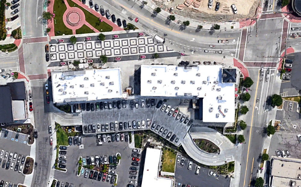
Downtown Provo, satellite view. Click for link. Map data: Ⓒ Google.

The streetscape arrangement of cities and towns in Utah is a fascinating topic all its own. It’s a Mormon thing, basically. Beginning at the center of the LDS church, streets are numbered north to south, and then named East and West relative to the church. Everything directs back to that central point.

Much like Ogden, Provo has outwardly branded its “Historic Downtown.” This is a performative gesture that, as Francaviglia points out, began in the 1970s throughout the United States, and continues to this day. Such initiatives often have the same gloss of a corporate advertising campaign, but might also leverage grants and other funds for the actual restoration and preservation of older structures.

Francaviglia notes that although Main Street façades have been heavily ornamented since the turn of the century, they are often restored today with a more garish and lively Disney color palette than would have been typical at the time.

It was hard for me to tell in Provo what lettering on these buildings was authentic and/or restored and which was augmentation. Again, Francaviglia suggests that this doesn’t really matter all that much. But as a typography nerd, it kinda bugged me.

Some of this filigree is truly lovely. Everything is cleaner, certainly, for which I’m sure historians and preservationists are grateful. But the bright, saturated paint treatments are pure Disneyland.

Sadly though, the elaborate Disneyfied paint jobs only apply to the sides of the buildings which directly face West Center Street. The sides which face alleys are left in their original, washed-out industrial states. Here the logic of film sets is evident. You only need to design for what’s on camera, in this case, the pedestrian and vehicle traffic on the main thoroughfare. The rest is “backstage” just like at a theme park.

Some of the structures in Provo really had me fooled/confused at first glance. This could just as easily be a successful renovation as it could be a “new for old” fresh build from the 1990s. Upon a close look at the trim and condition of the brickwork, I’d say this is an antique building.

From across the street it’s much tougher. But some of the architectural details make me think this is a recent development, like the mix of the turn of the century craftsman-style exposed rafters with the more 1920s and 30s brick and awning approach. This is a historical collage, a pastiche really only evident with those who have a background to spot it.

Conversely, his building would probably stand out to even the untrained eye. It features the kind of 1990s Italian rococo you see in business parks filled with law firms in Southern California which were inspired by Jon Jerde’s Bellagio in Las Vegas. This particular bit of West Center Street struck me as the most un-Provo.

Here’s a bit of authentic storefront with some light restoration to the paint and gilding.

And just like in Ogden, they’ve tried to theme the new construction to the adjoining antique structures. I don’t think they’re fooling anyone with that Central Bank. But as Francaviglia points out, it really doesn’t matter. This same kind of intermix, augmentation, and accommodation was happening in the 1990s but also back in the 1890s. It’s not a new thing. What’s new is the Disneyland Effect.

McCall, Idaho

Decades prior to the rise and dominance of the cinema, architecture would ape from other architecture. But now the sources of pastiche, more often than not, come from the movies. And what channeled that filmic grammar out into the built environment was Disneyland. Have a look at the block of storefronts above. Do they look familiar?

Downtown McCall, satellite view. Click for link. Map data: Ⓒ Google.

Downtown McCall, satellite view. Click for link. Map data: Ⓒ Google.

McCall, Idaho is a small resort on the south shore of Payette Lake. The settlement has been there for decades, but it wasn’t until the 1960s that the town started actively marketing itself as a vacation destination. The primary industry used to be logging, but the last sawmill closed in the mid-1970s. Today it’s the kind of place where big city residents would look to own a second home, or stay at a rental during the summer months.

For the few blocks of the downtown quad, you have a mix of what are likely historic structures. These look like what were once saloons and boarding houses. However, the building to the right, “STEAMERS,” has done some reduced-scale thematic staging on the second story.

When I drove through McCall, there were a couple new developments still under construction. And they all have the Disneyland touch.

The illusion of having larger structures featuring diced up façades with individual personalities is a Disney trick to make it look like there are numerous individual proprietors along Main Street U.S.A.

Even what were in all likelihood much older, individual storefronts have been “Disneyfied” with the same kinds of lighting sconces I saw in Ogden.

Holladay, Utah

All of the above places have a real history, however. Each of those Main Streets, despite being augmented with theming and numerous layers of alteration and restoration (resulting in a qualitative layer cake), have a genuine sense of place. Of what Charles Moore called “inhabitation.” What happens when you start from scratch?

Holladay, satellite view. Click for link. Map data: Ⓒ Google.

Holladay, satellite view. Click for link. Map data: Ⓒ Google.

As Richard V. Francaviglia might have predicted, you start with Disneyland. Which is what I found at this curious development in Holladay, just south of Salt Lake City.

Now this is different than the piecemeal new developments I saw in Ogden and Provo which were slotted into Main Street settings alongside their much older neighbors. The kind of buildings where you do a double-take and wonder if they’re actually old. This “Holladay Village” doesn’t try to fool anyone. This downtown block says: I’m here, I’m the new Town Center, I look like a theme park, and I know that you’re comfortable with that, too.

The plan was approved in 2011 and the developer agreement on the city’s website is dated 2012 (the city also has a nice archive of preliminary renderings). Holladay Village is the work of ArcSitio Design who are based in Salt Lake. It appears to be mixed use with lots of pedestrian space, no curbs, and pleasant plantings throughout.

The state thought enough of Holladay Village to select the project for the 2017 Urban Design Utah Legacy Award. This is the highest urban design award available in Utah, according to the Utah American Society of Landscape Architects.

I thought it was a pleasant enough site, and apparently Holladay Village is far better than what it replaced. And I’m not going to complain about the design, exactly, because I like the themed approach. All the little individual proprietors—like “Amy”—in their own storefronts, which are supposed to have the appearance of having evolved over time into Moore’s “inhabitation.”

Some of the buildings are attached and a few others are free-standing. The mixture of styles suggests that there wasn’t one single designer or team of designers. But of course, there was. All designed and built in one go. Lively paint and trim. Not shy about ornamentation and vernacular forms.

Many, if not most, architects loathe this kind of “lowbrow, populist” design. But when a practitioner doubts that a Disneyland Effect exists, and that the inspiration for—yes, award-winning—public spaces is cribbed from the movies and thus from theme parks? I point to places like Holladay.

July 28, 2020 /Dave Gottwald
lagoon-biergarten-01.jpg

Lagoon - Part 3: Biergarten of Eden

June 29, 2020 by Dave Gottwald

As I’ve looked at, Lagoon has many of the familiar trappings of any American theme or amusement park. But it’s not all cheese and stereotypes. Just in time for the 2019 season during which I visited, Lagoon added a German Biergarten area which rivals anything you’d find at a Disney park.

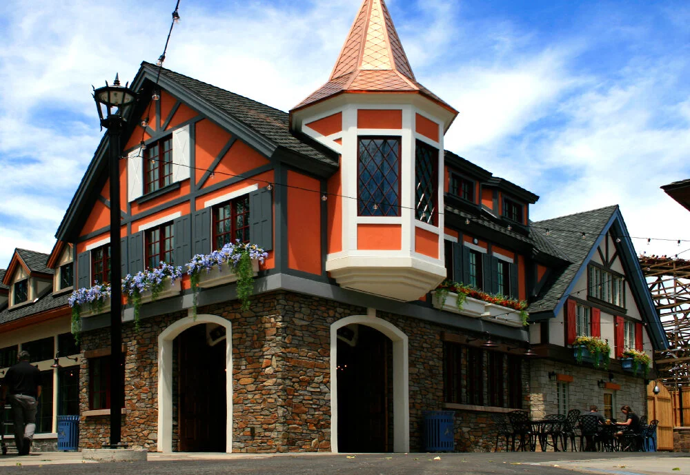
There is no entrance to the area off the main Midway per say. But the boundary of the Biergarten is marked by this prominent structure selling beer and food to go.

The Lagoon Biergarten was meticulously designed and skilfully executed for the park by Salt Lake City’s Coel Studio. Although the way its footprint is situated doesn’t allow for true immersion (the Roller Coaster roars by right next door with nothing but a wood fence in between), this is a solid investment for the park and a most welcome direction for Lagoon to take.

Coel partnered with Wyoming architect Dan Stalker on the themed buildings in a Bavarian style and engaged with EPG for the landscape design. Have a look at the process work and photography at Coel Studio’s project page and their Instagram.

The masterplan is well-plotted and appropriately cinematic. The portion facing the park’s Midway is wide open and inviting.

Walking clockwise (which research suggests most guests in public spaces circulate) you come to a tall clock tower structure with a large archway entrance.

Directly ahead is the interior courtyard space.

The team at Coel working with Dan Stalker Architecture certainly did their thematic homework. This approach to a “weenie” or visual magnet is cribbed directly from the Disney playbook. Here the vantage, scale, and orientation resembles the approach down Main Street U.S.A. to Sleeping Beauty’s Castle.

To the left is additional outdoor seating, with better cover from inclement weather than what is available in the larger, more open front areas of the biergarten.

To the right is the center of the space, anchored by an ornate fountain. The overall approach to the area is large, connected interior spaces diversified and visually parsed by a conglomeration of façades. This suggests structures erected by different proprietors over time instead of designed together. Disney first used this approach with Main Street U.S.A. and then later with the original Fantasyland renovation in the early 1980s. You now find it all their parks. It’s been especially common since the 1990s for new retail and dining complexes, like I’ve found in Michigan and also Wisconsin.

I was impressed by the central water fountain with its wrought iron and gilded elements.

German heraldry is combined with more cute animal iconography. At the top is a golden lion toasting a beer stein in its paw. This is the kind of rigorous detail which is par for the course for Disney, but usually dismissed as unnecessary expense by smaller operations.

The carved blackletter typography pays tribute to Lagoon’s 1886 opening and also the 2019 debut of the biergarten. Wonderful detail, and subtle enough that I almost didn’t see it.

Epcot’s Germany pavilion, 2007.

Of course, I couldn’t help but be reminded of the Germany pavilion or “mini-land” in World Showcase at Walt Disney World’s Epcot park. The area also has its very own biergarten restaurant, though it is strictly an indoor experience and a venue for live entertainment.

The German Biergarten model, which Disney and Lagoon are both trafficking in, is popular in many regions of the United States, particularly in the Midwest. Frankenmuth, Michigan is one such romanticized “European” town that takes authentic the German roots of the region and has transformed itself into a tourist destination through thematic design.

Moving inside, some of the signage is just terrific. I was pleased to discover that according to Coel Studio, Lagoon’s in-house staff was responsible for fabrication of these pieces. The typography is appropriate with quality wood routing and hand painting.

The interior dining space houses two of the largest kitchens in the park. There are 60 total beers on tap, 20 of which are unique. Like Disney and Universal have done in recent years, the menus are flat screen panel displays with appropriately themed graphics and typography.

The simple themed chandeliers are charming and low key, augmented by sunlight streaming down from skylights. The Coel team paid as much attention to the interior details as the outside.

The themed approach to restroom iconography likely did not originate with Disney, but they do it very well and Coel has delivered a version of that approach here at Lagoon.

The typography is consistent all over the complex, manufactured with contemporary substrates when required, but still with Old World touches like the rusted and weathered metal seen here.

There are some subtle elements throughout, like this small bit of stained glass.

One thing which is not as subtle, however, is the biergarten logomark. In fact, I think it’s employed to loudly and frequently. One can hardly blame Coel Studio, as they are a branding consultancy who have a number of brewery clients.

Looking down, it’s even on the manhole cover.

And it’s on every bench and trash can. Although a bit over-logo’d, the Lagoon Biergarten is some top notch thematic design that was meticulously planned and executed on the level that one would expect from Disney or any of the bigger players. I was pleasantly surprised to find this hidden gem at Lagoon (and its beer!) and I hope the park looks to similar design investments in the future.

Oh, and that logo ain’t so bad at all. I even bought the t-shirt.

June 29, 2020 /Dave Gottwald
lagoon-29.jpg

Lagoon - Part 2: Time-Worn Tropes

June 15, 2020 by Dave Gottwald

Utah’s Lagoon is certainly a charming park with a lot of genuine history. It’s kept up well, wonderfully landscaped, and staged at a real human scale. Cool, well-shaded, with a variety of things to see and do (even a water park). Yet I’d like to highlight some of its more interesting tropes, both good and bad, and comment on the most recent ways it has tried to compete with the likes of Disney and Universal.

Lagoon 2019 park map.

I do want to first call attention to Lagoon’s wicked cool park map. This graphic is reproduced on the paper guidemap you’re handed at the front gate, and also mounted at poster size at various locations inside. The graphic style of textured, yet flat, digital illustrations is very contemporary. And although the scale of the grounds is distorted by this representation, it doesn’t get hokey like the more hyperbolic Cedar Fair maps.

The one thing that the park map doesn’t resonate with at all, however, are the disparate themes found within. I’ve already described the primary Midway area, so now I’ll look at some of the other motifs found at Lagoon.

Lagoon’s “Frontierland”

What’s an American theme park without a “Frontier Old Wild West” land of some kind? Actually, like the Ghost Town at Knott’s Berry Farm in Southern California, as well Greenfield Village at The Henry Ford and even Frontier Trail at Cedar Point, there are actual structures of historical significance here.

And like all those other places, the staging of them at Lagoon’s Pioneer Village is problematic and confusing. I’ve even found this to be true at actual museums.

This dedication plaque near the entrance to the area demonstrates what I’m talking about rather well. Indeed, Horace and Ethel Sorensen did found the village in 1938 near Salt Lake City. The couple intended it to be the same sort of open-air, “living history” museum as Colonial Williamsburg, which John D. Rockefeller Jr had begun restoring about ten years prior.

Lagoon bought the village and its half-dozen structures—lock, stock, and barrel—in 1975 from The National Society of the Sons of Utah Pioneers. As such, Pioneer Village is quite like Walter Knott’s relocated Ghost Town assemblage, which began in 1940 when Knott purchased his first antique structures from actual western towns such as Prescott, Arizona. Though you won’t find any mention of the 1975 purchase and relocation on the above plague or anywhere else that I could find at Lagoon.

The entrance signage for Pioneer Village is set in Louis Minott’s ever-misapplied Davida (1965) which is a Victorian phototype revival that is so very, very not “Old West.” It’s a common face which I also found at Lakeside Park in Denver at a Mexican food stand.

As I’ve documented at Cedar Point, Kings Island, and elsewhere, after the first Arrow log flume ride debuted at Six Flags Over Texas in 1963 (El Aserradero “The Sawmill” is still operating) they started popping up all across the country, then the world. If you’ve got a “Western” or “Frontier” area at your favorite local park—and even if you don’t—the ride is a standard trope.

I thought it was odd that the Lagoon model, installed in 1976, is eponymously just “Log Flume.” But it looks like there were over two dozen equivalents of an Untitled album for the Arrow flume ride at one point. Another couple handfuls exist abroad called, accurately, “Flume Ride.”

Around the corner, a path winds to the very rear edge of the Lagoon property. The park faces east and backs up to the foothills at the base of the Wasatch Range, which is quite picturesque. But it also offers a sense of true remoteness, something that you can’t get at a bermed park like Disneyland which is surrounded by suburbia.

Hong Kong Disneyland on Lantau Island, 2008.

Actually, that was one of the most remarkable things about the Disney park in Hong Kong which I visited back in 2008. There the Main Street USA and Sleeping Beauty Castle are dwarfed by the lush mountains of Lantau Island, with Discovery Bay and peaks like Lai Pik Shan in the distance. Being used to the California original, it was oddly off-putting at first. But over the course of the week I spent there, I really grew to appreciate the setting.

And that same charm of a kind of “real-life matte painting” is present here at Lagoon. You can really see how much the natural topography adds to the verisimilitude of the “Rattlesnake Grub” shack.

Some nice prop vignettes here of the Six Flags / Cedar Fair variety. This is something I’ve commented on at length for years and Lagoon is handling it rather well, more on the subtle side of things. In fact, this is the only such staged display of propping that I came across at the park.

And perhaps that’s because this is the newest themed area at Lagoon. The Rattlesnake Plaza expansion behind Pioneer Village was added to the park in 1997. It’s the home of (naturally) the aforementioned Rattlesnake Grub as well as Rattlesnake Rapids, a standard river rapids ride. Everything from the logo marquee above to the level of theming indicates a nineties-level attention to what has been working for Disney and Universal.

It’s a smaller river rapids ride than the more substantial ones at Cedar Fair parks. More like what I found at Valleyfair in Minnesota.

Here in Rattlesnake Plaza, it’s evident that everything is newly built. It looks themed and it’s meant to look themed.

Walking back in the Pioneer Village area, the lines start to blur again. Old and new, relocated and constructed, historical and themed, all whipped into a single frappé.

Old? New? Relocated? Custom built? It’s the same problem I had on Cedar Point’s Frontier Trail. And I’d argue that the rugged landscaping and natural backdrop makes this even more difficult to discern.

Some of these buildings, I can’t even tell the origin. Is this from the original Pioneer Village dating back to the 1930s? It houses a circus memorabilia museum, so the “Big Top” aesthetic fits. But the building is clearly quite old. Maybe this is thematic design from an earlier era.

No clue about this one. Just looks like a repainted house.

A Moment of Surrealism

Just around the bend, I found this structure which is clearly of vintage condition and was moved from the original Pioneer Village. However, as I got closer I noticed that the interior had been hollowed out.

Welcome to The Twilight Zone, Lagoon edition. What was once an antique building has been gutted, painted black with an exposed ceiling structure which resembles an Urban Outfitters location. The retail checkout in the center of the room appears to be floating in space; in the void. This reminded me a lot of the false front work on the classic Star Trek episode “Spectre of the Gun” which I commented on when I was discussing Deadwood, South Dakota.

The trimmings make me think of the interior design faux-folksiness of the Cracker Barrel chain.

Just My Cup of Tea

As I wandered through the grounds looking at some of the less-themed and more standard amusement fair elements, I can across a Disney-flashback if there ever was one, the Tipsey Tea Cups. Curiously the graphics and typography on the entrance signage resemble the 2010 Disney/Tim Burton live-action Alice in Wonderland adaptation rather than the company’s 1951 animated one which I saw being aped rather directly at Enchanted Forest in Oregon to the point of potential legal action. After all, Disney has proved itself to be zealously litigious in the past.

I was surprised to later learn that the “teacups ride” is actually a standard genre at all kinds of amusement parks all over the world, so Lagoon is innocent as far as I’m concerned with regards to attraction plagiarism.

Mad Tea Party at Disneyland, 2007.

From my cursory research, it’s unclear if Disneyland’s Mad Tea Party (1955) as developed by Arrow is the true predecessor to all of these other rides, or simply a refinement of an earlier amusement concept.

Theme Park Orientalism

Lastly for this post, I’d like to highlight a common enough sight at American parks—the somewhat stereotypical representation of Asian design and architectural forms. This pagoda and the surrounding gardens are home to one Jumping Dragon ride.

Let’s run down the list. Dragon? Check. Although he doesn’t appear to be “jumping.” A variant of “Wonton” or “Chopstick” lettering, which many in the Asian-American community have a problem and design commentators have gotten hip by declaring racist unless actually ”enjoyed” by Asian businesses? Check again. Lagoon might be able to get away with it, but this kind of typographic treatment has certainly gotten big companies into trouble before.

Faux-imperial statuary? Check.

Wrought iron fencing with faux-imperial graphic symbols? Check.

Japanese stone lanterns (these particular Tōrō are Kasuga-dōrō), because what is the difference between gardens in China, Japan, and other parts of East Asia anyway? Check.

Oh, and everything painted fire engine red, including the electrical boxes? Check, and mate.

At the complete opposite north end of Lagoon park, I found Samurai. This spinner ride’s queue even has its own Torii gate.

Look, I can’t very fairly single out Lagoon for this. They’re far from the only park sporting the Wonton Look™. I grew up going to Six Flags Magic Mountain with its Ninja (the park calls it “The Black Belt of Coasters,” I’m not kidding), one of only three Arrow suspended models left operating in the United States.

The surrounding themed area, which has been at Magic Mountain since opening day in 1971, is called Samurai Summit and sports all the expected trimmings that we’re seeing here at Lagoon. Tatsu, a Bolliger & Mabillard flying coaster, was added to that California park in 2006. At least that’s a Japanese word which has multiple authentic meanings (though I bet they’re leaning into “dragon”).

The lanscaping and cartoonish “exotisism” here at Lagoon is just like what I found at Worlds of Fun, which has an entire themed Asia area. Not surprisingly, it dates from the same period as Magic Mountain’s Samurai Summit (early 1970s), and you generally don’t see this kind of stuff past the 1980s (Ninja opened in 1988). Spending time at Worlds of Fun—and having a look back at the marketing used for the park’s opening and in its early years—prompted me to ask, “Can theming be racist?” and I still don’t have an answer. I think it still deserves discussion.

Continued in Part 3.

June 15, 2020 /Dave Gottwald
lagoon-01.jpg

Lagoon - Part 1: Lagoony Tunes.

February 15, 2020 by Dave Gottwald

The Continuation - Summer 2019

In June of 2019 I embarked on a second research roadtrip, this time through the American Southwest. I had not visited Las Vegas to document thematic design in some ten years, and I was also eager to see several of the wonderous National Parks scattered throughout the state Utah. Along the way I found some unexpected surprises—bits of theming here and there that has prompted some new thinking for me about the mythical American Old West.

Route from Idaho to Phoenix, Arizona. Map data: Ⓒ Google.

Route from Idaho to Phoenix, Arizona. Map data: Ⓒ Google.

As before during the summer of 2017, my intrepid travel companion was the ever creative and hilarious David Janssen, Jr.—an artist, designer, and educator who currently teaches in the Fine Arts Department at Washington State University as an instructor in 2D Foundations. Our ultimate goal was to reach Phoenix, Arizona and tour Frank Lloyd Wright’s Taliesin West studio retreat.

Lagoon, satellite view. Click for link. Map data: Ⓒ Google.

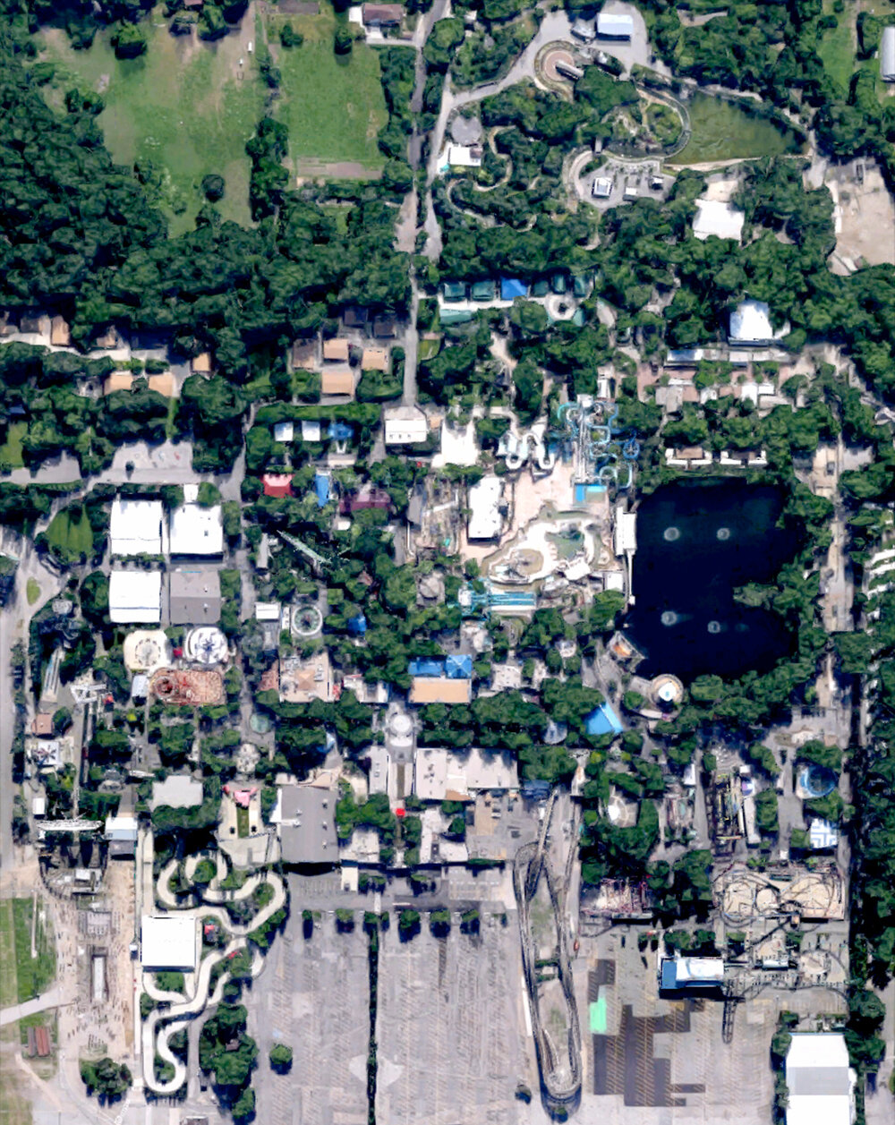
Lagoon, satellite view. Click for link. Map data: Ⓒ Google.

The Fun Spot of Utah

Our first stop, however, was Utah’s premiere amusement park / quasi-theme park, Lagoon. Located just north of Salt Lake City in Farmington, Utah, Lagoon has a long history dating back to the 1880s. As such the park has the same sort of layered charm as Cedar Point which dates from roughly the same period. Era upon era has been built upon and over, augmented, and expanded.

Vintage postcard, bathing at Lagoon.

Lagoon opened to the public on July 12, 1896 and was billed as a destination resort featuring “Bowling, [an] Elegant Dancing Pavilion, Fine Music, A Shady Bowery, and Good Restaurants.” Just like the trolley parks which sprouted up all across the United States in the first couple decades of the twentieth century, Lagoon was the brainchild of a railroad magnate—Simon Bamberger, the fourth Governor of Utah—who wanted to increase passenger traffic on his lines.

Vintage postcard, Shoot the Chutes.

The park’s first thrill ride attraction, a typical “Shoot the Chutes” water voyage, opened for the last season of the 19th century. The following summer, swimming and boating were permitted for the first time in the small lake which is Lagoon’s namesake.

Map of the Lagoon property, 1911.

This early map shows the small scale of the Lagoon park in its first few decades. The park’s very first roller coaster, the Scenic Railway, is indicated here as the “Double Eight” in reference to its double figure-eight track layout with a height of 40 feet.

Vintage photograph, Scenic Railway, 1907.

The attraction was built for the 1907 season adjacent to the Shoot the Chutes. By the early 1920s it had been demolished. There’s a nice short documentary online about the ride.

Map of the Lagoon property, 1949.

By mid-century, Lagoon had expanded considerably and added numerous Midway-type rides, games, and concessions. This once quiet bathing and boating retreat had morphed into a full-blown amusement park.

A Lushly Landscaped Midway

The central spine of the Lagoon park is a typical Midway. However, unlike the wide concrete jungles found at Cedar Point or Kings Island, the Midway area here is narrow, resplendent, and full of mature trees. They provide a cool canopy in spite of the summer sun, and also add scale to the various structures.

Lagoon’s Midway has all the classics you’d expect, like a this carousel which was built in 1893. It was installed in the park for the 1906 season, and as such is Lagoon’s oldest standing attraction. A blaze on the Midway in 1953 threatened to destroy it, but it was saved by firefighters dousing it continuously with water. In 2003 the Lagoon carousel was lovingly restored for its 110th birthday.

It’s not a traditional American Midway without some carnival-style games. These are spaced along both sides of the span, and are styled in the expected Theme Park Gingerbread motif.

Just like at Cedar Point and many other parks featuring midways, a sky gondola ride hangs overhead. Lagoon’s Sky Ride was added in 1974 and is the much smaller, open air feet-dangle of the ski lift variety nearly identical to the Sky Glider at the Santa Cruz Boardwalk, rather than the more substantial, closed-cabin Von Roll model.

Travelling over the Midway at about two and a half miles per hour some 60 feet in the air made for a calm seven minute journey from one end to the other. It was so nifty we rode it roundtrip (though you do have to exit and queue up again to reboard). And just like the trees, the Sky Ride provides an intimate sense of scale for this portion of the park.

The Wild Kingdom Train opened for the 1967 season as the “Animaland Train” and follows a route of about a third of a mile around Lagoon’s namesake lake and fountains, and through a tunnel to the Wild Kingdom Zoo area, which is actually the state's second largest.

The train depot is a mixture of Theme Park Gingerbread and a Frontier Old West look, decked out in patriotic red, white, and blue with mustard yellow accents—just like the locomotive and cars of the Wild Kingdom Train itself.

I have to wonder if this 24" narrow gauge steam railroad, the Sky Ride, and other additions which came to Lagoon in the late 1960s and early 70s were an attempt to import the popular trappings of Disneyland. Just like what happened at Cedar Point during the same period, parks with long histories began to adapt in response to Disney slowly and successfully rewriting the script of audience expectations for amusement parks nationwide.

Lagoon’s namesake lake, in which swimming is no longer permitted.

“Lagoon-A-Beach”

Which is fine, because there’s a complete water park area right in the middle of Lagoon called Lagoon-A-Beach. Prior to the late 1980s, this part of the park was the location of a massive swimming pool. The waterpark initially opened with a additional, separate gate admission, but has since been folded into a single price for all.

In the grand Disney tradition, the name of the waterpark area is a cheesy wordplay on Laguna Beach, California (which is quite near to where I grew up, actually).

Lagoon lacks separation and transition between its various themed areas, so you can see the ten slides of Lagoon-A-Beach towering overhead from many different settings. Just like at Cedar Fair parks which have internal water park areas—such as Valleyfair—this is a visual intrusion which disrupts scale and staging throughout Lagoon’s landscaping as a whole.

The Creative Director for Lagoon-A-Beach appears to be Captain Obvious. Here we have the infamous “Easter Island Heads” from the monolithic human figures scattered about Rapa Nui National Park known as Moai. If the designers had only waited a couple of decades, they would have known that the heads have hidden bodies buried in the ground beneath. Moai are a common trope at water parks.

Also common are volcanos, as they make excellent water features. Castaways-style suspension bridges fashioned from shipwrecked wood and rope are also expected in such settings. Nothing surprising here, all decently executed, but of course nothing on the scale of a Disney or Universal water park.

Just a Simple “Roller Coaster”

Lagoon has a real vintage treasure creeping and crawling out into its main parking lot area—the fourth oldest wooden coaster in the United States (sixth in the world)—plainly called Roller Coaster.

Vintage postcard, Roller Coaster.

Sometimes advertised in decades past as the “Giant Roller Coaster,” and known affectionately by locals as the “White Roller Coaster,” the ride is actually only 62 feet tall at the first drop. It was designed by the legendary John Miller and opened at Lagoon for the 1921 season. Damaged by the same 1953 fire which threatened the park’s carousel, it was rebuilt and has been restored more than once since.

Much like the rest of the park itself, Lagoon’s Roller Coaster has a layered aesthetic that shows the passage of time. The ride is from the 1920s, yet the queue and station suggest the popular Art Deco stylings of the 30s and 40s, as I saw at Lakeside Park in Denver two years before.

It’s all part of the historical personality of a park as old as Lagoon, though the grounds are not immune to some of the more tacky tropes of the amusement park industry as seen at Cedar Fair and Six Flags, as well as the more detailed and immersive thematic cues of leaders such as Disney and Universal.

Continued in Part 2.

February 15, 2020 /Dave Gottwald
  • Newer
  • Older

All original content on this site © 2007—2025 Dave Gottwald.
All photography which is my own is licensed under Creative Commons Attribution-NonCommercial 4.0.
This means you are free to share and adapt my images for non-commercial purposes only.