Welcome to Westworld(s).
As I mentioned in my last post, I have personal reasons for both Bryce Canyon National Park and Monument Valley Tribal Park being on my bucket list since childhood. And actually this is true for Arches as well. The common thread? Theme parks, television, and the movies.
The Hoodoos That You Do So Well
Bryce Canyon is most famous for what are called its “hoodoos.” These rock formations are distinct from what are called pinnacles or spires in that they do not uniformly taper upward to a point. Rather, hoodoos are a product of erosion which vary in thickness and somewhat resemble totem poles. They are also found in the east side of Zion National Park to the south.

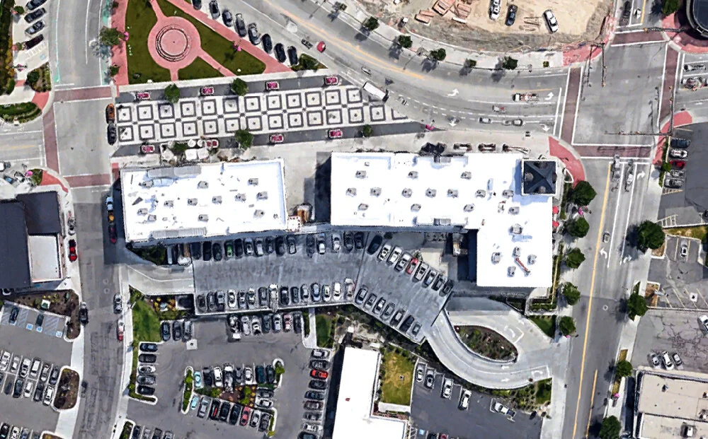
Bryce Canyon, satellite view. Click for link. Map data: Ⓒ Google.
From the rim looking down Bryce seems deceptively contained. Yet from a bird’s eye view you can see how extensive the canyons of the park are.
I was curious where the name “hoodoo” comes from, and thought it might be an Anglicization of a Native American word (I’d seen it rendered mistakenly as “hudu” before). Turns out, it actually comes from West Africa. “Hoodoo” in the Hausa language means roughly the “practice of retribution.” Hoodoo, like voodoo, is a spiritual system created by African slaves in the New World. The rock formations resemble the candles used in Hoodoo ceremonies.
The hoodoos of Bryce vary tremendously in size, shape, and coloration. Many of them looked like undersea coral to me. I also was under the mistaken impression that they stood fully formed from the canyon floor like piles of candle wax. In fact, they tend to appear in croppings not unlike fences high above the hiking trails, emerging from hills of loose soil.
In other places around Bryce they look less like individual totems and stand like walls.
And from a far distance, they lose all definition and blend together completely.
Big Thunder Mountain at Disneyland, 2007.
“Something Like Walt Disney”
This is more of what I expected to see at Bryce Canyon. I assumed that all hoodoos were freestanding towers resembling candle wax drippings. My preconceptions come from the Big Thunder Mountain Railroad attraction at Disneyland, designed by Tony Baxter. The attraction has since been adapted for other Disney Parks around the world.
Big Thunder Mountain at Disneyland, satellite view. Map data: Ⓒ Google.
Baxter initially conceived of the attraction in the mid-1970s as a themed take on Arrow’s mine train coaster (which was quite popular at more than one Six Flags park) for the Magic Kingdom at Walt Disney World. But the company switched gears and wanted the attraction to debut first at Disneyland, replacing the aging Mine Train through Nature’s Wonderland which had opened in 1960 as an expansion of the Rainbow Caverns Mine Train (1956).

Vintage postcard, Mine Train through Nature’s Wonderland. Ⓒ Disney Enterprises, Inc.
It was a natural fit. The Mine Train attraction already featured faux rockwork which could have been referencing any one of a number of National Parks throughout the Southwestern United States. And the look of the trains would be retained pretty much untouched for the new roller coaster.
As Baxter recalled in The Disney Mountains: Imagineering at Its Peak his initial design concept for the Magic Kingdom was in the words of author Jason Surrell “a majestic Southwestern landscape inspired by the craggy spires and rugged gorges of Monument Valley, Arizona.” But he did not feel the theme would be appropriate for the more intimate scale of Disneyland:
We had created a Monument Valley look for Florida, which has a very spectacular, classic grandeur and conjures up all of the different emotions that really work with the scale of Walt Disney World, which is a spectacular Park. Well, Disneyland is a charming Park, so we had to find an aesthetic that was compatible with Fantasyland, which was was to be Big Thunder’s next door neighbor.
The National Graphic issue Tony Baxter found in the Disney research library.
Baxter went on to describe his research process:
I was looking through National Geographic and I found a great article on Bryce Canyon in Utah, and on the first page it said ‘It all looks like something by Walt Disney'—that it is that fantastic and fanciful—and I said, ‘I think I’ve hit pay dirt here, this is what we’re going to do.’
Surrell’s book identifies the issue (October, 1958) and so I tracked down a copy online for a couple dollars. You know what? Tony Baxter remembered the quote from the article exactly.
Spreads like this fired Baxter’s imagination.
Here is a perfect example of what my colleague Greg and I call “cinematic subsumption” and the bizarre feedback loops which it can bring about. In our award-winning 2019 article for The International Journal of the Constructed Environment, “The End of Architecture,” we describe the process of filmic grammar affecting all manner of design, and basically taking over (“subsuming”) the built environment.
Big Thunder Mountain at Disneyland, 2007.
In this example, a writer and his wife visit Bryce Canyon. She observes (not inaccurately) that Bryce Canyon, basically, reminds her of an attraction at Disneyland. Two decades later, a Disney designer reads the article, and now themes an attraction after that very same National Park. Accepting that the theme park model is based in filmic grammar, essentially her observation is that “this looks like a movie” and then a movie gets made based on that observation.
Big Thunder Mountain at Disneyland, 2008.
This is the feedback loop of cinematic subsumption—blurring the line between the source and the reference, the copy and the original. The kind of stuff that Jean Baudrillard was on about in his famous Simulacra and Simulation (1981).
Theme Park —> National Park —> Theme Park —> ?
The hoodoo rock formations of Big Thunder Mountain at Disneyland are a thematic interpretation of someone’s observation of a National Park looking like the thematic. Of course the landscape design for the attraction as a whole incorporates many other visual cues of “Southwestness” like the various cactus species pictured above. And there’s certainly no runaway 19th century mine train in Bryce Canyon.
Big Thunder Mountain at Disneyland, 2008.
See from a distance, Tony Baxter’s hoodoo spires look like something out of the Candyland board game. And the singular statement of a “mountain” now reveals itself to be thoroughly divorced from the realities of the topography of Bryce itself. Not so much the greenscape (notice how many trees, particularly evergreens, are visible in the above photographs from my visit) but in that the foliage is far denser than the rock formations themselves. The site of Big Thunder is completely surrounded, enveloped.
Big Thunder Mountain at Disneyland, 2008.
I also didn’t see any dinosaur bones at Bryce Canyon National Park, though there are many significant sites elsewhere throughout the state of Utah. So this is kind of regionally resonant.
Big Thunder Mountain at Disneyland, 2008.
Notice how Baxter uses the ribcage as a tunnel-like element for the water splashdown finale of the coaster, which is something atypical for this kind of ride. The Arrow originals didn’t have splashdown elements; this appears to be cribbed from the way the Disney designers slowed the Matterhorn Bobsleds down at the end of their speedy downhill journey.
Monumental Interpretations
The original Big Thunder Mountain at Disneyland opened in September of 1979 after roughly two years of planning and construction, including the deinstallation of the Mine Train through Nature’s Wonderland. The attraction design for the Magic Kingdom—which Tony Baxter had been toying with for years (his first sketches date to 1971–72)—debuted there at Walt Disney World in 1980. And true to his initial vision, it was still based on the famed vistas of Monument Valley which straddles the state line of Arizona and Utah.

Monument Valley, satellite view. Click for link. Map data: Ⓒ Google.
Unlike Bryce Canyon, Monument Valley has a robust cinematic reputation. The location has been widely used in American Westerns of the mid-twentieth century, most notably in the films of John Ford.
Thus being primed in the movie memories of so many Americans, the remarkable skyline is ideal fodder for theme park interpretation. Everyone from Grandparents to teenagers will likely find the setting oddly familiar. The most iconic forms of the valley are known as “the Mittens” (formally the West and East Mitten Buttes), resembling as they do, upright hands complete with thumbs.
Although the Mittens are the most iconic, Monument Valley’s contours and features are more diverse than you would guess. There are all kinds of cool buttes, mounds, and croppings. All of them very large.
And everywhere you look, the vista changes. It’s like a different park with each turn of your shoulder. I could have spent a week there (which you can actually do on private off-road tours with Tribal guides).
Big Thunder Mountain at Walt Disney World, 2007.
Honey I Shrunk the Valley
The last time I visited Walt Disney World thirteen years ago, their Big Thunder Mountain Railroad was closed for an extended refurbishment. So not only was I deprived of riding it, I couldn’t get many photos either. Above you can see that the geologic language of Monument Valley has been interpreted with great elasticity. At the entrance and throughout the queue are whole features of the valley, shrunk down.
No rocks like this exist at such a scale at the actual site. The buttes which have been interpreted for the attraction are all massive in real life. The smaller rocks above in the foreground are soft and broken, which much loose soil around. All similar rocks at the Magic Kingdom’s Big Thunder are sculpted, moulded, and rigid—just like the larger formations in Monument Valley.
Big Thunder Mountain at Walt Disney World, satellite view. Map data: Ⓒ Google.
When the project moved to Disneyland in the mid-1970s, Tony Baxter had to mirror his original layout and condense it somewhat to make it fit in the much smaller footprint allocated for the attraction at that park. Returning the project back to Walt Disney World allowed him to resume his design work at the intended scale and orientation. The Magic Kingdom version sits on 2.5 acres, some 25 percent larger than the Disneyland site. Also unlike at Disneyland, this Big Thunder sits directly alongside the shores of the Rivers of America, providing an even more incongruous interpretation of Monument Valley, where there are no significant bodies of water around for hundreds of miles.
Big Thunder Mountain at Walt Disney World, 2007.
Like the Disneyland original, this second attraction features a single, central mountain for which Big Thunder takes its name. At 197 feet, it’s actually the tallest “mountain” in the entire state of Florida. The interior of the structure houses the ride’s exciting finale and final drop.
What I find interesting here is that Monument Valley has no peak-type structures, so like with the hoodoos of Bryce Canyon, Baxter and his design team had to cheat a bit to provide a mountain in the vernacular of a landscape which actually doesn’t lend itself to one. A singular “peaked” hoodoo at Disneyland and a singular “peaked” mitten at the Magic Kingdom.
Big Thunder Mountain at Tokyo Disneyland, 2008.
The West Comes East
When Tokyo Disneyland opened in 1983 as the first overseas Disney park, it did so without an iconic “wildest ride in the wilderness.” However a spot was set aside for it during master planning and it was always intended as an addition for the park’s first expansion phase. Big Thunder Mountain (no “Railroad” in the title) opened at Tokyo Disneyland on July 4, 1987. This was likely a deliberate nod to the pure “Americanness” of its Western setting.
Big Thunder Mountain at Tokyo Disneyland, satellite view. Map data: Ⓒ Google.
Here in Tokyo the footprint is smaller like at Disneyland, yet along the shores of the Rivers of America like at the Magic Kingdom. The design motif is once again rooted in the majesty of Monument Valley, but Baxter and the other designers also made sure that there were many elements unique to this third iteration.
Big Thunder Mountain at Tokyo Disneyland, 2008.
For example, the attraction queue has a series of interesting twists and turns which are only found in Tokyo. I found the rockwork here to be a more thoughtful interpretation, overall, of Monument Valley. For one thing, the scale is far less reduced.
What the Disney designers have done more successfully here than at the Magic Kingdom version of Big Thunder is to take these massive buttes and better reproduce their crags and contours at human scale. The forms work better as “human or a bit taller than human” rather than the toadstool-like, trash can-sized rocks at Walt Disney World. You shouldn’t be able to sit on a butte. But walking next to one seems to work. The macro becomes the micro.
Big Thunder Mountain at Tokyo Disneyland, 2008.
There is also a lot more thematic prop work at the Tokyo attraction, to the point where the “valley” seems to be littered with antiques. The above scene looks like a junkyard, circa 1890. Also notice the forced “wall” of buttes in the background.
Big Thunder Mountain at Tokyo Disneyland, satellite view. Map data: Ⓒ Google.
Because of the tighter attraction footprint, the wall functions like a fence blocking the buildings behind. This is clear by looking from above.
Bryce Canyon, satellite view. Map data: Ⓒ Google.
Oddly, this seems true to what I saw at Bryce Canyon, with walls of hoodoo croppings that looked like barriers. Even the satellite view looks the same. So there’s a little bit of hoodoo magic in Tokyo’s Big Thunder Mountain after all.
Big Thunder Mountain at Tokyo Disneyland, 2008.
It was my impression, both times I’ve visited (2001 and 2008), that the interpretation of Monument Valley and overall theming at Tokyo Disneyland’s Big Thunder is more immersive than its stateside sister attractions. The propping might be a tad excessive, but the rockwork is terrific.
POV footage of Big Thunder Mountain at Tokyo Disneyland, 2008.
On my second visit to the park in 2008, I recorded some POV video footage with my digital camera. I didn’t have a great one at the time, so it’s pretty amateurish. But I was able to review it and note the attention to detail in crafting even more arch passages than the Magic Kingdom version has. Again, the detailing throughout vibes nicely with what I found out in Monument Valley.
Tom Sawyer Island at Tokyo Disneyland, 2008.
And it doesn’t end there. Unique to Tokyo Disneyland is the fact that the “Monument Valley-ness” extends beyond the Big Thunder attraction itself and onto their Tom Sawyer Island. The first of these artificial islands is surrounded by the Rivers of America at Disneyland, and there is a nearly identical island at the Magic Kingdom. The Disneyland version was rethemed in 2007 as a “Pirate's Lair” referencing the popular film franchise.
The Japanese have a great love of classic American Westerns (this part of the park is even called Westernland) so extending the iconic Monument Valley rockwork and colors out into the rest of the environment makes total sense. Even if these small buttes and peaks look totally incongruous on an island facing a river surrounded by greenery.
Big Thunder Mountain at Disneyland Paris, 2008.
L'Ouest Est le Meilleur (The West Is the Best)
As deep as the Tokyo version’s impression was on me, I have to say, none of the other Big Thunder Mountain attractions even compare to what Tony Baxter and his design team came up for their fourth and final version, which opened at Disneyland Paris in 1992.
Big Thunder Mountain at Disneyland Paris, satellite view. Map data: Ⓒ Google.
There are many factors which make this version of the attraction so unique. First of all, Mark Twain and Tom Sawyer aren’t well known in France, so a Tom Sawyer Island was dropped. Second, although this area would still be called “Frontierland,” in spirit Tokyo’s “Westernland” appellation is more appropriate. Only the American West is represented; the Rivers of America here are the Rivers of the Far West. And out on its own landmass is the icon at the center of the entire story: Big Thunder Mountain.
Big Thunder Mountain at Disneyland Paris, 2008.
Disneyland Paris is the only park to feature a Big Thunder attraction on opening day. And as he mentions in Surrell’s The Disney Mountains: Imagineering at Its Peak, Baxter appreciated that he was able to incorporate it into the masterplan this time, for
[this] allowed Big Thunder to take center stage, which it couldn’t do at any of the other parks because it was built after the center stage was completed, so it’s always out on the end or in the corner—peripheral. In Paris, we were able to put it right in the middle of Frontierland, knowing that hearing the screams and the bells and whistles would bring an energy level to Frontierland that we really wanted.
Big Thunder Mountain at Disneyland Paris, 2008.
The mountain is not only the visual focal point of the Frontierland at Disneyland Paris, but also the narrative one. For the first time Baxter and the other designers created a master spatial narrative for the area. The Frontierland areas at prior parks had all been collaged together to represent different parts of the county’s wildness. With only the West in Paris, the land became the gold mining town of Thunder Mesa.
Guests queue up for the attraction in the mine structures in the town on the shores of the Rivers of the Far West. Then you ride the train through a tunnel under the water to emerge on the island, complete the rest of the route, and go back through another tunnel again to disembark.
Given the Channel Tunnel (“Chunnel”) which was under construction at the time and now connects England and France by rail, this was a very clever design move.
POV footage of Big Thunder Mountain at Disneyland Paris, 2008.
Again, my POV footage of the ride isn’t great. But in reviewing it I could see that the attention to detail at Tokyo was taken even further. Also, there appears to be a blend of Monument Valley “butte and mitten language” with the Bryce hoodoo vocabulary from the Disneyland original. Some of the hoodoo forms are visible above in the top right. In an interview with Tony Baxter for “The E-Ticket” Magazine published in 2009, it turns out he confirmed this:
For Big Thunder Florida we chose the grandeur and spectacle of Monument Valley as inspiration for the rockword. In Disneyland, we went with the charming and fanciful rock formations of Bryce Canyon. In Disneyland Paris, I think we were successful in blending the two.
POV footage of Big Thunder Mountain at Disneyland Paris, 2008.
One thing that really caught my eye going over my photos and footage from Paris is the amount of visible rock strata incorporated into the design. It’s a touch of realism that adds a bit more immersion to the landscape, also there is not much in the way of dramatic strata at either Bryce Canyon or Monument Valley. It just feels “prehistorically Southwestern.”
POV footage of Big Thunder Mountain at Disneyland Paris, 2008.
An element which is completely unique to the Paris attraction is that faux trees dot the mountainscape. And they’re evergreen conifers; they look like little Christmas trees! Sure, all four Big Thunder attractions feature iconic cactus varieties. The ones in California and Florida are real; the ones in Japan and France are faux saguaros. But fake trees, especially ones we associate with winter, were odd to see indeed.
Big Thunder Mountain at Disneyland Paris, 2008.
What I realized is that the climate at Disneyland Paris makes things tricky. The week I visited in April of 2008, it lightly snowed twice. Even on the sunbleached day I took my POV footage on the ride, it was freezing cold. In the picture above you can see how the evergreen species planted around the edge of the Rivers of the Far West at the right visually compensate for the loss of leaves on the trees to the left.
Tony Baxter and his designers tried to convey a singular American West setting, yet nature stopped them cold. So, even faux evergreens were made part of the attraction design, to blend with the rest of the live plantings. As someone who grew up in the Western United States, it looks odd. Mountain smashed together with river and desert. But I suppose the French just go with it.
Big Thunder Mountain at Disneyland Paris, 2008.
One last thing. The artificial rock designs at Disneyland Paris around their Big Thunder are more naturally ocre in color. At Disneyland, they are light tan, brightly bleached (somewhat like Bryce Canyon). At the Magic Kingdom and Tokyo Disneyland they are super red, almost comically bright orange. But the coloration felt the most natural at the Paris park. They nailed that bit, despite the fact that the rocks are scattered throughout the foreground of landscapes they would never been found in naturally. The forest above looks like Ohio. The rocks look like New Mexico.
Well that’s it for theme park connections. Up next I’ll look at the television and film ties to Utah’s national parks which made them such must-see destinations for me on this past roadtrip.