
Viva Las Vegas - Part 2: Thematic Archaeology.
One of my personal guilty pleasures in doing site research is finding the really run down stuff. Destinations that have seen better days; neglected, even partially or totally abandoned. In mega-themed areas like Las Vegas, you can always find some place down on their luck. But I thought was that too easy. So I decided to go further afield.
Totally Terrible
About 25 miles south of the Las Vegas Strip sits Terrible's Hotel & Casino, which opened as the Gold Strike Hotel and Gambling Hall in 1987. In 2014 it was purchased by the Terrible Herbst Oil Company who own those convenience store gas stations you find throughout the Southwest featuring the “Terrible Bandit” mascot. The eponymous renaming took effect four years later.
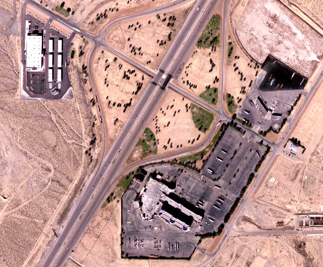
Terrible’s Hotel & Casino (just outside Primm, Nevada), satellite view. Click for link. Map data: Ⓒ Google.
The site is basically a massive truck stop with ramps and service stations designed to support large semi-trailer rigs. As such, it would appear that most of the casino patrons and overnight guests at Terrible’s are also truck drivers.
The place was in awful shape, and it was cheaply put together to begin with. Which is why I kind of love it so much. I find beauty in the peeling paint and sun bleached stucco.
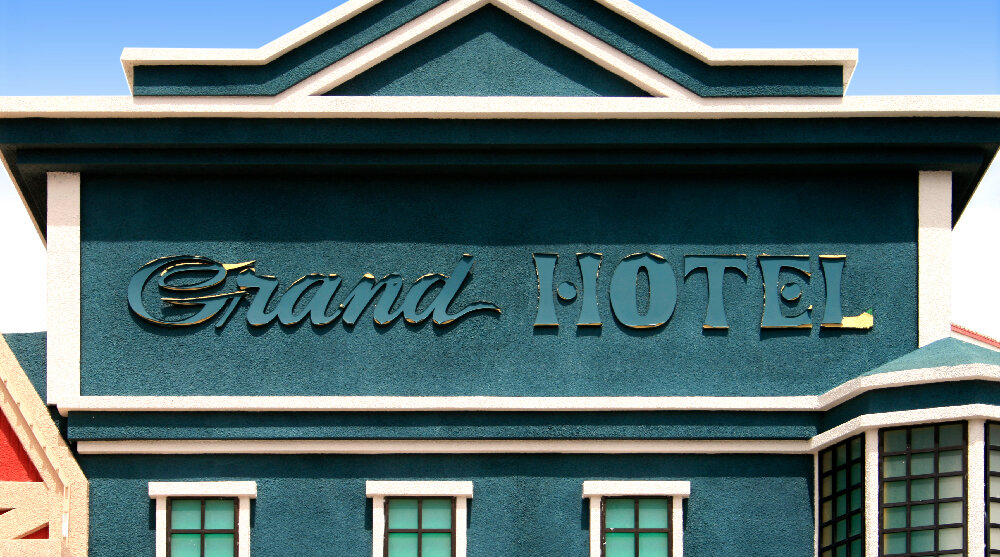
There was period from the late 80s to the late 90s when thematic design in Las Vegas was just running rampant. As much as I dig this stuff, it really was out of control. This was the era that gave us all the massive kitschy mega-resorts with their own easily-identifiable themes: Excalibur, Luxor, Mirage, Mandalay Bay, Paris, NY NY, etc. So in order to complete, even the more down market establishments made an attempt to slather on some theming. And here at Terrible’s, it’s Vegas’s oldest, its original theme: The Old West.
I ducked inside for just a moment. It was quite dark and the gaming areas were pretty tight quarters, so I didn’t have much leeway to take pictures. Apart from the cute, backlit glass, wood typography signage, there wasn’t much design either. The fun stuff was all outside.
Zooming by on the highway, there’s no way I would have noticed this. In order to foster an illusion of structural diversity, paint lines run all the way to the ground, whether the façade changes or not. Up close this looks super cheap. But from a distance, at speed? I’d have to admit, it’s effective.
What’s most fascinating to me about all these exteriors is that not a single one of them is functional. The lineup of “old timey proprietors” is clearly cribbed from Disney’s Main Street USA, but you can’t open a single door. Like with the paint job above, they’re designed to read from the highway, but crumble upon closer inspection.
And speaking of crumbling. Look at this fabulously distressed lettering. My fellow road tripper David Janssen, Jr. calls this “roached” after a term one of his painting professors used to say.
The above roached letters are actually routed in wood. But most of the primary signage is wood typography—set in fairly authentic faces—rendered in backlit plastic.
Only the actual entrances to the casino areas are real, functioning façades with real doors and windows. The north end features a porte-cochère as that’s where you enter the hotel. Here on the south end it’s just an extra way to get in and gamble for a spell during a rest stop.
I have to wonder if they run these popcorn lights at night. It’s probably expensive, so I doubt it.
Along this south edge of the parking lot you get even more of the “town” that they are trying to suggest.
A red rural barn, crammed right in between the Main Street USA type buildings. I really like the routed type here; it’s a shame it’s painted the same red as the barn and thus only reads if you’re standing right in front of the thing (defeating the purpose of having the structures present well at a distance).
The backlit sign here missing its graphic front suggests that indeed this casino hotel was built with more detail in the late 80s than which have survived to the present day. There is some humorous realism here as well—notice it’s a guns and ammo shop.
Pete’s Dragons?
Terrible’s is actually kind of late to scene around these parts. Another dozen or so miles down Interstate 15, sitting right at the California state line, is Primm. Until the mid-nineties it was simply called “State Line.” But there’s also a Stateline on the southeastern shore of Lake Tahoe, so it was renamed for original developer of the town to avoid confusion. It also sounds better.

Primm, Nevada, satellite view. Click for link. Underlay map data: Ⓒ Google.
Since the late nineties, Primm has been a complex of three casino hotels and an outlet mall. At one time there was both a novelty tram to the north, a train (referred to as a “monorail” but it actually runs on two rails), and a single-car tram to the south that transported people between the casinos and over the interstate highway. The northern highway crossing only lasted the first year or so.
The first casino hotel to open here was Whiskey Pete’s in 1977. Why is it called Whiskey Pete’s? As documented in Weird Las Vegas and Nevada, the local lore is that the owner of the gas station that used to be on this site was a bootlegger during prohibition. “Whiskey Pete” died in 1933 and dedicating a casino hotel to his namesake seems entirely appropriate.
Okay. But why is the place a medieval castle? On this i have no information. But it’s garish, charming, ugly, and totally incongruous. I think the palm trees are a nice touch. And I suppose the cartoon mascot up at the ramparts is Pete. This is the cheesiest kind of theming possible. Even though the place is not super run down like Terrible’s, this is guilty pleasure territory.
Old West 19th century wood typography on a castle. Very miniature golf.

Here is the rather silly looking single car tram that used to travel back and forth over the interstate highway connecting to the Primm Valley Resort to the east. It fell silent sometime in 2016. I’m getting Logan’s Run (1976) vibes. The thing about monorail technology is that it looks super cool and futuristic when you have a long, multi-car train. When it’s just a single little pod somehow it’s incredibly laughable.
Some of the architectural features are suitably grand. You can see to the right where the tram track (white concrete) connects with the casino structure.
I was not able to get many good photos inside, because it was dark and there was nothing noteworthy besides the gaming areas (which you are not permitted to photograph on any casino floor).

The famous Ford Deluxe V-8, shot full of holes in 1934. Wikimedia / Public Domain.
However, Whiskey Pete’s is home to the “Bonnie and Clyde Death Car.” The bullet-ridden Ford Deluxe V-8 was bought by the Primm Valley Resort and Casino in 1988 for ~$250,000.
It was pretty difficult to snap a picture of, sitting most inappropriately and incongruously off to the side of the gaming tables behind plexiglass walls. It’s sort of the intersection between a down market themed casino and the classic Americana roadside attraction, a tradition since the first automobiles.
Primm & Proper
Three casino hotels. Three themes. The other two are over on the opposite side of the highway. Opened in 1990 as Primadonna Resort & Casino, the Primm Valley Resort (as it is known today) is done in a sort of colonial / Victorian motif. It reminded me of a cheap and obnoxious version of a genre which Disney has replicated all over the world (with tons more money of course). I saw one of these original, vintage seaside resorts at Cedar Point in 2017.
Again, we have palm trees.
I spent very little time inside, because again the lighting was not great and there was not much to see beyond the gaming areas. Except up at the ceiling.
Here’s a Disney trick, though not executed very well—forced perspective. There’s a little faux second story with windows, curtains and shutters, and fake balcony railings, all decked out with ridiculous trim and routed wood filigree. Really the only thing of note on this archeology trip.
Slowly Going the Way of the Buffalo
Next door, however, was the mother lode. This was by far my favorite resort in Primm, though it’s in as just as sorry a state as the other two. Obviously a tribute to William Frederick "Buffalo Bill" Cody, this was the last Primm casino hotel to open in 1994, Buffalo Bill’s.
The early to mid-nineties was a peak time for both Rollercoaster Wars and Theming Wars. Everyone was trying to outdo each other with ridiculous extremes, and Buffalo Bills fits right in there. How to grow beyond the core drinking and gambling folks? Every casino company was trying to find new ways to capture the Disney market, the family market. One of the ways was more and more fanciful theming. And the other was to add non-gambling attractions in the form of rides and shows that would be attractive to teens.
The hotel casino opened in May 1994 and its signature attraction followed in August. When Desperado opened it was the tallest roller coaster in the world with a first drop of of 225 feet (209-foot lift hill, maximum speed 80 mph), making it a major draw for Primm. Roller coaster aficionados from all over the world would travel to Buffalo Bill’s just to ride it. Perhaps they would stay a night or too. And drink and gamble some.
Although I didn’t gamble or spend the night, I’ve ridden Desperado twice, once in 2003 and again in 2008. Unfortunately I don’t have any pictures. But it was an intense once for sure. Watch the above POV footage to take a ride yourself (it starts at about 1:23).
As with all coasters in the Roller Coasters War, it didn’t hold its title long. So once all the superfans showed up and rode Desperado once or twice, they moved on to the next big record-setting destination. And even in the longer haul, such a thrilling ride wouldn’t be suited for younger visitors. Buffalo Bill’s had this figured out, so they also opened with a log flume ride in the classic Arrow tradition. Both attractions have outdoor portions and indoor parts that weave through the casino itself, which is exciting for both riders and the gamblers watching them.
Old West Kitsch is everywhere at Buffalo Bill’s, but it’s of a much higher quality than I saw at Terrible’s. Not as slick as DIsney’s Frontierland, not as authentic-feeling as Knott’s Berry Farm’s Ghost Town. Let’s split the difference; somewhat like Cedar Point’s Frontier Trail.

Map of Buffalo Bill’s Resort.
The complex is a lot bigger than you get a sense of from the parking lot and front entrance. The “B Tower” in blue in the upper right of this map is the barn-like structure that’s so prominent when you drive up. Everything else is kind of hidden from immediate view. This is smart on the designers’ part, because there’s a big reveal when you walk into the gaming floor.
Operating Primm Resorts “Monorail” Train, 2009. HowdeeDoodat/Flickr.
When I visited in 2008, the main train between Buffalo Bill’s and the Primm Valley Resort was still running; by 2019 it was not. Its four cars were capable holding a maximum of 96 people. Again I put “monorail” in quotes because all these trains and trams actually ran on two rails. I would assume that the resort owners realized that the public probably associates “monorail” with “Disney theme park” so it’s a clever misnomer.
The “monorail” station sits outside above the hotel’s porte-cochère on the second floor. I especially love the Windsor typeface treatment. Maximum cheese.
The train platform is flanked by a little Frontier Town façade which reminded me very much of the original Mine Train Through Nature’s Wonderland at Disneyland (1960–1977).
Although executed cheekily, there are some nicely thought out details here. Observe how when the elevated track leaves the “Old West Town” station at the casino, it’s supported by a wooden railroad trestle which looks and feels authentic to the period.
Only after the track is a good distance from the themed station area do the supports assume the more traditional, modernist-looking (Disney-like) concrete look.
Again, I couldn’t tell what was inside from the street, and this is a wise design move. I had some vague memories from 2003 and 2008, but did not take any pictures on those visits. So I went in pretty cold here. What fun! This is the late 80s to early 90s Extremely Overdone Theming but it’s not half bad.
The architectural details are, again, not Disney but certainly superior to say, a Six Flags environment. The front desk, guest check-in area is made to look like a two story rooming house. There is a mining sluice and water features in the queue area as you wait to speak with someone.
Similarly, the cashier where you cash in your chips is made up to be a bank. The Spanish tile roof and Mission-style stucco are done fairly well. It’s cute. And look at that massive tree trunk to the left! There are several fake trees rising all the way to the pitch black ceiling to make it feel like we are outdoors at night—a common thematic design trick—like the Blue Bayou restaurant at Disneyland.
Something I have observed at other themed casinos on The Strip is that often the design features are used to hide structural supports, as with the false chimneys here on the “Livery Stable Blacksmith” barn.
Here is the “monorail” station from the inside, above the casino exit.
I love the incongruity here, and there is a lot of it throughout the American Southwest. The typeface style (a slab serif) is authentic to the nineteenth century.
But of course the neon is not.
The “Star of the Desert Arena” is themed at its connection to the casino floor areas, but as seen from the parking lot it’s just a massive warehouse. The 6,500-seat indoor hall was built for concerts of the top 40 variety.
There is more detailing here than I expected. Lots of different kinds of buildings. Here the Denny’s chain restaurant location is contained within a brick structure labeled “Feed & Grain.” The inside-for-outside, day-for night is a relaxing shift from the pounding heat outside. One reason people stay inside gambling all day in Nevada is that the air conditioning can’t be beat.
The gaming floors were nicely themed, but of course I’m not allowed to linger around the table games and slots and take photos. So I wandered over to the small food court which is again done up to be part of this “town.” Even the Panda Express is part of the show. From this low angle you can clearly see the filmic and theatrical origins of thematic design; note the stage lighting on the ceiling.
The Buffalo Bill’s people really spent extra on design touches here where they didn’t need to, but the era in which the resort was built was one of this kind of excess.
The two times I had visited prior, I not only rode the signature roller coaster but also the Adventure Canyon Log Flume. In 2003 it was the basic attraction that the hotel had opened with, presumably. By 2008 they had added a “shooting gallery” element to make it more interesting (and perhaps extend its shelf life). There was a light sensor rifled in the log and you used it to shoot at targets throughout the route and rack up a score.
It was sad to see the ride drained of water and basically left to rot.
A tour of the shuttered property, fall 2020.
It was quiet when I visited in the summer of 2019. None of the rides nor trains were running. All of the Primm resorts appeared to be struggling. So when the COVID-19 Global Pandemic hit in the spring months of 2020, they simply got wiped out. Buffalo Bill’s has been completely shuttered with no announced plans to reopen (as of June 2021).
I don’t know what the future holds for Primm and its three resorts. But Buffalo Bill’s in particular is a wonderful snapshot—like an insect trapped in amber—of that time from the late 1980s to the mid-1990s when every casino operator in the region thought that theming would guarantee revenue. Through the lens of the Disney experience, in order to draw families, all you needed to believe was that “if you build it, they will come.” And for a while, it worked. Part of the problem was that the funds invested got the operators some level of thematic design, but without the experiential holism that makes Disney’s projects so superior. The other issue is that there is no media synergy—no intellectual properties or cinematic universes with memorable characters and elaborate backstories—to draw from in.
That might to be the ultimate lesson to take away from places like this; the larger mediascape is the focus, and theming is but one expression of its filmic grammar. It’s the fire keeping the hot air balloon aloft, and without the flame, the whole thing just deflates and comes crashing to the ground.


