Themerica

Musings on Thematic Design and the End of Architecture

  • Blog
  • Archive
  • About
DCA 55.jpg

DCA Then and Now - Part 2: Main Street L.A.

August 28, 2021 by Dave Gottwald

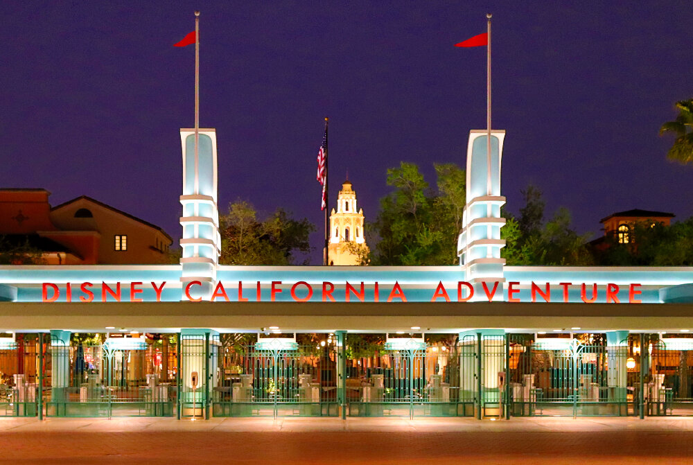
The concept for Buena Vista Street at Disney California Adventure is that it represents Los Angeles around the time Walt Disney arrived to start his animation studio; specifically the Atwater Village and Silver Lake neighborhoods circa 1923. Back in 2011, in anticipation of this area’s completion, the Disney Parks Blog posted some great concept art where you can read a bit about the designers’ intentions. Essentially, it’s the Main Street U.S.A. concept applied to Los Angeles during Hollywood’s Golden Age. It’s Main Street L.A.

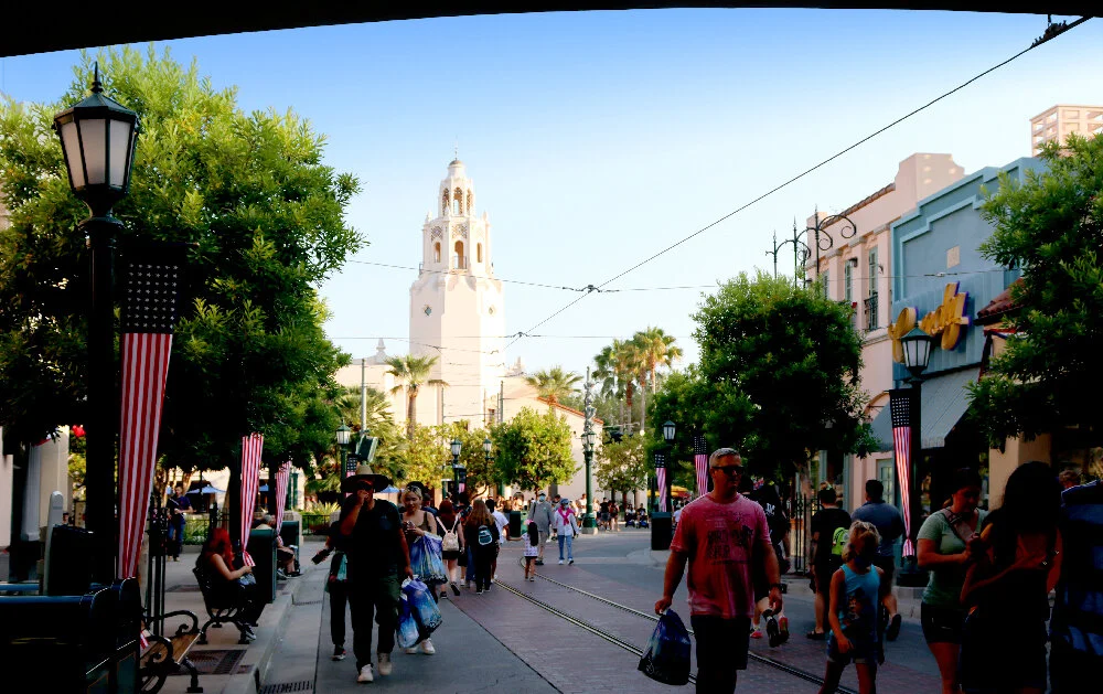
A Stroll Down Buena Vista

Immediately upon entering the land, there is a sense of calm. And shade! Mature trees abound with plenty of places to sit down. It’s comfortable, it’s inviting. It feels lived in. And what was here before?

DCA’s original Golden Gate Bridge and retail spaces, 2008.

To be honest, just a lot of concrete and super obnoxious signage. For research purposes, I wish I had taken more photos of the original entry portal and plaza. But it was just so ugly I didn’t spend any time on it. This is one of my few images that shows Greetings from California, a rather tacky retail location.

Now, to the left (east) as you walk in is Oswald’s Filling Station. It’s just a small retail location and photo op, but it pays tribute to one of Walt Disney’s earlier creations, Oswald the Lucky Rabbit. Disney developed the character for Universal Pictures in 1927 but lost control of it to the studio two years later. In a lucky move, the company reacquired Oswald in 2006 from NBCUniversal; he was basically traded for sportscaster Al Michaels (the world of animation and theme parks is nothing if not strange).

Oscar’s Super Service, Disney-MGM Studios, 2007.

I promised you I wasn’t done with WDW’s Hollywood Studios park. Because neither was the design team who worked on Buena Vista Street. As you enter, just to the right (northwest) in that park is Oscar’s Super Service, a small retail stop and wheelchair / stroller rental in the guise of a gas station. Although far from identical, both this and Oswald’s at DCA are rendered in the Streamline Moderne style.

Directly next to Oswald’s is the park’s main guest relations location. Rather than a City Hall facility like on Disneyland’s Main Street, U.S.A., here the building has been fashioned as an ornate but still small scale Chamber of Commerce. First Aid is right next door, and also looks like a business storefront.

Across the plaza to the right (west) the restrooms have been remodeled into the “Sepulveda Bldg.” The Spanish Colonial Revival and Mission Revival architecture movements are evident here. There are shades of Los Feliz, and also Glendale (where the Disney Studios would eventually be located) as well as Pasadena.

Directly to the left of the Sepulveda Bldg is the redesigned park lockers facility. It’s done in a Deco architectural style, recalling many bank buildings of the Los Angeles area built in the 1920s through the 1940s. It’s clever yet subtle, as you want to think of security when you think of lockers. Adjacent to this is one of two entrances to the westside retail space, the Elysian Arcade.

Next to that is an elaborately decorated façade housing a small produce market. The detail in the stonework is incredible, all for a place where you’d go in and buy a banana and a bottle of water.

In front of the market and lockers, framing the entire eastside, is the Buena Vista Street station for the Red Car Trolley. This operating trolley car attractions features replicas of the once famous Los Angeles “Red Cars” of the Pacific Electric Railway Company. The station’s design had nods to the Craftsman Style.

The line runs every eight minutes during park operating hours and has four stops between Buena Vista Street and next door Hollywood Land: this one, Carthay Circle, Hollywood Boulevard, and Sunset Boulevard. The distance traversed is not great, so it’s really more for fun than transportation. It’s a ride.

Pacific Electric Red Line station at Disney-MGM Studios, 2007.

This tribute to the Pacific Electric and their Red Cars was cribbed from Hollywood Studios. Actual trolleys were planned but ultimately cut from the design budget for that park’s first expansion Sunset Boulevard which opened in 1994. However nods to them, including the station above, remain throughout the area.

I was disappointed that during my recent visit to DCA, pandemic protocols meant that the trolley line was not operating. But I rode it several times the year it opened and the cars are as well-designed as the land is.

Behind the station sits a massive tree providing plenty of shade. Like with the rest of the entry, there is seating abound. Especially now, in the late afternoon time, the whole area is restful, almost more tranquil than Disneyland’s entrance plaza around its train station. Every element is well-considered in the larger scheme of pleasing experiential design; there is nothing placed without thought for the guest.

Across the way to the east is the Los Feliz Five & Dime, which is a tribute to American variety stores from the 1910s to the 1940s. Just like on the original Main Street U.S.A. over at Disneyland, the exterior façades appear to be individual proprietorships with unique designs, but their interiors are all linked into a single retail area with different themes in each room. This serves as the north entrance to those eastside spaces.

Just like Main Street U.S.A., this is simply a thoughtfully designed shopping mall. Directly up ahead (south) we can see something in the distance, beyond the redesigned monorail bridge.

The obnoxious, stretched Golden Gate cartoon is gone, replaced by a small scale replica of a portion of the Glendale-Hyperion Bridge.

Glendale-Hyperion Bridge, circa 1928. Los Angeles Times Photographic Archive / Public Domain.

This particular bridge, completed in 1928 in Atwater Village and linking Glendale with Silver Lake and Downtown Los Angeles, has a connection to Disney company history. Walt and Roy had moved their studio operation just a few blocks down the road two years prior, at 2719 Hyperion Avenue.

So thematically and historically, it fits. But the bridge also serves a spatial role, providing a moment of compression and release just like the two entrance tunnels into Main Street U.S.A. beneath the railroad tracks at Disneyland. And the arched portal frames the park’s new “wienie” perfectly.

Grand Circle Tour

Again, it’s about Disney company history. The Carthay Circle Theatre is where Snow White and the Seven Dwarfs (1937), the first Disney animated feature film, had its world premiere. Originally conceived of as a dark ride about Walt Disney, instead the elaborate recreation houses the Carthay Circle Restaurant on the upper floor, with additional dining space and a bar on the ground floor, including the private 1901 Lounge.

Vintage postcard, Carthay Circle Theatre.

As with all “Disney Versions” this is a stylistic nod, not a replica, built at approximately ¾ scale. And it’s an appropriate choice for all the rest of Buena Vista Street. The theatre opened in 1926 at 6316 San Vicente Boulevard in the Carthay Circle neighborhood of Los Angeles, and is designed in the Spanish Colonial Revival style. When you approach the structure, it feels like all the architectural nods along the way are building up to it and supporting it. The effect is great. Unfortunately the original—which was rivaled only by Grauman's Chinese Theatre in terms of lavish Golden Age film premieres—had fallen out of fashion and was demolished in 1969.

Carthay Circle Theater at Disney-MGM Studios, 2007.

Once again, the Disney design team has borrowed an idea from their earlier Studios park in Florida. An even smaller rendition of the theater caps the end of a block of Sunset Boulevard which opened in 1994. It houses the Once Upon a Time clothing shop.

Because the Disneyland Resort had been closed for over a year due to the pandemic, the marquee still read “WELCOME BACK” during my July 2021 visit. The forced perspective employed on the bell tower works well even up close, and the marquee itself is much reduced from the original but still contains all the same detail work in wrought iron.

The interiors project an early twentieth century supper club. Dark woods and textiles, but not overly so. The sconces really brighten the space up but still make it feel exclusive and classy. It’s the kind of space that you walk into and immediately feel underdressed.

The Restaurant was closed upstairs due to pandemic restrictions during my visit, though it’s now opened again. I’ve dined there a few times before, but unfortunately didn’t take any photos. Downstairs is the Carthay Circle Lounge where guests can pop in for a cocktail and a quick bite and then go back to the park. Behind this bar is the exclusive 1901 Lounge. It’s named after Walt Disney’s birth year and is only available to Club 33 members and their guests. No reservation is required, but a club member must be present. This space is brighter with walls and trim in light cream, contrasting with the other seating areas on the ground floor.

Buena Vista Street is a series of plaza within plazas. I don’t know if they actually have names, but just across the street from the Carthay (northeast) is this area. Again, plenty of seating and shade. Tons. During the holiday season this is where they install the park’s Christmas tree.

This corner is all done out in Deco. The Elias & Co. department store is named after Walt’s father, Elias Disney. There are two entrances to this retail space, which is connected all the way through to the Los Feliz Five & Dime at the other end, with Big Top Toys in the middle. This entire building was the obnoxious Greetings from California store I mentioned early. Both Elias & Co. entrances have their own façades styled slightly differently, so from a distance they appear to be two separate businesses.

The architecture, materials, and typography here are meant to suggest long extinct California department store chains like Bullock's and I. Magnin (both were folded into Macy’s in the early 1990s). This is a thoughtful element which provides conceptual class diversity to the themed land. As the Five & Dime represents the convenience store, Elias & Co represents luxury fashion and cosmetics. Again, this feels lived in.

Turning across the street to the left (west) is an endcap entrance that rhymes with the produce market on the other end of the block; it’s the same type of ornate stone work. Inside is the Trolley Treats candy store. As with the opposite side of Buena Vista Street, the various façades are designed to appear separate, but are actually all interconnected interior retail spaces.

The Elysian Arcade is a pedestrian avenue designed like the shopping promenades which were common in the 1910s and 1920s. This provides a rationale for why all the various shops are linked inside.

The arcade even has a store directory.

Like inside the Carthay Circle Theatre building, everything is rendered upscale with quality materials. Even the tile floor received an incredible amount of attention. This is just one example of when Disney goes all out, they spend a lot and don’t miss a thing. I’ll take a closer look at all of these details—especially the typographic ones—in my next post.

Directly adjacent to the retail floor is Clarabelle's Hand-Scooped Ice Cream. The space continues the same elegance, high quality materials, and Art Deco design with Victorian flourishes.

Sunshine Plaza railroad signage, 2008.

So like I asked before, what was here prior? Actually this corner of the original plaza was the only portion of the land that had any charm. It was done on the cheap, and it was designed in an slightly abstrated and decontextualized way that’s more Universal than Disney, but at least they were trying something.

Sunshine Plaza information booth, 2008.

Sunshine Plaza information booth, 2008.

The park’s original information booth referenced one Mission tower of the Santa Fe Depot in downtown San Diego. The treatment was very much like the Disney designers would do later with the Carthay—a stylized reduction rather than a replica. This single structure had more charm than the entire rest of Sunshine Plaza when the park opened.

In about the same spot today is one main entrance to the Fiddler, Fifer & Practical Cafe. This is the first bit of traditional masonry work on Buena Vista Street, and it stands in terrific contrast with the Mission and Deco stuff that’s come before it. Walking down the street and turning right (west) is a nice visual reward. This feels more urban, more like downtown Los Angeles. As red brick, it also feels older than the revival structures which flank the entry plaza.

As Disney would do a year later with Market House on Main Street U.S.A., what opened here in 2012 is actually just a glorified Starbucks location. Still, no expense was spared with the interiors which pair completely with the adjacent retail spaces. Period, upscale, and elegant.

The pandemic has pushed Disney to add outdoor seating outside along the trolley tracks as it isn’t running. So the clutter of the umbrellas and al fresco diners does obscure the vista of the cafe and disrupt the serenity of the curbside walk. I’m torn. At once it makes the scene more credible as an urban space. But it also takes us out of the setting of the theme. The furnishings and arrangements are very contemporary, so this feels like Pasadena today. Not 1923.

Sunshine Plaza California Zephyr, 2008.

What was here before was an attempt at placemaking. But as I mentioned in my last post, it’s abstracted and thus not immersive. I will highlight this once again and often: immersion requires literal visual interpretations. The California Zephyr was indeed a famous passenger passenger train. But the way the train sits up against the platform is not credible. Not to mention that it’s placed on a curve. What train station looks like this? None. Ever. And that’s exactly the problem. It’s like calling something red an apple. There’s more to it than that.

Compare with the area as it looks now. Does this look like a place? Feel like a place? That’s the difference.

Sunshine Plaza California Zephyr, 2008.

Both the train cars before and the cafe now were designed as an entrance to retail and dining. Inside when the park opened were Bur-r-r Bank Ice Cream, Baker’s Field Bakery, and Engine-Ears Toys. Besides the awful puns, one is a credible space and the other is not. The way this locomotive is presented… is it a museum display? Is this is a historic artifact? A recreation? Does it move, is it a ride? No, it’s just a fake entrance to some shops.

One idea that was carried over to the area’s redesign was the park information booth. Now it’s been combined with the Carthay Circle trolley stop, and is designed to vibe with the theatre building across the way as a kind of visual annex.

And in the center of it all, the Carthay Circle Fountain area.

Actually, at the off-center of it all. That’s one of the most clever parts of the layout of Buena Vista Street; unlike the Plaza Hub at Disneyland, the central element doesn’t line up with the wienie behind it. The fountain here sits off to the side, which means it’s revealed in a dogleg turn to the right as you walk in. This makes the street seem to join with the circle plaza by running into it, instead of it all feeling that it was designed as a single development. As if the street was running along, and then at some point the circle and theatre were built and came to intersect it.

As you can see in this 2012 Disney Blogs post the original landscaping was planted pretty young. But it’s been growing in for nearly decade now, so the fountain area is nice and thick. Again, plenty of shade.

This is a bold statement to make, but as a pure themed space, I think the design and execution of Buena Vista Street is actually superior to Main Street U.S.A. over at Disneyland. Yet the fact that they function as a set is what really makes the California Adventure redesign really shine.

The Carthay Circle Theatre is 89.5 feet tall, which is a dozen and a half feet taller than Disneyland’s Sleeping Beauty Castle. The theatre functions as a long draw wienie, just like the castle. You see it as you enter and it orients you to the environment. It’s in the distance.

Yet it also works as a short draw visual magnet from outside the gates, exactly as the Disneyland Railroad Station does across the plaza at Disneyland. This works not only because the Carthay is taller, but also because the street approach is much shorter (just over half the distance).

Compared one to one, the visual hierarchy for each park entrance is nearly the same. The effect is perfect.

What the Disney designers correctly realized was that such a parity was much needed between two theme parks that directly face each other, with entrance gates just yards apart. No two adjacent parks have this relationship in the world. The multiple offerings at WDW are a bus ride away from one another, and the sister park resorts in Tokyo and Paris feature offerings that are adjacent, but still distant.

Storytellers statue boxed up at the 2012 Preview event (left) and in 2021 (right).

A statue of Walt Disney also now lives inside both the parks. In keeping with the area’s asymmetrical balance, the one at Buena Vista Street, called “Storytellers,” sits off to the left (east) next to the Elias & Co. plaza. And it’s not made a big show of, he’s just standing there. As the Ray Spencer, Creative Director for the Buena Vista Street project noted on the Disney Parks Blog:

We made a conscious decision to put the statue down on street level with the rest of our guests, rather than up on a monumental planter, like at Disneyland park. Set in this time period, Walt Disney could have been you or I, or anybody at that time, out on the street. It’s part of the story of the street, a story of humble beginnings.

The 2012 redesign resolved the thematic and spatial relationship between the two parks. Such a relationship didn’t exist at all in 2001; California Adventure was seemingly conceived of in a vacuum, as if there was nothing next door at all.

Now two stories are told—when Walt Disney spend his boyhood in Missouri, and when he came to Los Angeles to be an animator and an entrepreneur. Two desperate, thematically stylized romanticizations, yet of equal visual and contextual weight.

Powerful stuff. They finally got it right.

Continued in Part 3.

August 28, 2021 /Dave Gottwald
DCA-03.jpg

DCA Then and Now - Part 1: How to Make an Entrance.

August 19, 2021 by Dave Gottwald

Although I’ve visited the Disneyland Resort many times since, I hadn’t done any actual site documentation there since 2008. In the summer of 2021 I spent four days at the resort catching up as best I could. So much had happened in terms of design changes, particularly in the last decade, that I struggled to capture it all. Ultimately I decided to focus on major new developments, and look at other various alterations with a “then and now” approach.

DCA original entrance, 2008.

Postcard from the Edge

The most drastic of these alterations have been made to Disney California Adventure (DCA), which opened to disappointing reviews and lackluster attendance in February, 2001. For years the Disney designers—whose vision had to be drastically scaled back due to corporate budget cuts—were frustrated with the park’s poor performance.

Disney’s California Adventure 2001 park map. Ⓒ Disney Enterprises, Inc.

Put indelicately, this “second gate” at the Disneyland Resort was done on the cheap. Visitors complained that it was a half-day park at best (yet the same price as Disneyland next door) with too many restaurants and not enough attractions. It was built on the site of the former Disneyland parking lot, prompting late Disney Imagineer John Hench to viciously quip, “I liked it better as a parking lot.”

Disney’s California Adventure 2001 souvenir park map poster. Ⓒ Disney Enterprises, Inc.

At opening, DCA was comprised of four lands: Sunshine Plaza, Hollywood Pictures Backlot, Paradise Pier, and Golden State. This last one was divided into six distinct themed areas which the designers referred to as “districts”—Condor Flats, Grizzly Peak Recreation Area, Golden Vine Winery, Bountiful Valley Farm, Pacific Wharf, and The Bay Area.

The shape of California over the original park layout. Underlay map data: Ⓒ Google.

Arguably the only clever concept the original park’s designers came up with was that each of these four lands and six “districts” were laid out together in roughly the shape of the state of California. As my overlay demonstrates, it’s a bit exaggerated and not literal. Yet the locales of the various themed areas align rather well.

Disney California Adventure, satellite view. Click for link. Map data: Ⓒ Google.

Disney California Adventure, satellite view. Click for link. Map data: Ⓒ Google.

In the twenty years since the park has been added on to and modified possibly more than any other theme park on the planet. And these changes started right away. DCA’s original dark ride, Superstar Limo, didn’t even last a whole year. A Bug's Land opened in the fall of 2002. Then more additions in 2004 and 2008. Change after change, right through to the present.

DCA original entrance, 2008.

Perhaps the most obnoxious original element was the park’s entrance. I’m not sure what the designers were thinking, but the idea was supposed to be a kind of abstracted journey into a stylized tourist postcard of California. It might have seemed nifty on paper, but as an actual environment it totally flopped.

Which was sort of to be expected. It’s sitting right next to Disneyland! As The Imagineering Field Guide to Disney California Adventure (an official Disney publication) put it honestly, yet delicately:

The park was originally envisioned as a counterpoint to Disneyland—a different offering with a distinct tone and selection of experiences intended to provide variety for guests at the resort. But the proximity of Disneyland pointed out that there are elements of the Disney Park experience at Disney California Adventure—in its original incarnation—did not possess.

The Sun Icon, 2008.

And the park’s original visual magnet, or “wienie” as Walt Disney called it? It was the Sun Icon, which looked like a giant hubcap mounted above a wave fountain. Yes, that was the official name. The Sun Icon. In the 2019 Disney+ streaming series The Imagineering Story, designers like Kevin Rafferty were quite honest in their reappraisal of the mistakes they made. Said Rafferty of the Sun Icon:

Much to our chagrin, it didn’t adhere to our fundamental design principles of theme park design. The first statement that you saw when you walked into the gate was the sharp sun. Frankly you could have seen that at a shopping mall in Newport Beach. It’s like, ‘Why is it here?’

The Sun Icon in Sunshine Plaza, 2008.

The thing was actually so ugly that I took very few pictures of it back in 2008. Here you can see Sunshine Plaza as it was called through the park’s original Golden Gate Bridge.

DCA’s Original Golden Gate Bridge, 2008.

This stretched iconic bridge build around the original Disneyland Monorail track was cartoonish and silly. This is what was supposed to compete with the original Disneyland Park, mere steps away?

Abstracted and bland Sunshine Plaza on 2001 park map. Ⓒ Disney Enterprises, Inc.

As I detail in my studio courses in thematic design, in order for these environments to be experientially successful, a degree of immersion is required. And immersion works best when the presentation is literal. In other words, immersion can be measured on a gradient of abstraction. The less abstract (more literal) a space is, the more immersive it will be, and thus the most experientially successful.

DCA original entrance, 2008.

This original entrance was a total abstraction. Too garish, too brash, and moreover, didn’t immerse people as they entered the park. The bridge especially comes off like an oversized toy. Honey, I Shrunk the Guests?

DCA original ceramic mural, east side, 2008.

Flanking either side of the bridge was what Disney advertised as the “largest ceramic mural in the world.” This was part of the stylized postcard landscape that guests were supposed to be entering.

DCA original ceramic mural, west side, 2008.

Again I thought the thing was pretty ugly, so I didn’t take many pictures of it. Fortunately, over at Yesterland there is a good record with many detailed close up shots.

Welcome to Buena Vista Street

What DCA needed was an entirely new approach, something thematically appropriate to compliment Disneyland right next door. The designers realized, the only way to compete with the original Disneyland was to compliment it. In 2007 they announced that the park would basically get its very own version of Main Street U.S.A.

Buena Vista Street, satellite view. Click for link. Underlay map data: Ⓒ Google.

Buena Vista Street, satellite view. Click for link. Underlay map data: Ⓒ Google.

After extensive planning and two years of construction, an entirely new themed land for Disney California Adventure, Buena Vista Street, opened on June 15, 2012. Sunshine Plaza, the Sun Icon and its wave pool, and the cartoonish Golden Gate Bridge were all torn out. In place of all that now is a detailed and immersive environment—in my opinion some of the most successfully rendered placemaking that the company has ever executed. I will detail this land across two posts.

Buena Vista Street preview event, June 10, 2012.

I was actually on Buena Vista Street for a Disneyland Annual Passholder (AP) preview event five days prior to the public opening. Here you can see the construction walls still up.

Organic and pleasant Buena Vista Street on 2021 Park Map. Ⓒ Disney Enterprises, Inc.

The land is named after the street that the Walt Disney Studios is on. Note the powerful use of asymmetrical balance, and how the entry corridor dog-legs to the right and leverages some classic conceal-and-reveal to place the central fountain off to one side. The entire area feels organic, and although spotlessly clean in the Disney fashion, gives the impression of having been built over time.

Pan-Pacific Gate

A new entrance gate and turnstiles for California Adventure had opened exactly one year prior to Buena Vista Street. The original 11 foot high CALIFORNIA letters were relocated to Cal Expo in 2012, the fairground where the 18-day California State Fair is held annually.

Pan-Pacific Auditorium, closed and neglected, mid-seventies. Wikimedia / Public Domain.

The new gate was designed to evoke perhaps the classic example of Streamline Moderne architecture in Los Angeles (and one of the finest ever to be built in the United States), the Pan-Pacific Auditorium. It’s an inspired choice, as the structure was designed by LA architectural firm Wurdeman and Becket. Welton Becket, you’ll recall, was the neighbor of Walt Disney who advised him to hire his own “Hollywood people” and form his own in-house design consultancy (WED Enterprises, later Walt Disney Imagineering). In the late 1960s, Welton Becket Associates designed Disney’s Contemporary Hotel at Walt Disney World (WDW).

After closing in 1972, the Pan-Pacific Auditorium fell into decay and finally burned down in 1989.

Looking closely you can see how well the designers adapted the contours of the auditorium. But are guests fully immersed? Not yet. This is just a bit of Streamline moderne, with only tenuous aesthetic connection to what lies inside.

Then again the entry gates of Disneyland across the way only begin to suggest a Victorian Gingerbread styling that will be more fully realized once inside the park. It’s a tease, and it doesn’t make literal sense in the context of the design of Main Street U.S.A. The same could be said for DCA’s new entrance.

Pan-Pacific Auditorium entrance to Disney-MGM Studios, 2007.

This wasn’t a new idea however. When Disney-MGM Studios (now Disney's Hollywood Studios) opened back in May of 1989 at Walt Disney World, the park featured a nearly identical entrance gate (ironically this was just three weeks before the original auditorium would burn down). One major difference is that the Studios park gate includes ticket sales windows and also functioning neon. The same structural motif is also used for the more recently built entrance to the Disney's Hollywood Studios parking lot. As we’ll see, this isn’t the only element that the design team would lift from that Florida park.

Continued in Part 2.

August 19, 2021 /Dave Gottwald
vegas-city-center-01.jpg

Viva Las Vegas - Part 3: Learning from Shanghai?

August 06, 2021 by Dave Gottwald

To finish out the posts on my reinvestigation of Las Vegas, I’m concluding with perhaps the most significant development on The Strip since the 1990s. And that’s been the very deliberate (and very expensive, and likely very profitable) rebranding of Sin Sity as a true urban landscape, a “destination city.” This seems to be in order appeal to a more international (and largely affluent, quite Chinese) tourist audience.

In short, Las Vegas is Learning from Shanghai.

CityCenter complex, Las Vegas Strip, satellite view. Click for link. Map data: Ⓒ Google.

CityCenter complex, Las Vegas Strip, satellite view. Click for link. Map data: Ⓒ Google.

My pun refers, of course, to the rather famous study by Robert Venturi, Denise Scott Brown, and Steven Izenour in which they asked the architectural community what might be learned from studying the design of the Las Vegas Strip. And Vegas has learned, to. Once it was from Disney. But that era (1985–1995 at its peak, with thematic rumblings well into the 00s) appears to be winding down.

At the heart of this new rebrand is CityCenter.

CityCenter under construction, July 2008.

The prior time I had conducted site research in the summer of 2008, construction was well underway. The final price tag for this 76 acre, mixed-use urban complex was about $9.2 billion, making it the largest privately funded construction project in U.S. history, Fittingly, Walt Disney World once held that title.

CityCenter under construction, July 2008.

Seeing those towers arise out of The Strip, surrounded by all the other themed casinos struck me as super surreal. At first it felt like just another theme, as if this was a Blade Runner (1982) techno future kind of thing.

CityCenter under construction, July 2008.

A kind of future, certainly. Managed by AECOM Tishman, the project was a collaboration between eight world-renowned architects and MGM Mirage (now MGM Resorts International) and is the largest LEED-certified project in the world (six Gold certifications). But also, like Blade Runner itself, it represents something of a dystopia.

For example, the rounded tower being built above no longer exists. Very serious construction defects in The Harmon were discovered that year I visited, and work stopped. The tower was deemed unsalvageable; they started tearing it town in the summer of 2014 and a little over a year later it was gone.

CityCenter under construction, July 2008.

The CityCenter project could not have opened at a worse time. When it was announced in 2004, things looked great. Then global economy tanked in the fall of 2008, and the response when doors swung open in December, 2009 was a collective yawn (and, in investor circles, a whole lot of sweating).

MGM’s initial financial partner during the construction phase was Dubai World, who was also racked by the Great Recession. However, things are now on the mend. Just this summer, MGM announced they were buying out Dubai World’s stake (to the tune of over $2.1 billion), giving them full ownership of the Aria and Vdara resorts on the property. MGM then plans to sell the hotels off, and lease them, turning a longer-term profit on their investment.

vegas-city-center-06.jpg

It looks almost like a model, doesn’t it? Or a CGI background from a sci-fi streaming series. When initially pitched, the project was described by MGM as a “self-contained city-within-a-city.” Walking around deep inside, looking up at only modern skyscrapers, it certainly felt that way. Like being inside a Disney park surrounded by an earthen berm, you can’t see the rest of Las Vegas outside CityCenter.

The dystopian Detroit of 1987’s Robocop was also fresh in my mind. Concrete and steel, abstract and angular. Almost a postmodern take on brutalism. It’s so out there, and so not what I expect from Las Vegas.

I won’t digress too much here into cinematic subsumption, which I’ve blogged about before and also have expounded upon in scholarly journals [here] and [here] with my writing partner Greg Turner-Rahman. But basically, the built environment (and by extension, our very lives) has been completely colonized (or “subsumed”) by the language of cinema. I’ve mentioned feeling like CityCenter is Blade Runner or Robocop. Looking up at this particular building, all I could think about was The Towering Inferno (1974). This is an aside, but I’ll be returning to it in future posts: movies change the way we experience the built environment.

So who was this Postmodern Sci-Fi Future Tech City built for? It wasn’t movie fans. As Stefan Al describes it in his fantastic The Strip: Las Vegas and the Architecture of the American Dream, this new approach is what he calls “Cosmopolitanism” and it’s aimed squarely at the international leisure class.

vegas palazzo.jpg

Al notes that this began with the opening of The Palazzo in 2007, a tower expansion of the more traditionally themed Venetian Resort. Here the design departed from a literal approach:

In Las Vegas, replica buildings had lost their luster, so [owner Sheldon] Adelson changed the name to the more generic Palazzo. Instead of a classic Venetian style, it was going to be a modern interpretation of Italian Renaissance like the one that was so pervasive in Southern California’s high-end shops and McMansions. “The Palazzo won’t have a recognizable theme like the Venetian.” a Las Vegas Sans spokesman said, “but instead will be an upscale design reminiscent of Bel Air, Rodeo Drive and Beverly Hills.”

The aesthetic broke free, in other words, from the more Disney approach of immersing guests in a recognizable setting of time and place. Renaissance Italy became a more generic “Southern California Luxury” that relies on international brands connoting a particular lifestyle and a certain class of people.

And so it is at CityCenter (a name MGM retired in 2015, preferring its Aria brand). This is supposed to feel like staying the night (or the week) at any other luxury-level site from Shanghai to Paris, Berlin to New York City. The hotels, entertainment, restaurants, and indeed the architecture itself are meant to provide—as MGM had initially promised—the feeling of a “city within a city.”

The integration of DNA from numerous global luxury brands is far from subtle, too. This mall could exist in any one of a dozen cities around the world. But it’s bolder. And in the afternoon I spent walking around, the customers were anything but American (I guessed maybe one in three were from the U.S.). There were many Europeans and, predominantly, visitors from Asia.

Even some old chestnuts have been imported in to provide some pixie dust from other well known destinations with hospitality heritage. The very name Waldorf Astoria provides credibility to those who have visited in New York City (and spent their money there).

I mentioned Shanghai at the start of this post because, architecturally, that’s what I see. And inside the shops and hotel lobbies, that’s the kind of money I saw being spent. I did not see theme park families, the Florida set. I saw older, high rolling couples from other countries. And if there were children in tow, they were fully grown.

What will become of the Disneyland-style family destinations on The Strip? Once again as Al points out, Las Vegas tends to reinvent itself every twenty years or so. Will Paris and The Venetian and The Mirage and Treasure Island and New York New York and Luxor be vastly redesigned? Some are already headed that direction. The Island sunk its pirate show a ways back and is now the “TI” with a focus on sexiness. Luxor has been shedding its Ancient Egyptian roots for years.

Or will some of these be imploded completely? I could see something inexpensive and tame like Excalibur remaining for the kiddies. But for many of these other themed resorts from the 1980s and 1990s, I’m not so sure. Things get even more dicey when you consider that the majority of the casino resorts I just listed are all owned by the very same MGM Resorts.

Las Vegas has learned from Shanghai. Where it will take up studies next?

August 06, 2021 /Dave Gottwald
primm-01.jpg

Viva Las Vegas - Part 2: Thematic Archaeology.

June 19, 2021 by Dave Gottwald

One of my personal guilty pleasures in doing site research is finding the really run down stuff. Destinations that have seen better days; neglected, even partially or totally abandoned. In mega-themed areas like Las Vegas, you can always find some place down on their luck. But I thought was that too easy. So I decided to go further afield.

Totally Terrible

About 25 miles south of the Las Vegas Strip sits Terrible's Hotel & Casino, which opened as the Gold Strike Hotel and Gambling Hall in 1987. In 2014 it was purchased by the Terrible Herbst Oil Company who own those convenience store gas stations you find throughout the Southwest featuring the “Terrible Bandit” mascot. The eponymous renaming took effect four years later.

Terrible’s Hotel & Casino (just outside Primm, Nevada), satellite view. Click for link. Map data: Ⓒ Google.

Terrible’s Hotel & Casino (just outside Primm, Nevada), satellite view. Click for link. Map data: Ⓒ Google.

The site is basically a massive truck stop with ramps and service stations designed to support large semi-trailer rigs. As such, it would appear that most of the casino patrons and overnight guests at Terrible’s are also truck drivers.

The place was in awful shape, and it was cheaply put together to begin with. Which is why I kind of love it so much. I find beauty in the peeling paint and sun bleached stucco.

There was period from the late 80s to the late 90s when thematic design in Las Vegas was just running rampant. As much as I dig this stuff, it really was out of control. This was the era that gave us all the massive kitschy mega-resorts with their own easily-identifiable themes: Excalibur, Luxor, Mirage, Mandalay Bay, Paris, NY NY, etc. So in order to complete, even the more down market establishments made an attempt to slather on some theming. And here at Terrible’s, it’s Vegas’s oldest, its original theme: The Old West.

I ducked inside for just a moment. It was quite dark and the gaming areas were pretty tight quarters, so I didn’t have much leeway to take pictures. Apart from the cute, backlit glass, wood typography signage, there wasn’t much design either. The fun stuff was all outside.

Zooming by on the highway, there’s no way I would have noticed this. In order to foster an illusion of structural diversity, paint lines run all the way to the ground, whether the façade changes or not. Up close this looks super cheap. But from a distance, at speed? I’d have to admit, it’s effective.

What’s most fascinating to me about all these exteriors is that not a single one of them is functional. The lineup of “old timey proprietors” is clearly cribbed from Disney’s Main Street USA, but you can’t open a single door. Like with the paint job above, they’re designed to read from the highway, but crumble upon closer inspection.

And speaking of crumbling. Look at this fabulously distressed lettering. My fellow road tripper David Janssen, Jr. calls this “roached” after a term one of his painting professors used to say.

The above roached letters are actually routed in wood. But most of the primary signage is wood typography—set in fairly authentic faces—rendered in backlit plastic.

Only the actual entrances to the casino areas are real, functioning façades with real doors and windows. The north end features a porte-cochère as that’s where you enter the hotel. Here on the south end it’s just an extra way to get in and gamble for a spell during a rest stop.

I have to wonder if they run these popcorn lights at night. It’s probably expensive, so I doubt it.

Along this south edge of the parking lot you get even more of the “town” that they are trying to suggest.

A red rural barn, crammed right in between the Main Street USA type buildings. I really like the routed type here; it’s a shame it’s painted the same red as the barn and thus only reads if you’re standing right in front of the thing (defeating the purpose of having the structures present well at a distance).

The backlit sign here missing its graphic front suggests that indeed this casino hotel was built with more detail in the late 80s than which have survived to the present day. There is some humorous realism here as well—notice it’s a guns and ammo shop.

Pete’s Dragons?

Terrible’s is actually kind of late to scene around these parts. Another dozen or so miles down Interstate 15, sitting right at the California state line, is Primm. Until the mid-nineties it was simply called “State Line.” But there’s also a Stateline on the southeastern shore of Lake Tahoe, so it was renamed for original developer of the town to avoid confusion. It also sounds better.

Primm, Nevada, satellite view. Click for link. Underlay map data: Ⓒ Google.

Primm, Nevada, satellite view. Click for link. Underlay map data: Ⓒ Google.

Since the late nineties, Primm has been a complex of three casino hotels and an outlet mall. At one time there was both a novelty tram to the north, a train (referred to as a “monorail” but it actually runs on two rails), and a single-car tram to the south that transported people between the casinos and over the interstate highway. The northern highway crossing only lasted the first year or so.

The first casino hotel to open here was Whiskey Pete’s in 1977. Why is it called Whiskey Pete’s? As documented in Weird Las Vegas and Nevada, the local lore is that the owner of the gas station that used to be on this site was a bootlegger during prohibition. “Whiskey Pete” died in 1933 and dedicating a casino hotel to his namesake seems entirely appropriate.

Okay. But why is the place a medieval castle? On this i have no information. But it’s garish, charming, ugly, and totally incongruous. I think the palm trees are a nice touch. And I suppose the cartoon mascot up at the ramparts is Pete. This is the cheesiest kind of theming possible. Even though the place is not super run down like Terrible’s, this is guilty pleasure territory.

Old West 19th century wood typography on a castle. Very miniature golf.

primm-tram.jpg

Here is the rather silly looking single car tram that used to travel back and forth over the interstate highway connecting to the Primm Valley Resort to the east. It fell silent sometime in 2016. I’m getting Logan’s Run (1976) vibes. The thing about monorail technology is that it looks super cool and futuristic when you have a long, multi-car train. When it’s just a single little pod somehow it’s incredibly laughable.

Some of the architectural features are suitably grand. You can see to the right where the tram track (white concrete) connects with the casino structure.

I was not able to get many good photos inside, because it was dark and there was nothing noteworthy besides the gaming areas (which you are not permitted to photograph on any casino floor).

The famous Ford Deluxe V-8, shot full of holes in 1934. Wikimedia / Public Domain.

The famous Ford Deluxe V-8, shot full of holes in 1934. Wikimedia / Public Domain.

However, Whiskey Pete’s is home to the “Bonnie and Clyde Death Car.” The bullet-ridden Ford Deluxe V-8 was bought by the Primm Valley Resort and Casino in 1988 for ~$250,000.

It was pretty difficult to snap a picture of, sitting most inappropriately and incongruously off to the side of the gaming tables behind plexiglass walls. It’s sort of the intersection between a down market themed casino and the classic Americana roadside attraction, a tradition since the first automobiles.

Primm & Proper

Three casino hotels. Three themes. The other two are over on the opposite side of the highway. Opened in 1990 as Primadonna Resort & Casino, the Primm Valley Resort (as it is known today) is done in a sort of colonial / Victorian motif. It reminded me of a cheap and obnoxious version of a genre which Disney has replicated all over the world (with tons more money of course). I saw one of these original, vintage seaside resorts at Cedar Point in 2017.

Again, we have palm trees.

I spent very little time inside, because again the lighting was not great and there was not much to see beyond the gaming areas. Except up at the ceiling.

Here’s a Disney trick, though not executed very well—forced perspective. There’s a little faux second story with windows, curtains and shutters, and fake balcony railings, all decked out with ridiculous trim and routed wood filigree. Really the only thing of note on this archeology trip.

Slowly Going the Way of the Buffalo

Next door, however, was the mother lode. This was by far my favorite resort in Primm, though it’s in as just as sorry a state as the other two. Obviously a tribute to William Frederick "Buffalo Bill" Cody, this was the last Primm casino hotel to open in 1994, Buffalo Bill’s.

The early to mid-nineties was a peak time for both Rollercoaster Wars and Theming Wars. Everyone was trying to outdo each other with ridiculous extremes, and Buffalo Bills fits right in there. How to grow beyond the core drinking and gambling folks? Every casino company was trying to find new ways to capture the Disney market, the family market. One of the ways was more and more fanciful theming. And the other was to add non-gambling attractions in the form of rides and shows that would be attractive to teens.

The hotel casino opened in May 1994 and its signature attraction followed in August. When Desperado opened it was the tallest roller coaster in the world with a first drop of of 225 feet (209-foot lift hill, maximum speed 80 mph), making it a major draw for Primm. Roller coaster aficionados from all over the world would travel to Buffalo Bill’s just to ride it. Perhaps they would stay a night or too. And drink and gamble some.

Although I didn’t gamble or spend the night, I’ve ridden Desperado twice, once in 2003 and again in 2008. Unfortunately I don’t have any pictures. But it was an intense once for sure. Watch the above POV footage to take a ride yourself (it starts at about 1:23).

As with all coasters in the Roller Coasters War, it didn’t hold its title long. So once all the superfans showed up and rode Desperado once or twice, they moved on to the next big record-setting destination. And even in the longer haul, such a thrilling ride wouldn’t be suited for younger visitors. Buffalo Bill’s had this figured out, so they also opened with a log flume ride in the classic Arrow tradition. Both attractions have outdoor portions and indoor parts that weave through the casino itself, which is exciting for both riders and the gamblers watching them.

Old West Kitsch is everywhere at Buffalo Bill’s, but it’s of a much higher quality than I saw at Terrible’s. Not as slick as DIsney’s Frontierland, not as authentic-feeling as Knott’s Berry Farm’s Ghost Town. Let’s split the difference; somewhat like Cedar Point’s Frontier Trail.

Map of Buffalo Bill’s Resort.

Map of Buffalo Bill’s Resort.

The complex is a lot bigger than you get a sense of from the parking lot and front entrance. The “B Tower” in blue in the upper right of this map is the barn-like structure that’s so prominent when you drive up. Everything else is kind of hidden from immediate view. This is smart on the designers’ part, because there’s a big reveal when you walk into the gaming floor.

Operating Primm Resorts “Monorail” Train, 2009. HowdeeDoodat/Flickr.

When I visited in 2008, the main train between Buffalo Bill’s and the Primm Valley Resort was still running; by 2019 it was not. Its four cars were capable holding a maximum of 96 people. Again I put “monorail” in quotes because all these trains and trams actually ran on two rails. I would assume that the resort owners realized that the public probably associates “monorail” with “Disney theme park” so it’s a clever misnomer.

The “monorail” station sits outside above the hotel’s porte-cochère on the second floor. I especially love the Windsor typeface treatment. Maximum cheese.

The train platform is flanked by a little Frontier Town façade which reminded me very much of the original Mine Train Through Nature’s Wonderland at Disneyland (1960–1977).

Although executed cheekily, there are some nicely thought out details here. Observe how when the elevated track leaves the “Old West Town” station at the casino, it’s supported by a wooden railroad trestle which looks and feels authentic to the period.

Only after the track is a good distance from the themed station area do the supports assume the more traditional, modernist-looking (Disney-like) concrete look.

Again, I couldn’t tell what was inside from the street, and this is a wise design move. I had some vague memories from 2003 and 2008, but did not take any pictures on those visits. So I went in pretty cold here. What fun! This is the late 80s to early 90s Extremely Overdone Theming but it’s not half bad.

The architectural details are, again, not Disney but certainly superior to say, a Six Flags environment. The front desk, guest check-in area is made to look like a two story rooming house. There is a mining sluice and water features in the queue area as you wait to speak with someone.

Similarly, the cashier where you cash in your chips is made up to be a bank. The Spanish tile roof and Mission-style stucco are done fairly well. It’s cute. And look at that massive tree trunk to the left! There are several fake trees rising all the way to the pitch black ceiling to make it feel like we are outdoors at night—a common thematic design trick—like the Blue Bayou restaurant at Disneyland.

Something I have observed at other themed casinos on The Strip is that often the design features are used to hide structural supports, as with the false chimneys here on the “Livery Stable Blacksmith” barn.

Here is the “monorail” station from the inside, above the casino exit.

I love the incongruity here, and there is a lot of it throughout the American Southwest. The typeface style (a slab serif) is authentic to the nineteenth century.

But of course the neon is not.

The “Star of the Desert Arena” is themed at its connection to the casino floor areas, but as seen from the parking lot it’s just a massive warehouse. The 6,500-seat indoor hall was built for concerts of the top 40 variety.

There is more detailing here than I expected. Lots of different kinds of buildings. Here the Denny’s chain restaurant location is contained within a brick structure labeled “Feed & Grain.” The inside-for-outside, day-for night is a relaxing shift from the pounding heat outside. One reason people stay inside gambling all day in Nevada is that the air conditioning can’t be beat.

The gaming floors were nicely themed, but of course I’m not allowed to linger around the table games and slots and take photos. So I wandered over to the small food court which is again done up to be part of this “town.” Even the Panda Express is part of the show. From this low angle you can clearly see the filmic and theatrical origins of thematic design; note the stage lighting on the ceiling.

The Buffalo Bill’s people really spent extra on design touches here where they didn’t need to, but the era in which the resort was built was one of this kind of excess.

The two times I had visited prior, I not only rode the signature roller coaster but also the Adventure Canyon Log Flume. In 2003 it was the basic attraction that the hotel had opened with, presumably. By 2008 they had added a “shooting gallery” element to make it more interesting (and perhaps extend its shelf life). There was a light sensor rifled in the log and you used it to shoot at targets throughout the route and rack up a score.

It was sad to see the ride drained of water and basically left to rot.

A tour of the shuttered property, fall 2020.

It was quiet when I visited in the summer of 2019. None of the rides nor trains were running. All of the Primm resorts appeared to be struggling. So when the COVID-19 Global Pandemic hit in the spring months of 2020, they simply got wiped out. Buffalo Bill’s has been completely shuttered with no announced plans to reopen (as of June 2021).

I don’t know what the future holds for Primm and its three resorts. But Buffalo Bill’s in particular is a wonderful snapshot—like an insect trapped in amber—of that time from the late 1980s to the mid-1990s when every casino operator in the region thought that theming would guarantee revenue. Through the lens of the Disney experience, in order to draw families, all you needed to believe was that “if you build it, they will come.” And for a while, it worked. Part of the problem was that the funds invested got the operators some level of thematic design, but without the experiential holism that makes Disney’s projects so superior. The other issue is that there is no media synergy—no intellectual properties or cinematic universes with memorable characters and elaborate backstories—to draw from in.

That might to be the ultimate lesson to take away from places like this; the larger mediascape is the focus, and theming is but one expression of its filmic grammar. It’s the fire keeping the hot air balloon aloft, and without the flame, the whole thing just deflates and comes crashing to the ground.

Continued in Part 3.

June 19, 2021 /Dave Gottwald
linq-promenade-01.jpg

Viva Las Vegas - Part 1: Micro-theming and Faux Urbanism.

May 23, 2021 by Dave Gottwald

I haven’t spent time in Las Vegas in a research capacity since 2008. So for a city that is constantly reinventing itself at every turn, there was a lot to take in when I visited again during the first week of July, 2019. I wanted to focus on emerging trends in thematic design, as well as look for any marked changes to The Strip’s most iconic casinos and resorts.

LINQ Promenade, Las Vegas Strip, satellite view. Click for link. Map data: Ⓒ Google.

LINQ Promenade, Las Vegas Strip, satellite view. Click for link. Map data: Ⓒ Google.

I stayed at Harrah's on the north end of The Strip. A few blocks walk to the south is a newer “faux urban corridor” which runs down a wide pedestrian alley. As you can see here in the satellite view, this “street” terminates at a massive Ferris wheel called the High Roller which opened in 2014. At 550 feet, it’s currently the tallest such attraction in the world.

To the south (right) is the The Flamingo. The original hotel opened in 1946, and the current structure barely resembles what came before. Third to open on the Strip, it’s now the oldest and the last remaining casino which opened prior to 1950. To the north (left) is The LINQ Hotel + Experience which opened in 2013. This property had for many years been the down-market Imperial Palace (1977)—the only Asian-themed resort on The Strip—and before that the Flamingo Capri (1959).

The corridor in between the two resorts is called The LINQ Promenade. It's sort of Universal CityWalk-like with a greater emphasis on realism. Very Caruso. This side alley off The Strip is certainly not on the level of considered backstory as Disney Springs at Walt Disney World. But the design impulse is still there—to simulate the natural layering which occurs over time in the urban environment.

What is the appeal of this faux urbanism? It's ironic that they want to recreate it here in Las Vegas, a city whose development is its antithesis. False brick buildings and storefronts recall a “timeless but in the past-ness.” Although the promenade is for pedestrian access only, curbs line either side of the storefronts. I almost expected replica pay phones fire hydrants.

Within this faux urban environment is a considerable amount of what I’ve come to call “micro-theming.” Each shop and dining establishment increasingly has its own themes buried within the mega (uber) themes of the resort areas themselves. What I used to call an “all you can eat thematic buffet” that arose during the 1980s placed variety primarily at the resort level. If you wanted to sample a new theme, you walked on.

There seems to be more micro-theming in Las Vegas than I remember in 2008. All the mega-themed resports, the Luxors and Excaliburs and New York New Yorks and Bellagios and Venetians, seem to be a bit passé. The big ones are still here, lively as ever, but they’re also full of a diversity of micro themes.

Again, the layering here isn’t exactly Disney-level. But the designers made an effort to establish a more natural urban sense of place over time. Some buildings are made to look older than their current tenants.

Not that most folks would notice but there appears to be little micro histories built into most structures. For example a sports bar featuring sexy school girls looks like it has been installed into an early 20th century bank.

All of this is mixed with more contemporary retail and dining design, like you might find anywhere across the Sun Belt. Bright and open. Employing vernacular architectural styles, but without any dressing down or aging. “Old built as new” as you might find anywhere from Santa Barbara to Santa Fe.

The plantings in particular suggest nearby Southern California.

Southeastern small town folkiness is also thrown into the mix, though the buildings themselves are all brick and suggest larger cities in the North.

I call this sort of thing “Cracker Barrel Pastiche.” It’s the sort of establishment where sweet tea cocktails are served in mason jars and peanut shells cover the wood plank floors.

In a nod to classic, Rat Pack-era Vegas, there is neon signage throughout. This little bit in the window adds some Nashville Honky-tonk flavor.

But some of the other marquees are much more elaborate and smack of a mid-century supper club.

One thing the faux urban approach provides to contemporary brands is the opportunity to place themselves in an alternate history of sorts, in a grand imagined past. In-N-Out Hamburgers was founded in 1948, but it was a simple roadside drive-thru stand. Here the fast food restaurant has been reimagined as a Hollywood Golden Era movie house.

Everything continues to be nested like Russian dolls—themes inside themes inside even more themes.

If you want to change immersion channels you just walk into a different restaurant or bar instead of a new hotel property. Perhaps the mega-resort approach is truly becoming a thing of the past.

For those who are looking to notice it, the incongruities in these types of environments can be overwhelming. I'm beginning to wonder if the overall audacity of it all is the appeal. I still see visitors of all stripes who are saying to themselves “wow they actually did this” whatever “this” is.

In this case, a celebrity chef fish ‘n’ chips restaurant’s entrance is a pair of oversized, cartoonish London telephone boxes.

Excess in this context doesn't just mean a lot. It also means ridiculous as in “this doesn't make sense to me.” I look at a design decision and laugh and think this is a mistake but maybe it's not a mistake. The contradiction is the point. It's the appeal.

In the end, it’s all just the wrapping paper on the real package: getting you inside the casinos to gamble.

The most meta moment I had during my Las Vegas stay was certainly this souvenir shop. The classic “Welcome to Fabulous Las Vegas” sign designed by Betty Willis in 1959 can be found all over town, from the replica photo-op at the airport to t-shirts and coffee mugs. In 2005, even the Nevada license plate issued to commemorate the Las Vegas centennial featured the sign.

Although Young Electric Sign Company (YESCO) has owned the sign since their purchase of its fabrication in the early 1960s, they lease the sign to the county and the design itself has never been trademarked (rumor is that Willis wished it to be her gift to the city and remain freely in the public domain).

Seeing it here, tucked into this promenade of faux urbanist micro-theming and adapted into a storefront fin was almost a bridge too far.

Continued in Part 2.

May 23, 2021 /Dave Gottwald
  • Newer
  • Older

All original content on this site © 2007—2025 Dave Gottwald.
All photography which is my own is licensed under Creative Commons Attribution-NonCommercial 4.0.
This means you are free to share and adapt my images for non-commercial purposes only.