Themerica

Musings on Thematic Design and the End of Architecture

  • Blog
  • Archive
  • About

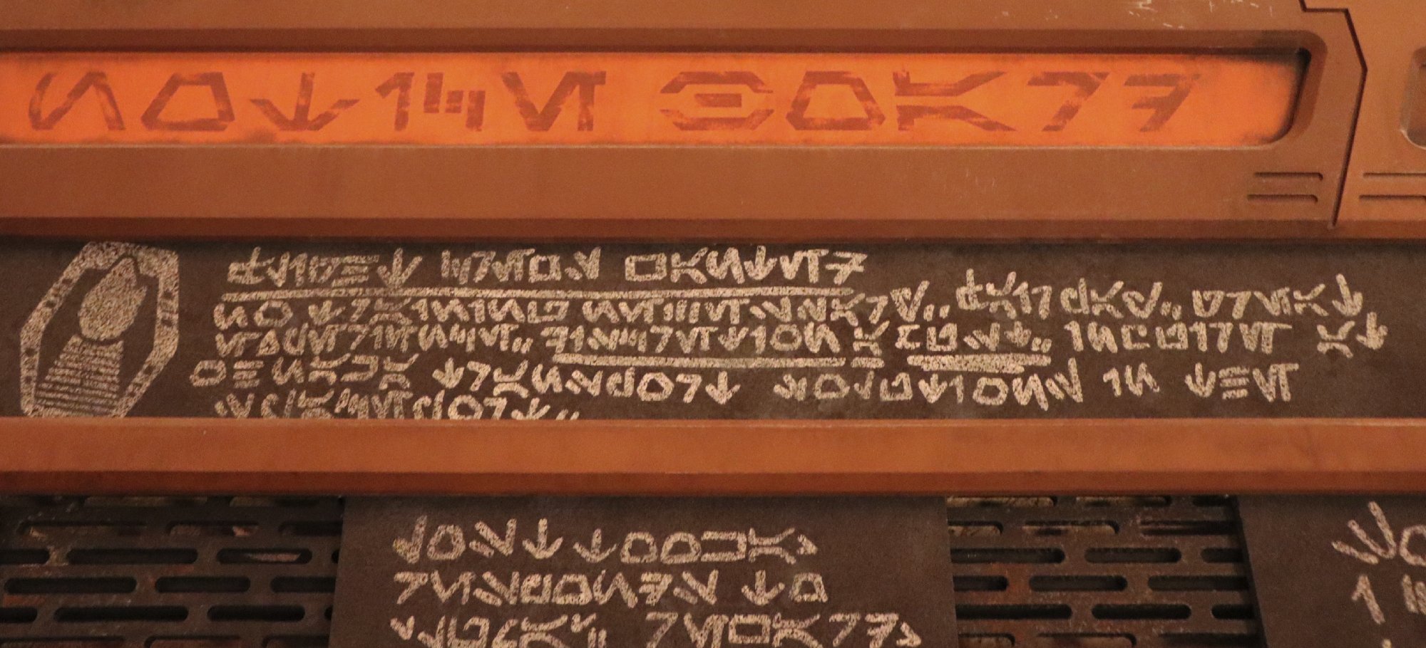
The Typography of New Orleans Square.

November 29, 2023 by Dave Gottwald

As seen prior, during the summer of 2021 and 2022 I was able to visit the Disneyland Resort and continue my site documentation photography. Following my last post on the Typography of Galaxy’s Edge (the park’s “Star Wars Land”), I’d like to take a small break from my manuscript work to share some nice examples of the lettering to be found in my favorite area of Disneyland Park—New Orleans Square.

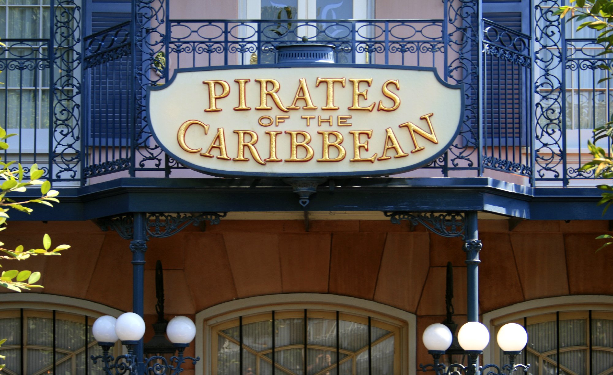
New Orleans Square (NOS) was the last expansion of Disneyland that Walt Disney was personally a part of. The first new full “land” to be added to the park, it opened on July 24, 1966—well in advance of its signature attraction Pirates of the Caribbean and accompanying table service restaurant, The Blue Bayou—with a dedication ceremony featuring then Mayor of New Orleans, Victor H. Schiro. Costing some $18 million, a million more than all of Disneyland in 1955, Walt Disney reportedly quipped to the press that his new land, a tribute to The Big Easy of the Antebellum South, was pricier than the Louisiana Purchase itself.

I hadn’t noticed the above wordmark in NOS until recently, which is carved into a stone surface on a pillar outside The Haunted Mansion. The lettering and application certainly does not date from 1966. If I recall correctly, I first remember seeing this mark in the 1990s, and it has been used on merchandise ever since. The style is appropriate for the land, with elaborate swashes and some characters like the “A” which resemble a modified ITC Benguiat. Overall, however, it does feel a bit too “logo-ish” as if it was designed to be printed on a sweatshirt for a sports team.

The signage which dates to the opening of the land in 1966 is really something special, like this above example from table service restaurant Cafe Orleans. From the late 1960s into the mid-1970s, design was going through many period revivals, one of which was Art Nouveau. So although NOS was meant to represent the city of New Orleans before the Civil War, the graphics and lettering to be found throughout the land aren’t accurate to that period at all, but rather reflect popular art and design trends during its development and construction.

Since France was a center of the turn-of-the-century Art Nouveau movement, the Imagineers must have thought, okay, French, New Orleans, makes sense. Hand-painted floral illustrations and stylized serif lettering demonstrate this sensibility throughout, like on the wall outside the Mint Julep Bar.

The late 1960s was the height of the phototypesetting era, and this poster-size sign which has sat at the entrance to Pirates of the Caribbean since it opened on March 18, 1967, provides a solid bouquet of the kinds of offerings that were popular in phototype catalogs.

Along with Art Nouveau, typefaces from the Victorian era were being revived at this time. “Sail With The Tide” is set here in Art Gothic, originally designed in the 1880s but brought back for phototype and later for digital. You might recognize it as the title face for the television series Murder She Wrote or from the album cover for Siamese Dream by The Smashing Pumpkins.

Some of the finest signage at Disneyland is routed in wood, and this “Exit Through the Gift Shop” notice at Pirates is no exception.

The serif treatment of the attraction name here matches other nearby applications, but I suspect the sign dates from the 1970s or even the 1980s with the line treatment of the skull and crossbones.

Some signage is more playful than historical, as at that same gift shop just off the exit to Pirates, Pieces of Eight. Throughout NOS there is serif and swash work that to my eye anticipates some of the major trends in typography which would emerge in the 1970s, like the elegant forms of Ed Benguiat’s ITC Bookman and its swash variants, which are still popular today.

Look closely and you’ll notice that the illustration in this hanging oval sign above the other entrance to the shop is replicated small on the first one.

Much of the safety information in the park dates to the 1990s, but the designers have usually done a good job of making substrate and printing choices that align with the overall theme. This is a contemporary, digital italic serif, yet it fits with period samples like The Fell Types which are used to evoke the swashbuckling era.

The graphic designers at Walt Disney Imagineering don’t always get it right, however. This sign probably dates to the late 1980s or early 1990s. And while the main Roman characters and corner ornaments feel right for NOS, the “Please” in Brush Script definitely does not!

Hand painted Roman type abounds in NOS. This choice reminds me of the lettering used in The New Yorker, especially the leg of the “R.” It’s a style that was common in the 1910s and 1920s, so it makes sense that this was probably referenced from a phototype revival font.

Sadly, this lettering is cut vinyl, and the sharp serifs don’t really fit with other signs throughout the land. Yet the silhouette of the man with the top hat? There’s The New Yorker again. Odd.

Poking around, I found a few examples I’d never noticed before, even after visiting Disneyland for decades and pouring over the park in detail in search of hidden gems. And here is such a sign. The script employed here is serviceable—very much in the vein of Matthew Carter’s Shelley family, which would not arrive until 1972—and appears hand painted based on a character set.

I’m not going to lie; the tail on the “y” bothers me. Too extreme.

For years the French Market quick service restaurant had featured elegant swash type on its signage and menu boards, but it has recently been rebranded as Tiana’s Palace and themed to The Princess and the Frog (2009).

I’ve always admired the lead entry sign to the Blue Bayou Restaurant, which is hand painted on glass and also appears to be from a phototype sample.

Like so many signs at Disneyland, it looks wonderful at night and takes on a different personality after dark.

Since 1967, The Blue Bayou has featured a very elegant and stately double-B monogram of the Shelley variety on their menus, but this particular application is relatively recent, within the last ten or fifteen years.

In the same location near the host stand, you can find this newer script, and I think it’s a poor choice. It looks more at home on a Prince album cover from the 1980s than at the classiest table service general admission eatery in the park.

Purple Rain Bayou?

Behold the original entrance plaque to the mysterious Club 33. I have always absolutely adored this double-3 mark. The numeral forms are quite unique, they harmonize with the double-B monogram directly next door at The Blue Bayou, and they inject a bit of mid-20th century modernism into an otherwise 19th century setting.

Very 1960s executive class, very Mad Men.

I’m far less enamored with the revised 2014 mark, in which the designers decided to lean in on the Art Nouveau sensibilities that have been present in NOS from the very beginning. Solid reasoning, to be sure, but there is something about that 1960s advertising suite ‘33’ that can’t be topped. Also, if you tip it sideways, the original mark can read as MM for “Mickey Mouse.” Not so with the new one.

Still, the remodeled club, which I visited in July of 2021, is exquisite and tasteful. The revised mark looks absolutely stunning in mosaic tile at its entrance.

One of the most famous attraction marks in all of Disneyland’s history is probably the lettering for The Haunted Mansion. This plaque sits at its entrance, and has roots in a Victorian woodcut typeface called Rubens which was a popular phototype revival during the 1960s. Designed by John F. Cumming in the 1880s, every major foundry of the era featured a cut of it in several weights.

You might recall it being used in the opening titles for the 1980s series Knight Rider. Digital versions informed by its Disney application are available from many sources, the best of which is David Occhino’s Mansion.

More recent entry and safety signage from the late 1990s and early 2000s employs Runic, a Monotype face that dates back to 1935. The Imagineers made a good call here; to my eye Runic vibes well with Rubens.

Victorian serifs of a similar character as Rubens can be found scattered throughout NOS. This painted lettering appears to be based on a phototype revival of a face from the 1880s called Jefferson. Similar serifs from the same era include Washington, Webster, and Lafayette. Lettering like this has been used by Sierra Nevada Brewing and the band Alkaline Trio.

Here’s another choice that appears to harmonize well with Rubens. Look at the “M” in particular. As far as I can tell, this shop dates back to 1966. The Haunted Mansion didn’t open until 1969, but had been in development since the early 1960s. This makes me think that the graphic designers at Imagineering might have been working on typography for the land for quite a while, and made many of the same phototype selections within the same time frame. Wonderful custom swashes; this might be my favorite sign in the entire land.

The lettering is also repeated in a painted graphic on a nearby wall. According to Yesterland, the lower text “Sacs & Modes” refers to a flower shop that existed in NOS from the mid-1970s to the mid-1980s.

Some of the newer pieces in NOS are as detailed and lovely as the original 1966 material. This plaque was added above the small fountain in the entrance courtyard of Pirates for the attraction’s 30th anniversary in 1997. Disneyland’s medieval wordmark is faithfully reproduced, and the stylized swash treatment of the attraction name is just out of this world.

Again, the graphic designers at Imagineering don’t always nail it, though. This entrance sign dates to the late 1990s or early 2000s, and just strikes me as cheap looking. Like something you’d see at a Six Flags park. The Roman lettering is straight out of Adobe Illustrator, with amateurish dotted strokes set outside the rounded characters. “Of the” looks to be set in Apple Chancery, or something equally low rent. And the ornamented cross at the bottom is almost falling off the sign. It’s gross.

Some of tackiest stuff in NOS dates to the early 2000s and is tied to the branding for the Pirates of the Caribbean film series, which features some terrible typography in its posters and marketing materials.

But Imagineering appears to have recovered from that sad era. Some of the latest additions, like this sign for the 21 Royal dining experience, appear as if they’ve been here since Walt Disney first opened the land back in 1966.

The monikers for Club 33 and 21 Royal aren’t unique. In fact, nearly every retail and dining space in NOS has a numbered street address. You can find them painted in a variety of lettering styles throughout.

The carved piece near the entrance to 21 Royal might pre-date the dining experience, but I can’t be sure. It certainly feels 1966.

I was fortunate enough to dine at 21 Royal in June of 2022. Though I took plenty of pictures, the space was devoid of typography for the most part. I did spot the iconic Disneyland “D” on the tile work in one of the bathrooms.

The famous “D” is derived from the original Disneyland wordmark, a piece of lettering that has been constantly evolving since 1955. I’m wondering if the tile application in 21 Royal is a nod to its prior use in the signage for the VIP Dream Suite. Originally, this space above Pirates was intended to be a private apartment for Walt and Roy Disney, then it was used as the Disney Gallery before being converted into a VIP overnight experience and finally a exclusive dining one.

You see one version or another of this D all over the park. They vary somewhat based on the year. This one is on a popcorn vending cart just outside The Haunted Mansion.

Speaking of popcorn carts, there is some nifty recent lettering on the NOS ones. Like I’ve discussed prior, the graphic designers at Imagineering have been very big on using the antique stylings of the Letterhead Fonts foundry for the past fifteen years or so. That appears to be what we have here. This looks very close to Prince. Of course any designer worth their paycheck is going to try and customize a typeface when they can, and this may have happened here.

Here on the side of the cart we have more Letterhead loveliness. The “AND” appears to be Boston Truckstyle, which the Imagineers have used extensively over at California Adventure as well.

I’ll finish here with perhaps my favorite typographic classification, the slab serif. New Orleans Square has always shared a Disneyland Railroad station with the adjacent Frontierland since its opening, so in deference to that elder, opening day land, the lettering on its queue structure is appropriately Old West.

On the side of the roof is a different woodtype slab, a look called “French Clarendon” or sometimes “Playbill” due to its use on posters and playbills of the late 1800s and early 1900s. It also recalls the “WANTED” posters common to Wild West movies and TV shows.

One of the pleasures of walking around Disneyland as a graphic designer is taking in all the signage, much of which is—still, to this day—hand painted or hand applied. These typographic delights, usually quite well-attuned to a given time and place by the Imagineers, are but one small part of the gestalt of visual details which make themed spaces so immersive and engaging.

November 29, 2023 /Dave Gottwald

The Typography and Graphics of Galaxy's Edge.

May 14, 2023 by Dave Gottwald

Typography—that is to say, the use of lettering on signage and props—is an essential part of world building within themed spaces. From the first moment I set foot in the Star Wars: Galaxy’s Edge expansion at Disneyland, I was astounded at the level of detail the designers put into their deployment of the “Aurebesh” alphabet.

This constructed script was first used on screen displays in Return of the Jedi (1983) as designed by Joe Johnston, an art director on the film. He called the original character set he developed Star Wars 76, and it has been modified several times since for use within the Star Wars universe of films, television series, and merchandise.

Aurebesh is not the only alien language in the Star Wars universe, however. This entrance sign is masterfully rendered in one of these other alphabets.

Equally impressive is the ways in which English is incorporated throughout the land. Graphically, all the signage is “of a set” and completes the immersion begun by the space planning, architecture, and landscaping of Galaxy’s Edge.

Sometimes the use of English is charmingly and deceptively non-obvious, as at the entrance to Oga's Cantina. Many guests might walk right past and not read it because at a glance the lettering could be an alien language. Look closely, however, and the Roman characters emerge.

This “pass-by” read is reinforced by other nearly identical graphic treatments to the entrance of other interior spaces which use Aurebesh, like here at Savi's Workshop.

The verisimilitude of Galaxy’s Edge is tightly bound up with the unintelligibility of these signs. Just like wandering around any city on Earth where you don’t speak the language, guests visiting Black Spire Outpost on the planet Batuu feel as if they are encountering a truly alien place.

What does this say? If you want to know, the designers have added an extra layer of interactivity to Galaxy’s Edge. By installing the Star Wars: Datapad on Play Disney Parks Mobile App, there is actually a feature to translate the Aurebesh alphabet into English. Simply point your smartphone at the signage.

The variety of applications throughout the land is very cool, and all are appropriately distressed. Just like other aspects of the Star Wars universe, this is a “used future” in which nothing is shiny and new.

Operational Graphics

The Disney Imagineers have different level of graphics which they apply in their placemaking. The first, and more important, are Operational Graphics. These need to be in the native language of the guests, and, though stylized, fairly legible.

A large subset of these are wayfinding, just like the directional signage you would find at a mall or a large airport. In many examples throughout Galaxy’s Edge, the Aurebesh lettering is featured as a secondary language. Here the subtitles for each location are not required, and the titles can be clearly read in English.

The stylization of operational graphics is a delicate business. Here the wait time indicator at Millennium Falcon: Smugglers Run needs to be loud and clear for guests. Notice that the lettering is subtly bolder with less flourishes than the earlier example.

Like any other visual hierarchy, scale undoubtedly helps. This exit sign for the attraction is quite stylized, but painted very large on the wall.

Just like in the real world, repetition also helps with recognition. EXIT is rendered the same way everywhere in Galaxy’s Edge, so if you’ve read it once you won’t give it a second thought the next time.

A common challenge with operational graphics is when they intersect with regulatory requirements. This restroom meets the international standard for the MEN icon while still feeling part of the world of Star Wars.

Similarly, this working fire hydrant needs the appropriate labeling but is stylized to the rest of the operational English as seen throughout the land.

As are the health warnings as required by California law.

Perfect theming is not always possible, of course. Although the STAFF ONLY lettering here is stylized, the State of California Alcoholic Beverage License must be displayed as is.

Yet the designers will modify Disney’s own internal language for operational graphics if it’s appropriate. Here the standard Cast Members Only is restated as AUTHORIZED PERSONNEL ONLY to make it more officious.

Story Graphics

The second category are Story Graphics. Like the name of the entrance to a shop or eatery, these bits of signage reinforce the reality of the narrative being established by the space. Here is a parking sign like you would find in an actual urban environment.

Successful story graphics express vernacular, or the recognizable and credible look of existing solutions and systems. This flight space announcement appears just as it would at a bus depot, subway station, or airport terminal.

Sometimes story graphics connect “our” world of products and services with the fantasy of a themed environment. The Coca-Cola brand is rendered in an alien script with just enough signifiers to tell us that it’s a “real” sign where we can purchase a Coke beverage. Is there Coke in Star Wars? Nope. But it doesn’t matter, because the story graphic has successfully inserted the brand into the environment, and thus, the world.

Ghost Graphics

The final category are Ghost Graphics. These bits of lettering, signage, and displays don’t so much as offer narrative as to complete the picture of the environment. This single line of Aurebesh doesn’t tell us anything other than to complete the reality of the computer wall panel.

Ghost graphics are also applied to objects. This appears to be a piece of luggage of some kind, but we don’t get any other information about it. This is the definition of ghost—these graphics float around almost invisible in the background, but add reality nonetheless.

Sometimes ghost graphics can subtly support story objectives. This pair of storage tanks is a ideal example. “Fr” is clearly a brand mark for a company of some kind, perhaps a petrochemical concern.

Imagineers often use ghost graphics to establish the history of a space; to give it the sense that there have been many different layers of inhabitation over the years. Here some kind of signage has faded away in the hot sun, and new lettering has been written on top in a kind of graffiti.

And of course all three types of graphics may contain iconography. Here the operational graphic on an automatic door incorporates an icon that feels “real world” in its utility.

On this story graphic, however, the meaning of the symbol is unknown to us; it serves no function. It means GROUND CREW only to the characters within this storyspace, yet it belongs in the same icon system as the sliding door.

Lastly, the designers will sometimes add an Easter Egg or “inside joke” into the graphic landscape. For example, within the Millennium Falcon set there is an XO on the wall which only serves as a reference to where Han Solo and Princess Leia shared a brief kiss.

Whether operational, story, or ghost, all the graphic design and typography within a themed environment contributes to the immersion and inhabitation we experience.

Disney has a short video from their Imagineering in a Box series that covers many other examples from their parks if you are interested in learning more.

May 14, 2023 /Dave Gottwald

Virtual Interiorities Now Available in eBook and Softcover from Carnegie Mellon ETC Press.

January 17, 2023 by Dave Gottwald

It’s certainly been a while since I’ve posted here. And with good reason! I’ve been quietly shepherding a book project to completion over the past nine months along with my co-editors Gregory Turner-Rahman (my colleague at University of Idaho) and Vahid Vahdat (Washington State University).

This three-volume collection of essays from Carnegie Mellon University ETC Press examines the virtual beyond the headset. Here you will find multiple, sometimes unexpected entry points to virtuality—theme parks, video games, gyms, pilgrimage sites, art installations, screens, drones, film, and even national identity.

Each volume is available separately as PDF, ePUB, and print-on-demand:

Book One: When Worlds Collide

Book Two: The Myth of Total Virtuality

Book Three: Senses of Place and Space

The project began in the summer of 2020 and at long last went was released on December 15, 2022. We’re super proud of this collection which links ongoing discussions in the humanities, film, game studies, architecture, and design disciplines under the aegis of what “virtual” means in a socio-spatial context. As our press blurb states:

Contemporary virtual reality is often discussed in terms of popular consumer hardware. Yet the virtual we increasingly experience comes in many forms and is often more complex than wearable signifiers. This three-volume collection of essays examines the virtual beyond the headset. Virtual Interiorities offers multiple, sometimes unexpected entry points to virtuality—theme parks, video games, gyms, pilgrimage sites, theater, art installations, screens, drones, film, and even national identity. What all these virtual interiorities share are compelling cultural perspectives on distinct moments of environmental collision and collusion, liminality, and shifting modes of inhabitation, which challenge more conventional architectural conceptions of space.

A Journey from Total Cinema to Total World

My own chapter in Virtual Interiorities appears in Book Three and is an expanded version of an article I published this past year in the latest issue of Disegno—The Journal of Design Culture. That article was chosen as the lead piece for the issue's theme Total Cinema: Film and Design which seeks to interrogate French film theorist André Bazin in new ways. Disegno—The Journal of Design Culture is published by the Moholy-Nagy University of Art and Design in Budapest, Hungary.

In addition to writing and co-editing, I designed the book covers with Greg. He provided the imagery and I supplied the typography and layout.

Example page layout in CSS 4, rendered for ePUB and PDF in Prince.

One particular challenge which was very rewarding was having control over the internal typography and layout of the book. ETC uses the Pressbooks platform for electronic and print-on-demand formatting. There are some basic templates to choose from which are styled using CSS 4 and rendered by an HTML to PDF engine called Prince. By extensively modifying that code, I was able to customize every class of type in the book, and even control positioning on the page throughout the layout.

Table of Contents in CSS 4.

This was extremely useful for front and tail matter which required extensive visual hierarchy. I had never used CSS to such detailed extent before, and certainly never in page layout for print. It was a lot of fun.

Since this is very much an image blog, also here are the illustrations I created to accompany the article and subsequent chapter.

Teatro Olimpico di Vicenza.

Bazin used the Olympic Theater of Vincenza as his example of how the architecture of the stage functions as an internal world to keep it isolated from reality outside.

Disneyland’s collapsed, common stage.

Within the themed environment Bazin’s spatial construct of the theater folds in on itself. Tourists are called “guests” by Disney because we have been invited by the cast onto a collapsed, common stage.

Typical game engine design space.

The game engine is explicitly cinematic: the operational metaphor is a virtual “camera.” Bazin’s mask is here called the view frustum, which represents the camera’s field of vision—the region of the virtual world which will appear on screen.

StageCraft Volume set.

StageCraft is the combination of a Volume set covered in LED panels with live Unreal game engine content. The LED surfaces not only display content, they also provide realistic lighting with adjustable color.

From Bazin’s segregation to unified experiential medium.

Bazin’s inexorable segregation of film and stage was two-fold with his fixation on the spatial characteristics of each and then on how those aspects formulate and facilitate the relationship between audience and performer. What Bazin could not foresee was how media would shift from passive to active, and how theater and cinema would become a new, single medium of participatory interaction.

So pleased and proud that Virtual Interiorities is now a reality! More information about the contributors and their essays can be found at the project’s website.

January 17, 2023 /Dave Gottwald
DCA 04.jpg

DCA Then and Now - Part 9: Not So Marvelous.

May 01, 2022 by Dave Gottwald

The latest addition to Disney California Adventure is Avengers Campus which opened on June 4, 2021. This is Disney’s first major placement of Marvel characters and stories in their parks on the West Coast after their 2009 acquisition of the company. And it’s the only place in the United States they can, at least as far as The Avengers are concerned. The Universal Studios Orlando parks have attractions based on The Avengers, X-Men, Spider-Man, and Fantastic Four. Per the new acquisition agreement, a Marvel attraction can’t be built by Disney east of the Mississippi based on those existing themes.

The original Tower of Terror standing tall over a bug's land, 2012.

Avengers Campus replaces a bug’s land which was actually the park’s first major expansion. It opened on October 7, 2002 and was themed to the Disney•Pixar film A Bug's Life (1998). a bug’s land was an area for very small children, and everything was oversized to give the impression that guests had shrunk to the size of insects.

Fan reaction to Avengers Campus was mixed to negative. I think some of the design elements are strong, but my overall impression of the land is that it’s something of a miss. There are a handful of cool ideas here and there, but they just don’t seem to come together right.

Avengers Campus, satellite view. Click for link. Underlay map data: Ⓒ Google.

The land consists of two major attractions, a flagship restaurant, and (frankly) not much else. Apparently the Imagineering vision was initially more expansive but the project was subject to budget cuts in the face of the global coronavirus pandemic.

Subtle Yet Stark

I have not seen any of the Marvel Cinematic Universe films all the way through. I started watching the first Iron Man (2008) with my nephew once, but I lost interest. They’re just not my kind of movies. Yet successful thematic design means providing immersion and interest without presuming guests are familiar with the underlying intellectual property.

According to the Iron Man backstory, Tony Stark’s father Howard Stark founded Stark Industries in 1939. This map of the Avengers Campus is thus appropriately Art Deco, and it introduces the backstory that the area grew out of a complex of Stark defense plants and research labs. Creator Stan Lee has said he based Howard Stark on Howard Hughes.

The first thing I noticed as I walked through Avengers Campus were scores of ghost graphics. Their purpose is to provide a faux historicity to a themed space. Just like with the actual built environment, layers accumulate over time. Ghost graphics, particularly larger ones, can create the impression that a space is older than it is.

There’s a nice short video, part of Disney’s Imagineering in a Box series at Khan Academy, which explains how they are used in thematic design.

This “STRATEGIC SCIENTIFIC RESERVE” eagle graphic is a thus a reference to Stark Industries being a major defense contractor during World War II.

Sometimes the designers provide a literal moment for their backstory, like you’d find on the back of a restaurant menu about its founders.

This sign is a reference to Edwin Jarvis, loyal household butler to the Stark family. He’s sort of the Iron Man equivalent of Alfred Pennyworth in the world of Batman. Again, I had to look this up since I’m not familiar with the Marvel comics or movies. But it’s an Easter Egg that fans will get right away.

Here’s another one I had to look up. “Lucky the Pizza Dog” is Kate Bishop's adopted golden retriever from the Hawkeye (2021) television series.

Spiderman Midway Mania

The major new attraction which debuted with Avengers Campus is WEB SLINGERS: A Spider-Man Adventure. It’s a mixed reality dark ride with 3D augmentation and a shooting gallery aspect, making it an update to the park’s Toy Story Midway Mania! I don’t really care for gamified experiences, so I skipped riding it.

Web Slingers show building, satellite view. Map data: Ⓒ Google.

The footprint of its show building takes up more space than any other structure in the land. It’s stylized as a headquarters for a project called WEB, with which Tony Stark is looking to recruit young engineers to develop innovative technologies.

One thing the designers did rather well in my opinion was to create a credible corporate identity for this “Big Tech” venture. The mark appears to be an abstraction of a spider and is featured on signage throughout.

Part of the backstory of the attraction is that Tony Stark is holding an open house event at WEB, so many of the supporting graphics have a very trade show look and feel.

There are small details all around the show building structure which contribute to the overall immersion. All the typographic is organized and systematic.

As within all Disney theme park lands, even the trash and recycle cans are appropriately branded.

The primary façade is very slick and corporate. All sheen red metal. But as you walk around the corner there is a secondary area which houses the land’s restrooms. It’s more industrial and run-down. I wonder if there is a subtle commentary here, that behind the shiny corporate image of innovation and technological wonder is the the costs—environmental devastation and pollution in the form of pipes, smokestacks, and rusted shed metal.

This “Spider-Bot” is part of the WEB SLINGERS attraction storyline. They are helpers which run amok and begin self-replicating out of control. This one appears to have been shot with one of Spider-Mans webs and is disabled.

I found this split between slick corporate trade show and industrial machinery to be the most interesting design element of the land.

Stranger Things

One of the mistakes the Imagineers made, however, was to try and cram a bunch of different aspects of the Marvel Cinematic Universe into this small themed area. To the right across the way from WEB SLINGERS is the Ancient Sanctum. 

A version of the Disney Magic cruise ship stage show Doctor Strange: Journey into the Mystic Arts is performed here by a costumed cast member portraying the titular character from Doctor Strange (2016). 

According to the official Imagineering backstory,

For as long as anyone can remember, rumors of unexplained events and energies have emanated from a remote location in the hills outside Los Angeles. In the late 1940s, a Stark Industries complex was built on the location. Decades later, Tony Stark invited Doctor Strange to the Avengers Campus to enlighten recruits about the mystic arts. Doctor Strange suspended the area’s cloaking spells and revealed the Ancient Sanctum to the world.

Okay. It’s pretty cool looking, but all it’s used for is a glorified character meet-n-greet. And its inclusion within the campus feels pretty forced.

The theming is pretty cool, but the whole thing comes off as both a missed opportunity and a franchise checkbox. There’s no narrative reason for Doctor Strange to be hanging out at the Avengers Campus. Given a more robust backstory or even an attraction, maybe. This is just a courtyard for character photo ops.

And one novelty photo. Off to one side is an optical illusion rendered on a tiled floor. Custom made for Instagram for sure. It just feels cheap, hokey.

Avengers Assemble (Eventually)

Like a bug’s land before it, Avengers Campus connects to Cars Land via a secondary entrance to the south. I do want to commend the designers here for their sense of transition. There’s a concrete wall that appears to have been broken through.

The wall with fencing is a perfect break from the theme guests are arriving from, forming a natural threshold and gateway to Avengers Campus.

It feels like a contemporary military bunker installation as opposed to the main entrance to the campus which focuses on the complex’s World War II roots.

The sitting vehicle as oversized prop, however, scans as lazy design. It’s a car with a logo and a paint job. This is a Universal Studios move and should be beneath the Imagineers. 

Turning to the right from the Cars Land entrance, we find the Avengers Headquarters.

Is this an attraction? A restaurant? A themed shop?

None of the above. It’s an empty building where “You may encounter brave Super Heroes such as Iron Man, Black Panther, Captain Marvel, Black Widow, Thor, Doctor Strange, Ant-Man, The Wasp, and The Guardians of the Galaxy.”

Back of house for future expansion, satellite view. Map data: Ⓒ Google.

Originally this was to be another banner attraction, an elaborate 4D dark ride or roller coaster to be built on a parcel of land used for cast parking and back of house facilities. It’s been put on hold, perhaps permanently.

The entry doors sit closed shut and unused.

Guardians of the ToT

Walking through Avengers Campus from its primary entrance, the first attraction to be Marvelized at California Adventure is actually the final one you encounter. Guardians of the Galaxy – Mission: Breakout! opened on May 27, 2017 as a re-theming of the park’s Twilight Zone Tower of Terror. It’s based on characters from Guardians of the Galaxy (2014) and Guardians of the Galaxy Vol. 2 (2017).

Tower of Terror as seen from Condor Flats, 2008.

Tower of Terror was added to California Adventure in 2004 as a clone of the original attraction at Disney’s Hollywood Studios. Before the Carthay Circle Restaurant was built, you would see it from all sorts of vantages at the front side of the park.

I didn’t go on Mission Breakout! so I can’t speak to the interiors. The outside has basically been re-skinned in a kind of Art Deco-retro science fiction-steampunk (I’m not sure, as I haven’t seen the Guardians of the Galaxy movies). Some of the details like these new streetlights are well done.

Tiny Bites

Our last stop is at the land’s signature themed eatery, based on Ant-Man (2015) and Ant-Man and the Wasp (2018). Once again, I had to look all this stuff up. Dr. Henry Jonathan "Hank" Pym is a scientist who invents a substance which can change size, and becomes Ant-Man.

Here at Avengers Campus, his Pym Test Kitchen resembles a scientific laboratory. Hank has been using his “Pym particles” to shrink and enlarge various foods.

There are some clever visual effects all around the space, like this factory assembly line of pretzels overhead.

Typical store-bought pretzels enter some kind of Pym particle device with glowing energy rays, and emerge on the other size enlarged (like the ones sold in the restaurant).

There is also some wit here, and a wink and a nod to the prior a bug’s land area. Ordinary condiment bottles are oversized. Have we been shrunk? Or did Dr. Pym make them larger?

Same with the self-serve soft drink counter. All the fluids appear to be supplied by massive cola cans mounted above. The graphics are all accurate and convincing.

The outside bar, Pym Tasting Lab, continues the theme, with a single massive beer can behind the taps.

Even the “drink responsibly” and “please recycle” labeling is replicated along with the bar code SKU.

One final touch. It’s a Disney Imagineering tradition that whenever an attraction or land is replaced or re-themed, some small elements of the prior design are kept as a reminder of the past. Here outside Pym Test Kitchen you can find what appear to be enlarged Christmas-style twinkle lights. They were originally installed in a bug’s land and have been retained.

I really wanted to like Avengers Campus. I like it when the designers succeed. But if I’m being honest the entire area was underwhelming. Nice little bits here and there, but great thematic design produces a gestalt effect—it should feel greater than the sum of its parts. I just don’t see a reason to return. And I don’t think this is due to my lack of familiarity with the Marvel movies and characters. I’ve enjoyed themed spaces and attractions all over the world where I didn’t have a deep love for the source material. The bottom line is good storytelling is good storytelling and superior design is superior design.

This concludes my nine part tour of all the changes made to Disney California Adventure, 2007–2021. Next up is everything new across the way at Disneyland Park and other parts of the resort.

May 01, 2022 /Dave Gottwald
DCA 10.jpg

DCA Then and Now - Part 8: Condor Falls Flat.

February 13, 2022 by Dave Gottwald

The original site plan for California Adventure was a bit strange. It seems like the Imagineers couldn’t quite commit to complete themed areas. As I mentioned in my first DCA Then and Now post, they decided to subdivide.

Original Condor Flats billboard, 2008.

Condor Flats

One of the four larger lands, Golden State, was originally split into six districts called Grizzly Peak Recreation Area, Golden Vine Winery, Bountiful Valley Farm, Pacific Wharf, The Bay Area, and Condor Flats. At one exit of that district there was once a large billboard advertising “Condor Flats Air Tours” with the typical Disney pun instructing guests to “Bear Left.”

Fly ‘n’ Buy Souvenirs, 2008.

According to the Disney Fandom Wiki, the Imagineers developed an elaborate backstory for Condor Flats. In 2001, Paul Pressler (then Chairman of Walt Disney Parks and Resorts), began the dedication of Soarin' Over California with this statement:

This high desert airfield pays tribute to the daredevils and dreamers who lead us from the barnstorming age to the space age. It is home to the preeminent flight adventure Soarin Over California. From early existence man has looked to the sky with dreams of one day experiencing the thrill of flight. It was in California that many of those dreams were first realized.

It’s a neat idea, having a small part of this park themed to a “high desert airfield” setting reminiscent of Edwards Air Force Base (née Muroc Air Force Base) where Chuck Yeager broke the sound barrier in 1947.

The original land’s entrance sign was terrible looking, so I don’t have a picture of it. You can find it here.

Vintage Chevron gas pumps, 2008.

As with all of California Adventure’s original design, however, the execution of Condor Flats left a lot to be desired. This “Fly ‘n’ Buy” retail location, in the guise of a vintage service station, did indeed feature period-appropriate antique props like these Chevron gas pumps. But the art direction was off.

Aircraft hanger restrooms, 2008.

Great aging and washdown on this metal siding, for example. But the typeface is a 1990s revival serif and doesn’t smack of the right era.

Interior of the Fly ‘n’ Buy, 2008.

Inside the place was kind of a yard sale. I’ve discussed “prop cages” before but here the effort is more Six Flags than even Universal. The theme appears to be “junk” without any narrative sense or reality to ground the aesthetic. Who is the proprietor of this fill station? What’s the backstory? This is low rent theming.

Interior of the Fly ‘n’ Buy, 2008.

The tools on the wall tell us this is a service garage. But the license plates and other bric-a-brac makes the place seem more like an antique shop or rural general store. It’s a mess.

Exterior spaces next to the Fly ‘n’ Buy, 2008.

The junkyard vibes continue outside and around the corner. Again, the vision comes off as “do something automotive, and by the way we don’t have much of a budget.” Yet—and I’ve stressed this before—not having a lot of money to spend does not automatically mean that a project has to be awful. Especially if a rundown airstrip and filling station in the middle of the desert is your motif, you don’t need much at all.

Exterior spaces next to the Fly ‘n’ Buy, 2008.

The problem is lack of planning, lack of thought, and lack of story. None of which cost more than the dozen creative meetings the Imagineers were going to have anyway. Like so much of the original California Adventure (I know, I know, again I harp on this), there were some good ideas but in the end they weren’t successfully followed through, and they were executed poorly. So I’m glad that although it took fourteen years, the original Condor Flats finally got a makeover.

Grizzly Peak Airfield

Condor Flats became Grizzly Peak Airfield in 2015. Three years prior, in the midst of the redesign of the Paradise Pier area, the Golden State land and its districts were officially retired. This was the final phase of that dissolution, and I happen to think it’s one of the best redesign moves that Disney has ever made.

Rather than retheme the area like Pixar Pier—or completely tear it down and do something new from scratch as with Buena Vista Street—the Imagineers simply adapted the area’s setting to serve as a natural extension of the land right next door, Grizzly Peak. Themed to the California National Parks Yosemite and Sequoia & Kings Canyon, that area is home to the park’s signature water attraction, Grizzly River Run.

The basic structures were retained but heavily rethought and reskinned. Rather than a bright and tacky desert outpost, instead we find a reasonably authentic wilderness airfield.

The timeline has been subtly adjusted as well. Condor Flats didn’t feel like a trip to the past; more like it was discovered last week having been abandoned for decades. It was old but not present. The original “junkyard” look has been jettisoned, and now guests feel immersed in a National Park setting during a Great American road trip at midcentury. The gas pumps are still antiques, yet shiny. This is a New Past.

This time around, the designers paid clear attention to the typography and signage throughout.

The advertising of Disney’s sponsor Coca-Cola is era-specific.

The road trip narrative is sprinkled throughout, and it’s not overdone in any one place. Gone are the “piles” of past junk. The station wagon looks like it was just parked for a stop and the family is inside asking for directions. There are all kinds of nice period details like the stickers on the car windows and the luggage and cooler in the back.

Small story elements link the Grizzly Peak Airfield to the National Park theme of Grizzly Peak. These “half-day destinations” are all listed by name, but we don’t get any more information about them. This is a trick borrowed from Tolkien’s elaboration descriptions of Middle-earth. Every single geographic feature, no matter how insignificant, no matter if it has any bearing on the characters in the story, is given a place name. As Louis J Prosperi notes in his Imagineering Pyramid, this has the effect of making a fictional world seem much larger and more realistic. It’s the same here.

The interior of the filling station has been revamped as a mercantile for campers, hikers, and river goers. And it works! There’s about the same amount of propping as before, but it’s more orderly and thoughtful. There’s a rhyme and a reason here. And we feel grounded in a real midcentury setting; all the products, packaging, and various ephemera has been carefully selected for verisimilitude.

The land’s public restrooms have been reimagined along the same lines as the filling station. The washed down color palette of barn door red and forest green is consistent, and feels lived in yet not abandoned like the buildings of Conor Flats did.

Again, great attention paid to the typography. This gothic sans rings true for mid century, when the early twentieth century designs of Trade Gothic, Franklin Gothic, and News Gothic were still very popular.

Perhaps my favorite touch are the little bits of National Park signage employed throughout. I’m fascinated with the brand identity of the parks system, so this was a special treat. Curiously, the look of these signs was all due to a single career ranger with no professional design experience.

It’s perhaps a bit design hipster to my eye (and a little too Pacific Northwest) but I like that Disney graphic designers are at least trying. The Grizzly Peak shield appears to be based on the actual arrowhead logo for the US National Parks system, though various parks have employed their own logos over the years.

Here we have the classic Sign Painter script by the infamous House Industries foundry.

Just across the way from the filling station and restrooms now tands a lookout tower built in forced perspective. Before, this metal framework was part of a “cooling station” in the form of a large thrust bell from the Space Shuttle. Coca-Cola was sold there and the rocket engine was a large outdoor mister. It was pretty ugly, so I never snapped a picture of it, but you can see it here in a shot from Daveland.

Nice type here, all set in Interstate which was designed throughout the nineties in the style of United States Federal Highway signage dating back to 1949. Great to see the Imagineers actually routing lettering into wood rather than it being an applied graphic.

I love seeing informational (or “didactic”) text embedded in vernacular graphic design, especially signs like this one. I made a few of them myself when I was a designer at the Oakland Museum of California working on their History Gallery Reinstallation Project (2008–2011). I also designed signs very much like this one for a John Muir exhibit there.

The designers could have used just a piece of metal here, but again it’s routed in wood. Terrific.

Here is one of my favorite graphic pieces at Grizzly Peak Airfield. This map done in the National Parks guide style is reproduced more than once throughout. Like the wilderness activities list at the filling station, this map applies a “Tolkien's Mountains” approach in showing guests a larger, unseen one.

Clever signs like this educate as well as amuse. Disney Legend Marty Sklar called this design technique “An Ounce of Treatment for a Ton of Treat” in his Mickey’s Ten Commandments.

The signature attraction for this land when California Adventure opened was Soarin’ Over California. Although the show building was a nondescript aircraft hanger in its original incarnation, the Imagineers actually came up with an extremely elaborate backstory for its existence:

Condor Flats was once a Mecca for pilots and aeronautical innovators. As the aviation industry moved into more sophisticated jet, rocket and radar research, it moved into more sophisticated headquarters, but the old hanger remained. And then a group of younger aviation enthusiasts found out that the old test site was still around. This group of dedicated aviators developed a sort of "flying theater," a simulator in which everyone can experience the exhilaration of flying.

The new version of the attraction is Soarin' Around the World (which also debuted at Shanghai Disneyland in 2016, where it is called Soarin’ Over the Horizon). The entry sign is now an interpretation of a typical National Park treatment, with California Craftsman trappings that rhyme with the adjacent Grand Californian Hotel and Spa. I’ve noted this natural connection between the NP lodges and the Craftsman style before.

Note the rustic, Craftsman-like fixtures at either side of the entrance walk. The attraction’s show building has now been washed down to match the rest of the redesigned land’s color palette.

The land’s primary fast food outlet used to be called the Taste Pilots’ Grill. Once again the design was so tacky that I didn’t even take any pictures of it. It’s now the Smokejumpers Grill.

Tying in with the wilderness setting of Grizzly Peak, the eatery’s theme now honors the smokejumpers of the US Forest Service. The same attention to detail that we’ve seen throughout the filling station, restrooms, and Soarin’ building is evident here. None of the kitsche of the Taste Pilot’s Grill remains.

Exiting back towards Buena Vista Street, a small “Thanks for Visiting!” sign hangs, routed in wood and painted modestly. You could also miss it. But that’s sort of the point. Where Condor fell flat was in the lack of story structure, incoherent design execution, and a dearth of details and subtlety. The new Grizzly Peak Airfield has it all, and this sign is a great reminder of it. It’s both subtle and detailed.

Good job all around.

Continued in Part 9.

February 13, 2022 /Dave Gottwald
  • Newer
  • Older

All original content on this site © 2007—2025 Dave Gottwald.
All photography which is my own is licensed under Creative Commons Attribution-NonCommercial 4.0.
This means you are free to share and adapt my images for non-commercial purposes only.