Themerica

Musings on Thematic Design and the End of Architecture

  • Blog
  • Archive
  • About
old-town-museum-01.jpg

Our (Old) Town.

September 22, 2019 by Dave Gottwald

When I embark on these kinds of road trips to themed venues, it’s mostly planned out. But sometimes serendipity comes calling, like the Welcome to Iowa stateline casino complex I stumbled upon while on my way down to Missouri. Here’s another such treasure: the Old Town Museum in Burlington, Colorado.

Burlington’s Old Town Museum, satellite view. Click for link. Map data: Ⓒ Google.

Burlington’s Old Town Museum, satellite view. Click for link. Map data: Ⓒ Google.

I was zipping along on I-70 on my way to Denver after having spent the day prior driving through Kansas when I found Burlington, which is the first town after crossing the state line. It’s a pretty small place, about 4,000 people. The city’s official website is boosterism at its finest, proclaiming in a cheerful voice you can almost taste:

With 256 days of sunshine, the City of Burlington is one of Colorado’s best-kept secrets. You can find us just off Interstate 70 near the Colorado/Kansas border. Burlington is a full service city located approximately 170 miles from the Denver-Metro area. Make plans to come for the day but don’t worry, we’re prepared for you to spend the night!

I decided to pull off at the town’s official Colorado Welcome Center just to rest and stretch a minute. Unlike Iowa’s barns-within-barns, this center didn’t feature any noteworthy design. But—rather wisely—the Old Town Museum is practically next door, and their parking lots connect. I could spy some Old West looking buildings from my truck. What was this?

The main building of the museum is pretty standard fare; these types of small town attractions are all over the country. After paying a small fee ($8), there are some interpretive panels about the history of the area (mostly agricultural) to take in before grabbing a map and wandering around the complex.

The town of Burlington proclaims that the museum is “more than just a barn” and they’re not wrong. Unfortunately, the buildings here lack any interpretation, so you can’t really make sense of what you’re looking at.

Like many of these “Old Town” presentations, there appears to be a mix of relocated, restored, rebuilt, and ‘new for old’ structures. And just like other historic downtowns throughout the West which I’ve documented, it’s all scrambled.

It’s a quiet Wednesday morning, and there’s only a couple other people here.

On Saturdays throughout the summer, there’s more activity. And on the fourth Saturday of each month, there’s a “Wild West Dinner Theater” show. I’d imagine some upright piano music and a ‘high noon’ type shootout between an outlaw and a sheriff. The script sort of writes itself.

Decontextualized like this, the little houses and other buildings are like graves. This is an architectural graveyard.

Down the center is a single Main Street block which has been assembled, again, from structures that have been moved or otherwise rebuilt. They do not appear to have any relationship to each other. I’m guessing this is the block where the shootout is staged on those Saturday dinner nights.

A couple of these buildings are really, really new. Or at least, appear to be.

The paint is fresh, the window glass is new. So, are they trying to go for historical recreation or more of a theme park aesthetic? At least the amalgamated spaces of Greenfield Village are clearly historical in origin, even if they’ve been brought together from disparate sites. And there is both organization and interpretation at play.

Part theme park, part museum, part graveyard. The place was odd.

Many of the walkup storefronts are so similar that they kind of wash over you after a while. Plenty of benches in the shade to sit in though.

If you’re familiar at all with the original classic Twilight Zone (1959–1964), that’s sort of the vibe with all these disconnected structures. Actually, it’s rather exactly the vibe.

There isn’t even any historical era to tie everything together. If it’s “old” it counts. This Texaco filling station shack is probably from the 1930s or 40s. The sign appears to be a contemporary replica.

Some nice lettering graphics in a few of the windows, though this is clearly very new printed and cut vinyl. The typefaces are probably from Letterhead Fonts which I have seen at nearly every theme park I’ve ever visited.

There are a couple samples of hand routed wood signage as well.

A few antique wagons and buggies are scattered about.

But the painted lettering appears to be fairly recent.

With some more interpretation, the Burlington Old Town Museum has the potential to be more substantial than it is. I realize it’s a small town non-profit that likely barely squeaks by, so I’m not judging it for that. I think what’s best illustrated here is that the cultural effects of thematic design and themed environments have compressed anything that’s perceived as “old” into a single pool of “pastness.” The Past becomes just another themed area, like Fantasyland.

It’s right in the name—”Old Town” becomes a kind of liminality, a Twilight Zone-like state that simply isn’t now (because there are no electricity, cars, or television), but clearly isn’t ancient times either. It’s just a Great American Pastness.

Perhaps the oddest part of the whole property is the themed façade on the opposite side of the main museum building, facing the Colorado Welcome Center’s parking lot. It appears to house a Colorado Workforce office, but an awful lot of detail was put into its construction.

In typical Disneyland fashion, it appears to be a grouping of five storefronts of different design, but in actuality it’s only one building. Each is a false front. Why this approach? Why the expense? The other side, the main museum entrance, doesn’t have this treatment at all. Maybe it was some developer’s idea to drive foot traffic. In any case, let’s hope the jobs they offer inside are real.

September 22, 2019 /Dave Gottwald
eisenhower-library-01.jpg

Midwestern Presidential.

September 14, 2019 by Dave Gottwald

After finishing my time at Worlds of Fun I had planned a route which would include two U.S. Presidential Libraries that would be on my way through to Colorado. Truman’s was right here on the edge of the Kansas City metro area in Independence, Missouri (Harry’s hometown). Geography would track with chronology this time, for I then continued on to Eisenhower’s in Abilene, Kansas (Dwight’s hometown).

A one-two punch of mid-century Oval Office antics—the Truman Library and the Eisenhower one.

Why Presidential Libraries? Well, first of all, for several years I was an exhibit designer, so all sorts of museums are interesting to me from that perspective. Secondly, thematic design has increasingly been incorporated over the past two decades into exhibits all over the world; this was the kind of work I was engaged in. So I always like to see what’s turned up. Lastly, just like the Great Lodges of the National Parks, a Presidential Library (and the aura of the U.S. Presidency itself) is sort of a theme all its own.

The Truman Show

The only Presidential Library I had visited before was Ronald Reagan’s in Simi Valley, California. It’s curious—there’s a certainly amount of fandom I found, sort of a “collect ‘em all” attitude similar to how people feel about the National Park System. They even sell a passport which you can have stamped at each library. You would think this would appeal primarily to children, but I saw plenty of adults queuing up to get their stamp at the Reagan Library. Myself included.

Unfortunately, I had long forgotten that I purchased one of these passports during my visit. So no Harry and Ike stamps for me. I get it; I’m a sucker for this kind of stuff. Still, you have to take Presidential Libraries with a huge grain of salt, at least if you’re serious about history. The approach to these places is strictly hagiographic—you wouldn’t be wrong to halfway assume there were entombed Pharaohs on the grounds.

Truman Presidential Library, satellite view. Click for link. Map data: Ⓒ Google.

Truman Presidential Library, satellite view. Click for link. Map data: Ⓒ Google.

The Postwar era through to the Cold War and the Space Race might be my favorite time period in American history, so I was well-primed for these two libraries. It was also nifty to be able to visit both on the same day in not only geographic but also chronological order, so to speak. A geek’s dream.

Overall, the exhibits struck me as more formal than playful, and the graphics felt two or three decades old. Still, the content was comprehensive—even if I darted through most of it. Not for lack of interest, I just know the content already.

It’s fun to see cultural stereotypes picked apart and converted into didactic dioramas so many years on. I wonder what 9/11 will one day look like in this context. Or millenials. Or hipsters. Will this scene be an IKEA kitchen with a Starbucks cup on the table, an iPhone, and a yoga mat rolled up next to a Whole Foods canvas bag? It’s hilarious to think about. Set your time circuits for sometime in the 2070s.

After passing through so many purely graphic displays, I was pleased to come across some genuine experiential design using the environmental cues of theming. Here visitors experience a recovering post-war Europe still reeling from the conflict. Shortages, rubble, rations. You literally walk through all of it, feeling the battered textures on the walls, lowering your head to crawl through holes. The message is clear—we (the Americans) were the only ones left standing.

And who, of course, comes to save the day? President Truman! The next large hall dedicated to the Berlin Blockade and Airlift (1948–1949) was especially cool. This was one of the defining events of Harry’s years in office, and the library has handled it admirably. From the ceiling are hung various objects in certain quantities—a physical kind of information design—that conveys just how much was delivered into Berlin during the crisis. I’d done some of this type of design work myself for an exhibit called Above & Below at the Oakland Museum of California, along with the help of my good friend Tom Klump of inktank design.

More on him in a moment.

The other solid example of thematic design and staging was in the “whistlestop room.” Content was integrated into a display resembling a train depot platform.

Adjacent was a diorama of the back of a train with audio clips playing from the bullhorns. But this isn’t Disney—no audio animatronic presidents here. And again, the black and white photographic cutouts just reek of mid-eighties museum design.

As you prepare to exit the museum proper, outside to the garden grounds and gravesite, there is a nearly lifesize picture of Truman crossing the downtown Main Street of what looks like to be Independence, Missouri. Even at a Presidential Library, we can’t escape the mythology of Main Street, recontextualized and sweetened as it is by the Disney Version (despite the lack of pontificating robots).

Official grave sites are quite solemn, and design-wise, identical. The Eternal Flame is a standard signifier. Still, this was restrained and respectful; there was no flowery prose or grand statues. I’ve seen much worse.

Harry Truman died in 1972. His wife, Bess, passed away ten years later and was then buried beside him in the library’s courtyard.

The absolute thematic highlight of the Truman Library was the 1:1 Oval Office set. They claim it looks “exactly as it did when Truman left office” in 1953, and I believe them. There was a similar, also period-accurate display at the Reagan Library. But because of the older technology and furniture (man I was grooving on those office chairs!) this one just felt so much cooler.

Where does this kind of representation fall on the thematic spectrum of FAKE-REAL? It’s not fake-fake (obviously not real and proudly so) nor is it real-real (the actual office in Washington D.C. at the White House; reconstructed, moved, or otherwise). That leaves us with FAKE-real (like a foam tree on a movie set) or REAL-fake (that’s really the same make and model television as Harry had to the left of his desk in 1953, but not the actual unit).

An Oval Office set like this in a Presidential Library is the ultimate REAL-fake, just like the recently restored Apollo Mission Control room at the Johnson Space Center in Houston, Texas. By referencing archival materials, period photographs, and consulting with those who were there, researchers went to antique shops and online auctions to find such-and-such ashtray and so-and-so sportcoat hung on such-and-such chair at so-and-so’s desk.

And so with Harry’s office. The settings are all correct, they’re just not the actual items. Or maybe some of them are? It’s always an amalgam. It’s production design by way of Mad Men (2007–2015).

One absolutely genuine artifact (made abundantly clear by the formal presentation, thick glass, and alarmed vitrine casing) is Harry Truman’s famous “The Buck Stops Here” sign. According to the library, “it appeared at different times on his desk until late in his administration.” They elaborate:

The sign "The Buck Stops Here" that was on President Truman's desk in his White House office was made in the Federal Reformatory at El Reno, Oklahoma. Fred A. Canfil, then United States Marshal for the Western District of Missouri and a friend of Mr. Truman, saw a similar sign while visiting the Reformatory and asked the Warden if a sign like it could be made for President Truman.

Naturally, full-size replicas are available in the library’s gift shop. Did I buy one? Absolutely.

A New Tru

A bit further back, I mentioned Tom Klump of inktank design. As it turns out, earlier in 2019 he was invited to work with Gallagher & Associates on a redesign project for the Truman Library as part of their $25-million capital campaign. My instincts when I visited that the museum needed updating—especially the graphics—ended up being spot on. I asked Tom recently about his work on the project:

What was your role working with Gallagher & Associates on the new Truman Presidential Library?

Tom Klump, inktank design: I was brought on as a contract exhibit designer during the construction documentation phase. I worked under the associate studio director and alongside a full-time graphic designer as well as copywriters and 3D designers. The senior designer would hand off draft designs and scale elevations and it was my job to update the designs to reflect client comments or create anew following the established look and feel. Generally, I flowed in script and images and designed graphic layouts whether they be dimensional panels, information graphics, entire walls, interactive exhibits or—as with the artifact cases—coordinate the pieces from the collection with the graphics to ensure everything fit.

The entire museum appears to have been redesigned, at least according to the virtual walk-thru. Were there any elements in particular that you felt needed the most updating? Or did you not look at the prior galleries.

Tom: The entire museum has essentially been gutted and redesigned. I only know the galleries from site survey photos, and the Google Maps walk-thru (which helped me immensely) but everything was reimagined to educate the visitor. From the new entrance to the interior galleries and graphics, it will be an entirely new experience for them.

What’s the new typographic approach? Is there is a museum-wide brand system or are you using period-appropriate typography in the exhibit areas?

Tom: The typography adheres to templated, museum-wide standards so it does not change drastically between sections. With only three typefaces doing the work throughout, the type has been kept organized, simple, straightforward, and restrained. In terms of modern museum standards it is a big improvement over the existing space.

Are there any aspects of the new design which you feel are particularly themed? I’m thinking of vernacular graphics and environments, like we’ve done in the past at the Oakland Museum of California.

Tom: No, I’d say it is not as drastically themed. All fourteen sections are set apart by wall and/or ceiling treatments as well as a specific color palette and the content; they’re cohesive while standing apart from each other. Although it should be noted, I only worked on about half of the sections, and really didn’t see much else being done. I believe the Berlin Airlift section will be themed nicely and the whistle stop train car will remain. The reproduction of his Oval Office of course remains unchanged.

The above video clip is a a virtual fly-through of the new Truman Library as presented in December, 2018. The library closed on July 23, 2019 to begin the re-installation process and plans to reopen sometime in the summer of 2020.

I Like Ike

After these few hours spent at the Truman Library, I raced across the Plains for what seemed like forever (but was only about a half-day) to Abilene, Kansas. Although he was born in Texas, the Eisenhower family moved to Abilene when future general and President Dwight was about two years old, and Ike considers it his hometown.

Eisenhower Presidential Library, satellite view. Click for link. Map data: Ⓒ Google.

Eisenhower Presidential Library, satellite view. Click for link. Map data: Ⓒ Google.

The library is administered by a non-profit foundation which Ike founded after World War II, before he was even president. The grounds are extensive—far bigger than the Truman site—and have the feeling of a late sixties corporate campus. This could be Xerox at the Stanford Research Park in Palo Alto, California. It was certainly hot enough that day.

I suppose if pressed, I would admit that I Like Ike. He kept America at relative peace during a very tense time during the Cold War, and he played a lot of golf. He was tired, and he really didn’t want to be president. I’m especially a fan of his famous farewell address televised live on January 17, 1961 in which he warned of a growing “military–industrial complex.”

But that man is seemingly nowhere to be found at this museum. In fact, the image you first encounter of Ike reminded me much more of George Orwell’s Nineteen Eighty-Four, specifically the 1956 British film adaptation. His visage is massive, in stark black and white, taking up nearly and entire wall. I’m sure the museum thought they were picking a friendly, thoughtful pose. Instead President Dwight D. Eisenhower looks remarkably like Big Brother.

The museum is divided into two major sections: Eisenhower the general and Ike the president. There is a great emphasis in the former less on interpretation and more on “holy relics” like this table on which World War II treaty negotiations took place.

Or the general’s 1942 olive green Cadillac staff car.

Moving into the second, presidential section, there are more thematic elements, more staging, and more nostalgia. This movie marquee reminded me very much of the design I worked on for the “Hollywoodland” section of the Gallery of California History.

This Mid-Century Modern den is as close to a “REAL-fake” as there is at the Eisenhower Library, at least that I could photograph. His home office—where he worked after his presidency on a farm adjacent to the battlefield at Gettysburg, Pennsylvania—is recreated elsewhere in the exhibit, but I couldn’t get a shot in focus through the thick glass. This is the verisimilitude of period movie set; a stage of props which are accurate as possible.

I was wondering how the library was going to approach the threat of nuclear war with the Soviet Union. The curators appear to have focused on the aspect of domestic bomb shelters and U.S. Civil Defense infrastructure, and less on Eisenhower’s foreign policy. The dioramas were pretty terrific, and there were vintage graphics and ephemera, the kind which are archived on the always lovely CONELRAD.

Where the exhibits felt dated was in the treatment of the Civil Rights Movement, women, and multiculturalism. Some of the panel text was actually kind of cringeworthy. I hope the museum gets a content facelift soon enough just like the Truman Library.

The larger grounds around the museum are almostly laughingly worshipful. It kind of felt like I was on the set of a sci-fi film; a distant planet with a statue of an alien society’s Glorious Founder. The massive lettering on the ground, CHAMPION OF PIECE reminds me of the old saw about boxer Muhammad Ali saying “I’m the greatest.” Well, not if you have to say it.

What I did dig around the campus was the variety of modernist sans serif dimensional lettering, though none of it matches. Here we have what looks like the venerable Futura Bold.

And also a very light weight of what appears to be Trade Gothic. Nicely tracked out.

However this sans serif (not Helvetica Light but it’s close) is tight letter spacing in the extreme. Did they order the wrong size letters for the slab of concrete they had? It certainly looks like it.

Where I found the library grounds to be the most low-key (and respectful) was at Dwight and Mamie Eisenhower’s final resting place. It’s called a “Place of Meditation” rather than a chapel or church. And although there are Biblical reference scattered throughout the interior, the presentation is decidedly non-denominational, even deist. Ike died in 1969 and his widow followed a decade later (oddly, just the same as with the Trumans).

There’s a lovely and calming fountain out front. The bright aqua tile is very late sixties.

Some more mid-century lettering.

The interior has the sort of sixties modern Protestant design with abstract stained glass patterns. It really reminded me of the church in the wedding scene at the end of The Graduate (1967). It was charming, and also really transported to me around the time that Ike passed away. It was really tasteful—color me impressed.

Eisenhower Library gift shop bumper sticker.

My final stop at the sprawling Eisenhower Presidential Library complex was at the requisite gift shop, where I found this gem of a bumper sticker. The joke (I suppose) is that American party politics have shifted greatly since the post-war years—I miss that era’s Republican president, and even (shocking!) the Democrat one too. It’s probably popular here in Kansas.

September 14, 2019 /Dave Gottwald
WoF-02.jpg

Worlds of Fun - Part 4: The WayBack Machine.

August 14, 2019 by Dave Gottwald

A large part of the theme park is wrapped up in nostalgia. In fact, fond yearning for past times might thematic design’s single biggest ingredient. Whether conjuring up the imaginary past of Disney’s Main Street USA or romanticizing exotic foreign locales, theming relies on cultural mythology and shared media representations. Nostalgia is the reason much of our media exists, anyway, from Stranger Things to the Marvel Cinematic Universe or even the Westerns of John Ford.

Taken for a Spin

I was delighted to find a ride from my youth at Worlds of Fun. Finnish Fling is what’s called a “Rotor” manufactured by Chance Rides of Wichita, Kansas. You might have been on one of these at some point—there were once dozens of them across the United States, including a half-dozen Six Flags parks.

Rotor is essentially a barrel-shaped centrifuge which produces a sensation a bit less than 3g (three times the pull of Earth’s gravity). Certainly not as intense as astronaut training, but serious enough to cause weaker stomachs to lose their lunches. The big surprise for first time riders is that when the spinning reaches maximum effect, the floor slowly drops out, leaving guests pinned in place to the walls.

Vintage postcard, Spin Out, Six Flags Magic Mountain.

The Rotor I grew up with was called Spin Out at Six Flags Magic Mountain in Valencia, California. Not all Rotors were installed within these ornate wooden structures, but the housings for both Spin Out and World of Fun’s Finnish Fling appear to be nearly identical. Both were built with an observation level, allowing guests waiting in the queue to look down on those experiencing the attraction and decide if they were up for it. The first time I went on Spin Out in high school, my friend Brad discouraged me from looking down into the ride. He’s not one for spoilers, and I’ll give him that—it was much, much cooler not knowing that the floor was going to drop out on you. I recall my face being flush red by the end.

So Finnish Fling was truly a time machine for me. Something of a “WayBack Machine” as the Internet Archive calls it. Spin Out was removed from Magic Mountain in 2008, and I only rode it during the mid-nineties. Here at Worlds of Fun I could be 16 again.

Vintage postcard, Finnish Fling.

Vintage press photos from the early 1970s show that Finnish Fling originally had a 20-foot long spartan galley ship model which was used in the filming of Ben Hur (1959) out in front of the ride building. Definitely not Scandinavian, but whatever! Vikings had galley ships too. It was pulled in the early 1990s—just one of the many thematic details which have been removed from the park over the years. I’m guessing it was wood rot that did this beauty in, just like the other, larger boats at Worlds of Fun which were all bought at an MGM studio backlot auction.

WoF-57.jpg

To ride a Rotor, you have to be wearing shoes and socks. Blast! I was in flip-flops for my day at Worlds of Fun. Sympathetic to my plight—and after I told him I hadn’t ridden a Rotor in some twenty years and I was really, really looking forward to the experience—the ride operator loaned me his own footwear, including sweat socks! Bless him.

And I’m so very glad this young man did. As it turns out, this would be the last summer for Finnish Fling at Worlds of Fun. It was scrapped at the end of the 2017 season, amid outcry from fans and even an online petition to keep it. Park officials cited high maintenance costs. But in their wisdom, they did recognize the ever-potent power of nostalgia, and auctioned off final rides for a local charity.

There’s only a few places left in the United States to ride an original Rotor—the Turkish Twist at Canobie Lake Park in Salem, New Hampshire; the Tumbleweed at Frontier City in Oklahoma City, Oklahoma; and the G-Force Rotor at Sylvan Beach Amusement Park in Sylvan Beach, New York.

Worlds of Fun 1995 souvenir park map poster.

So for one last spin, Finnish Fling was my own personal thematic time machine. But what about nostalgic feelings for something that you yourself never experienced? In his introduction to Motel Vegas, Fred Sigman’s photographic survey of decaying and/or long gone Las Vegas motels and their garish neon signage, Scott Dickensheets notes a powerful lust for these images, despite the fact that

I never directly experienced the zoomy golden age of roadside splendor myself…so what, I wonder, is the source of this ersatz nostalgia I feel…the obvious-seeming answer is that [these images tap] into a culturally inculcated longing for a less complicated time…

The 1995 map above—from the very year that Cedar Fair purchased the park—proudly features the two most beloved extinct attractions in the history of Worlds of Fun: Orient Express and Zambezi Zinger. I never got to ride either one of them. Yet I know what Scott Dickensheets is talking about.

Orient Express (1980–2003).

Getting Oriented

Orient Express (get it? it’s a reference to the famous Agatha Christie novel) was a classic Arrow looper, basically an evolved take on their wildly popular Loch Ness Monster which is still in operation at Busch Gardens Williamsburg. Orient Express was constructed with the same interlocking loops which made Ol’ Nessie so famous.

Orient Express official press kit, 1980.

When the ride opened for the 1980 season, it was the current state of the art for steel coasters. Along with the interlocking loops, Orient Express featured a reverse helix and a brand new element which Arrow had not yet installed on any of their other rides.

Vintage postcard showing “Kamikaze Kurve” element, Orient Express.

Arrow dubbed this element “The Kamikaze Kurve” for Orient Express. It has since been known on other Arrow loopers as a “boomerang.” As pictured above, basically it’s a pair of connected inversions. The train enters on the left, inverts and passes under, inverts again and then exits on the right. Both Vortex at Kings Island (1987) and Viper at Magic Mountain (1990) have boomerangs with identical geometry to the Kamikaze Kurve which was installed on Orient Express. They’re the only two left—all other Arrow coasters with a boomerang element have since been dismantled. Bolliger & Mabillard calls it a “batwing” on their rides.

Orient Express official press kit, 1980.

Worlds of Fun was incredibly proud to debut Orient Express. It had enough record-setting stats and unique features to really place the park on coaster enthusiast’s lists worldwide. It was really this ride which put Worlds of Fun on the map.

Orient Express official press kit, 1980.

I went on enough about culturally problematic design in my previous post, but I do want to point out the completely Krazy “Kamikaze” typography going on here in the Worlds of Fun press kit. It’s the tried and true “make Roman lettering look like Asian brush stroke” effect. Here it’s taken to the extreme—laughably tacky. What’s up with all the extraneous accents?

Orient Express official press kit, 1980.

The park went out of their way to compare the height of Orient Express with the park’s other rides in their promotional materials and advertising. These days, of course, 117 feet is nothing. A kiddie ride.

Orient Express logomark.

Orient Express logomark.

Behold this logo! It has to be one of the coolest roller coaster marks ever designed. Some kind of mysterious, creepy-looking dragon, beautifully illustrated. And the lettering, which appears to be a modified, faux-italic bit of Serif Gothic, looks like an early 80s metal band.

Orient Express on Worlds of Fun 1995 souvenir park map poster.

From my research this looks to be the very first serious branding campaign for an individual ride at Worlds of Fun. That wicked cool logo was used everywhere.

Orient Express entrance and shop, (1980–2003).

As the ride’s queue marquee, it looks absolutely terrific. And complete with the branding push, Orient Express had its own merchandise shop called, naturally, “Orient Expressions.” The early eighties were a time when coasters were beginning to be more aggressively named, branded, and merchandised. Each ride now had to have its own logo, gift shop, and sweatshirts. Today, of course, this is commonplace.

Orient Express (1980–2003).

I managed to find a few snapshots online, though I could not identify the photographer(s). You can see the lush landscaping which Orient Express was known for. Riders darted in and out of trees.

Orient Express (1980–2003).

I can’t imagine trying to snap pictures with a film camera on a ride this rough (Arrow loopers have a well-deserved reputation for roughness, this being before ride layouts were simulated and refined on computers), but the coaster had enough superfans that apparently some of them went for it. Twisting and snaking this way and that, Orient Express was beloved for many years.

Vintage postcard, Orient Express (1980–2003).

And let’s not forget those famous interlocking loops. Today Loch Ness Monster has the only pair left in the world.

Vintage Worlds of Fun advertisement, 1980.

Early on these loops had become the de facto symbol of Worlds of Fun, much like Sleeping Beauty’s Castle at Disneyland. The park used them time and time again on their press photos, souvenir books, guidemaps, and postcards. Orient Express appeared as the central element in almost all the park’s advertising, and was billed as “THE GREATEST COASTER EVER CONCEIVED.”

Vintage Worlds of Fun bumper sticker.

After riding Orient Express and heading back home, you could let motorists on the highways around Kansas City know that you were warned. But you rode it anyway.

Although the ride was dismantled after the 2003 season and its metal sold for scrap, Orient Express lives on. There’s actually an entire YouTube subculture of coaster fans who post and share both on and off ride vintage footage of amusement and theme park attractions, especially extinct ones. In this way, fans can relive a favorite roller coaster from their youth, or in my case, ride one for the first time. The above clip is Orient Express POV footage shot with a camcorder in 1995.

What’s most amazing is today in the age of 3D gaming software and now virtual reality, coaster fans are recreating extinct attractions in simulators such as No Limits by studying photos, videos, and even elevation plans. It was neat watching camcorder footage taken on the ride but it was even cooler (and light years more surreal, from a time travelling, nostalgic perspective) to “ride” the coaster as a virtual simulation—perfectly timed, slick and smooth, no jolts. The above clip is an Orient Express POV simulation in No Limits 2 software.

Zambezi Zinger (1973–1997).

What a Zinger

So why go on about these extinct attractions? Well, I’m getting to that. But first I’d like to look at one other long-lost Worlds of Fun guest favorite—Zambezi Zinger.

Zambezi Zinger on Worlds of Fun 1995 souvenir park map poster.

Another fine alliteration, Zambezi Zinger was a particular type of electric spiral lift ride designed by Werner Stengel and manufactured by coaster legend Anton Schwarzkopf. His company called this model the Speed Racer or Extended Jumbo Jet. The first installation of this type was Big Bend at Six Flags Over Texas (1971–1979), which still has tons of fans. World of Fun’s Zinger was the second.

The Speed Racer / Extended Jumbo Jet was the largest and last such ride to be designed. The earlier Jet Star, Jet Star 2, Jet Star 3 / Jumbo Jet, and City Jet / Jet 400 were all prefabricated models designed to be relocated, as in the case of a travelling fair. As such many of them continue to be moved from park to park. For example, Cedar Point once had a Jumbo Jet (1972–1978) which was subsequently moved on to many other parks around the United States and Europe. It now resides in Belarus.

Zambezi Zinger entrance (1973–1997).

I spoke to several older employees during my visit to Worlds of Fun. They all waxed fondly and had nothing but praise for the Zinger. Makes sense—people are big fans of these things. Sadly, just like Orient Express, it was off the menu long before I arrived. I did, however, get to ride its cousin at Six Flags Great America just the week prior.

Whizzer at Six Flags Great America.

Gee Whiz

Both of Marriott’s Great America parks opened in 1976 with identical Schwarzkopf Speed Racer rides called Willard’s Whizzer, named in honor of the Marriott Corporation’s founder, J. Willard Marriott. The California version closed at the end of the 1988 season, a few years after a fatal crash on the ride at that park which caused Marriott to remove Willard’s name from both Whizzer coasters. The Six Flags version in Gurnee, Illinois was nearly closed in 2002, but public outcry forced park officials to reconsider. It lives on today.

Honorary plaque for Whizzer at Six Flags Great America.

The noted American Coaster Enthusiasts organization bestowed this remaining Whizzer with its landmark status a decade after the near-closure. Although this designation affords no government protection, it does make a very public statement that urges Six Flags to continue to preserve the ride.

Spiral lift hill on Whizzer at Six Flags Great America.

All iterations of the Schwarzkopf electric spiral lift ride have two unique features. The first is, naturally, the spiral lift. Unlike a traditional coaster in which the trains are pulled up an incline by a chain and then released, the trains on these rides have on-board motors that drive them to the top of a spiral. From there, gravity does the rest. These motors are one of the reasons that there aren’t many electric spiral lifts left—apparently they are quite costly and difficult to maintain.

Single file seating on Whizzer at Six Flags Great America.

The second is the single file, bobsled-style seating. Initially these types of rides opened with no restraints of any kind, but seatbelts were added in the 1980s.

I rode the Whizzer several times during my visit to Six Flags Great America. It was super unique; the warm hum of the motors beneath the trains, the spiral climb, and the unusually smooth track layout with plenty of airtime, supremely banked curves, and relatively high G-forces. If you’re any kind of coaster fan, there’s tons to love here. And most of all, extremely rare—there are only two such coasters left in the entire world.

That’s right. Although Zambezi Zinger left Worlds of Fun after the 1997 season, it lives on.

Vintage postcard, Zambezi Zinger (1973–1997).

¡El Renacimiento! (The Rebirth!)

Unlike its smaller, prefabricated Schwarzkopf cousins, the Speed Racer / Extended Jumbo Jet model was intended to be a permanent installation. Yet instead of scrapping the ride like California’s Great America did, Worlds of Fun did something unexpected. They sold it.

The Zambezi Zinger survives—improbably—to this day at Parque del Café theme park in Quindío, Colombia. It goes by the name Montaña Rusa (which is just “Roller Coaster” in Spanish) these days where it’s been in residence since 1999, two years after the Zinger closed at Worlds of Fun. What surprised me is that people actually make pilgrimages to Colombia specifically to ride this coaster which they remember so fondly and passionately from their youth. There are countless online threads and videos of people who have travelled all the way to South America for this.

Most recently, this past spring someone who has blogged and written about Worlds of Fun extensively over the past twenty years finally made the trip. Curiously, she had this to post shortly before departing:

The truth is I never rode Zinger… All those times everyone tried to get me to ride Zinger… Even when I knew it was being removed. How stupid could I have been? Fear is a powerful thing, but Regret. Regret is a terrible thing. So when I realized, probably 15 years ago that I had a chance to fix that regret, it was a powerful thought. How often are we allowed the chance?

The above 360 on-Ride clip was shot on May 24, 2019, as well as this one. She rode Montaña Rusa a total of eight times that day.

Déjà Vu All Over Again

Which brings me back to what Scott Dickensheet mused, “…so what, I wonder, is the source of this ersatz nostalgia?” For the Worlds of Fun superfan above, it was about regret. About growing up with that park but never riding that one ride. And the thrill of finding out—like a loved one returning from the grave—that there was a still a shot, a chance to go back, to unto that mistake. By booking a trip to Colombia.

There are many things I loved about the AMC period drama Mad Men (2007–2015). The set design, the costumes, the obsessive attention to historical detail—it’s a designer’s dream. And of course, watching Don Draper work a room.

My favorite all-time monologue / pitch (all of Don’s monologues were pitches, whether he was talking to Betty, Peggy, or a group of suits) is from the first season’s finale episode, “The Wheel.” It’s worth quoting at length (emphasis is mine):

Technology is a glittering lure. But there is the rare occasion when the public can be engaged on a level beyond flash, if they have a sentimental bond with the product. My first job, I was in house at a fur company with this old pro copywriter, Greek, named Teddy. And Teddy told me the most important idea in advertising was ‘new.’ Creates an itch. You simply put your product in there as a kind of calamine lotion. But he also talked about a deeper bond with the product: nostalgia. It’s delicate, but potent. Teddy told me that in Greek nostalgia literally means ‘the pain from an old wound.’ It’s a twinge in your heart, far more powerful than memory alone.

This device isn’t a spaceship. It’s a time machine. It goes backwards, forwards. Takes us to a place where we ache to go again. It’s not called ‘The Wheel.’ It’s called ‘The Carousel.’ It lets us travel the way a child travels. Around and around and back home again to a place where we know we are loved.

Back in 2014–2015, some of the marketing folks at Worlds of Fun must have been binge-watching Mad Men, because they decided to refurbish a space in the Europa area and convert it to a nostalgic retail outlet. This location opened in 1973 as “La Petite Toy Shoppe.” It had been called “Déjà Vu” since the early eighties, and throughout the nineties was a clearance outlet for overstock souvenirs.

Déjà Vu now calls itself the “Vintage Worlds of Fun Headquarters” and carries the slogan I could swear I’ve done this before. This was a wise move on their part, as Don Draper reminds the Kodak people he’s pitching to that there’s bags full of money to be made from the public “if they have a sentimental bond with the product.” In a way, theme parks get to have their cake and eat it too; they can remove rides and other attractions with impunity, then posthumously celebrate their ‘extinct’ status with merchandise.

As Mr. Draper says, nostalgia is “delicate, but potent.” And it comes in many flavors, whether authentic or Dickensheet’s “ersatz” variety. Some people, if they have the skills and inclination, recreate their own experiences to relive. Just like with Orient Express, people have modeled the Zambezi Zinger using No Limits simulation software. The above clip is a POV simulation using the original version of No Limits.

Zambezi Zinger model on display at Déjà Vu, 2015. Roller Coaster Philosophy/Flickr.

Others prefer the physical to the virtual. The above working model was created by this fella in 2013. He had built an earlier version in 2011, and he’s constructed all kinds of working models over the years, both fictional and actual roller coasters. Perhaps because he’s in the Kansas City area and possibly has some kind of relationship with Worlds of Fun, his Zambezi Zinger was on display at the park for a while.

For the rest of us, of course, there’s the merchandise. The day I visited Worlds of Fun it was the middle of the week, and Déjà Vu was buttoned up tight. I inquired and learned that it was usually only open for business on weekends and peak holiday. I get it. Delicate, but potent. But after chatting up a young staff member (possibly too young to have ridden either the Zinger or Orient Express) I found he was sympathetic to my plight. He arranged to open the store himself just so I could shop a little.

While I was in there tooling around and getting all sorts of swag from t-shirts to sticker and magnets of extinct attractions and items featuring the original hot air balloon logo for the park, a couple other people ducked in and asked if they too could shop. It was awfully nice of this kid to let us in.

Orient Express shirt by Kansas City retailer Charlie Hustle.

The park’s merchandisers aren’t the only ones getting in on the action. A local company called Charlie Hustle launched a Worlds of Fun Collection apparel line in June of 2019. As they say on their website,

Inspired by the classic designs in sports and popular culture, we use the t-shirt as a canvas in effort to express our love and passion for vintage clothing. Our influences take us back to our youthful innocence and those childhood moments we all wish to relive.

The original balloon logo is featured on several items, and Zambezi Zinger has its own tee. Their Orient Express shirt, however, sold out in all sizes except small the day after it was offered (they’ve since restocked). It would appear to be an official partnership, as guests throughout the 2019 summer season report that Charlie Hustle is available at retail outlets throughout Worlds of Fun, including Déjà Vu.

Zambezi Zinger shirt by Kansas City retailer Loyalty KC.

Loyalty KC is yet another local outfit that traffics in the midwestern nostalgic trade. The company designs “shirts that pay homage to the great city of Kansas City.” Fortunately their awesome Zambezi Zinger shirt from 2018 (featuring the era-omnipresent Cooper Black) is still available in lots of sizes.

So sure. I rode Finnish Fling in order to relive my high school trips to Six Flag Magic Mountain. But I also now wear vintage-style t-shirts for extinct attractions that I never rode that were once at a park I didn’t grow up with. I mean, why not? A woman flew all the way to South America to ride a coaster she’s apparently very passionate about but never actually went on growing up.

As usual, I have more questions than answers. I’m a designer and a history buff, so naturally I dig vintage graphics anyway. If the Orient Express logo was truly terrible, I doubt I’d sport it out in public. It is cool; it’s worth wearing just aesthetically. But there is more, I think.

Thematic design is so wrapped up in nostalgia, wound so tightly, that at each and every park I’ve visited so far—parks I did not grow up with and have never visited before—I still felt it. I tended to imagine what these places were like when they opened, or perhaps during their first decade. Maybe that’s about the nature of change at these parks altogether. The degradation I’ve been talking about, how the intention of the designers gets lost over time, distorted; contradictions introduced… I’m longing for that ‘pure’ experience. Which is really what Don Draper is talking about, in the end. A chance to return again to purity, to safety, and ultimately, to lost love.

Delicate, but potent.

August 14, 2019 /Dave Gottwald
WoF-03.jpg

Worlds of Fun - Part 3: Can Theming Be Racist?

August 07, 2019 by Dave Gottwald

I really enjoyed my visit to Kansas City’s Worlds of Fun. The park is lushly landscaped, features a variety of attractions, and much of its early seventies design (led by Randall Duell) is preserved relatively intact. There’s been some thematic degradation over the years, for sure. All three original boats (two of which were purchased at an MGM backlot auction) that once factored into the park’s overall globetrotting theme based on the Oscar-winning film Around the World in 80 Days (1956) have been scrapped.

But it’s what remains that is the most interesting. And the most problematic. Worlds of Fun is a time capsule of an earlier era. Despite the gains made in expanding social consciousness throughout the 1960s, the park remains trapped in 1973 amber which fully reveals just what had not yet been addressed in American society. Worlds of Fun makes apparent just what kind of cultural stereotyping was acceptable back then—and is perhaps still acceptable today.

Worlds of Fun 1973 souvenir park map poster.

The 1973 Worlds of Fun souvenir map features cartoon mascots for each of the themed lands: Americana, Europa, Scandinavia, Africa, and Orient. As one might expect, the are all caricatures of the same white boy. In Scandinavia, he’s a Viking; for Americana, a cowboy. In Europa he’s some kind of cool lookin’ cat wearing French-like street clothing.

Orient area, Worlds of Fun 1973 souvenir park map poster.

Asian Fusion

For the Orient our character appears, well, “Oriental” as they would have said then. The boy is wearing a conical hat (in Chinese dǒulì 斗笠) which is still popular throughout many Asian countries to this day. He appears to be holding firecrackers and a lit stick of dynamite. Yet his skin remains white.

I point this out only because it’s a clear representation of what “other” would be to an overwhelmingly white, middle class, Middle American audience at a Missourian theme park in the early seventies. Rather than presenting some kind of Asian young person, the white cartoon becomes the other, subsuming his identity. The cartoon kid gets to play “dress up” as Viking warrior and as a cowboy—here he acts as if Asian. Because my area of expertise is design, I’m not sure how else to comment. But there it is.

Orient area in 1973.

Press photos from the opening season show an Orient area with plenty of natural woods and more muted paint schemes.

The current look of the land is reds and yellows, dialed up to eleven. The forms on the roof appear to be a comically exaggerated and simplified interpretation of secular Thai architecture.

Orient area in 1973.

There’s color in Randall Duell’s original design treatment, but it’s subtle and scans as a bit more authentic (or authentic-seeking). There are also smaller details‚ such as the Thai-inspired columns, that appear to have been completely removed. It’s a shame—although the 1973 Worlds of Fun 1973 souvenir park map poster is full of racist caricatures, the 1973 thematic design is not quite as offensive. At least they were trying.

I expect cheesy puns for my theme park attraction names, but the ones here in Orient are especially bad. Panda, bamboo, Bamboozler, get it? To be bamboozled, or course, is to be taken by a confidence man or tricked by some other kind of fraud. Curiously, it’s also the title of a film by Spike Lee about a contemporary television minstrel show on which black actors wear blackface makeup. But I digress.

Vintage postcard, Singapore Sling.

Bamboozler opened in 1977 as Singapore Sling. The ride moved to the Americana area in 1980 (where it was known as Whirligig), and then four years later returned to its current location in Orient as Bamboozler.

A “Singapore Sling” is a classic gin cocktail which was supposedly invented during World War I at the hotel bar in Singapore. That hotel, Raffles, is a late nineteenth century British colonial-style luxury resort and was named for Sir Thomas Stamford Raffles who founded the colony in 1819 as and outpost of the British East India Company. This is nothing more than an interesting aside; “Singapore Sling” has a colonial connection.

Yes, yes they did. “Pagoda Soda.” The script typeface is particularly egregious.

There are a few such “pagodas” scattered around the Orient area. They all carry what are called hard hill roofs (in Chinese yìngshāndǐng 硬山顶 ). So there’s some authenticity in those tiles and framing, but the colors are extremely garish. Mustard yellow everywhere.

I commented on this in my prior Worlds of Fun post, but I’d like to point out again the—quite ironic—suitability of a Panda Express outlet in the Orient area. This was probably added after Cedar Fair bought the park in 1995, during a period of explosive growth for the Chinese American fast food chain which included contracted presence at both Cedar Fair and Six Flags parks nationwide.

This bridge appears to be painted red in all the early park photos, just not this red.

Here’s a new one for me—pagoda as duck food dispenser. With the red paint and white trim, at a distance, this looked like some kind of emergency phone box to call the paramedics. And look at those upturned eaves! This is a common (and thus obvious to reference) feature of traditional Chinese architecture.

What’s interesting about thematic design is that it’s a distilled art form. Aesthetics become heightened, sweetened, amped up, exaggerated. And thus sometimes misapplied. That upturned curve telegraphs “Asia” to a white Western audience in a very direct way. So why not use it everywhere, even if that’s a departure from the actual design of said culture(s)? Here in Orient at Worlds of Fun even the benches have upturns. And they’re bright mustard yellow, naturally.

In the center of Orient is a large garden area surrounding a pond. Early photos show a sparse landscape, but in the decades since it’s actually become quite heavily wooded and somewhat charming.

That’s the queue building for Bamboozler off at the right. The ride which used to be at this spot was called Oriental Octopus. It moved to Scandinavia and then left Worlds of Fun after the end of the 2014 season for Valleyfair where it lives as Monster.

I’ve been in love with Japanese garden design since I was a child. These stone lanterns (in Japanese tōrō 灯籠 or 灯篭, 灯楼) are indeed authentic examples, and likely made of concrete instead of actual stone—just like other contemporary low-cost models which you can buy for your own garden. This is a pedestal lantern (in Japanese tachidōrō 立ち灯籠) of which there are some twenty subtypes. The style pictured here is commonly called Kasuga-dōrō (春日灯籠).

You can buy lanterns carved from actual stone, but get out your checkbook. Even the smaller ones can cost over $10,000. No wonder Worlds of Fun went with concrete.

This is a kind of stone pagoda—a tower—and not a lantern. Curiously, such stone pagodas and lanterns which are covered in moss and other aged distressing are considered more valuable. But here we lose points for the concrete.

Thematic design is also not only a distillation, it’s also quite often a collage. So in this “traditional” garden setting we see Japanese forms, Chinese forms, and more generic pan-Asian forms. Sumo wrestler becomes the Buddha and back again.

Just to the right of the Bamboozler building, which is quite Thai-inspired, we have these public restrooms, which are housed in a (surprisingly) authentic Japanese structure. I’ve been to public baths in Japan, and this strikes me as completely legit (except for the paint-by-numbers job).

Where would cultural appropriation be without depressing, poor quality typography? And I won’t even comment on the problematic nature of henna tattoo art. Best to let that one lie.

Another pagoda. This time with a decidedly Midwestern roof shingle treatment.

But they still managed to curve up those eaves.

Again like I saw in the Africa area, we’ve got some Lithos-looking type with an inline element added into the graphic mix. I don’t know why an inline Neuland/Lithos is a seemingly the only shortcut for “exotic and/or ethnic” for many American designers. But there you have it.

Here’s something I did not know: the English “Rickshaw” is Japanese in origin. Dating back to the 1870s, we get the word from jinrikisha (人力車, 人 jin = human, 力 riki = power, 車 sha= vehicle), which literally translates to “human-powered vehicle.” But of course the designers of Worlds of Fun probably didn’t know that. They were just looking for some tacky alliteration. “Richard” certainly isn’t Japanese—it’s about as white European royalty as you can get.

Ricky’s (sorry!) shop is closely guarded by more than one imperial guardian lion—something authentically Chinese.

Yet just across the path in a neighboring planter is a stone pagoda in the Japanese style. It’s all a melange—a design soup of “Asian-ness.”

Spinning Dragons is a small coaster which opened in the Orient area in 2004 after the demise of Orient Express (more on this in my next post). I like the elaborate nature of the ride’s logo and typography, but like so much 2000–2010s design, it’s very video game / sports team / energy. And—of course—more bold red and yellow, because this is Orient!

Speaking of bold red, Coke seems like a more natural fit here than in other parts of Worlds of Fun. This outlet was added relatively recently (within the past decade), but the designers still took care to give the Coca-Cola pagoda the very same garish features to match the other older ones in Orient.

Africa area, Worlds of Fun 1973 souvenir park map poster.

I Bless the Rains Down in Africa

The other themed area which I found fairly ridiculous from a cultural perspective is Africa. Just like Orient it’s trapped in a pre-social consciousness amber. Which I found a bit odd, because Worlds of Fun opened in 1973, at the height of the Blaxploitation era. Then again, this is Kansas City. Missouri has an unfortunate and long, bloody history—owing to its status as a border state—of ugly race relations.

There were moments of stark contrast as I snapped photos. Many of the frontline staff at Worlds of Fun are African Americans, such as the young man walking by here.

I’d been extremely curious to know what these young people think of this theming, because the “jungle tribalism” on display is beyond tacky. It’s crudely cartoonish.

Yet again, Neuland is the go-to typeface for a lot of the signage. And some very extreme zebra patterns, like something you’d find in Elvis’ Jungle Room at Graceland.

The buildings themselves are not super awful. It’s the kind of thing you see in zoos and wildlife preserves all over the United States—raw wood and corrugated metal roof construction that telegraphs “jungle.”

Africa area, Disney’s Animal Kingdom, 2007.

The only park I’ve ever visited that has managed to avoid all these design tropes is Animal Kingdom at Walt Disney World. And they had a ton of money and research behind the development of that park, so I get it.

Africa area, Disney’s Animal Kingdom, 2007.

Their Africa area is set in fictional east African port village called “Harambe.” Disney’s designers went out of their way to avoid depicting the continent as a jungle cartoon devoid of people. Instead it feels like Sub-Saharan Africa today. It feels lived in, all the way down to the tattered electrical wiring and scattered television aerials.

The designers of Worlds of Fun neither had the time, nor the money, nor the inclination for such an approach. There is a mix of Central African jungle and North African desert however. As you wrap a corner you come into what looks like Morocco or Tunisia.

The theming is sparse. But the radically different architecture manages to convey the shift in locale without that much detail.

The ‘open air market’ look is co-opted here to house carnival games. But still it’s played as passably realistic.

And what’s this though? Quite cartoonish—straight out of Disney’s Aladdin (the 1992 animated version or the recent live action remake).

Cooper Black lets us know this is home to the “Moroccan Merchant.” Stereotype much, Worlds of Fun? Worst of all, this is a crazy discount store—the equivalent of Dollar Tree. “Everything must go” markdowns, etc. I’m assuming they can still get away with this today because a.) this is Kansas City and b.) racist depictions of Arabs are the only legitimate, overt forms of racism left in the United States.

Here we have a knock-off Moai (those very large heads on Easter Island). This is an icon which has become more popular in recent years due to the revival of polynesian pop, and the tiki bars and mugs which go along with it. This fella sits outside the queue area for a standard Vekoma Boomerang which opened in 2000. The park had it plopped down in the Africa section, but given the coaster’s name, the area around it is a sort of loosely themed as a mini-Australia / Micronesia.

The real Moai are on a Chilean island off the coast of South America, but they are related to similar statuary found in the South Seas. So I’ll give Worlds of Fun a pass on this. But I bet this one doesn’t have a full body underneath it like the real Moai!

I didn’t ride it, but just adjacent to this area is a standard Intamin river rapids ride with an Egyptian theme, Fury of the Nile. I’ve been to the Nile River, and they sure don’t have any rapids like this. These rough waters showed up at Worlds of Fun in 1984.

Eleven years after the park opened, and they still opted for full-on cartoon depictions of hieroglyphics.

And of course, “Mummy’s Yummys.” Ancient Egypt (like Ancient Rome, Ancient Greece, or Ancient China) is totally acceptable as a full-blown cartoon, even today. It’s as if these societies are so long-dead, we can’t very well offend anyone—failed civilizations can totally be mocked. They failed, after all.

Worlds of Fun 1974 souvenir park map poster.

A New Cultural Map

As sort of a postscript, let’s have a look at the very next year’s poster map after Worlds of Fun opened. It’s a completely new design, and all the original white boy caricatures have been removed. In fact, the only humans shown are park guests. Everyone else is an animal.

Africa area, Worlds of Fun 1974 souvenir park map poster.

Who was only the year before a colonial “jungle explorer” is now a silly looking ape wearing the pith helmet this time and (of course) snacking on a banana. Still no people of color in sight—but this is a common trope across all sorts of media. To show “Africa” you just show “wildlife.” It’s like no one actually lives there. Certainly no one black.

Orient area, Worlds of Fun 1974 souvenir park map poster.

Over in Orient, everyone’s been eliminated all together. No white boy “Asian,” no animal characters, no park guests, no nothing. Visually, the area’s trained dolphin show Fins & Flippers (1973–1996) appears to have taken center stage. Because, you know, Asia?

I can only speculate as to why this new map for 1974. But I’d like to think that someone in management decided (perhaps urged on by some comments from the public) that the caricatures as originally drawn were in poor taste.

When I was strolling around the Europa area, I spotted this sign. As the Urban Dictionary suggests, paisano is sort of the equivalent of “fellow countryman” or “hommie” for Italians Americans. The Racial Slur Database doesn’t list it as a pejorative term, but it would appear that the shortened form, paisa, is used to disparage Mexican Americans in some contexts. So this theme park pizzaria sign isn’t insulting, exactly. Instead it’s merely tacky. It’s a joke that’s too on the nose. It would be like calling a French bistro “Chez Francais.”

I titled this post “Can Theming Be Racist?” because I don’t have an answer. Can thematic design be culturally insensitive? Well I would venture that all forms of design are cultural artifacts, and as products of one culture or another, they can certainly be insensitive to one or another culture. And I think that’s what I took away from my visit to Worlds of Fun—that key notion of other. It’s the same reason Martin Scorsese gets a pass for trafficking in Italian American Mafia stereotypes. There’s an authenticity of experience and expression there.

But at least none of his films ever featured a “Paisano’s Pizza” joint.

Continued in Part 4.

August 07, 2019 /Dave Gottwald

Worlds of Fun - Part 2: Around the Worlds in (About) Eight Hours.

July 28, 2019 by Dave Gottwald

As I mentioned in my last post, Kansas City’s Worlds of Fun was inspired by the Oscar-winning film Around the World in 80 Days (1956). As such, the themed areas or “worlds” are Americana, Europa, Africa, Scandinavia, and Orient. From here I’ll detail each land in the order I found them during my visit.

Scandinavia

Because of the removal of the park’s Americana gate in 1998, the first “world” guests have encountered since is actually the Scandinavia area, at what was once the rear of the property. This is what I first walked into after coming through the newly designed main gate. As described in the original 1973 Worlds of Fun souvenir guidebook, this is Scandinavia:

Enjoy the Ski Heis Sky Ride. The sailing ship “Victrix,” a three-masted man-of-war schooner which sailed the high seas in many Hollywood movies, has been reconstructed as a cannon firing range. The Viking Voyager is a flume ride through the Fjords of the North Sea. Visit the Alpine Animal Village—a petting zoo for all ages. Clap your hands and stomp your feet. You won’t be able to stay in your seat as you enjoy the musical review in the giant Tivoli Playhouse. Take a dipping, diving ski slope ride down the Schussboomer.

Vintage postcard, original Scandinavia area.

Sounds exciting, right? Unfortunately, very little of this original, fairly detailed theming remains today. In fact, the only thing the above photograph has in common with today’s Scandinavia is the dense trees in the background.

Vintage postcard, Victrix (1973–1993).

For many years, guests could fire small cannons from the deck of Victrix at targets floating in the lake. By the late eighties the ship had thoroughly deteriorated and much of its wooden structure was rotted. Victrix was thus scuttled and removed in 1993.

There are still themed pockets of woodwork in and around where the ship was docked for so many years. This small structure now serves as a smoking section and is home to a Coke machine.

Other elements are tied to a Nordic aesthetic of the area but in a cheesier, more carnival fair way. Sea Dragon (added in 1994) is your classic “large swinging boat” ride.

Vintage postcard, Sky Hi (Ski Heis) headed towards Scandinavia (1973–1987).

Guests could once arrive at Scandinavia via a Von Roll aerial gondola. The station at this location was called “Ski Heis” which is simply Norwegian for a “ski lift.” More on this gondola later.

The signature attraction for Scandinavia remains however—a classic Arrow log flume ride called Viking Voyager. I was actually impressed with how well the queue building has been upkept; the paint looked relatively shiny and new. And the lettering works, despite being pretty seventies.

What’s so cool and unique about this log ride is that, well, there aren’t any “logs.” As the Worlds of Fun website notes, the boats are themed appropriately and “armored and adorned in the style of Vikings ships that sailed the Scandinavian seas.”

Viking Voyager in 1973.

The original boats were adorned with dragon heads affixed to their bows, but in 1993 (the same year Victrix was destroyed) they were replaced by brightly colored, headless boats still in use today. Fans speculate it was due to weight or perhaps they obscured guest faces for on-ride photos. Either way they appear to be missed.

The rest of the Scandinavia area is a mishmash of some decently designed, freshly painted buildings. And a bunch of stuff which just doesn’t fit at all.

No attempt whatsoever was made to integrate Cedar Fair regular Chickie & Pete’s. At both Cedar Point and Valleyfair I found the location of the chain restaurant to be more or less appropriate (in either an Americana or Old West setting). Here it’s been dropped from the sky into a Nordic area.

At least the trimmings and colors here are pretty good. But pizza in Norway?

Other retail locations and eateries throughout have been somewhat genericized, though you can still spot a bit of Nordic-style trim at the apex of this roof gable.

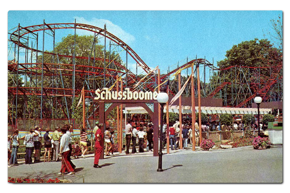
Vintage postcard, Schussboomer (1973–1984).

Vintage postcard, Schussboomer (1973–1984).

Long since removed is this Schwarzkopf “Wildcat” model coaster, Schussboomer. That routed blackletter sign is fantastic; I would have loved to have seen it in person.

Africa

From Scandinavia I continued on, underneath a railroad trestle. And things began to get cheesier. However, from the 1973 Worlds of Fun promotional literature, you’d have assumed they were going for authenticity:

Enjoy an African Safari where you will explore the deepest corners of the African Continent. Unknown excitement lurks behind each bush and boulder as you steer your jeep along the African Safari. Zigzag with blinding speed through jungle trees on the Zambezi Zinger, one of the world’s tallest and fastest rides. Test your marksmanship in the Big Game Hunt.

As with Scandinavia, most of this is long gone. The “zebra-striped jeeps” of The Safari only lasted five years. Zambezi Zinger, a much beloved roller coaster, made it all the way to the late nineties (more about this ride in a future post).

Many of the structures are simply country shacks painted in bright colors. There is an aura of generic “tribal culture” throughout—obviously nothing like the attention to detail you’d find at Disney’s Animal Kingdom. It’s probably more similar to San Diego Zoo Safari Park or Busch Gardens Tampa Bay.

Just around to the left after entering the Africa area from Scandinavia is now Prowler, a fantastic wooden coaster from Great Coasters International which opened in 2009.

Typographically, wherever and whenever “Africa” is expressed, you tend to find the inline variant of the wood type Neuland, hand-carved in 1923 by German Rudolf Koch.

Although I’d like to blame Jurassic Park (1993), well before that franchise’s logo came along the face had a long history of evoking the “Dark Continent” and other jungle-like settings, and these designs are culturally problematic (to say the least).

I was disappointed in the theming for Prowler. Although wooden roller coasters typically don’t need much (at least when they’re in a Western setting), the load station has some tropical tin roofing and that’s about it. They could have done more, possibly suggesting a mining operation or a jungle tour company.

Elsewhere in Africa, Worlds of Fun isn’t shy about making connections with Jurassic Park. In this case, however, they got the typography wrong. This isn’t Neuland, but some handpainted Lithos which was designed by Carol Twombly in 1989 and is based on Ancient Greek letterforms. To the layperson it resembles Neuland a bit, and thus shares its problematic stereotyped past.

The jungle theme continues towards the far back of Worlds of Fun. Mamba (1998) is a steel hypercoaster which faces Oceans of Fun, a companion water park that opened in 1982. Mamba is the younger sister of Wild Thing (1996) at Valleyfair and Steel Force (1997) at Dorney Park; all three have a very similar layout and general specifications.

The load station for Mamba was inexpensive (not surprising for a Cedar Fair park), but also subtle and kind of clever (which is surprising). The Victorian metalwork and glass skylights really reminded me of the famed Crystal Palace at the Great Exhibition of 1851 in Hyde Park, London. Given the colonialist flavor of both the exhibition and that era in general, this makes sense for a coaster named after a species of extremely venomous snake supposedly set in the jungles of Africa.

The rest of the Africa area includes some Moroccan and Egyptian stylings—really terrible stuff—but I’ll be looking more closely at that in my next post.

Europa

Moving along, the area in about the center of the Worlds of Fun property has a European theme. As the 1973 marketing copy describes:

Ride the Le Taxitour where guests will drive antique French Taxis along beautifully landscaped hillside roads. Arrive at Moulin Rouge, a 300 seat indoor theatre, and be treated to a musical travelog show. Whirl like a windmill on the Flying Dutchman. Ride der Fender Bender—the bumper-crunching autobahn. Stroll the tree-lined promenade with its brightly colored shops.

As with many themed lands representing “Europe” at parks around the world, bits of national iconography are carved out. This appears to be the “Italian” district. No rides, just a (closed) pizza place.

As I’ve seen at other Cedar Fair parks, Coca-Cola tends to set up shop no matter what the theme of a particular area happens to be and where its setting is. Although there is an appropriate irony here at Worlds of Fun—nothing is more American than Coke, yet you find it all over the world in just about every culture. Disney handles this kind of sponsorship with greater authenticity; for example, at Animal Kingdom the Coca-Cola logos are rendered in the actual languages in which you’d find them. Not so at Cedar Fair.

Just like at Cedar Point (and now again at Kings Island), Worlds of Fun has an autopia-style, drive-your-own car ride. Originally there were two such rides at the park, the other being the aforementioned The Safari (1973–1978). But Le TaxiTour is still here. The queue building features an Eiffel Tower-style roof element, which reinforces the cheesy pun of the ride’s name (the landmark is called “tour Eiffel” in French).

The vehicles are styled as antique Fords very similar to those found at other Cedar Fair parks.

I found the ride pleasant and the grounds well kept.

Despite the French name and setting, there are bits of vintage Americana car culture sprinkled throughout in the form of authentic antique signage.

I particularly appreciated the lettering on this Firestone specimen.

But not so fast. The rest of the signage in and around the Europa area drips with seventies cheese. The warping on this Autobahn Fraktur text is particularly egregious. Autobahn is the park’s classic bumper car attraction.

The dimensional title sign for Falcon’s Flight fairs a bit better. This carnival-style spinner ride was added for the 2017 season, so the cheese here is more of a 2010s energy drink / sports team variety.

Americana

After walking under another railroad trestle, Europa connects with what once was the opening act for Worlds of Fun—Americana.

The two trestles between themed areas at Worlds of Fun.

This is the second time a trestle has been used as a transition zone between themed areas; I crossed under the railroad tracks from Scandinavia into Africa as well. I suspect the design intention is the same as the covered bridges at Six Flags Great America—it’s a nice quick and dirty shortcut for moving spatially between themes.

And although I might bring bias from being so familiar with the Disneyland entrance into Main Street USA under their railroad via two tunnels, I do think there is an organic aspect to this approach which famed architect Frank Lloyd Wright referred to as “compression and release.”

Passing under the railway tracks (either via a tunnel or a trestle) provides a micro of this experience. Your vision narrows in the passage, allowing for a visual “wipe” of the theme you’re leaving, and then you emerge and the vista opens up in a brand new setting, waiting to be explored.

In 1973, Americana was described in park literature as being a land of:

Turn-of-the-century atmosphere with lush gardens, stately structures, and the famous riverboat “Cotton Blossom.” Also enjoy a step back in time when entering Americana’s “Westward Ho” era. Wander the bustling streets and browse the old time shops of historic Kansas City. Walk the 9th Street Incline…water really does flow uphill! “Grab some grub” at the Vittle Griddle and board the huffing, puffing, fire belching WORLDS OF FUN Train at the Union Depot.

Vintage postcard, Cotton Blossom (1973–1995).

Americana was once home to the third full-size boat at Worlds of Fun, Cotton Blossom. Just like Victrix it was purchased at an MGM backlot auction. Cotton Blossom was most fondly remembered for being the primary set piece in Show Boat (1951). The vessel served as the platform for the opening ceremony for Worlds of Fun on May 26, 1973, but that wasn’t enough to save it from wood rot. It was scrapped at the end of the 1995 season. There is now a namesake BBQ restaurant in the same location which opened in 2019.

Americana - “Westward Ho”

The Worlds of Fun Railroad is a 36" narrow gauge line with a single stop in Americana, Union Depot. The route is loop of just over a mile, pulled by a single locomotive named ELI which was manufactured by Crown Metal Products of Pennsylvania. Crown Metal also provided the two engines for Kings Island’s narrow gauge railroad as well as several other parks before going bankrupt in 1989.

Union Depot was small and charming, and reminded me of the original Frontierland station at Disneyland (which is now part of the New Orleans Square area of the park). The trope of listing a town’s elevation—something actually done at many early railroad depots, and followed through at Disneyland—is proudly displayed, with “Kansas City” as the location rather than “Americana” or “Worlds of Fun.”

Vintage postcard, Sky-Hi station in Americana (1973–1987).

Riding the train is a wonderful way to take in the lush landscaping of the Worlds of Fun property. But for nearly a decade and a half, you could admire the park from the air too.

The two Von Roll gondola stations still exist. Underlay map data: Ⓒ Google.

The Von Roll type 101 sky ride route roughly ran northeast to southwest and back (here I’ve rotated the satellite view vertically). The station in Americana labeled the ride “Sky Hi” while the station in Scandinavia called the gondola “Ski Heis.”

Vintage postcard, Sky-Hi (Ski Heis) headed towards Americana (1973–1987).

Like so many Von Roll sky rides, Sky Hi/Ski Heis was victim to both high maintenance costs and insurance liabilities. Once a staple of amusement parks, theme parks, and zoos across the country, there are only eight permanent installations left in the United States.

I didn’t spot the former Ski Heis station when I was walking through Scandinavia (today it’s a picnic facility), but I did find the Sky Hi Americana station, which is now a red barn featuring carnival games.

Directly across the way from Union Depot is some kind of Wild West structure in garish colors. This was originally added to the park in 1981 as an ice cream parlor, and fourteen years later it was converted into a full service Tex-Mex joint called Blue Bronco. On the day visited it was Battle Creek BBQ, but for the 2019 season it reverted to Tex-Mex and is called Prospector's Cantina.

Plenty of generic “country cottage” style structures serving pizza and other fast food options seemed to be around every turn in Americana.

If I see another Subway Sandwich outlet dressed as a country cabin…

Just like at many other Cedar Fair and Six Flags parks, there are generic “Old West” style buildings scattered throughout, many of them with garishly bright paint jobs and signage.

Some of the structures were decked out in more muted colors and actually quite well-maintained.

This one cropping had real Ghost Town at Knott’s Berry Farm vibes. Everything from the varied storefronts to mismatched materials to faux aging. What to call this? It’s sort of authentically theme park.

Cyclone Sam's is an interesting twist on a classic seated spinner ride. The Wobble Wheel (1977–1993) sat here prior, and was a similar contraption. What makes this experience unique is that it’s indoors in the dark with various cyclone and tornado effects. The exterior barn reminded me of Disney’s Splash Mountain.

Americana - “Bicentennial Square”

Around the corner from the “Westward Ho” section of Americana, I came to something quite eerie. Here was a back corner of the park which appeared to be completely abandoned.

Copious Victorian Gingerbread everywhere, but no people.

Most of the carnival games were boarded up, closed.

Further back, there looked to be a kind of Christmas village.

Indeed Worlds of Fun does run a Winterfest event on select nights in November and December.

So does this back corner of the park simply sit dormant until then?

The whole thing was very odd. And I know I’ve used this analogy before, but it felt like an old episode of the Twilight Zone. Particularly the pilot, “Where is Everybody?”.

The only draw seemed to be a traditional wooden coaster called Timber Wolf.

The coaster was added to Worlds of Fun in 1989, and doesn’t have any theming or other design elements except for the woodsy landscaping.

Looking around at the queue area out in front of Timber Wolf, I saw a stream and several ponds. There were also concrete pavers. What could have sat here before?

Vintage brochure featuring the debut of Screamroller (1976–1988).

As it turns out, the signature attraction for “Bicentennial Square” (basically its single biggest draw) was an Arrow Corkscrew model called Screamroller. This was the fifth of the total first ten Corkscrew clones built between 1975 and 1979.

Worlds of Fun 1976 souvenir park map poster featuring Bicentennial Square.

For the 1983 season, Screamroller was converted to a stand up coaster (the first such ride in the United States) and renamed Extremeroller. The standing configuration was too stressful on the coaster’s superstructure, and it was reverted to a seated model in 1984. The new name stuck, however, until Extremeroller was removed four years later.

The opening of “Bicentennial Square” at Worlds of Fun in 1976 was part of a patriotic wave that swept over amusement parks and theme parks all across the United States. Today there doesn’t even appear to be any Bicentennial signage and it’s not designated on park maps. The entire area—the former entry plaza, “Westward Ho” and “Bicentennial Square” are collectively simply called Americana.

Thirty years later, though, patriotism was back.

Patriot is a Bolliger & Mabillard inverted steel roller coaster in the Batman fashion. Pretty standard fare for a Cedar Fair or Six Flags park. There are some small Colonial thematic trappings throughout the queue area such as these eagle statuary.

The ride’s souvenir store is presented as a classic ol’ timey American country home.

Just like at Disney parks these days, the go-to for period-appropriate American typography is the venerable Letterhead Fonts.

Orient

The last “land” I encountered at Worlds of Fun was the Orient area. The theming going on here is a melange of middle class white American notions of “Asia-ness” as frozen in the early seventies. It’s all so intense, garish and bizarre that I’ll be saving most of my photos and thoughts for my next post.

True to cultural indifference, in early park promotional literature, this area is referred to as both “Oriental” and “Orient.” From the 1973 guidebook:

Enjoy the alluring Oriental gardens along the ancient and mysterious waterways of the Far East. Challenge the tangling tentacles of the Octopus and delight to the amazing antics of the Dolphins at the Fins and Flippers Show.

Original Torii Gate (1973–1999).

For many years, as guests entered the Orient area from Americana they walked through a traditional Japanese torii gate which is typically found at the entrance to a Shinto shrine (signifying a physical transition between the profane and sacred). I’m not sure why it was removed—doubtful it was cultural sensitivity. I’m going with the same culprit which doomed the ships of Worlds of Fun; wood rot.

Some structures appears to be influenced by Thai design.

Traditional Japanese gardens blend with Chinese and Korean iconography. And red. Lots and lots of red.

It was certainly surprising to find a Panda Express outlet in an aesthetically and somewhat culturally appropriate context (even though the food is still terrible). I’m used to seeing these at Cedar Fair and Six Flags parks in everything from Southern to Colonial to Old West structures.

Next I’ll be delving into such problematic design issues in more detail, not just in the Orient area but all throughout Worlds of Fun.

Continued in Part 3.

July 28, 2019 /Dave Gottwald
  • Newer
  • Older

All original content on this site © 2007—2025 Dave Gottwald.
All photography which is my own is licensed under Creative Commons Attribution-NonCommercial 4.0.
This means you are free to share and adapt my images for non-commercial purposes only.