DCA Then and Now - Part 4: Carland / Cars Land.
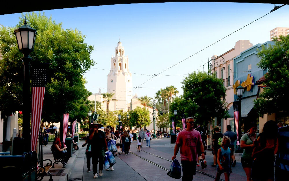
In terms of “then and now” sometimes there was no “then.” When Disney California Adventure (DCA) opened in 2001, the entire southeastern quadrant of the former Disneyland parking lot was left alone and set aside for future expansion. I used to park my car there frequently during the three years of DCA’s construction and even after, because the tram ride to Disneyland’s entrance was shorter. A Bug's Land took a slice of this plot in 2002. The addition of the Twilight Zone Tower of Terror in 2004 took another bite.
The citizens of Radiator Springs in Cars, 2006 film. All screen caps are from my DVD.
Then eight years later, Cars Land took nearly all the rest. Disney’s Imagineers first had the concept for a Carland that was celebration of California automobile culture when they were brainstorming expansions for DCA. Then suddenly Cars (2006) was a massive hit for Pixar (which Disney purchased that year), grossing some $462 million at the box office.
As The Imagineering Field to Disney California Adventure notes,
Cars Land represents one of the earliest fruits of the 2006 acquisition by The Walt Disney Company of Pixar Animation Studios, and the largest collaboration to date between the Imagineers and the animators from Pixar. The concept went into development in earnest not long after the combination of the two companies… From concept to production and field art direction, the creators of the films worked hand in hand with the creators of the land.
Cars Land opened along with Buena Vista Street and the parks’ revamped entrance in June of 2012, a year after the release of Cars 2 (2011). For the most part, the themed area is a re-creation of the town of Radiator Springs from the film. But there are a couple embellishments that establish the land’s identity. The main one is this large billboard which serves as a photo op at the primary entrance.
Vintage postcard, Bakersfield, California.
The billboard is rendered in the easily identifiable motif of the “Greetings From” or “Wish You Were Here” postcard design that was wildly popular across the United States during the first half of the twentieth century. I’m sure you’ve seen one of these before, or are familiar with the graphic design trope which they have spawned—large, dimensional letters which are filled in with photographic or illustrated scenes that add up to a sense of place.
Welcome to Radiator Springs
I hadn’t seen Cars in years, and the only time I had watched it was when I was babysitting a niece and nephew. So I was only really paying attention half the time. It struck me as cute, but I had forgotten the particulars completely. I gave it a full rewatch (twice) before proceeding with this post, and I’m glad I did. Cars is a really well told story, carefully designed and—as it turns out—ideal for being transmediated into theme park form.
Radiator Springs between the Cadillac Range and Ornament Valley as shown in Cars.
Cars—and its sequels and spinoffs, most recently Cars 3 (2017)—is set in a world in which vehicles of all kinds are anthropomorphic. They walk (well, roll) and talk and own businesses and have romances and rivalries and are the “people” in this world.
The primary setting for the first film is an Arizona town called Radiator Springs, a sleepy hamlet on the famed U.S. Route 66 which had been bypassed by the Interstate 40 some years back. Pictured above is a sequence from the film where Radiator Springs is identified on an imaginary map of Arizona, complete with an “Ornament Valley” (a riff on Monument Valley) and a “Cadillac Range.”
Radiator Springs at the finale of Cars.
Although fictional, this area is based on a real stretch of 66 through Arizona between Lake Mead and Flagstaff. I’ve driven it. The artists and animators at Pixar did a lot of site research along Route 66 when preparing the film, and it really does show. Though Radiator Springs is completely fake (inhabited by cars!) it feels real enough—architecturally—to be possible.
The plot of Cars is basically a fish-out-of-water, off the beaten path kind of tale. A famous, egotistical red racing car, Lightning McQueen (voiced by Owen Wilson) is humbled after being stranded in Radiator Springs for a spell, during which he befriends the town’s residents.
Cars Land on the DCA 2012 park map. Ⓒ Disney Enterprises, Inc.
The theme park interpretation of this town, which is unique among Disney Parks, sits at the back of DCA. The “main street” or Route 66 into town branches off the walkway towards the back corner of the park at a diagonal. Although Radiator Springs is set in Arizona, the entire 66 / Classic Car Culture motif is a very California thing, so I don’t begrudge them for cheating just a little bit. After all, since the park opened it’s being veering further and further from anything Cali-centric.
Seeing Cars Land before the general public, 2012.
Along with the new Buena Vista Street, I attended the preview for this area back in 2012, about a week before it opened to the public on June 15. I had never seen anything like it. And this was years before I had even gotten around to watching the film Cars. So I was evaluating the design of the land on its own merits, so to speak. Just as “new” theming.
The landscape of Radiator Springs Racers, at the rear of Cars Land, 2012.
The world felt cohesive, and somehow cozy yet massive at the same time. The imagineers were up to their old tricks with forced perspective, and this was probably the best rockwork I had ever seen at a Disney Park up to this time. Even more nuanced than Tokyo DisneySea, which is really saying something.
Radiator Springs in Cars.
Although I didn’t know it walking around Cars Land for the first time, all of these natural features are taken directly from the film. Right behind the main drag of Radiator Springs (and it is pretty much a one-drag town) sits the “Cadillac Ranch” as seen on the map above.

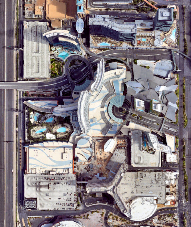
Cars Land, satellite view. Click for link. Underlay map data: Ⓒ Google.
When I say that Cars was meant to show up in a theme park, what I mean is it almost feels like the movie could have been based on the land, not the other way around. It’s practically Disneyland’s Main Street U.S.A. with all the proprietorships on either side of the street, leading to a classic Disney “wienie” visual magnet in the form of the courthouse with the Cadillac Range in the background. Here, because the land is laid out on a diagonal, this rockwork backs directly up against W. Katella Avenue to the south.
One of the highlights in Cars Land for me personally is the amount of highly detailed graphic design in the form of logos, ephemera, and signage. There are a few brand name riffs and jokes in the film, but here in the built environment they’ve expanded the palette considerably. If you’ve ever seen the “Welcome to… / Elevation… / Population…” signage when you drive into a small town, with all the Rotary International seals and local Chamber of Commerce stuff, then you understand the vernacular the designers are going for here. Some of the jokes are clever and quite subtle. Like all the best themed spaces, you’re rewarded for looking closely.
Much of the graphic design in Cars Land is the work of Imagineer Laurel Scribner Abbott.
The town of Radiator Springs itself has a seal which you can find on trash cans and park benches throughout Cars Land. It’s the same sense of civic reality that the Imagineers provided to Buena Vista Street.
Radiator Springs in Cars.
From this shot in the film, it’s clear that the animators almost were thinking of Disneyland when they laid out Radiator Springs and oriented its foreground to the Cadillac Range behind. You can also see how the butte behind the courthouse has been abstracted into the town’s seal.
All this is replicated so perfectly in three dimensions at DCA. Even for someone who hadn’t seen the movie (as I had not when it opened), the design of the land was just so palpable. Immersive. A stylized, cartoonish reality not unlike Mickey’s Toontown. But with the advantage of real world props and details. In Toontown, the light posts and manholes are “toonish.” Here the world of Cars is accepted and rendered as the real world and this makes all the difference between the two environments.
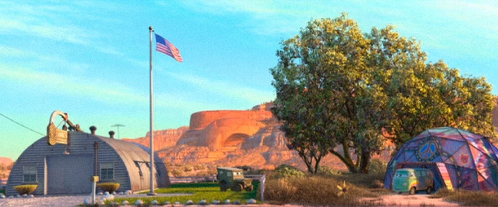
Tow Mater Towing & Salvage
One of the reasons why I think Cars really translates well to thematic design is that its cast of characters are each closely associated with their own environments; their small businesses, their vocations. And the personification of each character and their spaces is of a set; the characters are these businesses and these businesses are the characters. They’re inseparable.
First up on the left (east) side as you enter Cars Land is Mater's Junkyard Jamboree.
Mater’s tow yard in Cars.
Each character in Cars is certain type of vehicle which relates to their proprietorship or role in the town. Mater is a tow truck (voiced by a standup comedian who goes by the moniker Larry the Cable Guy) and his associated environment is a junkyard called “Tow Mater.”
Here in Cars Land that junkyard has been transmediated into a type of Teacups ride. Disney tends to do this really well. They can look at a scene, a sequence, or an environment in a film and figure out a way to transform it into an attraction, restaurant, or shop. They do this effortlessly. However in the case of Cars, you could argue that a lot of the work had already been done for them—a cast of unique characters expressed through the spaces they are associated with, where they live and work.
The elaborate design details seen on the “Welcome to…” signage at the entrance to the land continue throughout Cars Land, beginning right here. Dozens upon dozens of imagined license plates were drawn up and pressed into metal. The typefaces are perfect, the weathering is realistic.
Cars Land allows for the logical expansion and extrapolation of what we see in the movie. There’s a lot more here, but it all feels right, it all makes sense. Like it could have been in the film, just around the corner. Or maybe we blinked and missed it. Rarely does an element feel shoehorned in. It’s the Radiator Springs that was always there, yet not.
FIllmore’s Taste-In in Cars.
Fillmore’s Taste-In
Across the street from Mater on the right (west) side of the Route 66 main drag into town is Fillmore's Taste-In. Fillmore is the movie’s hippie (voiced by the late, great George Carlin). You’ve got to hand it to the story people at Pixar. They managed to milk nearly every American cultural stereotype and tie that association to the appropriate vehicle. Mater is a country bumpkin, a redneck, a hick. So he’s a rusted, run down tow truck. Thus Fillmore (named after the famous San Francisco rock venue) is a 1960 VW Microbus straight out of the Summer of Love, complete with every graphic and bit of tie dye that you’d expect.
The entrance to Fillmore’s “Taste-In” (a riff on the term “love in”) is a row of hanging rusted mufflers with colorful late 1960s psychedelic lettering rendered in a tie dyed style. Cleverly, the hanging tire features a few spokes which form a peace sign.
The Taste-In sign in Cars.
Compare with the signage as seen in Cars. There are some small changes, but overall it’s a really close interpretation. What’s remarkable about Cars Land is that the area’s designers had access to all of the digital models that Pixar had developed for the film. In effect, the “blueprints” for all of these structures already existed in the computer and just had to be translated into CAD and modified for scale etc.
Here in Cars Land what was a stop for fuel in the film (all the vehicles consume gasoline and oil as refreshments in this world) has become a snack and soda stand. The main structure is a small sort of geodesic dome as designed by Buckminster Fuller. In fact, its scale is quite close to the “Dome Home” Fuller built in Carbondale, Illinois and lived in from 1960 to 1971.
Fillmore introduces Lightning McQueen to his organic fuel.
The translation is rather smooth, with only the snack stands added to the left and right of the dome. Others have commented online that Fillmore’s little dome resembles the Meteor City Trading Post in Meteor City, Arizona. Or perhaps it’s Ortega’s Indian Market in Lupton, Arizona. Both buildings are Route 66 landmarks and are now abandoned.
Here’s a nice example of a detail which we never get to see up this close in the movie. Again, Cars Land is not just a rote interpretation of Radiator Springs, a manifestation of animation in the built environment. It also magnifies and embellishes upon the town when appropriate.
For example, this façade does not appear in Cars at all. Disney needed a garage which is not associated with any one movie character as a place to store the vehicles which are brought out for parades and meet ‘n’ greets. The design is well considered enough that this building '“blends” successfully into the rest of Radiator Springs. It doesn’t stand out; it just fits.
Here painted on the brick wall is my old friend, the House Industries script Las Vegas Fabulous. I had just spotted it in my prior post on the rich design details of DCA’s Buena Vista Street.
Sarge’s Surplus Hut
Back across the street, next to Fillmore’s, is Sarge's Surplus Hut. In Cars Land this is a retail shop selling mostly toys and apparel. It’s a Quonset hut which serves as mid-century architectural shorthand for U.S. Military quarters, and was inspired by repurposed huts which can be found along Route 66.
Sarge and his Surplus Hut in Cars.
Again, the genius of Cars: every character + vehicle + proprietorship is of a perfect cohesive set. Sarge (voiced by Paul Dooley) is a serious, by-the-books drill sergeant type character who serves as comic foil for Fillmore. He’s a 1941 Willys model jeep which became synonymous with the U.S. Military during World War II.
Sarge and his neighbor Fillmore.
The fact that Sarge and Fillmore are next door neighbors heightens this comedy. Sarge is the establishment square who is constantly mocking Fillmore for being a stereotypical “filthy hippie.” Sarge finds him lazy, lawless, and unpatriotic. And (although the movie never says so explicitly) he gives Fillmore a hard time for being a stoner.
Cozy Cone Motel
Back across to the east side of the street sits the Cozy Cone Motel. Some of these environments like Sarge’s hut or Mater’s tow yard are only glimpsed very briefly in the first Cars film. Others are far more integral to the story, and this motel is one of those spaces. Here in Cars Land it functions as a fast food court, with five individual windows selling “sweet and savory treats” as well as cold beverages.
The Cozy Cone Motel as seen in Cars.
Looking at the Cozy Cone as it appears in the film, you can see that the proportions have been altered in the theme park interpretation. It’s wider here and the cones are somewhat larger as they are supposed to be individual sleeping cabins for vehicles, each with their own garage door.
Vintage postcard, Wigwam Village.
The design for the Cozy Cone is a witty interpretation of yet another Route 66 icon—the Wigwam Motel chain. Back in a time when middle class white Americans had no understanding of the words “cultural appropriation,” this chain originally had seven locations: two in Kentucky and one each in Alabama, Arizona, California, Florida, and Louisiana. Even the name is wrong. You didn’t spend the night in a wigwam (found in the Northeastern United States and up in Canada) at all, but rather in a cabin resembling a tipi as built by the Indigenous peoples of the Plains (an icon common in the West).
Today only the motels in Holbrook, Arizona and San Bernardino, California remain.

See how measurably smaller and shorter the motel office is. There are only a handful of missed opportunities in Cars Land, and I think this is one of them. Although it is lavishly decorated inside, I wish the office wasn’t just for show. It would be more immersive if you could go in and walk around like a prospective guest. Maybe some business cards on the desk or some souvenir postcards and tourist trifold brochures available as cute takeaways. Something.
The cones themselves are pretty nifty interpretations of what we see in the film, which proportions tweaked for human scale.
The motel’s “cones” in Cars.
Although the shift in scale jars quite a bit, I really like that the doorway / garage striped awnings are the same, and that they kept the old school television antennas on each rooftop.
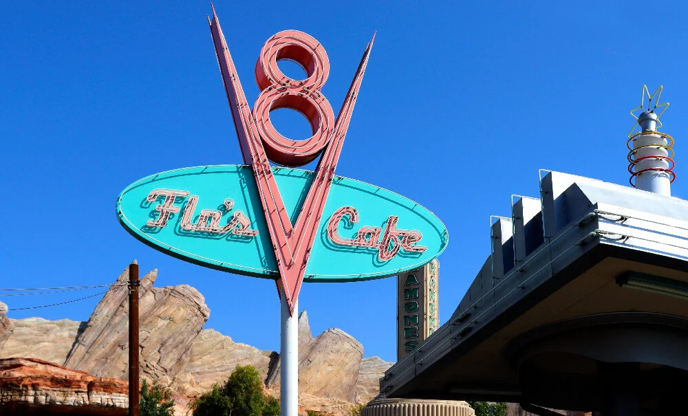
Flo’s V8 Cafe
Turning back to the west side is Flo's V8 Cafe which is a major location in the film. This is the largest dining spot in Cars Land with a broad menu of American comfort food and ample seating both indoors and out.
Flo’s V8 Cafe in Cars.
The movie version is a major hangout for several of the characters, and many scenes take place there. The design is supposed to mix the sensibilities of a mid-century roadside diner with a gas station, because again all the vehicles consume gasoline and oil.
The design is cute in the film, and just as snappy in the built environment. The main building incorporates an automobile air or oil filter. The roofs of the gas pumps look like engine parts (carburetor, piston arms, etc). The typography, coming direct from the movie, is suitably deco and reminds me of the fantastic work of the Font Diner foundry.
The owner Flo.
Always, always, always: character + vehicle + environment. The cafe’s proprietor is Flo, a blue 1957 General Motors Motorama show car voiced by Jenifer Lewis. Note the cars with their cans of oil as beverages in the background.
The gas pump bays serve as shade for outdoor diners. There are neat bits of propping like oversized cans of oil stacked everywhere, referencing the town’s refreshment of choice. Like with the other graphic design business scattered about the land, the labels on these are well-executed send ups to national automotive brands.
Sally talking to Lightning McQueen.
I would be remiss if I didn’t mention Sally Carrera (voiced by Bonnie Hunt), the blue 2002 996-series Porsche 911 Carrera. She’s the town’s attorney and also the proprietor of the Cozy Cone Motel. And the romantic interest of Lightning McQueen. Curiously, this car is the only character whose vehicle is not linked to their associated business location. This is because Sally was a hot shot lawyer in Los Angeles who moved out to Radiator Springs one day and stayed (shades of the 1991 comedy Doc Hollywood). So her vehicle (Porsche) reflects that vocation and not the motel she also runs.

At first glance I thought the gas pumps were legitimate antiques, but on closer inspection they are immaculate reproductions.
Flo’s gasoline pump in Cars.
And they are nearly identical to the pumps we see in the movie.
The rest of the architecture of Flo’s demonstrates again this approach of the Imagineers taking Radiator Springs as designed for the film and literally building upon it. Behind the primary “filter” structure of the cafe is a whole other building and patio at the rear right which is very mid-century modern in a Los Angeles or Palm Springs kind of way.
This is the only part of Cars Land which—although I love the design and it’s really well done—does not fit with the Radiator Springs we meet in Cars. It’s too slick, too modern, and too expensive looking. The town was bypassed by the construction of the Interstate years back and had thus fallen on hard times since. This (terrific) glass and steel annex just doesn’t work in that context.
Radiator Springs Curios
I’d visited DCA countless times between 2012 and 2016. So since I’d only seen Cars once before recently rewatching it now, there are certain things I’ve always associated with Cars Land and not the film. For example, I could not remember what the billboard sporting “HERE IT IS” is all about.
The Radiator Springs Curios “HERE IT IS” billboard in Cars.
In the film, it sits a bit apart from the Cozy Cone Motel, advertising the Radiator Springs Curios shop which is the next building down on the same side of Route 66 through town. In yet another nugget of 66 lore, “HERE IT IS” is almost a direct replica of a famous billboard at the Jackrabbit Trading Post in Joseph City, Arizona.
Radiator Springs Curios is a souvenir shop of the roadside kitsch variety common to rural areas. The design of the store with all its excessive signage and bric-a-brac is based on two icons of Route 66—the Hackberry General Store in Cool Springs, Arizona, and the Sandhills Curiosity Shop of Erick, Texas.
Lizzie in front of her curios shop in Cars.
The curios shop is owned by Lizzie, a 1923 Ford Model T Coupe voiced by Katherine Helmond. She’s also the widow of the town’s founder, Stanley (more on him at the end of this post).
Within Cars Land, the “HERE IT IS” billboard and the curios building are essentially integrated.
Red the fire engine in front of the curios shop in Cars.
In the film they are not. You can see how much land there is between the shop, the billboard, and the Cozy Cone. The Imagineers chose to expand their theme park version of Radiator Springs in some places. But in others—simply due to lack of real estate—they had to compress and contract it.
Now here we are at the intersection of Route 66 (the main drag through town) and the aptly named Cross Street.
The only major intersection in Radiator Springs in Cars.
The stylized sign post pictured above doesn’t quite exist in the film in the same way. But like most elements that the Imagineers came up with, it’s designed to fit. The intersection plays a notable spatial role in a few different key sequences of the story. In Cars Land it’s a practical way to bisect the area and provide two additional ways to enter and exit.
The town stoplight in Cars.
Radiator Springs is, quite literally, a one stoplight town.

Which has been loving recreated in Cars Land. The light blinks yellow all day and all night.
Ramone’s House of Body Art
Radiator Springs Curios and Flo’s V8 Cafe are, respectively, on the northeast and northwest corners of this intersection with Cross Street. At the southwest corner is Ramone's House of Body Art. This establishment is something of a cross between a tattoo parlor and an auto body paint detailing shop. It’s where a character in the universe of Cars would go to get “inked.”
Auto body artist Ramone.
The proprietor is Ramone (voiced by Cheech Marin of Cheech & Chong), a 1959 Chevrolet Impala Lowrider. The exterior design of his House of Body Art was directly inspired by the U-Drop Inn of Shamrock, Texas, a very famous Route 66 icon.
Luigi’s Casa Della Tires
Across the street at the southeast corner of the intersection sits Luigi's Rollickin' Roadsters, the second attraction in the land. It’s a trackless dancing cars ride and replaced the problematic Luigi's Flying Tires (2012–2015), a hovering bumper car ride that the designers could never get to work right.
Sally talks to Luigi and Guido.
The car in the tire business is Luigi (voiced by Tony Shalhoub), a yellow 1959 Fiat 500. His timid sidekick (voiced by Guido Quaroni, a Pixar animator who only speaks Italian in the film) is Guido, a forklift who resembles an Isetta. The backyard area for the roadsters attraction is completely invented for Cars Land, but the building front is very faithful to what is shown in movie.
There’s a lot of neon towards the end of the block, all appropriately aged with rust and peeling paint. It was only when rewatching Cars thoroughly that I recognized all of these signs. For years they just seemed like neat vintage re-creations.
Mater next to the Oil Pan.
I’d completely forgotten about The Oil Pan. A handful of key scenes take place in front of this building with the sign and painted mural on the brick wall. According to Cars fans online, The Oil Pan was a popular attraction until it went belly up in the 1960s (it is unknown who owned it). In Cars Land this is a retail space attached to Ramone’s House of Body Art. Once again the designers collapsed the empty space between the two lots.
Radiator Springs Fire Department & Courthouse
At the end of the “Main Street” of Cars Land is the town’s courthouse / firehouse. When Lightning McQueen gets in trouble and is hauled before the judge, it’s in this building. As you approach it’s even more clear that the overall layout of Radiator Springs itself was inspired by the Disney Magic Kingdom theme park model—the courthouse is basically the castle.
THe Fire Department & Courthouse in Cars.
Like other environments in Cars Land, the proportions and scale are altered from what we see in the movie. Also, in the film the building stands alone with tons of vacant land on either side of it.
The Cars Land version has the same 1950s vintage tail light flowers though, both here at the front of the courthouse and at the Cozy Cone Motel. This is one of the more subtle visual gags in Cars that translates really well to a themed space. The flowers are large enough to be rendered in great detail, and you can really get close to them and even try to identify which models of classic cars are being depicted.
I promised Stanley would return. He’s the town’s founder (a Model T like his wife, Lizzie) and his memorial statue from the film is faithfully reproduced in front of the town courthouse. This backstory for Radiator Springs is more thoroughly fleshed out in the design of the land’s signature attraction, which I will detail in my next post.
Memorial statue of Stanley in Cars.
Cars Land presents an interesting contrast to Buena Vista Street. The latter had been a spectacular imagining of parts of Los Angeles during the Golden Age of Hollywood, and that’s because there was a certain reality to it. As I mentioned in my last post, even the storm drains appear perfectly authentic.
Though equally impressive, the former, conversely, is placemaking of a certain unreality. There’s a different kind of fidelity being adhered to. You can’t even call it verisimilitude, because what is the truth of Cars, in which vehicles are essentially people? I’ll call this quality fauxmilitude: a faithful rendering of the fake, a fidelity to the unreal.
We end up judging Cars Land by how well it represents the source material, like any other transmediated work. Recall the common quip about a book [source] being better than the movie [adaptation], but in reverse. Because the Radiator Springs here is executed in the built environment (with real brick, and blacktop, and actual neon) and Cars is a computer animated film… in this case the adaptation somewhat surpasses the source material.