Themerica

Musings on Thematic Design and the End of Architecture

  • Blog
  • Archive
  • About
DCA 05.jpg

DCA Then and Now - Part 6: Radiating Springs.

November 17, 2021 by Dave Gottwald

Cars Land is a home run example of thematic design by day. I think my prior two posts establish that. Now, it’s true that theme parks in general—and the Disney parks in particular—tend to look great after dark. But I think this built environment manifestation of Radiator Springs takes it to a higher level, because it’s actually an expression of some key moments from the film Cars itself.

Radiator Springs bereft of neon at the start of Cars.

The first time we see Radiator Springs during that first night early on in the film, it looks pretty sad. Most of the lights are dead, and those that remain are flickering eerily. We as the audience get the message immediately; the town has been passed by.

Neon re-lighting sequence in Cars.

On Lightning McQueen’s last night in town—just before the media track him down and he gets carted off to the big race—there’s a charming scene set to "Sh-Boom (Life Could Be a Dream)” by The Chords. All of the neon signage in Radiator Springs has been restored and comes to life. The animation is really well done, and the choreography of the vehicles as they “dance” down the street is especially engaging. Basically, if you talk to anyone who has seen Cars at least once, they’ll probably recall it.

It’s the magic of this celebratory part of the movie that is recreated in Cars Land every night at twilight. The lights don’t come on all at once. They do come on quickly, but there’s a subtle sequence, like someone turning on strings of Christmas lights one by one.

At Disneyland next door there’s a special vibe during twilight, sure. But it’s all incandescent and twinkle lights. The neon on display here has a completely different feeling.

There’s also a different type of nostalgia being expressed. Over on Main Street USA it’s about the quaint charm of early electric lighting (the street is lined with both gas lamps and electric bulbs). That setting (early 1900s) is when electricity was cutting edge technology.

Neon first became popular in the United States during the 1920s and 30s , but in terms of Americana its peak power was during the 1950s and early 60s. Thus—apart from Las Vegas and Reno—many Americans associate neon with the middle of the twentieth century.

Its use in Cars was certainly a deliberate play on nostalgic Baby Boomers’ heartstrings as they watched the film with their children and grandchildren.

But neon is not the only effect used. Like at Disney’s other parks, both spot lighting and atmospheric arrangements are used to heighten the emotional resonance of themed spaces.

Careful attention was paid to make sure that the proprietorships look in person the way they do in the film. Some, like Mater’s tow yard, are never seen in Cars at night, but are imagined in a way that matches those that are.

As LED technology has improved in both luminosity and cost (particularly of high-brightness units), Disney has steadily adopted it throughout their environments. Like in our homes, the energy is cleaner and cheaper. The designers are particularly adept at using fixtures and trimmings that fake us into thinking these are all incandescent bulbs of a far older vintage.

More theatrical stage lighting is still employed liberally for certain effects.

Psychedelic projections at Fillmore’s in Cars.

In this case the designers are trying to approximate what is actually animated in the film.

Motion is replicated too. Commonly, neon signs of the mid-century period had elements which created the illusion of motion or animation as a way to catch eyes from a moving car.

Sarge’s moving neon in Cars.

In the case of the sign on Sarge’s Surplus Hut, it’s a projectile being launched.

On the sign for the Cozy Cone Motel, the “Z’s” rise from a car sleeping soundly.

Caption.

Cozy Cone in Cars.

Just like in the film. Incidentally, it’s this motel sign that says “Mid-Century Americana” to me the most, of all the signs in Cars Land.

I can’t recall if the tail light flowers are seen at night in the film, but they look great in Cars Land. Just the right amount of glow, which appears to have been achieved with LEDs.

Just like all the structures themselves, the Disney Imagineers had the 3D models and digital wireframes from the film from which to base their signage construction drawings on. The movie is the literal blueprint.

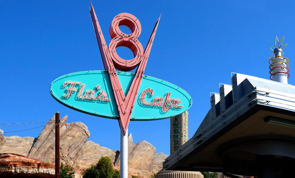
FLo’s in Cars at night.

The thing that really impressed me though, was the color of the neon. It’s not just “close enough” it’s a perfect match.

As a designer I’ve had my share of color matching nightmares over the years. From screen to print and back again. Different devices, wildly varying gamuts, incorrect profiles.

The Flo’s Cafe sign lights up in Cars.

The sequential nature of the town’s signage coming alive is highlighted at Flo’s in particular. The camera swoops up as each part comes on, one at a time.

the V8 crown at the top of the sign.

Look carefully at the colors.

It’s spot-on in Cars Land, to the point of being uncanny.

The lighting at the curios shop fits with its roadside kitsch vibe. Twinkle lights with lots of irregular fixtures and sconces. The impression is that all of this accumulated over time.

Radiator Springs Curios alight in Cars.

It was only after watching Cars carefully as I was preparing this post that was like (dang!) they nailed it completely. There are some different proportions and changes to the façade, but as for the lighting effects, it’s 1:1 for what we see in the film.

Kitty-corner across the intersection is another temple of neon at Ramone’s House of Body Art. The scheme is bright green and purple, which reminds me of a sports team or the branding for an energy drink (thus it’s a combination many designers avoid).

Ramone’s at night in Cars.

In the film it’s a bit more blue to my eyes.

The height is impressive in person.

All the smaller script bits in the windows are the same as in the film.

The bluer Ramone’s of Cars.

Yet note the darker, blue-ish interior of the “Body Art” lettering in particular. My guess, based on how they nailed everything else so closely, is that the designers couldn’t replicate the color effect in quite the same way with the physical neon installation as built.

Luigi’s is pretty much the same as in the film.

Luigi’s lit up in Cars.

Even the tower of tires is lit with internal spots (likely LEDs) and the string lights hung above are the same.

I particularly like this smaller logo on the side of the building facing Route 66.

I’ve mentioned in the prior posts how Cars Land expands upon the Radiator Springs we see in the film, extrapolating spaces and so forth. But there’s another kind of expansion going on—temporal. We can spend all the time we want in this version of the town (at least while DCA is open), examining various details in depth.

In Cars, most of these smaller signs are seen lit up very briefly.

The Sparky’s sign is visible for only seconds of screen time.

Smaller neon signs in Cars.

Also, we are only shown the neon signs from particular vantages. Walking around Cars Land at night, you can pick any angle to look at them. The themed space thus expands both time and perspective of its transmediated source.

Disney always has jokes intended for children and more subtle nods that only the grownups are going to catch. Like this bar-as-tune up joint “We’re Open” sign with a small nut for the olive in the martini glass.

It’s not my intention to belabor this point. But there is a confluence of forces at work that make Cars Land at night among the best-realized and affective themed spaces I’ve ever seen. In that it expresses, aesthetically—a truth about its source material.

It’s not just about the design. For one, the neon caries emotional and symbolic weight in the story of the film. We don’t just see the neon in Cars and then see the same thing in Cars Land like any other scenic aspect of the movie.

The conclusion of the neon processional in Cars.

The neon represents the prosperity of Radiator Springs. As in the lights are on and—as the above martini boasts—“We’re Open for Business!” The musical number is nothing short of a processional, a pageant, a parade in which Lightning McQueen demonstrates his true affection for the town and its citizens whom he has befriended. Right before he is whisked away to the big race.

And because the neon coming alive is repeated every single operating day at the same time, twilight, this procession as seen in the film becomes ritualized. It’s like the first lighting of the town Christmas Tree, every single night. Which at DCA is typically 365 days a year.

A few last notes about the nighttime ambiance of Radiator Springs Racers and its queue.

The designers first started doing this kind of stuff in the Frontierland area of Disneyland, and Big Thunder Mountain especially stands out. In the early years the Matterhorn was not lit at night in any special way (this wasn’t added until the attraction was redone in the late 1970s).

In the decades since, the Disney Imagineers have become experts in the art of backlighting with spots; this technique of course comes from filmmaking.

Themed lighting fixtures appropriate to the setting—which tend to be realistic—are augmented with a very otherworldly treatment on all the surrounding rockwork. If you’ve been to any kind of themed space with rockwork on display at night—from Las Vegas to Dubai—you’ve seen this. DIsney invented it.

I have no idea what you’d call this, because I’ve been looking at it since I was a child. Mountains and canyons inside a Disney park are just supposed to look like this at night. In fact, as I got a bit older and spent more time in the great outdoors, camping and going to national parks and the like, my first reaction was that I was stunned how dark everything actually is once the sun goes down. Which is one of the primary appeals of such places. Without light pollution, the landscape of the earth recedes and the stars dominate the night sky. Any trace of civilization evaporates.

Within the theme park, however, the stars of the show are the designers with their neon and LEDs and elaborately glowing rockscapes.

Continued in Part 7.

November 17, 2021 /Dave Gottwald
DCA 139.jpg

DCA Then and Now - Part 5: Go Speed Racers Go!

November 07, 2021 by Dave Gottwald

Tucked away at the far end of Cars Land, off to the right, sits the signature “E-Ticket” attraction for the area, Radiator Springs Racers. It’s a slot car dark ride, using the same technology initially developed for Epcot’s Test Track (1999) and later utilized for Journey to the Center of the Earth (2001) at Tokyo DisneySea.

Gateway to Ornament Valley

Between when Cars Land opened in 2012 until Star Wars Galaxy’s Edge debuted in 2019 this was probably the most popular attraction at the entire Disneyland Resort. Standby wait times are still routinely well over an hour. When I attended a Disneyland Annual Passholder (AP) preview event shortly before the land debuted to the public, the wait was over two hours. But that was a relatively small event. Local press reported wait times of over six hours during the week the Cars Land opened to the public at large.

Radiator Springs Racers, satellite view. Map data: Ⓒ Google.

The way the attraction’s layout is integrated into the land is quite clever. There’s no one single vantage (except this satellite view) from which to see the entire expanse. Any glimpses that guests might get are all carefully managed and controlled.

In the background lies The Cadillac Range mountain formation from Cars (2006). It’s rumored that Pixar/Disney had to receive permission from General Motors to replicate the design of these various vintage Cadillac fins from the 1950s and 1960s. Disney claims it’s more than 280,000 square feet of rockwork (the most at any Disney park), and they posted a video about its construction back in 2012.

Here the design challenge was to link several strong visual elements that are rather disparate in the film itself—the town of Radiator Racer Springs, Radiator Cap Mountain, The Cadillac Range, Carburetor Canyon, Willy's Butte, and even parts of Ornament Valley that are much further afield.

The Cadillac Range in the distance in Cars. All screen caps are from my DVD.

Again, owing to the wit of the Pixar story team, The Cadillac Ranch combines Arizona’s Black Mountains with the famed Cadillac Ranch art installation of Amarillo, Texas. I’m sure you’ve seen pictures of it—a row of ten Cadillacs (from 1949 to 1963) buried in the desert in 1974 with their rear fins sticking out. They get covered in graffiti and then repainted clean every few years. Chip Lord, Doug Michels, and their avant-garde art and design collective Ant Farm were behind the piece, and they were thanked by Pixar in the credits for Cars.

There’s another cool feature from the movie which is cleverly hidden. You have to be well into the queue or be exiting the attraction to catch it. Radiator Cap Mountain.

Radiator Cap Mountain in the foreground of The Cadillac Range in Cars.

In Cars, Radiator Cap Mountain sits directly behind the courthouse / firehouse of Radiator Springs and is much larger than the town below it. Like The Cadillac Range, it’s a nod to a real place, in this case Tucumcari Mountain in New Mexico. But naturally, tweaked quite a bit to resemble a radiator cap.

The mountain in Cars Land is much smaller, and is tightly incorporated into the rockwork of Radiator Springs Racers. There is a large “RS” (for Radiator Springs) on Radiator Cap Mountain in both the film and the themed land, just like how Tucumcari Mountain in New Mexico has a large “T” painted on it. I was surprised to learn that that more than 500 Hillside letters and messages can be found across the United States.

McQueen challenges Doc to a race in Cars.

Stanley’s Oasis

As with all transmediated Disney theme park attractions, there are usually key scenes or sequences in a film which set up the premise for the whole experience. In terms of a high speed, slotcar-type ride, Cars presents an ideal scenario. At about 43 minutes into the story, Doc Hudson (whom McQueen doesn’t know yet is a retired 1951 Fabulous Hudson Hornet) challenges hot shot Lightning McQueen.

So the car racing scenario has a basis in the movie. But that’s all we see of racing, out there in the desert, far outside of town. What the Disney Imagineers do so successfully is they build an entire spatial narrative specific to the attraction they are designing, and then graft it onto to the material world of a film in a seamless way. Just like other aspects of Cars Land, these augmentations (mostly) work.

Tunnels and bridges are very effective ways of providing transitions for theme park guests, as Dr. Benjamin George of Utah State University and I argue in our paper in Landscape Research Record No. 9, the 2020 proceedings for the Council of Educators in Landscape Architecture. In Cinematography in the Landscape: Transitional Zones in Themed Environments, we talk about how well the points of entry into Star Wars: Galaxy’s Edge ease guests into what feels like an entirely different world than the themed lands of the rest of the park (something I’ll be discussing in an upcoming post).

One of the most common complaints about DCA upon its opening was that the park lacked a berm around its perimeter to shield guests from the outside world. Even today, there are plenty of places to see the sprawl of Anaheim just outside. The Cadillac Range effectively blocks all these intrusions when you’re inside Cars Land, keeping guests fully immersed in its visual narrative.

As you make your way further in, you cross under two separate bridges, and each “compress and release” guests in architectural terms, providing a visual and experiential reset. In From Image as Place to Image as Space, I argue that this technique has roots in Disney’s multiplane animation.

Queue of Big Thunder Mountain, Disneyland, 2008.

I would argue that the first Disney queue area to convey visual narrative elements to guests, provide a kind of “origin story” background context for an attraction, and successfully build anticipation for the experience itself was Disneyland’s Big Thunder Mountain (1979)

Queue of Indiana Jones Adventure, Disneyland, 2008.

Since then Disney attraction queues have grown more and more elaborate. The executional apex of the art form, in my opinion, is with Disneyland’s Indiana Jones Adventure (1995). The extremely narrative driven route, which takes you from a jungle into the bowels of a mysterious temple, is over half a mile long.

Radiator Springs Racers queue area, satellite view. Map data: Ⓒ Google.

Still I was greatly impressed by the Radiator Springs Racers queue when I first walked it in 2012, and again in 2021 when I took the time to look closer and photograph it thoroughly.

There’s just enough backstory—suggestions here and there, nods to the films and its characters, as well to a broader Americana—to provide the proper context for the attraction, why it exists, and what its connections are to the lore of Radiator Springs as first seen in Cars.

The strongest story link is to the town’s founder, Stanley. This is only briefly suggested in the film, in mentioning that he is deceased husband of Lizzie who owns the Radiator Springs Curios shop. The backstory was explained as part of the supplemental features of the home video release for Cars on DVD and Blu-Ray disc:

As he was traveling west searching for a place to settle and make his fortune, Stanley stumbled upon a natural spring coming up from the earth. He stopped to fill his radiator and he never left. Soon afterward, Stanley met Lizzie, the love of his life, and together they founded Radiator Springs, which soon became a legendary resting spot for travelers making their way across Route 66.

Here, right in the middle of the queue area, is that very spring.

From there the environment fleshes out Stanley and Lizzie’s early years. Since they are depicted as Model T-style jalopies, this sets the period as the 1920s through perhaps the 1940s. Stanley’s name is used as the lead identifier on various businesses throughout, and the entire town is called Stanley’s Oasis—a precursor to Radiator Springs.

Since the backstory about the spring was never depicted in the film (and who knows if guests have seen that special feature on their blu-ray disc), there is some signage that recounts the basic details, succinctly, like you’d find at a state park.

Radiator Springs Racers queue buildings, satellite view. Map data: Ⓒ Google.

After passing “The Original Radiator Spring” and “Stanley’s Oasis” water tower, the queue winds through three buildings. Presumably, these are the oldest structures in Radiator Springs.

First there’s a large billboard for the town declaring “This is It!” and that you’ve arrived in Radiator Springs where you can “fill up and cool down!” Like much of the graphic design in Cars Land, this is the work of Imagineer Laurel Scribner Abbott.

This first building is The Amazing Oil Bottle House, made of concrete and glass bottles of various colors. A sign inside reads:

This world famous structure is made from genuine oil bottles saved after being consumed by Route 66 travelers visiting Stanley’s Oasis. Stacked upwards from end to end, these bottles would tower past the tallest fin in the Cadillac Mountain Range and reach to almost one hundred and twenty six-thousandths the distance to the moon.

Bottle houses are a tradition that go back to both the ghost town era of California history and the history of local theme parks. When Walter Knott purchased the entire town of Calico in 1951 and added many of its buildings to his Knott’s Berry Farm, he decided to add a bottle house to the collection of structures being restored on-site.

The Bottle House at Knott’s Berry Farm, 2014. Roller Coaster Philosophy/Flickr.

Although these were common enough in the boomtowns of the Old West (bottles being more plentiful at times than more traditional building materials), Calico didn’t have one. Built in 1953–54, It stills stands today in the Ghost Town area at Knott’s.

The next building over is an antique service station / garage, once again owned by Stanley. There are colorful cacti plantings throughout.

As with the rest of the signage in Cars Land, there is great attention to detail.

The silhouette of this vehicle suggests the 1930s.

On front of the garage are a pair of antique gasoline pumps that are decades older than the ones outside Flo’s. It’s a great period touch that strongly establishes the age of the queue area. They also make for interesting things to look at while standing in line in the summer heat.

The fictional brand—Butte Gas—has a logo featuring Willy’s Butte (more on that in minute).

Still, Stanley’s name looms around every corner.

These are particularly clever. They are misters, employed more frequently out at Walt Disney World in the Florida humidity (in fact, I can’t recall any of them installed inside Disneyland at all). As the Imagineers are wont to do, if they need to include a practical feature in their design for guest comfort or accessibility reasons, they insist that it all fit with the visual narrative of the area.

They are off-the-shelf industrial models from a company called Fogco in Arizona, but they’ve been distressed and painted to fit the period look of the rest of the queue, and advertise “Stanley's Cap ‘n' Tap.”

Title card for “Time Travel Mater” (2012). All screen caps are from my DVD.

This business—or any of Stanley’s other ventures—is not mentioned in Cars, but rather debuted on an episode of the series Mater's Tall Tales (2008–2012) called “Time Travel Mater”. It aired just days before Cars Land opened to the public.

Stanley and a time travelling Mater meet back in 1909.

According to that episode (which retcons some of the history of the founding of Radiator Springs; Mater is a time traveller who convinces Stanley to stay in the area, ensuring the town’s future), Stanley's Cap ’n' Tap began in 1909 when Stanley was traveling radiator cap salesman.

Radiator Springs Racers show building, satellite view. Map data: Ⓒ Google.

The attraction has a massive show building, completely concealed behind the tall façade of the Cadillac Range. I’m pleased to see Disney embracing solar in their operations; the show buildings for older attractions at the resort like the Indiana Jones Adventure and Pirates of the Caribbean still lack panels.

Tail Light Caverns & Time to Race

As you approach the load area, the entire narrative of the queue shifts. It’s not about Stanley and his oasis anymore. It’s about an interesting series of caves which, again, are not seen in the film.

The lighting treatment remind me very much of the winding temple queue for the Indiana Jones Adventure as well as those scattered all over the Asia and Africa portions of Disney’s Animal Kingdom.

Guests board their ride vehicles inside what appears to be a filling station built inside Tail Light Caverns, home to the famous “Stalac-Lights.” It’s presented as a National Park, much like Carlsbad Caverns in New Mexico.

Mater arrives in the Tail Light Caverns in 1909.

This location is once again from Mater’s Tall Tales. Disney was clever in setting up the backstory for basically the entire Radiator Springs Racers area with that single episode, “Time Travel Mater.” And of course, it was sheer media synergy savvy to air it a week before the land opened.

There are important references to Cars as well. Right after your board your racer and depart, the vehicle—which seats six passengers and has a generic resemblance to other cars seen in the film—approaches a familiar waterfall and bridge rendered in miniature and forced perspective so they seem rather far away.

Lightning and Sally’s day trip.

Here is where Lighting McQueen and Sally take a drive out of town to explore the rest of Ornament Valley. Just as in the film, riders on Radiator Springs Racers are treated to perhaps composer Randy Newman’s most famous bit of music from the film, “McQueen and Sally.” The visuals are paced carefully so that the cue that accompanies the majestic reveal of the waterfall is exactly the same.

Then you quickly disappear into a dark tunnel and begin the inside, show building portion of the attraction.

Here’s one of the many 4K POV videos of Radiator Springs Racers available, courtesy of the folks at ThemeParkHD. Skip to about 2:30 for the actual ride footage to start. The entire experience from load to unload lasts about four and half minutes.

After meeting the citizens of Radiator Springs (at night) as well as getting suped up for the big race with either a tire change at Luigi’s or a new paint job at Ramone’s, two cars pause side by side. Doc Hudson waves us on, and it’s race time. The route is entirely outdoors.

Doc and McQueen race around Willy Butte in Cars.

The rest of the attraction recalls the scene in which Doc challenges McQueen, saying that if he wins he doesn’t have to complete his community service sentence (repaving Route 66 through town) and is free to leave. The course they race is a banked curve around Willy's Butte, in a part of Ornament Valley.

The design of Willy's Butte is based on Mexican Hat Rock in Utah, but also resembles a classic Pontiac hood ornament. As it’s the centerpiece of the canyon racing scene in the film, it’s also the visual anchor for the entire Radiator Springs Racers portion of Cars Land. We race the same banked curve that Doc and McQueen did (and hopefully don’t end up at the bottom of a ditch like an overconfident Lightning).

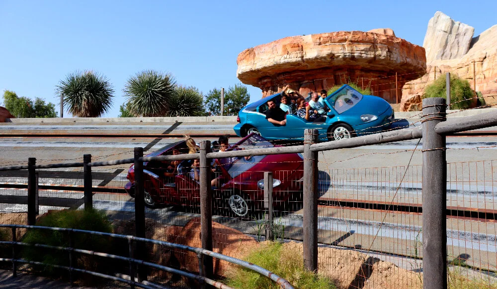
The racer vehicles turn and dart around the course so quickly (at times over 40 miles per hour in short bursts) that it’s hard to take in the beauty of the rockwork of the Cadillac Range. But the spires are always in the background and give this entire outdoor portion of the attraction a strong sense of place.

It’s when you’re being hurled through this landscape that you get a sense of the geographical mélange that has been meticulously assembled. Recognizable parts of California, Nevada, Arizona, Utah, and even New Mexico are slammed together. The cacti foregrounded here belong in the southern parts of Arizona, but the eroded canyon features in the background are from farther north.

Conversely, these peaks look closer to what I’ve seen in the National Parks of Utah than in Arizona.

The finale of this wild ride is two part. You race into a short tunnel for a flash photo opportunity, then accelerate one last time and head for the checkered finish line banner.

Which car wins each time is established randomly by computer. This banked curve finale is essentially identical to Epcot’s Test Track, though that attraction is arguably more thrilling in that the course is both longer and you go a lot faster (~65mph).

Once the vehicles slow you return to the Tail Light Caverns and realize that it’s not just a filling station—there’s an entire “clean & quiet” motor court here with “free cavern tours” and “good rates.” Upon exiting there are tons of rich details to check out, all the way on the return walk back to Radiator Springs.

Disney does this all the time. Because guests are typically so excited to board (especially first time riders) they often miss some of the more subtle world building going on in the themed space of a ride’s load / unload area. So the Imagineers save some of this visual storytelling for the exit out.

This also serves to “hold” guests in the narrative space as they leave, bringing them down from the high of what they experienced, and prepares them for the next thing they’re off to go do—whether it’s eat, shop, leave Cars Land for another themed area, or just ride Racers again.

Here the same trope from the Cozy Cone Motel is repeated. The “suites” of the motor inn are actually garages. This one is named after Lizzie, Stanley’s widow, who we meet in Cars.

Dinoco is yet another petroleum brand found in the Cars universe.

The name is both a verbal gag—a play on Conoco—and a visual gag referencing the famous Sinclair Oil brand which uses a Brontosaurus as its corporate logo. “Dinoco” substitutes a Stegosaurus (and, unfortunately, Copperplate Gothic).

Often guests must exit an attraction by going up and over the track of the ride vehicles. The Imagineers are always looking for interesting ways to do this. Here we walk the service corridors of the motor court.

There are fun bits of signage along the walls.

One of the few times you’ll ever see the designers break the fourth wall of their themed environments is with required notices like exit signs or employee only areas (“cast members” in Disney company parlance). However, these never stand out because they’re designed accordingly, all the way down to aging and rust.

The Imagineers are carefully to give you entirely new vistas on your walk out of an attraction than you saw standing in the queue on the way in.

It was here along the final banked curve where the winner is declared at the checkered banner that I found something very clever. Perhaps my favorite design element of the entire attraction.

Looking closely at the barbed wire along these fences, I noticed that the braided bailing wire strands themselves are real metal. But the “barbs” are fake, harmless rubber. I can’t imagine the extra effort and expense it took to fabricate thousands of these tiny rubber barbs and then glue them onto these strands of metal wire. Then paint them with artificial rust.

They look entirely convincing at a distant glance, and on close inspection. It’s remarkable. All to maintain—safely—the realism of some fencing.

Get Your Kicks Back On Route 66

The entrance into and exit from Cars Land on the east side of Disney California Adventure is nothing special. But on the west side it’s quite possibly the most charming part of the entire area. For one thing, guests have a panoramic view of the outdoor portion of Racers. But it took a narrative and spatial cheat to achieve this.

Route 66 intersecting with Cross Street.

In Cars, Route 66 intersects with Cross Street at Flo’s. Ramone’s, Luigi’s, and Lizzie’s businesses occupy the other three corners. But as you can see from the above vantage from the film’s finale, Radiator Springs is just a flat grid. Cross Street dead ends with another road. Route 66 bends right when it hits the courthouse / fire station at the end of town and then continues on.

What the Imagineers have done is create the look and feel of being back on Route 66—just like the drive that Lightning McQueen and Sally take out of town—yet the road leads off the intersection at Cross Street. The turn the highway takes in the movie instead leads to the queue entrance of Racers, so they had to find another way to make it out to the west side of DCA and still have guests recall vistas from Cars.

There’s a really fun gag along this stretch of highway. It’s a series of signs advertising Rust-eze (owned by Dinoco), a medicated bumper ointment for cars with rusty bumpers. This is a play on the very famous mid-century Burma-Shave campaign which was deployed all over the United States, including on Route 66, in which a series of signs along the road featured humorous verses. They were like advertising limericks, the poetic equivalent of a television jingle, and are very fondly remembered by Baby Boomers.

They were also double-sided, with different rhymes depending on which direction you were driving. Here are the Rust-eze signs, first walking east into Cars Land…

DCA 178.jpg

And then exiting to the west.

The first series references Mater, and the second warns you might get pulled over by Sheriff.

The road stretches along this panoramic view of Racers and the Cadillac Range, and then begins to curve to the right. Then you pass through an arch much like you’d find at a certain National Park in Utah.

Looking in from the other direction, you can clearly see how masterful the designers are at using tunnels to transition between different themed areas. It’s a threshold, a gateway. A magic portal. At first there is the Cadillac Range, at what appears to be miles distance, bright and out of focus. It’s the primary “wienie” drawing you closer and into the land.

As you get a bit closer and are about to walk under the arch, suddenly Willy’s Butte comes into view, having at first been obscured from your field of vision. It’s a fantastic trick. You’re drawn to one wienie, quite a ways away, and then abruptly you are given another one much closer, much larger. It’s thematic sleight of hand, and it works beautifully.

Next, we’ll return to Cars Land and see how different Radiator Springs is at night.

Continued in Part 6.

November 07, 2021 /Dave Gottwald
DCA 126.jpg

DCA Then and Now - Part 4: Carland / Cars Land.

October 11, 2021 by Dave Gottwald

In terms of “then and now” sometimes there was no “then.” When Disney California Adventure (DCA) opened in 2001, the entire southeastern quadrant of the former Disneyland parking lot was left alone and set aside for future expansion. I used to park my car there frequently during the three years of DCA’s construction and even after, because the tram ride to Disneyland’s entrance was shorter. A Bug's Land took a slice of this plot in 2002. The addition of the Twilight Zone Tower of Terror in 2004 took another bite.

The citizens of Radiator Springs in Cars, 2006 film. All screen caps are from my DVD.

Then eight years later, Cars Land took nearly all the rest. Disney’s Imagineers first had the concept for a Carland that was celebration of California automobile culture when they were brainstorming expansions for DCA. Then suddenly Cars (2006) was a massive hit for Pixar (which Disney purchased that year), grossing some $462 million at the box office.

As The Imagineering Field to Disney California Adventure notes,

Cars Land represents one of the earliest fruits of the 2006 acquisition by The Walt Disney Company of Pixar Animation Studios, and the largest collaboration to date between the Imagineers and the animators from Pixar. The concept went into development in earnest not long after the combination of the two companies… From concept to production and field art direction, the creators of the films worked hand in hand with the creators of the land.

Cars Land opened along with Buena Vista Street and the parks’ revamped entrance in June of 2012, a year after the release of Cars 2 (2011). For the most part, the themed area is a re-creation of the town of Radiator Springs from the film. But there are a couple embellishments that establish the land’s identity. The main one is this large billboard which serves as a photo op at the primary entrance.

Vintage postcard, Bakersfield, California.

The billboard is rendered in the easily identifiable motif of the “Greetings From” or “Wish You Were Here” postcard design that was wildly popular across the United States during the first half of the twentieth century. I’m sure you’ve seen one of these before, or are familiar with the graphic design trope which they have spawned—large, dimensional letters which are filled in with photographic or illustrated scenes that add up to a sense of place.

Welcome to Radiator Springs

I hadn’t seen Cars in years, and the only time I had watched it was when I was babysitting a niece and nephew. So I was only really paying attention half the time. It struck me as cute, but I had forgotten the particulars completely. I gave it a full rewatch (twice) before proceeding with this post, and I’m glad I did. Cars is a really well told story, carefully designed and—as it turns out—ideal for being transmediated into theme park form.

Radiator Springs between the Cadillac Range and Ornament Valley as shown in Cars.

Cars—and its sequels and spinoffs, most recently Cars 3 (2017)—is set in a world in which vehicles of all kinds are anthropomorphic. They walk (well, roll) and talk and own businesses and have romances and rivalries and are the “people” in this world.

The primary setting for the first film is an Arizona town called Radiator Springs, a sleepy hamlet on the famed U.S. Route 66 which had been bypassed by the Interstate 40 some years back. Pictured above is a sequence from the film where Radiator Springs is identified on an imaginary map of Arizona, complete with an “Ornament Valley” (a riff on Monument Valley) and a “Cadillac Range.”

Radiator Springs at the finale of Cars.

Although fictional, this area is based on a real stretch of 66 through Arizona between Lake Mead and Flagstaff. I’ve driven it. The artists and animators at Pixar did a lot of site research along Route 66 when preparing the film, and it really does show. Though Radiator Springs is completely fake (inhabited by cars!) it feels real enough—architecturally—to be possible.

The plot of Cars is basically a fish-out-of-water, off the beaten path kind of tale. A famous, egotistical red racing car, Lightning McQueen (voiced by Owen Wilson) is humbled after being stranded in Radiator Springs for a spell, during which he befriends the town’s residents.

Cars Land on the DCA 2012 park map. Ⓒ Disney Enterprises, Inc.

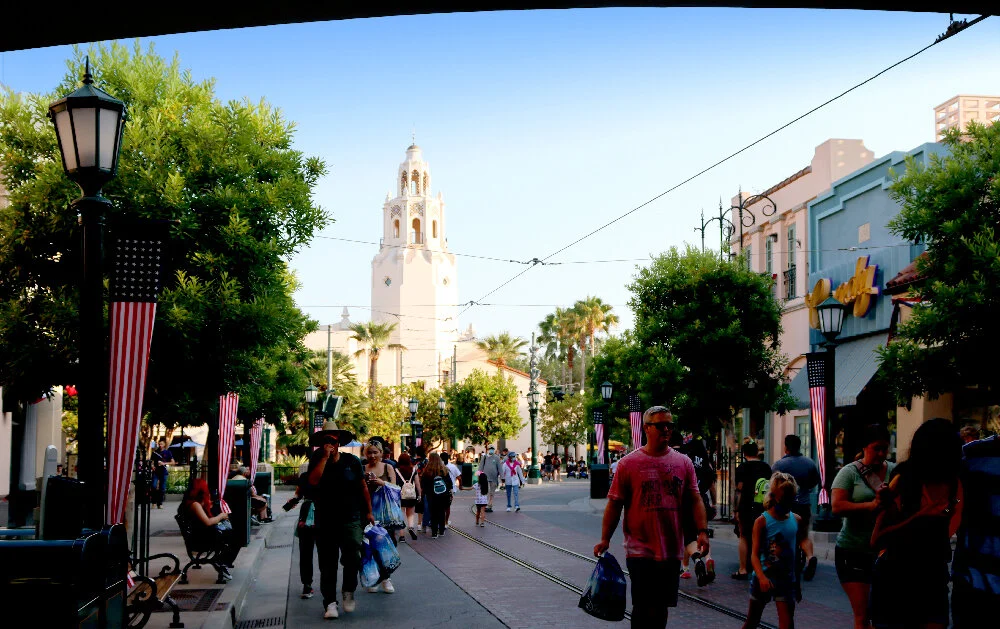
The theme park interpretation of this town, which is unique among Disney Parks, sits at the back of DCA. The “main street” or Route 66 into town branches off the walkway towards the back corner of the park at a diagonal. Although Radiator Springs is set in Arizona, the entire 66 / Classic Car Culture motif is a very California thing, so I don’t begrudge them for cheating just a little bit. After all, since the park opened it’s being veering further and further from anything Cali-centric.

Seeing Cars Land before the general public, 2012.

Along with the new Buena Vista Street, I attended the preview for this area back in 2012, about a week before it opened to the public on June 15. I had never seen anything like it. And this was years before I had even gotten around to watching the film Cars. So I was evaluating the design of the land on its own merits, so to speak. Just as “new” theming.

The landscape of Radiator Springs Racers, at the rear of Cars Land, 2012.

The world felt cohesive, and somehow cozy yet massive at the same time. The imagineers were up to their old tricks with forced perspective, and this was probably the best rockwork I had ever seen at a Disney Park up to this time. Even more nuanced than Tokyo DisneySea, which is really saying something.

Radiator Springs in Cars.

Although I didn’t know it walking around Cars Land for the first time, all of these natural features are taken directly from the film. Right behind the main drag of Radiator Springs (and it is pretty much a one-drag town) sits the “Cadillac Ranch” as seen on the map above.

Cars Land, satellite view. Click for link. Underlay map data: Ⓒ Google.

Cars Land, satellite view. Click for link. Underlay map data: Ⓒ Google.

When I say that Cars was meant to show up in a theme park, what I mean is it almost feels like the movie could have been based on the land, not the other way around. It’s practically Disneyland’s Main Street U.S.A. with all the proprietorships on either side of the street, leading to a classic Disney “wienie” visual magnet in the form of the courthouse with the Cadillac Range in the background. Here, because the land is laid out on a diagonal, this rockwork backs directly up against W. Katella Avenue to the south.

One of the highlights in Cars Land for me personally is the amount of highly detailed graphic design in the form of logos, ephemera, and signage. There are a few brand name riffs and jokes in the film, but here in the built environment they’ve expanded the palette considerably. If you’ve ever seen the “Welcome to… / Elevation… / Population…” signage when you drive into a small town, with all the Rotary International seals and local Chamber of Commerce stuff, then you understand the vernacular the designers are going for here. Some of the jokes are clever and quite subtle. Like all the best themed spaces, you’re rewarded for looking closely.

Much of the graphic design in Cars Land is the work of Imagineer Laurel Scribner Abbott.

The town of Radiator Springs itself has a seal which you can find on trash cans and park benches throughout Cars Land. It’s the same sense of civic reality that the Imagineers provided to Buena Vista Street.

Radiator Springs in Cars.

From this shot in the film, it’s clear that the animators almost were thinking of Disneyland when they laid out Radiator Springs and oriented its foreground to the Cadillac Range behind. You can also see how the butte behind the courthouse has been abstracted into the town’s seal.

All this is replicated so perfectly in three dimensions at DCA. Even for someone who hadn’t seen the movie (as I had not when it opened), the design of the land was just so palpable. Immersive. A stylized, cartoonish reality not unlike Mickey’s Toontown. But with the advantage of real world props and details. In Toontown, the light posts and manholes are “toonish.” Here the world of Cars is accepted and rendered as the real world and this makes all the difference between the two environments.

Tow Mater Towing & Salvage

One of the reasons why I think Cars really translates well to thematic design is that its cast of characters are each closely associated with their own environments; their small businesses, their vocations. And the personification of each character and their spaces is of a set; the characters are these businesses and these businesses are the characters. They’re inseparable.

First up on the left (east) side as you enter Cars Land is Mater's Junkyard Jamboree.

Mater’s tow yard in Cars.

Each character in Cars is certain type of vehicle which relates to their proprietorship or role in the town. Mater is a tow truck (voiced by a standup comedian who goes by the moniker Larry the Cable Guy) and his associated environment is a junkyard called “Tow Mater.”

Here in Cars Land that junkyard has been transmediated into a type of Teacups ride. Disney tends to do this really well. They can look at a scene, a sequence, or an environment in a film and figure out a way to transform it into an attraction, restaurant, or shop. They do this effortlessly. However in the case of Cars, you could argue that a lot of the work had already been done for them—a cast of unique characters expressed through the spaces they are associated with, where they live and work.

The elaborate design details seen on the “Welcome to…” signage at the entrance to the land continue throughout Cars Land, beginning right here. Dozens upon dozens of imagined license plates were drawn up and pressed into metal. The typefaces are perfect, the weathering is realistic.

Cars Land allows for the logical expansion and extrapolation of what we see in the movie. There’s a lot more here, but it all feels right, it all makes sense. Like it could have been in the film, just around the corner. Or maybe we blinked and missed it. Rarely does an element feel shoehorned in. It’s the Radiator Springs that was always there, yet not.

FIllmore’s Taste-In in Cars.

Fillmore’s Taste-In

Across the street from Mater on the right (west) side of the Route 66 main drag into town is Fillmore's Taste-In. Fillmore is the movie’s hippie (voiced by the late, great George Carlin). You’ve got to hand it to the story people at Pixar. They managed to milk nearly every American cultural stereotype and tie that association to the appropriate vehicle. Mater is a country bumpkin, a redneck, a hick. So he’s a rusted, run down tow truck. Thus Fillmore (named after the famous San Francisco rock venue) is a 1960 VW Microbus straight out of the Summer of Love, complete with every graphic and bit of tie dye that you’d expect.

The entrance to Fillmore’s “Taste-In” (a riff on the term “love in”) is a row of hanging rusted mufflers with colorful late 1960s psychedelic lettering rendered in a tie dyed style. Cleverly, the hanging tire features a few spokes which form a peace sign.

The Taste-In sign in Cars.

Compare with the signage as seen in Cars. There are some small changes, but overall it’s a really close interpretation. What’s remarkable about Cars Land is that the area’s designers had access to all of the digital models that Pixar had developed for the film. In effect, the “blueprints” for all of these structures already existed in the computer and just had to be translated into CAD and modified for scale etc.

Here in Cars Land what was a stop for fuel in the film (all the vehicles consume gasoline and oil as refreshments in this world) has become a snack and soda stand. The main structure is a small sort of geodesic dome as designed by Buckminster Fuller. In fact, its scale is quite close to the “Dome Home” Fuller built in Carbondale, Illinois and lived in from 1960 to 1971.

Fillmore introduces Lightning McQueen to his organic fuel.

The translation is rather smooth, with only the snack stands added to the left and right of the dome. Others have commented online that Fillmore’s little dome resembles the Meteor City Trading Post in Meteor City, Arizona. Or perhaps it’s Ortega’s Indian Market in Lupton, Arizona. Both buildings are Route 66 landmarks and are now abandoned.

Here’s a nice example of a detail which we never get to see up this close in the movie. Again, Cars Land is not just a rote interpretation of Radiator Springs, a manifestation of animation in the built environment. It also magnifies and embellishes upon the town when appropriate.

For example, this façade does not appear in Cars at all. Disney needed a garage which is not associated with any one movie character as a place to store the vehicles which are brought out for parades and meet ‘n’ greets. The design is well considered enough that this building '“blends” successfully into the rest of Radiator Springs. It doesn’t stand out; it just fits.

Here painted on the brick wall is my old friend, the House Industries script Las Vegas Fabulous. I had just spotted it in my prior post on the rich design details of DCA’s Buena Vista Street.

Sarge’s Surplus Hut

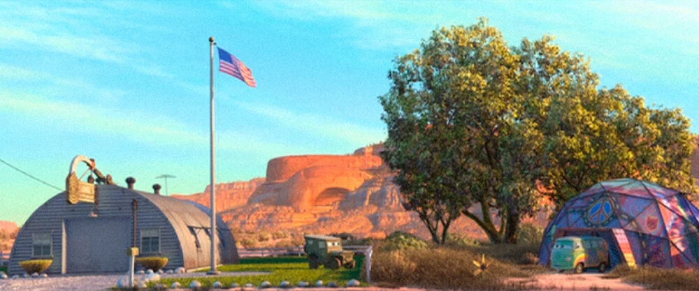
Back across the street, next to Fillmore’s, is Sarge's Surplus Hut. In Cars Land this is a retail shop selling mostly toys and apparel. It’s a Quonset hut which serves as mid-century architectural shorthand for U.S. Military quarters, and was inspired by repurposed huts which can be found along Route 66.

Sarge and his Surplus Hut in Cars.

Again, the genius of Cars: every character + vehicle + proprietorship is of a perfect cohesive set. Sarge (voiced by Paul Dooley) is a serious, by-the-books drill sergeant type character who serves as comic foil for Fillmore. He’s a 1941 Willys model jeep which became synonymous with the U.S. Military during World War II.

Sarge and his neighbor Fillmore.

Sarge and his neighbor Fillmore.

The fact that Sarge and Fillmore are next door neighbors heightens this comedy. Sarge is the establishment square who is constantly mocking Fillmore for being a stereotypical “filthy hippie.” Sarge finds him lazy, lawless, and unpatriotic. And (although the movie never says so explicitly) he gives Fillmore a hard time for being a stoner.

Cozy Cone Motel

Back across to the east side of the street sits the Cozy Cone Motel. Some of these environments like Sarge’s hut or Mater’s tow yard are only glimpsed very briefly in the first Cars film. Others are far more integral to the story, and this motel is one of those spaces. Here in Cars Land it functions as a fast food court, with five individual windows selling “sweet and savory treats” as well as cold beverages.

The Cozy Cone Motel as seen in Cars.

Looking at the Cozy Cone as it appears in the film, you can see that the proportions have been altered in the theme park interpretation. It’s wider here and the cones are somewhat larger as they are supposed to be individual sleeping cabins for vehicles, each with their own garage door.

Vintage postcard, Wigwam Village.

The design for the Cozy Cone is a witty interpretation of yet another Route 66 icon—the Wigwam Motel chain. Back in a time when middle class white Americans had no understanding of the words “cultural appropriation,” this chain originally had seven locations: two in Kentucky and one each in Alabama, Arizona, California, Florida, and Louisiana. Even the name is wrong. You didn’t spend the night in a wigwam (found in the Northeastern United States and up in Canada) at all, but rather in a cabin resembling a tipi as built by the Indigenous peoples of the Plains (an icon common in the West).

Today only the motels in Holbrook, Arizona and San Bernardino, California remain.

DCA 122.jpg

See how measurably smaller and shorter the motel office is. There are only a handful of missed opportunities in Cars Land, and I think this is one of them. Although it is lavishly decorated inside, I wish the office wasn’t just for show. It would be more immersive if you could go in and walk around like a prospective guest. Maybe some business cards on the desk or some souvenir postcards and tourist trifold brochures available as cute takeaways. Something.

The cones themselves are pretty nifty interpretations of what we see in the film, which proportions tweaked for human scale.

The motel’s “cones” in Cars.

Although the shift in scale jars quite a bit, I really like that the doorway / garage striped awnings are the same, and that they kept the old school television antennas on each rooftop.

Flo’s V8 Cafe

Turning back to the west side is Flo's V8 Cafe which is a major location in the film. This is the largest dining spot in Cars Land with a broad menu of American comfort food and ample seating both indoors and out.

Flo’s V8 Cafe in Cars.

The movie version is a major hangout for several of the characters, and many scenes take place there. The design is supposed to mix the sensibilities of a mid-century roadside diner with a gas station, because again all the vehicles consume gasoline and oil.

The design is cute in the film, and just as snappy in the built environment. The main building incorporates an automobile air or oil filter. The roofs of the gas pumps look like engine parts (carburetor, piston arms, etc). The typography, coming direct from the movie, is suitably deco and reminds me of the fantastic work of the Font Diner foundry.

The owner Flo.

Always, always, always: character + vehicle + environment. The cafe’s proprietor is Flo, a blue 1957 General Motors Motorama show car voiced by Jenifer Lewis. Note the cars with their cans of oil as beverages in the background.

The gas pump bays serve as shade for outdoor diners. There are neat bits of propping like oversized cans of oil stacked everywhere, referencing the town’s refreshment of choice. Like with the other graphic design business scattered about the land, the labels on these are well-executed send ups to national automotive brands.

Sally talking to Lightning McQueen.

I would be remiss if I didn’t mention Sally Carrera (voiced by Bonnie Hunt), the blue 2002 996-series Porsche 911 Carrera. She’s the town’s attorney and also the proprietor of the Cozy Cone Motel. And the romantic interest of Lightning McQueen. Curiously, this car is the only character whose vehicle is not linked to their associated business location. This is because Sally was a hot shot lawyer in Los Angeles who moved out to Radiator Springs one day and stayed (shades of the 1991 comedy Doc Hollywood). So her vehicle (Porsche) reflects that vocation and not the motel she also runs.

DCA 128.jpg

At first glance I thought the gas pumps were legitimate antiques, but on closer inspection they are immaculate reproductions.

Flo’s gasoline pump in Cars.

And they are nearly identical to the pumps we see in the movie.

The rest of the architecture of Flo’s demonstrates again this approach of the Imagineers taking Radiator Springs as designed for the film and literally building upon it. Behind the primary “filter” structure of the cafe is a whole other building and patio at the rear right which is very mid-century modern in a Los Angeles or Palm Springs kind of way.

This is the only part of Cars Land which—although I love the design and it’s really well done—does not fit with the Radiator Springs we meet in Cars. It’s too slick, too modern, and too expensive looking. The town was bypassed by the construction of the Interstate years back and had thus fallen on hard times since. This (terrific) glass and steel annex just doesn’t work in that context.

Radiator Springs Curios

I’d visited DCA countless times between 2012 and 2016. So since I’d only seen Cars once before recently rewatching it now, there are certain things I’ve always associated with Cars Land and not the film. For example, I could not remember what the billboard sporting “HERE IT IS” is all about.

The Radiator Springs Curios “HERE IT IS” billboard in Cars.

In the film, it sits a bit apart from the Cozy Cone Motel, advertising the Radiator Springs Curios shop which is the next building down on the same side of Route 66 through town. In yet another nugget of 66 lore, “HERE IT IS” is almost a direct replica of a famous billboard at the Jackrabbit Trading Post in Joseph City, Arizona.

Radiator Springs Curios is a souvenir shop of the roadside kitsch variety common to rural areas. The design of the store with all its excessive signage and bric-a-brac is based on two icons of Route 66—the Hackberry General Store in Cool Springs, Arizona, and the Sandhills Curiosity Shop of Erick, Texas.

Lizzie in front of her curios shop in Cars.

The curios shop is owned by Lizzie, a 1923 Ford Model T Coupe voiced by Katherine Helmond. She’s also the widow of the town’s founder, Stanley (more on him at the end of this post).

Within Cars Land, the “HERE IT IS” billboard and the curios building are essentially integrated.

Red the fire engine in front of the curios shop in Cars.

In the film they are not. You can see how much land there is between the shop, the billboard, and the Cozy Cone. The Imagineers chose to expand their theme park version of Radiator Springs in some places. But in others—simply due to lack of real estate—they had to compress and contract it.

Now here we are at the intersection of Route 66 (the main drag through town) and the aptly named Cross Street.

The only major intersection in Radiator Springs in Cars.

The stylized sign post pictured above doesn’t quite exist in the film in the same way. But like most elements that the Imagineers came up with, it’s designed to fit. The intersection plays a notable spatial role in a few different key sequences of the story. In Cars Land it’s a practical way to bisect the area and provide two additional ways to enter and exit.

The town stoplight in Cars.

Radiator Springs is, quite literally, a one stoplight town.

Which has been loving recreated in Cars Land. The light blinks yellow all day and all night.

Ramone’s House of Body Art

Radiator Springs Curios and Flo’s V8 Cafe are, respectively, on the northeast and northwest corners of this intersection with Cross Street. At the southwest corner is Ramone's House of Body Art. This establishment is something of a cross between a tattoo parlor and an auto body paint detailing shop. It’s where a character in the universe of Cars would go to get “inked.”

Auto body artist Ramone.

The proprietor is Ramone (voiced by Cheech Marin of Cheech & Chong), a 1959 Chevrolet Impala Lowrider. The exterior design of his House of Body Art was directly inspired by the U-Drop Inn of Shamrock, Texas, a very famous Route 66 icon.

Luigi’s Casa Della Tires

Across the street at the southeast corner of the intersection sits Luigi's Rollickin' Roadsters, the second attraction in the land. It’s a trackless dancing cars ride and replaced the problematic Luigi's Flying Tires (2012–2015), a hovering bumper car ride that the designers could never get to work right.

Sally talks to Luigi and Guido.

The car in the tire business is Luigi (voiced by Tony Shalhoub), a yellow 1959 Fiat 500. His timid sidekick (voiced by Guido Quaroni, a Pixar animator who only speaks Italian in the film) is Guido, a forklift who resembles an Isetta. The backyard area for the roadsters attraction is completely invented for Cars Land, but the building front is very faithful to what is shown in movie.

There’s a lot of neon towards the end of the block, all appropriately aged with rust and peeling paint. It was only when rewatching Cars thoroughly that I recognized all of these signs. For years they just seemed like neat vintage re-creations.

Mater next to the Oil Pan.

I’d completely forgotten about The Oil Pan. A handful of key scenes take place in front of this building with the sign and painted mural on the brick wall. According to Cars fans online, The Oil Pan was a popular attraction until it went belly up in the 1960s (it is unknown who owned it). In Cars Land this is a retail space attached to Ramone’s House of Body Art. Once again the designers collapsed the empty space between the two lots.

Radiator Springs Fire Department & Courthouse

At the end of the “Main Street” of Cars Land is the town’s courthouse / firehouse. When Lightning McQueen gets in trouble and is hauled before the judge, it’s in this building. As you approach it’s even more clear that the overall layout of Radiator Springs itself was inspired by the Disney Magic Kingdom theme park model—the courthouse is basically the castle.

THe Fire Department & Courthouse in Cars.

Like other environments in Cars Land, the proportions and scale are altered from what we see in the movie. Also, in the film the building stands alone with tons of vacant land on either side of it.

The Cars Land version has the same 1950s vintage tail light flowers though, both here at the front of the courthouse and at the Cozy Cone Motel. This is one of the more subtle visual gags in Cars that translates really well to a themed space. The flowers are large enough to be rendered in great detail, and you can really get close to them and even try to identify which models of classic cars are being depicted.

I promised Stanley would return. He’s the town’s founder (a Model T like his wife, Lizzie) and his memorial statue from the film is faithfully reproduced in front of the town courthouse. This backstory for Radiator Springs is more thoroughly fleshed out in the design of the land’s signature attraction, which I will detail in my next post.

Memorial statue of Stanley in Cars.

Cars Land presents an interesting contrast to Buena Vista Street. The latter had been a spectacular imagining of parts of Los Angeles during the Golden Age of Hollywood, and that’s because there was a certain reality to it. As I mentioned in my last post, even the storm drains appear perfectly authentic.

Though equally impressive, the former, conversely, is placemaking of a certain unreality. There’s a different kind of fidelity being adhered to. You can’t even call it verisimilitude, because what is the truth of Cars, in which vehicles are essentially people? I’ll call this quality fauxmilitude: a faithful rendering of the fake, a fidelity to the unreal.

We end up judging Cars Land by how well it represents the source material, like any other transmediated work. Recall the common quip about a book [source] being better than the movie [adaptation], but in reverse. Because the Radiator Springs here is executed in the built environment (with real brick, and blacktop, and actual neon) and Cars is a computer animated film… in this case the adaptation somewhat surpasses the source material.

Continued in Part 5.

October 11, 2021 /Dave Gottwald
DCA 58.jpg

DCA Then and Now - Part 3: The Disney Is in the Details.

September 11, 2021 by Dave Gottwald

It’s been said many times before that what the Disney Imagineers excel at in their designs is an attention to detail that is rarely matched. Sure, they’ve got deeper pockets than most (so they can spend more money, and thus more time). But there’s a genuine dedication to “getting it right” that’s part of the workplace culture, and DCA’s Buena Vista Street is no different.

Right when you enter there’s a re-dedication plaque at the main flagpole in the plaza. This is the opportunity for the company to formal rebrand the park with a new wordmark. They also dropped the possessive “Disney’s” for “Disney” which is strange to me, because it’s still Disney’s Hollywood Studios and Disney’s Animal Kingdom out in Florida. Maybe next to Disneyland they wanted to keep that consistency.

This plaque quotes Michael Eisner’s remarks from the 2001 park dedication. Which is not too dissimilar from Walt Disney’s original speech from 1955. Eisener’s has more “dreams” and “dreamers” though.

The street sign marking Buena Vista is stylized but based on historical examples. This is nice touch that immediately distinguishes this themed area from it’s older cousin Main Street U.S.A. Here a portion of Los Angeles is being depicted, as opposed to a small rural town. This kind of official metal signage immediately communicates that we’re in a larger, more urban place.

Same thing with the trash cans. Disney is known for elaborately theming these receptacles. Here they are appropriately civic, baring the slogan “Keep Buena Vista Street Beautiful.” Like the street sign, this adds a cityscape sensibility, as if there’s a public works department.

And even the sewer drains, which I almost missed at my feet. They read EAST JORDAN IRON WORKS, which is a real company founded in Michigan in 1883. I’m not sure if these drains are antiques or not, like the gas lamps on Main Street U.S.A. which were found in Baltimore (they would have been sold for scrap and Emile Kuri bought them by the pound). They might be thematic replicas. Not sure.

And of course, if you’re big enough to have a public works department, you’re going to have a Chamber of Commerce. Since my background is graphic design and I teach coursework in typography, of course I’m going to dial into these lettering choices. Sometimes Disney gets it pretty right. Here, not so much. This looks like a Trajan with some modified characters to make it feel more Arts and Crafts.

Across the way at the Red Car Trolley station, the lettering is really off (is that Gill Sans?) But the overall design is a decent lift.

Emblem for the Pacific Electric Railway Company. Wikimedia / Public Domain.

When you compare it to the company’s original logo, the reference is obvious. But here the typography totally dates to the first half of the twentieth century. They could (should) have done better with this one.

An interesting thing that’s been pointed out to me more than once is that the logo is repeated upstairs in the nearby Sepulveda Bldg. While I don’t approve of the use of Copperplate Gothic for the title lettering, this is actually a clever trick.

There’s no office up there. See, it’s a stairway to nowhere. As The Imagineering Field to Disney California Adventure notes,

A common scenic device used to create the impression that the “world” presented in the Park extends beyond what we literally built is the inclusion of “stairways to nowhere.” These elements, along with faux doorways and additional graphics, give a guest the subconscious belief that there’s more going on behind these walls than meets the eye.

Some of these “additional graphics” are quite beautiful. You see this at Disney parks around the world, and to a lesser extent in their competitors’ designs—actual hand painted lettering. Many years ago, before personal computers took over graphic design, Disneyland had its own sign department for all of this stuff.

The typefaces in the “Elias and Company” advertisement appear to be from venerable Letterhead Fonts, which I’ve seen used more and more at the Disneyland Resort over the past fifteen years or so. In a former life I was an exhibit designer at the Oakland Museum of California, and we used many of their faces in their Gallery of California History.

Disney Studio references abound. The “Deliveries Only” here reminds me of a script from the House Industries Sign Painter Collection, which I’ve also used before on projects.

This one I didn’t notice at first glance. Only when I came around the plaza again to have a look at Oswald’s from another angle did I see the nice vertical “GAS” dimensional lettering atop the roof. This is styled really well to the overall Deco look of the station.

I also missed this nice nod on the gasoline pumps the first time. It’s Oswald the Lucky Rabbit as a kind of “Sir Speedy” mechanic character.

I have mixed feelings on this sign. The reference is to the Los Feliz neighborhood in Los Angeles where Walt, his brother Roy, and their animation staff spent a lot of time. Nice. But the design is sort of a mishmash of historic authenticity and contemporary design. “Five & Dime” is an okay sans serif, but not executed very well. “Los Feliz” is rendered in a very bold script which strikes me as too current. Doesn’t looks right, yet the materials smack of the right period vibes.

All the references to Disney and his father are obvious. But a good deal of the easter eggs on Buena Vista Street make nods to the studio history which are more obscure. This sign references the Holly Vermont Realty Company, which shared an office with the Disneys when they were starting out.

Lessing, Kamen, and James were all company attorneys during the early days. Gunther Lessing was hired by Disney to work on copyright law, specifically that of the Mickey Mouse character. He later became vice president and general counsel for the studios. From 1932 to 1949, Disney Legend Kay Kamen was the exclusive character merchandising representative for the company. And Disney Legend Cyril James—known as “Roy Disney’s European Counterpart”—ran Disney’s international distribution and merchandising from London for decades.

The sign is rendered again in the lovely work of Letterhead Fonts.

Here at the lockers building is something fun that you don’t see anywhere else on Buena Vista Street. Somewhat related to mimetic (programmatic) architecture, this is a sign rendered as an object relevant to the business. Although the lockers inside are all modern digital combination units, when Disneyland opened in 1955 they had real keys. So this is a great nod that also places us in the 1920s and 1930s, when programmatic work was at its height across America.

Inside this corner market there’s some great detail. The wares are of the grab ‘n’ go variety—fruit, chips, bottled water, and soft drinks. The refrigerators look like period ice boxes, and there are wooden crates throughout. A nice touch is that Cuties Citrus is a real contemporary company selling Mandarin oranges, but their logo has been tweaked to look like an early twentieth century fruit crate label.

Even stacked fruit cans on the shelves with period-accurate brand labels. This is something that sets Disney apart from their theme park competitors. This is not even a sundries shop. It’s just a place to grab a banana or a bag of chips. And yet there’s all this attention to the propping and historical bits.

Some nice script on the outside awning which might also be from Letterhead Fonts.

There’s a typographic feast on the menu sign outside, which is made to resemble a chalkboard of daily specials. Definitely more Letterhead Fonts but mixed in with others. “Ice Cold” “Apples” and “Bushel” are set in Las Vegas Fabulous from House Industries. It’s one of their more popular scripts, based on the lettering of the original sign for the Flamingo Hotel, and I’ve also used it before in my exhibit design work.

“Mortimer’s” Market is a reference to Walt’s original name for Mickey Mouse, which his wife Lilian reputedly hated and convinced him to change.

He supposedly came up with the better Mickey name on a train. The California Limited advertised on this billboard high above the west side of Buena Vista Street lists Chicago, Kansas City, and Los Angeles as destinations—basically Walt’s birth through adulthood.

The Kingswell Camera Shop is named after Kingswell Avenue, where Walt and Roy Disney opened their first actual office in Silver Lake in 1923. This was the building shared with the Holly Vermont Realty Company.

This is some of the more “obvious” typefaces that Disney has used from Letterhead Fonts. Historical lettering that says “historical” in a very blatant way. It’s not bad design, but I think the designers do better when they make less obvious choices.

The original California Adventure park was filled to the brim with embarrassing puns. And although Disney is known for employing copious wordplay in their designs, thankfully this was all stripped out when the park was overhauled. I could only find one actual pun on Buena Vista Street, and it’s extremely subtle. “Eye Works” refers to Disney Legend Ub Iwerks. Why is this clever? Because it’s a shingle for an optometrist, and Iwerks is most famous for the special optical and photographic effects he innovated in his years with Disney. This might be my favorite detail in the entire land.

Julius Katz & Sons is named for Julius the Cat who appeared in the Alice Comedies of the early 1930s. This makes the character even older than either Mickey Mouse or Oswald the Lucky Rabbit.

Atwater Ink & Paint is named for Atwater Village in Los Angeles, where animators spent much of their time during the early years of the Disney Studios.

This is some real classy tile work with lovely Arts and Crafts typography. The address is an important one in Disney history; 2719 Buena Vista Street was the location of the Hyperion Avenue studio (1926–1940) for which Buena Vista Street is named.

There are a few other addresses in the 2700 block range which are visible along the storefronts. Sadly this one is set in Copperplate Gothic, though the dimensional metal numerals are quite nice.

The detailing on the Elias & Company building is exquisite. From the glasswork and metal to the engraved lettering, it’s a real treat and awash with period accuracy. This is undeniably a face from Letterhead Fonts. As I’ve said before, the Disney art directors and graphic designers don’t always make ideal choices. Other times they really nail it. Here they’ve picked a typeface that is really from the late 1880s or early 1900s, which is a credible choice for the 1920s.

It’s like seeing a period movie and all the cars are right from that year. Real life isn’t like that, and things that are years or even decades old hang around a lot longer than you’d think. A period film that feels right—and a period film is exactly what a themed space like Buena Vista Street is—is one where there is a mix of “contemporary” for the time and things that are even older.

This lettering, by contrast, actually belongs in the 1930s and 1940s. Pure Deco. Here the Imagineers are providing an era of Los Angeles history (the Golden Age of Hollywood) rather than a specific year. Even if 1923 is referenced specifically time and again as the year that Walt Disney arrived in California.

Here’s a clever bit, and something that I didn’t notice until visiting the newly redesigned California Adventure park for years. Tucked up behind the Deco façade of Elias & Co. is a bit of Gothic Blackletter. “Buena Vista….” something.

If it looks like the masthead of a newspaper, well that’s exactly what it is.

The inaugural issue of The Buena Vista Bugle, Summer 2012. Ⓒ Disney Enterprises, Inc.

The Buena Vista Bugle was an actual newspaper handed out beginning with the park’s reopening. Just like Disneyland had an actual newspaper handed out on Main Street U.S.A. in the early years. The distribution of the paper ended in the fall of 2016, but there’s a website which has archived scans of every issue.

The “Buena Vista” name shows up in other subtle places too. This is the refrigerator from a vendor selling soft drinks on the street. It’s a blink and you’ll miss it kind of graphic. But these subtleties have a gestalt effect in that they multiply and amplify each other to comprise what is essentially worldbuilding in a themed environment.

Although this small neon fin doesn’t scream authentic, I do like the fact that some of the signage could have been installed a bit later, say in the early or mid 1930s. Again, this makes Buena Vista Street feel more like a range in time, rather than a snapshot of 1923 specifically.

The ice cream shop is named after Clarabelle Cow, one of Minnie Mouse's best friends who first appeared in the short Steamboat Willie (1928).

The Fiddler, Fifer & Practical Cafe is interesting, in that at first you might think it has an inconsistent brand. But that’s actually truer to the period, when signs were painted by different people for the same establishment over time and didn’t necessarily match. The concept of “graphic identity” really didn’t exist in the 1920s, especially not for smaller shops.

The cafe is named after the Three Little Pigs from the 1933 Academy Award-winning animated short. Disney’s Silly Symphony cartoon version of the fairytale names them Fifer Pig, Fiddler Pig, and Practical Pig. Both these outdoor handpainted examples are well designed and executed.

The graphic on the doors, however, I find difficult to forgive. It’s clumsy and looks like a modern cut vinyl applied graphic rather than hand painted. It’s too digital and thus too perfect. The “CAFE” lettering looks like any coffee shop along the interstate. The ampersand is squished out of proportion! And even though the script initials resemble a very heavy weight of the Coquette script which I use here at Themerica™, this to my eye is the single ugliest graphic on all of Buena Vista Street.

And wouldn’t you know, there’s my reflection in the window. Nice luck.

And then the Imagineers do something like this. On the same project! For the very same building. The stained glass for the cafe is remarkable. I get that there is some verisimilitude in not having everything be fo the same quality. But if the design of that door sign was a bit more polished, and it was painted and not a vinyl graphic, what a different that would have made. They clearly had the money; they were getting glass cut like this.

Curiously, although the Fiddler, Fifer & Practical Cafe has its own name and identity, inside the location it’s a Starbucks. This was the first joint venture with the two companies inside a theme park, and it required a delicate touch. What’s more contemporary than a Starbucks? So this period lettering outside is quite suitable.

And I thought this was very clever. This is the original logo, which is only in use at the company’s original storefront in Seattle at 1912 Pike Place. Thus it makes the Starbucks on Buena Vista Street “old” (or at least as old as it can be).

The street signage begun at the park’s entrance is complete upon entering Carthay Circle.

This is probably the single best example of classic metal work in the land. It hangs on the information building opposite the Carthay Circle Restaurant.

On that same building, which doubles for the Carthay Circle trolley stop, here’s one last little classic example of Letterhead Fonts. Great choice, and the application feels period not contemporary.

Our tour began with a plaque and ends with one, at the “Storytellers” statue from my last post. Buena Vista Street is a themed environment simply overflowing with elegant design details, and I’m glad I finally had a chance to document much of it after visiting the redesigned park for years. Walt Disney is quoted here as saying “we are just getting started” and for my summer 2021 documentation of the Disneyland Resort, I feel the same way. Lots more to come!

Continued in Part 4.

September 11, 2021 /Dave Gottwald
DCA 55.jpg

DCA Then and Now - Part 2: Main Street L.A.

August 28, 2021 by Dave Gottwald

The concept for Buena Vista Street at Disney California Adventure is that it represents Los Angeles around the time Walt Disney arrived to start his animation studio; specifically the Atwater Village and Silver Lake neighborhoods circa 1923. Back in 2011, in anticipation of this area’s completion, the Disney Parks Blog posted some great concept art where you can read a bit about the designers’ intentions. Essentially, it’s the Main Street U.S.A. concept applied to Los Angeles during Hollywood’s Golden Age. It’s Main Street L.A.

A Stroll Down Buena Vista

Immediately upon entering the land, there is a sense of calm. And shade! Mature trees abound with plenty of places to sit down. It’s comfortable, it’s inviting. It feels lived in. And what was here before?

DCA’s original Golden Gate Bridge and retail spaces, 2008.

To be honest, just a lot of concrete and super obnoxious signage. For research purposes, I wish I had taken more photos of the original entry portal and plaza. But it was just so ugly I didn’t spend any time on it. This is one of my few images that shows Greetings from California, a rather tacky retail location.

Now, to the left (east) as you walk in is Oswald’s Filling Station. It’s just a small retail location and photo op, but it pays tribute to one of Walt Disney’s earlier creations, Oswald the Lucky Rabbit. Disney developed the character for Universal Pictures in 1927 but lost control of it to the studio two years later. In a lucky move, the company reacquired Oswald in 2006 from NBCUniversal; he was basically traded for sportscaster Al Michaels (the world of animation and theme parks is nothing if not strange).

Oscar’s Super Service, Disney-MGM Studios, 2007.

I promised you I wasn’t done with WDW’s Hollywood Studios park. Because neither was the design team who worked on Buena Vista Street. As you enter, just to the right (northwest) in that park is Oscar’s Super Service, a small retail stop and wheelchair / stroller rental in the guise of a gas station. Although far from identical, both this and Oswald’s at DCA are rendered in the Streamline Moderne style.

Directly next to Oswald’s is the park’s main guest relations location. Rather than a City Hall facility like on Disneyland’s Main Street, U.S.A., here the building has been fashioned as an ornate but still small scale Chamber of Commerce. First Aid is right next door, and also looks like a business storefront.

Across the plaza to the right (west) the restrooms have been remodeled into the “Sepulveda Bldg.” The Spanish Colonial Revival and Mission Revival architecture movements are evident here. There are shades of Los Feliz, and also Glendale (where the Disney Studios would eventually be located) as well as Pasadena.

Directly to the left of the Sepulveda Bldg is the redesigned park lockers facility. It’s done in a Deco architectural style, recalling many bank buildings of the Los Angeles area built in the 1920s through the 1940s. It’s clever yet subtle, as you want to think of security when you think of lockers. Adjacent to this is one of two entrances to the westside retail space, the Elysian Arcade.

Next to that is an elaborately decorated façade housing a small produce market. The detail in the stonework is incredible, all for a place where you’d go in and buy a banana and a bottle of water.

In front of the market and lockers, framing the entire eastside, is the Buena Vista Street station for the Red Car Trolley. This operating trolley car attractions features replicas of the once famous Los Angeles “Red Cars” of the Pacific Electric Railway Company. The station’s design had nods to the Craftsman Style.

The line runs every eight minutes during park operating hours and has four stops between Buena Vista Street and next door Hollywood Land: this one, Carthay Circle, Hollywood Boulevard, and Sunset Boulevard. The distance traversed is not great, so it’s really more for fun than transportation. It’s a ride.

Pacific Electric Red Line station at Disney-MGM Studios, 2007.

This tribute to the Pacific Electric and their Red Cars was cribbed from Hollywood Studios. Actual trolleys were planned but ultimately cut from the design budget for that park’s first expansion Sunset Boulevard which opened in 1994. However nods to them, including the station above, remain throughout the area.

I was disappointed that during my recent visit to DCA, pandemic protocols meant that the trolley line was not operating. But I rode it several times the year it opened and the cars are as well-designed as the land is.

Behind the station sits a massive tree providing plenty of shade. Like with the rest of the entry, there is seating abound. Especially now, in the late afternoon time, the whole area is restful, almost more tranquil than Disneyland’s entrance plaza around its train station. Every element is well-considered in the larger scheme of pleasing experiential design; there is nothing placed without thought for the guest.

Across the way to the east is the Los Feliz Five & Dime, which is a tribute to American variety stores from the 1910s to the 1940s. Just like on the original Main Street U.S.A. over at Disneyland, the exterior façades appear to be individual proprietorships with unique designs, but their interiors are all linked into a single retail area with different themes in each room. This serves as the north entrance to those eastside spaces.

Just like Main Street U.S.A., this is simply a thoughtfully designed shopping mall. Directly up ahead (south) we can see something in the distance, beyond the redesigned monorail bridge.

The obnoxious, stretched Golden Gate cartoon is gone, replaced by a small scale replica of a portion of the Glendale-Hyperion Bridge.

Glendale-Hyperion Bridge, circa 1928. Los Angeles Times Photographic Archive / Public Domain.

This particular bridge, completed in 1928 in Atwater Village and linking Glendale with Silver Lake and Downtown Los Angeles, has a connection to Disney company history. Walt and Roy had moved their studio operation just a few blocks down the road two years prior, at 2719 Hyperion Avenue.

So thematically and historically, it fits. But the bridge also serves a spatial role, providing a moment of compression and release just like the two entrance tunnels into Main Street U.S.A. beneath the railroad tracks at Disneyland. And the arched portal frames the park’s new “wienie” perfectly.

Grand Circle Tour

Again, it’s about Disney company history. The Carthay Circle Theatre is where Snow White and the Seven Dwarfs (1937), the first Disney animated feature film, had its world premiere. Originally conceived of as a dark ride about Walt Disney, instead the elaborate recreation houses the Carthay Circle Restaurant on the upper floor, with additional dining space and a bar on the ground floor, including the private 1901 Lounge.

Vintage postcard, Carthay Circle Theatre.

As with all “Disney Versions” this is a stylistic nod, not a replica, built at approximately ¾ scale. And it’s an appropriate choice for all the rest of Buena Vista Street. The theatre opened in 1926 at 6316 San Vicente Boulevard in the Carthay Circle neighborhood of Los Angeles, and is designed in the Spanish Colonial Revival style. When you approach the structure, it feels like all the architectural nods along the way are building up to it and supporting it. The effect is great. Unfortunately the original—which was rivaled only by Grauman's Chinese Theatre in terms of lavish Golden Age film premieres—had fallen out of fashion and was demolished in 1969.

Carthay Circle Theater at Disney-MGM Studios, 2007.

Once again, the Disney design team has borrowed an idea from their earlier Studios park in Florida. An even smaller rendition of the theater caps the end of a block of Sunset Boulevard which opened in 1994. It houses the Once Upon a Time clothing shop.

Because the Disneyland Resort had been closed for over a year due to the pandemic, the marquee still read “WELCOME BACK” during my July 2021 visit. The forced perspective employed on the bell tower works well even up close, and the marquee itself is much reduced from the original but still contains all the same detail work in wrought iron.

The interiors project an early twentieth century supper club. Dark woods and textiles, but not overly so. The sconces really brighten the space up but still make it feel exclusive and classy. It’s the kind of space that you walk into and immediately feel underdressed.

The Restaurant was closed upstairs due to pandemic restrictions during my visit, though it’s now opened again. I’ve dined there a few times before, but unfortunately didn’t take any photos. Downstairs is the Carthay Circle Lounge where guests can pop in for a cocktail and a quick bite and then go back to the park. Behind this bar is the exclusive 1901 Lounge. It’s named after Walt Disney’s birth year and is only available to Club 33 members and their guests. No reservation is required, but a club member must be present. This space is brighter with walls and trim in light cream, contrasting with the other seating areas on the ground floor.

Buena Vista Street is a series of plaza within plazas. I don’t know if they actually have names, but just across the street from the Carthay (northeast) is this area. Again, plenty of seating and shade. Tons. During the holiday season this is where they install the park’s Christmas tree.

This corner is all done out in Deco. The Elias & Co. department store is named after Walt’s father, Elias Disney. There are two entrances to this retail space, which is connected all the way through to the Los Feliz Five & Dime at the other end, with Big Top Toys in the middle. This entire building was the obnoxious Greetings from California store I mentioned early. Both Elias & Co. entrances have their own façades styled slightly differently, so from a distance they appear to be two separate businesses.

The architecture, materials, and typography here are meant to suggest long extinct California department store chains like Bullock's and I. Magnin (both were folded into Macy’s in the early 1990s). This is a thoughtful element which provides conceptual class diversity to the themed land. As the Five & Dime represents the convenience store, Elias & Co represents luxury fashion and cosmetics. Again, this feels lived in.

Turning across the street to the left (west) is an endcap entrance that rhymes with the produce market on the other end of the block; it’s the same type of ornate stone work. Inside is the Trolley Treats candy store. As with the opposite side of Buena Vista Street, the various façades are designed to appear separate, but are actually all interconnected interior retail spaces.

The Elysian Arcade is a pedestrian avenue designed like the shopping promenades which were common in the 1910s and 1920s. This provides a rationale for why all the various shops are linked inside.

The arcade even has a store directory.

Like inside the Carthay Circle Theatre building, everything is rendered upscale with quality materials. Even the tile floor received an incredible amount of attention. This is just one example of when Disney goes all out, they spend a lot and don’t miss a thing. I’ll take a closer look at all of these details—especially the typographic ones—in my next post.

Directly adjacent to the retail floor is Clarabelle's Hand-Scooped Ice Cream. The space continues the same elegance, high quality materials, and Art Deco design with Victorian flourishes.

Sunshine Plaza railroad signage, 2008.

So like I asked before, what was here prior? Actually this corner of the original plaza was the only portion of the land that had any charm. It was done on the cheap, and it was designed in an slightly abstrated and decontextualized way that’s more Universal than Disney, but at least they were trying something.

Sunshine Plaza information booth, 2008.

Sunshine Plaza information booth, 2008.

The park’s original information booth referenced one Mission tower of the Santa Fe Depot in downtown San Diego. The treatment was very much like the Disney designers would do later with the Carthay—a stylized reduction rather than a replica. This single structure had more charm than the entire rest of Sunshine Plaza when the park opened.

In about the same spot today is one main entrance to the Fiddler, Fifer & Practical Cafe. This is the first bit of traditional masonry work on Buena Vista Street, and it stands in terrific contrast with the Mission and Deco stuff that’s come before it. Walking down the street and turning right (west) is a nice visual reward. This feels more urban, more like downtown Los Angeles. As red brick, it also feels older than the revival structures which flank the entry plaza.

As Disney would do a year later with Market House on Main Street U.S.A., what opened here in 2012 is actually just a glorified Starbucks location. Still, no expense was spared with the interiors which pair completely with the adjacent retail spaces. Period, upscale, and elegant.

The pandemic has pushed Disney to add outdoor seating outside along the trolley tracks as it isn’t running. So the clutter of the umbrellas and al fresco diners does obscure the vista of the cafe and disrupt the serenity of the curbside walk. I’m torn. At once it makes the scene more credible as an urban space. But it also takes us out of the setting of the theme. The furnishings and arrangements are very contemporary, so this feels like Pasadena today. Not 1923.

Sunshine Plaza California Zephyr, 2008.

What was here before was an attempt at placemaking. But as I mentioned in my last post, it’s abstracted and thus not immersive. I will highlight this once again and often: immersion requires literal visual interpretations. The California Zephyr was indeed a famous passenger passenger train. But the way the train sits up against the platform is not credible. Not to mention that it’s placed on a curve. What train station looks like this? None. Ever. And that’s exactly the problem. It’s like calling something red an apple. There’s more to it than that.

Compare with the area as it looks now. Does this look like a place? Feel like a place? That’s the difference.

Sunshine Plaza California Zephyr, 2008.

Both the train cars before and the cafe now were designed as an entrance to retail and dining. Inside when the park opened were Bur-r-r Bank Ice Cream, Baker’s Field Bakery, and Engine-Ears Toys. Besides the awful puns, one is a credible space and the other is not. The way this locomotive is presented… is it a museum display? Is this is a historic artifact? A recreation? Does it move, is it a ride? No, it’s just a fake entrance to some shops.

One idea that was carried over to the area’s redesign was the park information booth. Now it’s been combined with the Carthay Circle trolley stop, and is designed to vibe with the theatre building across the way as a kind of visual annex.

And in the center of it all, the Carthay Circle Fountain area.

Actually, at the off-center of it all. That’s one of the most clever parts of the layout of Buena Vista Street; unlike the Plaza Hub at Disneyland, the central element doesn’t line up with the wienie behind it. The fountain here sits off to the side, which means it’s revealed in a dogleg turn to the right as you walk in. This makes the street seem to join with the circle plaza by running into it, instead of it all feeling that it was designed as a single development. As if the street was running along, and then at some point the circle and theatre were built and came to intersect it.

As you can see in this 2012 Disney Blogs post the original landscaping was planted pretty young. But it’s been growing in for nearly decade now, so the fountain area is nice and thick. Again, plenty of shade.

This is a bold statement to make, but as a pure themed space, I think the design and execution of Buena Vista Street is actually superior to Main Street U.S.A. over at Disneyland. Yet the fact that they function as a set is what really makes the California Adventure redesign really shine.

The Carthay Circle Theatre is 89.5 feet tall, which is a dozen and a half feet taller than Disneyland’s Sleeping Beauty Castle. The theatre functions as a long draw wienie, just like the castle. You see it as you enter and it orients you to the environment. It’s in the distance.

Yet it also works as a short draw visual magnet from outside the gates, exactly as the Disneyland Railroad Station does across the plaza at Disneyland. This works not only because the Carthay is taller, but also because the street approach is much shorter (just over half the distance).

Compared one to one, the visual hierarchy for each park entrance is nearly the same. The effect is perfect.

What the Disney designers correctly realized was that such a parity was much needed between two theme parks that directly face each other, with entrance gates just yards apart. No two adjacent parks have this relationship in the world. The multiple offerings at WDW are a bus ride away from one another, and the sister park resorts in Tokyo and Paris feature offerings that are adjacent, but still distant.

Storytellers statue boxed up at the 2012 Preview event (left) and in 2021 (right).

A statue of Walt Disney also now lives inside both the parks. In keeping with the area’s asymmetrical balance, the one at Buena Vista Street, called “Storytellers,” sits off to the left (east) next to the Elias & Co. plaza. And it’s not made a big show of, he’s just standing there. As the Ray Spencer, Creative Director for the Buena Vista Street project noted on the Disney Parks Blog:

We made a conscious decision to put the statue down on street level with the rest of our guests, rather than up on a monumental planter, like at Disneyland park. Set in this time period, Walt Disney could have been you or I, or anybody at that time, out on the street. It’s part of the story of the street, a story of humble beginnings.

The 2012 redesign resolved the thematic and spatial relationship between the two parks. Such a relationship didn’t exist at all in 2001; California Adventure was seemingly conceived of in a vacuum, as if there was nothing next door at all.

Now two stories are told—when Walt Disney spend his boyhood in Missouri, and when he came to Los Angeles to be an animator and an entrepreneur. Two desperate, thematically stylized romanticizations, yet of equal visual and contextual weight.

Powerful stuff. They finally got it right.

Continued in Part 3.

August 28, 2021 /Dave Gottwald
  • Newer
  • Older

All original content on this site © 2007—2025 Dave Gottwald.
All photography which is my own is licensed under Creative Commons Attribution-NonCommercial 4.0.
This means you are free to share and adapt my images for non-commercial purposes only.